When it comes to smartwatches, the first one that truly left an impression on me was the Moto 360. The reason was simple: it ran an open Android-based system that could install all kinds of apps — and that was back in 2014.
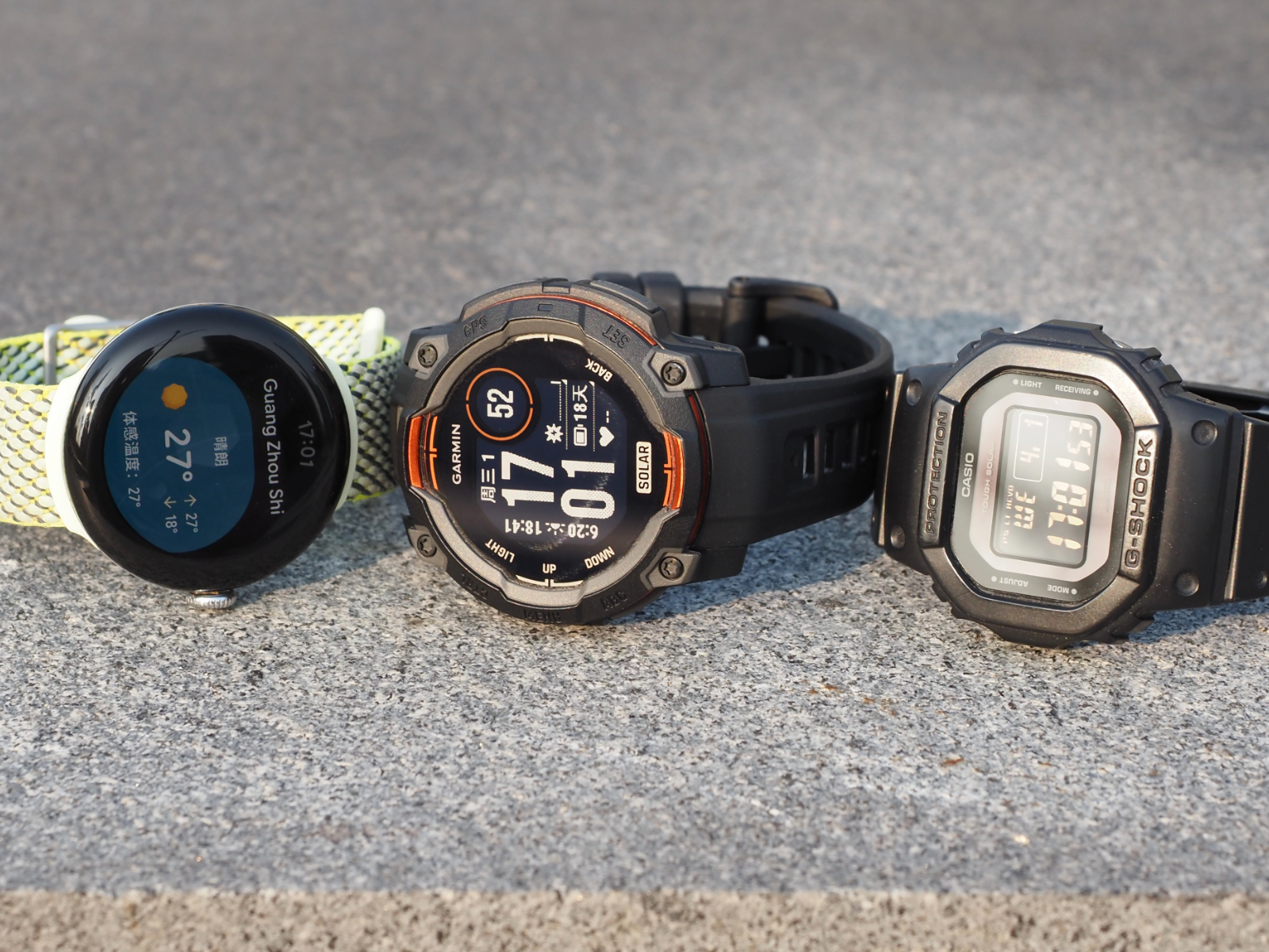
Over the years, I’ve tried the TicWatch, Samsung smart bands, G-Shock, and the Pixel Watch 2, but every one of them had something that left me unsatisfied.
Take the two watches I wore for the longest time, for example: the G-Shock GW-B5600, powered by solar charging and radio-controlled timekeeping, could practically go a decade without worrying about battery life. It was rugged and reliable. But it couldn’t satisfy my needs for health tracking and smartphone notifications.
Later, I switched to the Pixel Watch 2. Its workout and sleep tracking, along with the ecosystem integration, felt incredibly polished. But that anxiety-inducing battery life once forced me to charge it in the least graceful way possible while spending a night at the airport waiting for an early morning flight.
After using both of these watches, I realized that what I needed wasn’t an Android smartwatch packed with features but crippled by short battery life, nor a simple digital watch with incredible endurance.
What I needed was a hybrid: a watch with ultra-long battery life, professional-grade fitness and health tracking, and the ability to view smartphone notifications. At the same time, it also had to look good, feel durable, and stay lightweight.
Then, in January 2025, Garmin released the Instinct 3 Solar. And for the first time, I felt like I finally understood what kind of watch truly belonged on my wrist.
Function-Driven Design
One of the biggest reasons I was drawn to the Pixel Watch before was its appearance. The dual-sided 3D glass paired with a metal frame gave it a clean yet lively look. That kind of design works great for touch interaction and feels premium, but the trade-offs are weaker structural durability, glass that scratches easily, and touch controls that become unreliable when wet.
Looking back at the Instinct 3, it is built around one thing: toughness and durability. There is not a single overly decorative design element for the sake of appearance alone.
Since it does not rely on touchscreen interaction, the Instinct 3 recesses the display beneath the plastic bezel. Around the outer edge of the display glass is an orange aluminum alloy ring, designed to further improve the overall structural strength.
Combined with its 10 ATM water resistance rating, the Instinct 3 is probably the most rugged smartwatch in its price range right now.
Another defining characteristic of the Instinct series is its fully button-based operation. Every interaction is handled through five physical buttons. Considering outdoor scenarios where users may be wearing thick gloves, Garmin made the buttons large and tactile, with crisp feedback when pressed.
To reduce accidental presses, the two buttons on the right side are separated by their own protective frame, while the three buttons on the left use two raised ridges as guides, making it incredibly easy to locate them by feel alone.
Combined with an extremely ergonomic button layout (one on the right, one on the left), the controls become more intuitive and convenient than tapping a screen once you get used to them.
The Instinct 3 uses a fiber-reinforced polymer case. It may not look as refined as a metal case, but it is rugged, durable, and does not interfere with wireless signals like GPS or Bluetooth.
The sensor area on the back protrudes slightly on its own, paired with inward-curving lugs, allowing the sensors to stay firmly against the skin without needing to tighten the strap excessively. This avoids the common issue on other smartwatches where the watch shifts during sleep and leaks green light across your wrist in the middle of the night.
Speaking of light, the Instinct 3 features a dual-color LED flashlight at the top. Double-pressing the Light button turns it on instantly, and it is dramatically brighter than the makeshift flashlight mode on typical smartwatch displays, making it genuinely useful.
The Instinct 3 gives me the feeling that its functions were defined first, and its design came afterward. Refined elegance in form was never the top priority — durability, reliability, and practicality were. In the end, through nothing more than plastic and aluminum alloy, it manages to deliver a uniquely premium aesthetic.
Using this much plastic without feeling cheap — that is the power of design.
The Longest-Lasting Smart Sports Watch
Battery life is one of the biggest reasons I chose the Instinct 3. With my current setup (automatic backlight enabled, heart rate monitoring on, workout tracking enabled, and connected to my phone for notifications), a single charge lasts me 21 days. Charging itself is also fairly quick — going from 10% to 100% takes roughly 90 minutes.
That level of endurance is something most smartwatches cannot achieve even in their most stripped-down battery saver modes.
What is even more impressive is that the Instinct 3 supports solar charging. According to Garmin, just three hours of direct outdoor sunlight per day at 50,000 lux is enough to achieve effectively unlimited battery life.
In my own testing, leaving the Instinct 3 under the winter afternoon sun for three hours increased the battery by around 8%, while my average daily battery drain is only about 5%. In actual use, whether it was around eight or nine in the morning or four or five in the afternoon, as long as sunlight could directly hit the watch face, charging efficiency consistently reached 100%.
In other words, as long as I spend enough time outdoors and the watch face receives more than three cumulative hours of direct sunlight, I can still come home with an extra 3% of battery left at the end of the day.
From this perspective, the Instinct 3 is without question the longest-lasting smart sports watch available right now, thanks to Garmin’s two biggest advantages: its proprietary RTOS operating system and Power Glass solar charging technology.
RTOS Is the True God of Outdoor Watches
The Instinct 3 runs on Garmin’s in-house RTOS, a system refined and optimized over decades. In terms of functionality and stability, it sits firmly among the top tier in the industry, and it also has a fairly mature third-party app ecosystem.
And precisely because of that long history, Garmin’s system interaction can feel somewhat complicated, lacking the trendy polish of brands like Suunto or COROS. But when it comes to power efficiency, their RTOS systems are miles ahead.
RTOS stands for Real-Time Operating System, and at the fundamental level it works very differently from the general-purpose operating systems (GPOS) we use every day, such as Android or Windows.
RTOS is built around extreme determinism. It has no bloated background services or flashy UI layers. It manages every task with precision, waking the processor only when necessary and putting it back to sleep immediately afterward. This highly targeted way of operating dramatically reduces power consumption.
GPOS, on the other hand, is designed around versatility and visual polish. It carries the burden of countless background services and complex graphical rendering. Because the system overhead is so heavy, waking from sleep becomes expensive, making it difficult to instantly sleep and wake like an RTOS system. Most of the time, it has to stay running at relatively high power consumption, so battery drains away like flowing water.
If we compare them to people, RTOS is like a cold, hyper-efficient worker: no morning grumpiness, no staying up late, falls asleep instantly, wakes up and immediately gets to work, finishes the task and goes right back to sleep. No sweet talk, just pure efficiency. GPOS, meanwhile, is like the rest of us exhausted corporate workers: struggling to get out of bed, lying awake at night, sleeping poorly, constantly making flashy presentations and saying all the right things. It looks glamorous on the surface, but underneath it is running on low energy all the time.
Of course, there are many watches that use RTOS systems, and some products from brands like Xiaomi and Amazfit can deliver smooth and visually polished UI experiences as well. But none of them can match the battery life that Garmin delivers.
If you want to balance battery life, functionality, and professional-grade sports features all at once, there are basically only three companies left: Garmin, Suunto, and COROS. Among them, COROS does not offer a solar-powered model, and Suunto has also abandoned solar charging on its latest Vertical 2. That leaves only Garmin still fully committed to pushing solar technology forward.
Inside Garmin’s Power Glass Solar Technology
The world’s first solar-powered watch was the Synchronar 2100 released in 1972. Its surface featured two massive monocrystalline silicon solar panels, forcing the LED display to be positioned on the side instead — a compromise that accidentally gave it an incredibly futuristic appearance.
Even today, most solar-powered watches still follow a similar design philosophy: placing solar cells directly on the watch dial.
There are generally two main approaches. One uses a translucent dial with the solar cells placed underneath it, like the example on the left above. The other places a ring of solar cells around the inner bezel, allowing the watch to use far more elaborate opaque dials, like the example on the right.
Among Japan’s three major watchmakers, Seiko mainly adopts the first approach, while Casio and Citizen both use a mix of the two. My previous G-Shock GW-B5600 was closer to the second design.
Garmin took a completely different route. Their solution is called “Power Glass,” officially known as solar charging transparent lens technology. Instead of relying on those thick, bulky black solar panels, the entire surface becomes transparent glass. I even asked “Teacher G” to help create a rough illustration for everyone — if you are interested, it is worth taking a closer look.
Simply put, Garmin cuts the solar cells into a microscopic mesh structure and embeds them directly into the glass panel. To the naked eye, the pattern is almost invisible, making the surface appear completely transparent. In the non-display areas of the watch face, however, this “mesh” becomes effectively “solid,” ensuring overall solar charging efficiency remains high.
It is also worth mentioning that the Instinct 3 uses Corning Gorilla Glass as well, likely a customized version from the DX series. Compared to ordinary glass, surface reflectivity is reduced by roughly 75%, allowing more light to reach the solar layer, while scratch resistance is on par with sixth-generation Gorilla Glass.
While researching patents, I discovered something quite interesting: the original applicants behind this entire series of transparent solar panel patents were actually a French company called SunPartner Technologies. These patents were only transferred to Garmin in 2019.
Back in 2011, SunPartner Technologies introduced a transparent solar film called Wysips. The company claimed you could simply apply it like a screen protector to charge your phone, which caused quite a sensation at the time. Unfortunately, due to financial difficulties, the company filed for bankruptcy in 2019.
One of its biggest customers back then happened to be Garmin, so Garmin took the opportunity to acquire most of its patents and assets. In August of the same year, Garmin launched its first solar-powered smartwatch, the fēnix 6X Pro Solar, which also suggests that the two companies had already been working closely together long before the acquisition.
Even today, this remains a uniquely specialized business. As Garmin continues refining the technology, Power Glass keeps improving in solar efficiency, the glass panels become increasingly transparent, and production costs continue to fall. Without question, this is currently the most advanced solar solution available for mobile devices.
It is precisely this technological moat that has allowed Garmin to become the only company capable of delivering near-infinite battery life on a smart sports watch.
Of course, every technology comes with trade-offs, and Power Glass is no exception. First, its energy generation efficiency still cannot match traditional solar cells, nor can it harvest weak ambient light like moonlight or indoor lighting the way some Citizen watches can. Second, the glass itself is not perfectly transparent, which slightly affects the contrast and viewing angles of the MIP display.
Packed With Features, Powered by Customization
In terms of sheer functionality, the Instinct 3 is easily the most feature-rich watch I have ever used. The official website lists its capabilities in incredible detail, and I genuinely believe 99% of users can find everything they want here.
But because there is so much functionality, the learning curve is undeniably higher as well.
As mentioned earlier, every operation on the Instinct 3 is handled through those five buttons. On such a small screen, quickly navigating through hundreds of features to find exactly what you want is not always easy.
Thankfully, the Instinct 3 offers an extremely deep level of customization. Every page, every list, every button can be adjusted to match your own habits and workflow.
If you are lazy like me, though, the default factory settings are honestly good enough. Just customize the “Activities & Apps” page with the functions you use most often, and you are basically set.
Take cycling as an example — the Instinct 3 already has everything it should. Its biggest advantage lies in satellite acquisition speed. Usually, just a few seconds after starting a cycling activity, positioning is already locked in, and the accuracy is excellent. Even in dense urban environments surrounded by skyscrapers, the GPS remains extremely precise without drifting at all. No surprise there, considering Garmin originally built its reputation on aviation navigation technology.
ABC is one of my favorite features. Long-pressing the “Down” button instantly opens it, showing your current altitude and compass heading. Scrolling through the pages also lets you check recent changes in barometric pressure and elevation over time.
In reality, most mid-range and high-end smartwatches already include these ABC sensors. The difference is that Garmin makes them much easier to access directly, without forcing you to dig through an app list.
The Instinct 3 uses Garmin’s Elevate V4 heart rate sensor, which supports HRV tracking and strikes a solid balance between accuracy and power efficiency. For most people, it is already more than sufficient.
While Garmin’s newer V5 sensor is more advanced — supporting ECG and skin temperature tracking with even better accuracy — it also consumes more power. Of course, the bigger reason is product positioning: the V5 sensor is reserved for flagship models, and the Instinct 3 has not quite earned that status yet.
I’m Burned Out — and It Knows
Finally, let’s talk about the sleep and health tracking features that today’s exhausted corporate workers probably care about the most.
The Instinct 3 covers all the basics: abnormal heart rate alerts, sedentary reminders, stress level notifications, sleep HRV, sleep stage tracking, sleep scores, and more. The data is also presented in great detail, so there is really nothing to worry about in this area.
What stands out more is that Garmin introduced a concept called “Body Battery,” which feels a bit like the health bar in a video game.
“Body Battery” drains throughout the day based on your physical activity and stress levels. This includes passive activities like sitting around doing nothing, as well as walking, running, and other workouts. Higher stress levels consume even more energy. Resting and sleeping, meanwhile, recharge it. Broadly speaking, it follows a cycle of draining during the day and recovering at night.
And this is where the algorithm becomes almost magical: it can quantify both physical and mental exhaustion — and it is surprisingly accurate. For example, after working nonstop until 11 PM and feeling completely destroyed, I check the watch and see my Body Battery sitting at 10. Or after spending an entire day walking around shopping, feeling absolutely drained, I look down and find it at 5.
Based on this data, the Instinct 3 provides systematic recommendations for things like sleep duration and workout intensity. After several consecutive days of high-intensity work, it may suggest getting more sleep and doing lighter recovery exercises. On the other hand, if you spend days barely moving and oversleeping, it will remind you to increase your activity level and cut back on sleep a little.
I think this is what makes Garmin truly unique. It does not scold me for failing to hit a step goal after a long exhausting day, nor does it create anxiety around numbers. Instead, it makes the data work for the person.
Independent Enough, but Not Smart Enough
Unlike many smartwatches, the Instinct 3 is not merely an accessory for your phone. It can independently handle the vast majority of its functions, only requiring a phone for internet-dependent tasks such as notifications and system updates.
On the positive side, the Instinct 3 remains a fully functional watch even without a phone nearby. It can even sync its time through GPS. On the downside, its connection with the phone feels surprisingly weak, which makes it seem less “smart” overall.
By the way, the Instinct 3 can sync its data with the Apple Health app on the iPhone, so the ecosystem integration is still fairly complete.
Take something as basic as sleep mode, for example. Unlike products from Google or Apple, it cannot directly sync your system sleep schedule, Do Not Disturb settings, or alarms. Forget about automatically handling holiday schedules as well. Its scheduling system only understands Monday through Sunday, meaning you have to manually configure everything yourself. Even though you only need to set it up once, it still feels unnecessarily tedious.
Then there is automatic activity detection. I found it performs terribly with fragmented activities. A 20-minute bike ride, a 20-minute nap, or a one-hour walk simply will not be recognized or recorded automatically. The Instinct 3 follows your predefined schedule very rigidly: nighttime sleep is considered sleep, but taking a long afternoon nap will not be recorded at all.
It does include a nap feature, but honestly, I do not think it works very well either. For low-energy people like us, when it is time to sleep, we just collapse instantly — nobody remembers to manually start a nap recording on their watch.
Notifications on the watch are also strictly view-only. You cannot reply to messages, you cannot take phone calls directly from the watch, and you definitely should not expect to browse WeChat or anything similar on it. You could say the Instinct 3 has essentially zero entertainment features.
The Endgame for Smartwatches
More than a decade ago, driven by the fear of missing out — FOMO — I wanted a smartwatch that could keep me constantly connected to the world. But now, all I want is distance from the noise and the ability to quietly enjoy life.
The Instinct 3 Solar helped me break the habit I developed with the Pixel Watch 2 of endlessly swiping at the screen for no reason. It truly achieves something rare: not fighting for my attention.
Most of the time, it simply behaves like a long-lasting ordinary watch that only needs charging once every two or three weeks. I raise my wrist only to check the time, while useless notifications stay hidden away, giving me back control over my own life.
Its smart features work quietly in the background, almost invisibly. Most of the time it stays silent, yet whenever I actually need it, it appears at exactly the right moment: morning sleep feedback, nighttime reminders to go to bed earlier, relaxation suggestions during periods of high stress, and the instantly accessible LED flashlight that is always there when needed.
We live in an era obsessed with “fast-food” products, where most devices are designed to grab your attention as quickly as possible — some companies practically want you replacing them every single year.
Compared to that, the philosophy behind the Instinct 3 Solar — long-term durability and ultra-long battery life — feels increasingly rare and valuable. In fact, I cannot think of a real alternative to it anymore. And I think that is why this is the final chapter of my smartwatch journey.
Recently, I bought a pair of lithium-ion AA rechargeable batteries. Compared to traditional NiMH rechargeable batteries, they’re lighter, have higher voltage, and even come with a built-in USB-C charging port.
Lithium-ion rechargeable batteries with USB-C
I thought I could finally get rid of that bulky NiMH battery charger. But to my surprise, they wouldn’t charge after I got them, so I contacted customer support. The reply left me speechless:
Please use the included A-to-C cable for charging. This product does not support C-to-C charging.
I stared at that cheap black A-to-C cable and fell into deep thought.
If they all use USB-C, why isn’t it universal?
USB-C ≠ USB-C
While searching for a solution, I came across a video mentioning a newly released C-to-C adapter that can fix devices that don’t support charging via C-to-C cables. The name is quite odd—“5.1K resistor adapter”—and it sold out immediately after launch, with comments under the official video full of people asking for restocks.
I had only heard of adapters like Lightning to USB-C or micro USB to USB-C—those that convert between different connector types. I never expected to see a USB-C to USB-C adapter for the same connector format. So while trying to grab one, I also discussed USB-C standardization, charging, and data transfer with others online. That’s when I finally understood the root cause of why my batteries wouldn’t charge.
In short, the device didn’t follow the USB specification for setting identification resistors. As a result, the charger cannot determine whether it should supply power, and therefore fails to charge the device.
This situation is quite common in small appliances such as handheld fans, portable lamps, and flashlights. They all use USB-C ports, but can only be powered using A-to-C cables.
So why don’t manufacturers follow the standard design? And what exactly does the official specification require? Let’s briefly go over how USB-C is supposed to work.
The USB-C interface is highly versatile, supporting high-power charging and discharging, audio and video signal transmission, and reversible plug orientation. Precisely because of its rich functionality, its internal structure is also relatively complex.
USB-C pin definition
A full USB-C connector consists of 24 pins, with the A side and B side arranged in mirror symmetry. Based on function, they can be broadly divided into four categories: power, data transfer, control, and auxiliary.
Power
VBUS: A4, A9, B4, B9 → Responsible for power delivery, defaulting to 5V and reaching up to 48V depending on the protocol
GND: A1, A12, B1, B12 → Ground lines that complete the circuit and ensure stability
Data Transfer
Low-speed channels: D+ / D- (A6, A7, B6, B7) → Basic USB 2.0 data communication (480 Mbps)
High-speed channels: TX / RX (A2, A3, B2, B3, A10, A11, B10, B11) → Used for high-speed data communication such as USB 3 / USB 4 / Thunderbolt
Control (Most Critical)
CC: A5, B5
Determine plug orientation
Determine power direction (who supplies power)
Negotiate current and voltage
Enable fast charging / video modes
Auxiliary
SBU: A8, B8 → Used for auxiliary audio or video signals (such as DisplayPort)
As mentioned earlier, the missing identification resistor refers to a 5.1K pull-down resistor (Rd) on the CC pins. Without it, the device cannot be recognized as a power sink, so the charger will not supply power. This 5.1K resistance value is also the standard Rd value defined by USB-IF.
However, the issues with USB-C are not as simple as just missing a “pull-down resistor.”
A Unified Exterior, a Fragmented Reality
USB-C is indeed an excellent connector form, but it is still far from achieving the USB-IF vision of “universal, simple, and unified device connectivity and interoperability.”
Stripped-Down Connectors
In practice, it’s rare for devices to use all 24 pins. Manufacturers often trim functionality based on actual needs. For example, many small appliances remove data-related pins and retain only the power-related ones—leaving just 6 pins, which is a reasonable cost-saving strategy.
In fact, many devices previously used micro USB. Since the USB-A port on the charger side is always the power source by default, there’s no need to negotiate power direction like USB-C does, so the device circuitry didn’t include identification resistors. After switching to USB-C, some manufacturers chose not to redesign the internal circuitry to save costs, which is why these devices cannot be charged with C-to-C cables.
In other words, these cables may wear a USB-C shell, but inside, they’re still the familiar micro USB.
A USB-C female port with only 4 pins
For example, the USB-C receptacle shown above has only 4 pins. It provides D+ / D- for USB 2.0 low-speed data transfer, along with VBUS and GND for power, but lacks CC pins. As a result, devices using this type of connector cannot be charged with C-to-C cables.
In other cases, the connector includes CC pins, but manufacturers fail to solder the required 5.1K identification resistor. Some hands-on users have even added the resistor themselves to enable C-to-C charging.
A manually soldered identification resistor
Different Power Support
Even if we only look at charging, C-to-C cables with identical appearances can vary greatly in charging speed. In my own case, my power bank can trigger 90W fast charging on a Xiaomi phone using the original C-to-C cable, while some other cables can only reach up to 20W. If you’re unaware of this, your expensive high-wattage charger might end up running at a much lower power level.
To achieve 60W or higher charging power, you need to choose cables that support 3A or higher specifications.
Cables supporting 6A current
Expensive
Nowadays, many monitors support a single-cable setup. With just one C-to-C cable connecting your computer and monitor, you can transmit video while charging your laptop, keeping your desk clean and tidy.
However, anyone familiar with this setup knows that not just any C-to-C cable will work. You need a Thunderbolt 3 or higher standard cable, or a full-featured USB-C cable. These cables can cost several times—or even over ten times—more than regular C-to-C cables.
Original iPhone cable, 6A cable, full-featured USB-C cable
The Proliferation of Proprietary Charging Protocols
You could argue that the issues above stem from hardware differences and cost constraints. But the proprietary charging protocols developed by many smartphone manufacturers—especially in China—are a problem at the protocol level.
As early as 2014, Chinese smartphone makers began competing on charging speeds, pushing from 60W to 90W and even beyond 100W. At the time, official Power Delivery (PD) standards could not meet their needs, so they developed their own proprietary fast-charging protocols. Well-known examples include OPPO’s VOOC, Huawei’s SuperCharge, and Xiaomi’s HyperCharge. These modified protocols did achieve high-speed charging, even outperforming brands like Apple and Samsung in this area.
However, proprietary protocols require a dedicated charger, cable, and compatible device to reach full speed. Once you switch brands or use multiple devices, compatibility breaks down, and charging speeds may drop to 18W or even lower. In some high-power chargers, these proprietary protocols may conflict with the standard PD protocol, leading to negotiation failures, power fallback, or repeated handshakes.
In essence, proprietary protocols recreate new “ecosystem barriers” on top of the supposedly “unified” USB-C interface.
Confusing Official Naming
Beyond the inconsistencies caused by manufacturers’ cutbacks and modifications in hardware and protocols, repeated changes in naming by USB-IF have further increased the complexity for users:
In 2008, USB-IF introduced the USB 3.0 standard.
In 2013, USB 3.1 was released, renaming the original USB 3.0 to USB 3.1 Gen 1, while USB 3.1 became USB 3.1 Gen 2.
In 2017, USB-IF renamed the standard again to USB 3.2, changing USB 3.1 Gen 1 to USB 3.2 Gen 1, USB 3.1 Gen 2 to USB 3.2 Gen 2, and adding USB 3.2 Gen 2×2 (20Gbps).
……
Time
Official Standard (at the time)
Old Name
New Name (at the time)
Actual Speed
2008
USB 3.0
—
USB 3.0
5Gbps
2013
USB 3.1
USB 3.0
USB 3.1 Gen 1
5Gbps
2013
USB 3.1
—
USB 3.1 Gen 2
10Gbps
2017
USB 3.2
USB 3.1 Gen 1
USB 3.2 Gen 1
5Gbps
2017
USB 3.2
USB 3.1 Gen 2
USB 3.2 Gen 2
10Gbps
2017
USB 3.2
—
USB 3.2 Gen 2×2
20Gbps
Originally, it was already difficult to distinguish USB-C cables by appearance alone. These repeated official renamings have made things even more confusing, making it harder for users to tell them apart. As a result, some users created diagrams to mock this situation.
Past vs Present
However, careful readers might notice: we’ve been talking about USB-C, so why are we now discussing USB 3? This confusion actually comes from mixing up connector types and protocols.
USB-C refers to the physical connector shape, while USB 3 refers to the underlying protocol. It’s just that the latest USB protocols mostly use the USB-C connector and are the most widely adopted, so people often confuse the two concepts.
Connector vs Protocol
Conclusion
A few days later, my “5.1K C-to-C adapter” finally arrived. This tiny device adds the missing identification resistor, allowing the charger to recognize the connected device as a power sink and supply power accordingly.
My problem was solved—but what about USB-C? It seems to have many issues: inconsistent implementation, fragmented protocols, and uneven user experience. But these may only be surface-level symptoms. The real issue is that USB-C uses a unified connector shape to mask a complex and fragmented ecosystem of implementations and protocols.
Its problem has never been that it isn’t unified—it’s that it only appears to be.
In a previous article, I shared how I spent nearly two years building an e-ink display from scratch.
System Architecture Overview
For readers who haven’t read the previous article, here’s a brief introduction to the hardware and software structure of the project, along with links to the open-source repository (GitHub | Gitee).
Hardware Structure
The hardware setup consists of four main components:
ESP32 main controller: the brain of the system, responsible for receiving data, processing it, and sending display data. I’m using the ESP32-S3, as the larger memory is required to create a 400×300 buffer.
E-ink display driver board: acts as a bridge between the development board and the display. This was purchased on Taobao—just search for “compatible with Waveshare e-ink driver.”
400×300 e-ink display: the final output screen. I used a retired off-brand e-ink panel from a supermarket, also purchased on Taobao. As long as it’s compatible with the Waveshare driver, it should work. Similar displays can also be found on second-hand platforms like Xianyu.
3D-printed enclosure: organizes the messy wiring into a clean, product-like form factor.
Dupont wires: used to connect all the hardware modules above.
Software System
The software is built using MicroPython, which I’m familiar with. The structure is relatively straightforward:
main.py: the main entry point of the project, where you can configure the operating mode of the e-ink display.
wifi.py: handles Wi-Fi connection and time synchronization. Based on configured network credentials, it connects to the internet and syncs system time.
wificonfig.json: stores the Wi-Fi SSID and password. In manual update mode, these can also be modified through a web interface.
ink_calendar.py: the perpetual calendar program used in fully automatic update mode.
ink_websocket.py: enables the ESP32 to run a server for passive and manual update modes.
ink_display.py: a general-purpose module for rendering content on the e-ink display.
epaper4in2.py: the driver for the e-ink display.
ink_index.html: a local HTML file used for manual updates.
After publishing the first article, many readers asked whether the project could be open-sourced. I also realized there were many areas for improvement, so I recently spent some time iterating and upgrading the project.
With these upgrades, the e-ink display now supports multiple update methods:
Automatic update mode: updates the day’s calendar information automatically at 8:00 a.m. each morning;
Passive update mode: after receiving an SMS, an iPhone Shortcut automatically syncs information to the e-ink display;
Manual update mode: update content by entering text or uploading images through a web interface.
Next, I’ll walk through these three modes one by one:
Automatic Update Mode: Perpetual Calendar
Effect Preview
How It Works
On the previous day, the server (currently running on my own computer) automatically requests relevant APIs based on the current date to retrieve the next day’s calendar information, and then renders it into an image, as shown below:
The server then further processes this image into data readable by the e-ink display and uploads it to a public OSS location. Each client (i.e., the e-ink display device) will, at 8:00 a.m. every day, request the corresponding OSS address based on the current date, retrieve the image data, and render it on the display.
In this mode, the image generation process is handled entirely on the server side (regardless of how many clients there are, the server only generates it once). The client only needs to connect to the internet and periodically request the corresponding address to update the e-ink display.
Passive Update Mode: Sync to the E-Ink Display Upon Receiving SMS
Effect Preview
How It Works
The ESP32 controller of the e-ink display runs in server mode, ready to receive and process HTTP or WebSocket requests. On the iPhone, a Shortcut is created to send incoming information to the ESP32 server.
Then, another automation is set up on the iPhone: whenever an SMS is received, it automatically triggers the previous Shortcut to send the content to the ESP32 server.
Since the ESP32 has limited performance and lacks image processing capabilities, it forwards the received data to a cloud-based “Function Compute” service. This service processes the data into image format and returns it to the ESP32, which then displays it on the e-ink screen.
This mode also enables broader use cases, such as automatically syncing iPhone to-do lists to the e-ink display, displaying incoming emails, and more. Essentially, any information accessible via Shortcuts can be synchronized.
However, this approach also has its drawbacks: since the mobile device does not send image data directly, and the ESP32 cannot process images on its own, a real-time online backend service is required. Although the cost of such serverless function computing is relatively low, it still introduces additional overhead.
Manual Update Mode: Enter Text or Upload Images for Updates
Effect Preview
How It Works
While thinking about better ways to solve the “server-side image generation” problem, I had a sudden realization one day: modern smartphones are already powerful enough—why not generate the image data directly on the phone and then send it over?
Similarly, the ESP32 controller on the e-ink display runs in server mode, ready to receive and process HTTP or WebSocket requests. On the client side, a webpage (essentially a single-page application) is opened. Through this page, users can connect to the e-ink system over a local network, input text to generate images and cast them to the display, or upload images, crop them appropriately, and then cast them.
During the casting process, the frontend webpage uses JavaScript to process text and images, transmitting the image data to the ESP32 controller via WebSocket. After receiving the image data, the ESP32 saves it as a file in its local directory, and the system reloads the image data from the directory for display.
This mode does not require any additional cloud services, but it also has its limitations: since I haven’t solved the issue of requesting HTTP local resources under an HTTPS environment, it’s not possible to deploy this single-page application as an online service. Users need to download an HTML file and open it locally—on Android, this can be done directly from the file system, while iPhone users need to install an additional app (such as an HTML viewer) to open the local HTML file.
Conclusion
This e-ink display project has been ongoing for quite a long time. Each time I set it aside and learned something new elsewhere, I would come back and apply those learnings to further iterate and improve the project. Throughout the process, I’ve experienced a strong sense of accomplishment.
There are still many aspects of the project that could be optimized, but since I don’t intend to turn it into a fully polished “product,” I may consider wrapping it up at its current stage.
Some areas for improvement include:
Solving the issue of requesting HTTP resources in an HTTPS environment, which would make it possible to launch a universal single-page application. Users would no longer need to download an HTML file—just open a web page, enter the IP address, and update the display.
The ESP32-S3 controller is still relatively expensive. If the display can be updated without using a buffer approach, a more affordable ESP32-C3 might suffice.
The current 3D-printed enclosure mainly serves to tidy up the wiring and is relatively bulky. Optimizing the wiring layout could reduce the overall size.
The current power supply relies on USB. If only the perpetual calendar mode is used, the device only needs to perform updates once per day at 8:00 a.m., and can remain in deep sleep the rest of the time—making battery power a viable option.
Anyone interested is welcome to build upon this and continue exploring.
This is TDS Studio’s 19th article on SSPAI, and as always, it’s a full-platform exclusive release. Although it’s coming out after the Lunar New Year, happy holidays to everyone!
Not long ago, we brought you our coverage of the Xiaomi Buds 6, and it’s fair to say we weren’t particularly impressed with the changes compared to the previous generation. In our previously published “Mid-Range TWS Roundup” on SSPAI, we also touched on the REDMI product lineup. At the time, the Buds 6 Pro performed somewhat more consistently than the Xiaomi Buds series, but it was still limited to a slightly bass-heavy, pop-oriented tuning and noise cancellation performance that merely matched its price point—hardly competitive with some of the newer offerings from other smartphone brands. After seeing some of the pre-launch media teasers, the question became: could REDMI’s latest TWS at least catch up with the current mainstream standards in its price segment this time? The good news is—it did. Though not in every aspect.
Package & Accessories
The Buds 8 Pro packaging features a laminated finish, making it more than just a simple white cardboard box. It reflects subtle iridescent colors under light. The included accessories are minimal: two extra pairs of ear tips and a USB-C to USB-A charging cable. No carrying case was included in this launch.
Design, Fit & Acoustic Structure
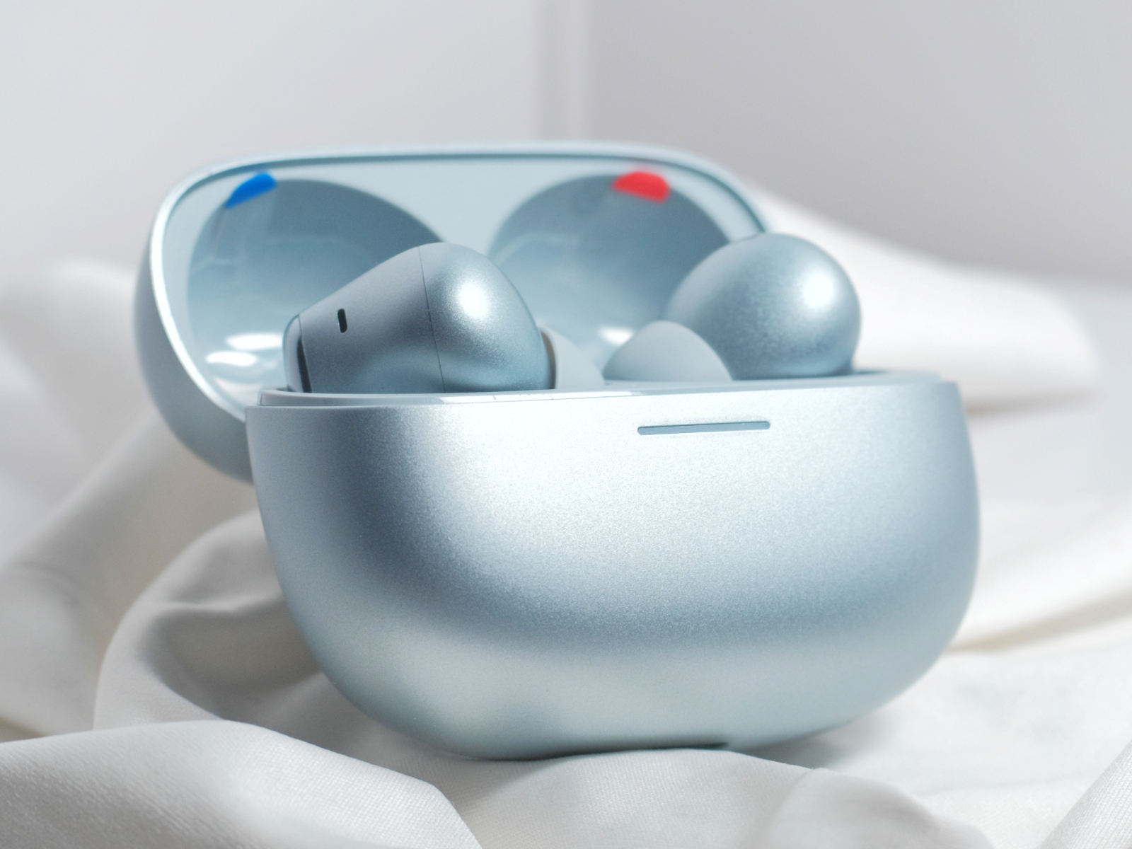
The REDMI Buds 8 Pro comes in three color options. In addition to the familiar black and white from the previous generation, the Jade Green has been replaced by a new flagship color, Mist Blue—the one we have on hand for demonstration. Visually, it resembles a lighter version of Sierra Blue, with a subtle pearlescent tone reminiscent of a sunrise sky. Most of the charging case and earbuds feature a matte finish which, combined with the color, gives an anodized aluminum-like appearance—though the material is still plastic.
The charging case of the Buds 8 Pro is largely similar in form to that of the Buds 6 Pro, including the same “Cloud Gap Light” indicator system—a subtle LED strip located at the lid opening. Overall, the case design is fairly straightforward, with the button placed at the bottom, offering clear and direct tactile feedback.
The earbuds themselves sit inside the case just like the previous generation, adopting the typical stem-style pod design with a polished glossy strip on the outer side. The acoustic chamber is shaped more like an oval rather than a flattened circle, with a controlled front-to-back length that may be more comfortable for users with shorter concha dimensions compared to options like the AirPods Pro 2. However, the matte surface may still result in a slightly slippery feel. The connection point between the chamber and the stem is positioned further back, allowing more clearance for the tragus but potentially introducing some pressure on the corresponding areas of the auricle. Users with medium to large ears who can comfortably wear AirPods Pro 2 should adapt well to this fit. Those with smaller ears are still advised to try them on in-store at a Xiaomi Home before making a purchase decision.
The REDMI Buds 8 Pro supports IP54-rated dust and water resistance, which is fairly standard.
Control & APP
Controls are implemented via touch input on the stem. The feedback tones are clear, supporting single, double, triple taps, and long-press gestures, all of which can be customized in the app (single tap is unassigned by default). With the current firmware, the recognition accuracy and response speed for long-press and triple-tap gestures are noticeably better than those of earlier firmware versions found on several Xiaomi flagship earbuds. Wear detection performance is also fairly reliable.
Through the Xiaomi Earbuds app, users can manage noise cancellation, switch sound modes, update firmware, record audio, and customize controls. Most Xiaomi and REDMI TWS earbuds from the past three generations—including limited editions—are supported. The app’s UI follows the HyperOS design language. Whether it looks good is subjective, but the logic is clear.
On standard Android phones, the find function can only assist by playing sound through the earbuds. In a quiet indoor environment, with the earbuds out of the case and unobstructed, it’s barely usable.
ANC, Transparency & Call
Let’s start with passive isolation. Similar to other pod-style earbuds, the Buds 8 Pro doesn’t offer any particularly noticeable passive isolation improvements—it mainly attenuates higher frequencies in a fairly typical manner. The default ANC toggle does not include an “off” option in its switching cycle, effectively encouraging users to keep ANC enabled or switch to transparency mode. Its ANC modes are quite complex, so let’s go through them one by one.
The basic ANC is divided into twenty fine-grained levels. Switching directly to the deepest level, the reduction of stable low-frequency noise is quite noticeable, essentially meeting the Skyline Level “threshold.” However, there is still a slight gap compared to mid-range low-frequency ANC benchmarks such as the vivo TWS 5 and OPPO Enco Free4—perceptually, the intensity is a bit lower. In the low-mid to mid-frequency range, however, the Buds 8 Pro performs on par with those models, delivering mid-frequency ANC depth in line with the median Skyline Level expectations. Its effective frequency bandwidth is similar to the previous Buds 6 Pro, generally covering the vocal range and performing well in lower fundamentals, though as frequencies approach the upper mids, the depth begins to lag behind the vivo TWS 5.
Subjectively speaking, it’s difficult to distinguish clear differences between adjacent levels across all twenty ANC steps. However, lighter ANC levels do reduce ear pressure, while still maintaining practical noise reduction in certain indoor noisy environments. Overall ear pressure control is good, and the perceived low-mid ANC depth is better than that of the flagship Xiaomi Buds 5 Pro. It’s worth noting that in extremely quiet environments, enabling ANC introduces a slight increase in high-frequency noise, which may be noticeable to users sensitive to background hiss—though in noisy environments, it’s essentially imperceptible. During intensive testing in common real-world scenarios (excluding air travel), the adaptive ANC algorithm appeared to prioritize deeper attenuation whenever noise was detected.
Commute Immersion—this seems to be the first time Xiaomi has introduced such a feature in its earbuds. Essentially, it provides three scene-based presets combining ANC profiles with ambient “soundscape” effects. In airplane mode, you’ll hear wind chimes and aircraft engine white noise; in bus/subway mode, it resembles boiling water (or luggage wheels rolling across smooth ground—don’t ask why boiling water would be heard in a subway); and in high-speed rail mode, it’s forest birdsong. All three soundscapes are fairly clear and usable, but tightly coupling sound effects with ANC scenarios can interfere with assessing the actual ANC depth and bandwidth. Subjectively, the first two modes seem to hover around levels 14–17 of standard ANC, while the high-speed rail mode makes vocal fundamentals feel even quieter—possibly quieter than regular deep ANC. However, it’s difficult to determine whether this is due to actual ANC changes or a psychoacoustic effect introduced by the forest soundscape. You may wish to refer to objective measurements for verification.
In terms of wind noise reduction, at deep ANC levels, there is a detection process that activates after about two to three seconds of identifying a wind source. In practice, this reduces wind noise but also slightly lowers the overall ANC perception, indicating that deep ANC itself is adaptive even when no adaptive option is manually enabled. Wind noise impact on listening is kept quite low, with relatively clean suppression, though wind from behind takes longer to respond. All three commute immersion modes also feature adaptive wind noise handling, though the high-speed rail mode appears less effective in removing wind noise—possibly related to its deeper perceived ANC tuning.
For transparency mode, the REDMI Buds 8 Pro offers three options. In standard transparency mode, environmental sound reproduction is fairly accurate, with only minor attenuation in higher frequencies. The overall sound pressure is not drastically different from removing the earbuds entirely. The wearer’s own voice does not sound overly muffled, making it one of the better performers in its price range. Wind noise impact in transparency mode is minimal, though noticeable when facing away from the wind source. Adaptive adjustments reduce overall ambient sound pressure once wind is detected. In my opinion, this adjustment may not be necessary, as the baseline wind noise suppression is already decent—sudden shifts in transparency mode during normal use can feel slightly uncomfortable. The vocal enhancement and environmental enhancement modes perform largely as expected, though they do not result in dramatic perceptual changes.
For calls, Xiaomi claims up to 95dB of noise reduction—identical to the Xiaomi Buds 6. However, the actual performance of the triple-microphone system does not seem significantly better than that of the Buds 6. In carrier network call tests, overall call stability was solid and among the top in this price segment. However, voice pickup remains somewhat muffled, and capturing speech in high-noise environments can be challenging. Wind noise has relatively little impact during calls.
Overall, the REDMI Buds 8 Pro delivers the best ANC performance among Xiaomi earbuds in recent years. Compared to the Xiaomi Buds 5 Pro—which only just managed to qualify—it can now consistently enter the In-Ear Skyline Level of the TDS ANC performance hierarchy, sitting around the middle tier. Its strengths lie in overall ANC perception, adaptive capabilities, wind noise resistance, and the natural environmental sound reproduction of transparency mode. Its ANC bandwidth coverage and voice usability in transparency mode are also acceptable, though call pickup and background noise could use improvement. Compared with similarly positioned products such as the OPPO Enco Free4 and vivo TWS 5, its maximum ANC depth shows a slight disadvantage, while bandwidth coverage is comparable. Wind noise resistance, transparency naturalness, and adaptive performance are somewhat stronger. In our view, it finally gives Xiaomi ecosystem users a usable ANC TWS option—though it’s not quite the definitive choice at this price point.
Connection & Battery
As a device that supports LHDC-V, the REDMI Buds 8 Pro was able to successfully activate the 5.0 192kHz profile on our standard test terminal, LHDC One. Our primary signal tests were conducted using LHDC-V (LHDC One) and AAC (Xperia 5 III). Under an LHDC-V connection, near-field packet loss and stuttering were minimal. Even at a distance of 7 meters with a load-bearing wall in between, there was no significant increase in stutter. Packet loss and interruptions only began to appear beyond approximately 7.5 meters through a wall. Under AAC, interruptions started to occur at around 6 meters through a wall, which is relatively average performance and can become noticeably problematic in environments such as high-speed rail stations.
In terms of latency, under default settings with AAC prioritized on the Xperia 5 III, streaming video and locally stored video playback showed a delay roughly equivalent to more than half a spoken syllable at normal speech speed. Overall, the latency performance is not particularly outstanding.
It also supports dual-device connection and Windows Swift Pair.
For battery life, the official specifications state up to 4.5h/8.5h of continuous playback with earbuds only (AAC, ANC on/off), and up to 16h/35h in total with the charging case (AAC, ANC on/off). It must be said that the total battery life with ANC enabled is rather limited—even shorter than the single-charge earbud endurance of some competitors under similar testing conditions. In our standard testing process, using AAC with the Xperia 5 III, adaptive listening disabled, deep ANC enabled, other settings at default, and continuous playback of streaming music (Apple Music Lossless) and podcasts at 50% volume, the earbuds lasted 5 hours and 7 minutes (measured from a full charge), slightly exceeding the official claim.
Charging tests showed stable input at around 2.7W, which is relatively fast among TWS earbuds, with proper PD support. It also supports fast charging, providing up to 2 hours of playback from a 5-minute charge.
Spatial Audio
When we previously reviewed the Xiaomi Buds 6, we mentioned that its spatial audio had improved compared to earlier iterations. This time, upon entering the settings for the REDMI Buds 8 Pro, it appears Xiaomi has taken a more structured approach.
This seems to be the first time Xiaomi has separated its proprietary “Spatial Sound” from Dolby Atmos on the earbud side, allowing us to run our standard Dolby Atmos testing workflow. The following impressions are based on the following setup: Xperia 5 III connected via AAC, spatial audio set to Dolby Spatial Audio on the earbuds, paired with native Dolby Atmos sources from Apple Music and Dolby Atmos-supported videos on Bilibili.
In this mode, the spatial soundstage is relatively expansive, presenting an increased sense of height and a clearly defined spatial boundary. There is a reasonable amount of rear-stage information, and the space maintains a fairly regular, near-spherical shape. However, the sound still suffers from excessive reverberation, with low frequencies remaining somewhat boomy—though imaging clarity has improved compared to previous generations. We recommend enabling it for video content, but it remains inadvisable for music listening.
Switching to “Xiaomi Spatial Audio” when playing Dolby Atmos sources brings back the overly processed tonal character of earlier implementations—the “bathhouse listening” effect becomes quite pronounced. However, spatial performance is still generally better than that of past Xiaomi earbuds, with rear-stage information less severely compressed. We still consider this to be a stereo-based adjustment—a form of “spatialized stereo”—rather than true multi-channel rendering. In fact, stereo sources perform more naturally. This spatial audio mode also includes five scenario presets, though it remains unclear why spatial audio would be necessary for audiobooks.
Head tracking is supported only in Xiaomi Spatial Audio mode. Tracking speed is not particularly fast, and rapid head movements introduce some latency, though the tracking does not lose position entirely—an evident improvement over previous implementations.
Driver, Sound Modes & Codec
In terms of drivers, the REDMI Buds 8 Pro features an 11mm titanium-plated dynamic driver paired with dual 6.7mm piezoelectric ceramic units in a triple-driver hybrid configuration. Based on the rendered diagrams, the two piezoelectric ceramics appear to be placed between the dynamic driver diaphragm and the faceplate, as well as between the faceplate and the front acoustic chamber. Why they’re arranged this way—and whether they are actually arranged this way in practice—remains unclear. In any case, after evaluating several recent Xiaomi earbuds, this trend of stacking multiple drivers alongside somewhat mysterious driver placement diagrams is becoming a familiar pattern. We sincerely suggest better communication between the acoustic engineering team and the marketing team’s graphic design staff.
The default sound profile is called “Balanced Listening.” In addition, there are three preset modes that enhance specific frequency ranges, as well as a customizable EQ supporting ±6dB adjustment across eight frequency bands.
Here’s a suggested EQ option for your consideration.
Supported codecs include SBC / AAC / LHDC / MIHC 2.0 / LC3. No bitrate limitations were observed for LHDC on general front-end devices, and LHDC-V works without issue.
Sound Description
Based on AAC codec + Balanced Listening mode, with adaptive features disabled, firmware version 1.2.3.6.
The bass has slightly elevated quantity, with noticeable thickness and fullness. Elasticity is acceptable, but sub-bass extension is not particularly strong. Attenuation in the ultra-low frequencies causes energy to accumulate more in the transition zone between bass and low-mid frequencies. The decay is relatively slow, leaving a fair amount of lingering resonance. There is some atmospheric coloration and richness. The Buds 8 Pro’s bass differs from the typical “bass-heavy” TWS tuning—it features a roll-off below around 50Hz rather than a smooth transition into sub-bass, meaning sub-bass performance does not stand out in its price range. Instead, energy is concentrated around 50–100Hz, resulting in a sense of abundance that may not be the most balanced approach. Instruments with fundamentals in the low-mid region tend to sound slightly forward.
In the midrange, vocal positioning is not particularly close, but the mouth shape appears relatively large, with limited refinement. The Buds 8 Pro prioritizes texture over definition in vocal reproduction, making imaging somewhat difficult to perceive (a common issue among smartphone-brand TWS in this segment, though especially noticeable here). Lines are not particularly well-defined, giving vocals a slightly “fuzzy” texture. There is no obvious bias between male and female voices, making it suitable for vocal types that are not overly thick or heavy. Some grain is retained, and overall smoothness is acceptable. There is some tonal coloration, with a slight warmth that does not overly interfere with perception. Throat resonance sits slightly higher, with a noticeable proportion of breathiness. Lip noises and saliva sounds may be slightly forward. Sibilance is smoothed out and only audible in extreme tracks. Transparency is not particularly high, though vocal brightness is somewhat enhanced—compared to similarly priced competitors such as the OPPO Enco Free4 and vivo TWS 5 Hi-Fi, vocals may sound slightly brighter.
For instruments, most also prioritize texture over line definition. String instruments such as violin, guitar, and viola exhibit mild coloration, with imaging precision remaining average. Bowing and plucking details are somewhat emphasized. The cello lacks solidity in body and may appear slightly oversized in spatial proportion. Brass instruments have enhanced presence; brighter instruments such as trumpet carry some upper-frequency energy, though overall thickness is limited. Woodwinds also receive slight adjustments in airiness, with a somewhat rougher tonal character. Harmonic richness among instruments is acceptable for smartphone-brand TWS in this price range. Among percussion instruments, kick drums are prominent, snare decay is somewhat slow, and cymbals retain brightness with some suppression of harshness and metallic edge.
The overall brightness in the upper mids is slightly increased, though total treble energy remains limited. We believe the piezoelectric ceramics do not contribute anything that a single dynamic driver could not achieve on its own. As usual, the established tendency toward multi-driver configurations makes it difficult for Xiaomi’s audio team to fully realize the concept of “necessary” hardware improvements—after all, more drivers are often assumed to be better. Smoothness is average. Ultra-high-frequency extension is slightly improved compared to our impression of the Buds 6 Pro and Xiaomi Buds 5 Pro, but due to the rapid roll-off and boosted bass, it is difficult to perceive much presence in that range.
Due to its bass characteristics, the soundstage has a certain sense of envelopment, forming a moderately sized space with defined boundaries. Combined with a modest sense of height, the spatial presentation is somewhat spherical. Separation between vocals and instruments is average, with decent overall coherence. Resolution meets expectations for the price, with slight emphasis on perceived detail. Dynamics are acceptable, while transient response is average.
Overall Impression
The REDMI Buds 8 Pro serves as evidence that Xiaomi’s audio team is beginning to find its rhythm. While it’s difficult for an outsider to determine whether this is the result of more careful optimization on a single product or a broader shift in product philosophy, there are at least several positive changes worth noting. Separating Xiaomi’s proprietary “Spatial Audio” from Dolby Atmos, bringing ANC and transparency performance up to an above-average level for similarly priced new releases, and making control interactions more responsive are all welcome improvements.
However, the default tuning still leans toward a bass-heavy profile, battery life remains less than ideal, and the habitual multi-driver stacking strategy makes it difficult to recommend outright. Our IV-level Recommend rating is based on the visible progress and the fact that REDMI’s earbud lineup has not been particularly underwhelming to begin with. At the very least, in terms of overall ANC performance, Xiaomi users finally have an ecosystem-native option that keeps pace with current standards—and from that perspective, it’s worth a listen. We hope future firmware updates will continue to refine the product, and that Xiaomi’s flagship lineup can maintain momentum alongside the REDMI series.
KT MARK for the model discussed in this article under current market conditions:
REDMI Buds 8 Pro: IV (Recommend)
TDS ANC Pyramid:
REDMI Buds 8 Pro: In-Ear Skyline Level
For details regarding the KT MARK rating system and the “non-interference evaluation principle” related to potential conflicts of interest, please search for TDS Studio Rating Standards and Content Description V202502 using any mainstream search engine.
KingTsui, TDS Studio.
Feb 2026
It’s a TDS production.
Some screenshots are sourced from Xiaomi; all other content is independently created. Unauthorized reproduction or structural imitation is prohibited. All rights reserved.
From October 2025 to January 2026, SSPAI partnered with modular mini PC pioneer Khadas to launch a hands-on trial program for Khadas’ latest product, the Mind 2. The program was conducted in two phases, with each phase selecting 10 SSPAI users to receive a complete Mind Family package—including the main unit and all expansion modules—for free trial.
We previously announced the winners of the first phase. Recently, the second phase has also concluded successfully. After evaluation, we are pleased to announce that the following two outstanding articles have received awards in the second phase of the trial program:
All other authors who submitted qualifying articles on time will receive participation awards, including a set of SSPAI merchandise and Khadas product discount coupons. We would like to thank all contributors for their active participation, and invite everyone to stay tuned for more hands-on programs featuring exciting new products from SSPAI.
Readers can browse all hands-on articles via the #Mind 2 Trial tag. The following is the Excellence Award–winning article from the second phase of the program.
Preface
Over the past few years, I’ve been trying to build a “cross-scenario” personal terminal of my own. While the term “cross-scenario” comes from Khadas, the underlying idea has been with me for a long time. What I’ve been looking for is not a hyper-productive machine that can put me into a working state anytime, anywhere, but a personal terminal that can stay on standby 24/7 and handle all of my needs across different scenarios. After years of work and life experience, I’ve come to realize that while work and life may be separated as much as possible, the person I am in life and the person I am at work are still the same. A device that integrates all of my memories, experiences, tools, and—most importantly—usage habits can truly blend into my daily life, become a part of it, and enhance both convenience and overall well-being.
To achieve this goal, I’ve experimented with solutions such as Windows To Go, cloud servers, ultrabooks paired with Thunderbolt eGPU docks, Windows handhelds with docking stations, and more. However, all of them eventually proved impractical due to various real-world pain points, making long-term use unsustainable. This lingering frustration stayed with me until I got to experience the Khadas Mind 2—a product that reignited my enthusiasm for the idea of a “cross-scenario” personal terminal.
Design and Build Quality
The Mind 2 measures 146mm × 105mm × 19mm and weighs 435g—roughly equivalent to two iPhone 15 Pro Max units (221g each), or an iPhone 15 Pro Max combined with a protective case and a 10,000mAh power bank. The device has a well-balanced weight distribution and doesn’t feel heavy in hand when used on its own. At the same time, the dense metal body provides just the right amount of heft, striking a good balance between premium feel and portability. Thanks to its thinner profile compared to other Mini PC products, it can easily fit into a waist bag or a small pocket in a laptop backpack. The combination of tactile feel, weight, and size makes you genuinely willing to carry it around at all times.
In terms of appearance, the chassis is made from CNC-machined matte dark gray anodized aluminum, with matte black cooling fins on the sides and a rear I/O panel that complement the overall understated, deep-toned color scheme. The rounded edges are comfortable to hold and don’t dig into your hand. The power button area features a chamfered design paired with an elongated button, resulting in an intuitive tactile response. Compared to other Mini PCs I’ve used over the past couple of years, the issue of sharp edges has been significantly improved, and the power button design feels more natural to use than the commonly seen flat circular buttons.
As for build quality, the metal components feel solid and robust, with no noticeable flex under pressure—unlike some metal-bodied laptops on the market that exhibit slight deformation when pressed. The plastic parts feature a finely textured matte finish that resists fingerprints and avoids the cheap plastic feel, while the edges of ventilation cutouts are smooth and free of burrs. The assembly quality is excellent, with tight material junctions, symmetrical port gaps, crisp button feedback, and well-balanced port insertion resistance. Overall, the fit and finish deliver a Mac-level experience—something that would genuinely soothe even the most detail-oriented perfectionists.
Mind 2 Detail Diagram
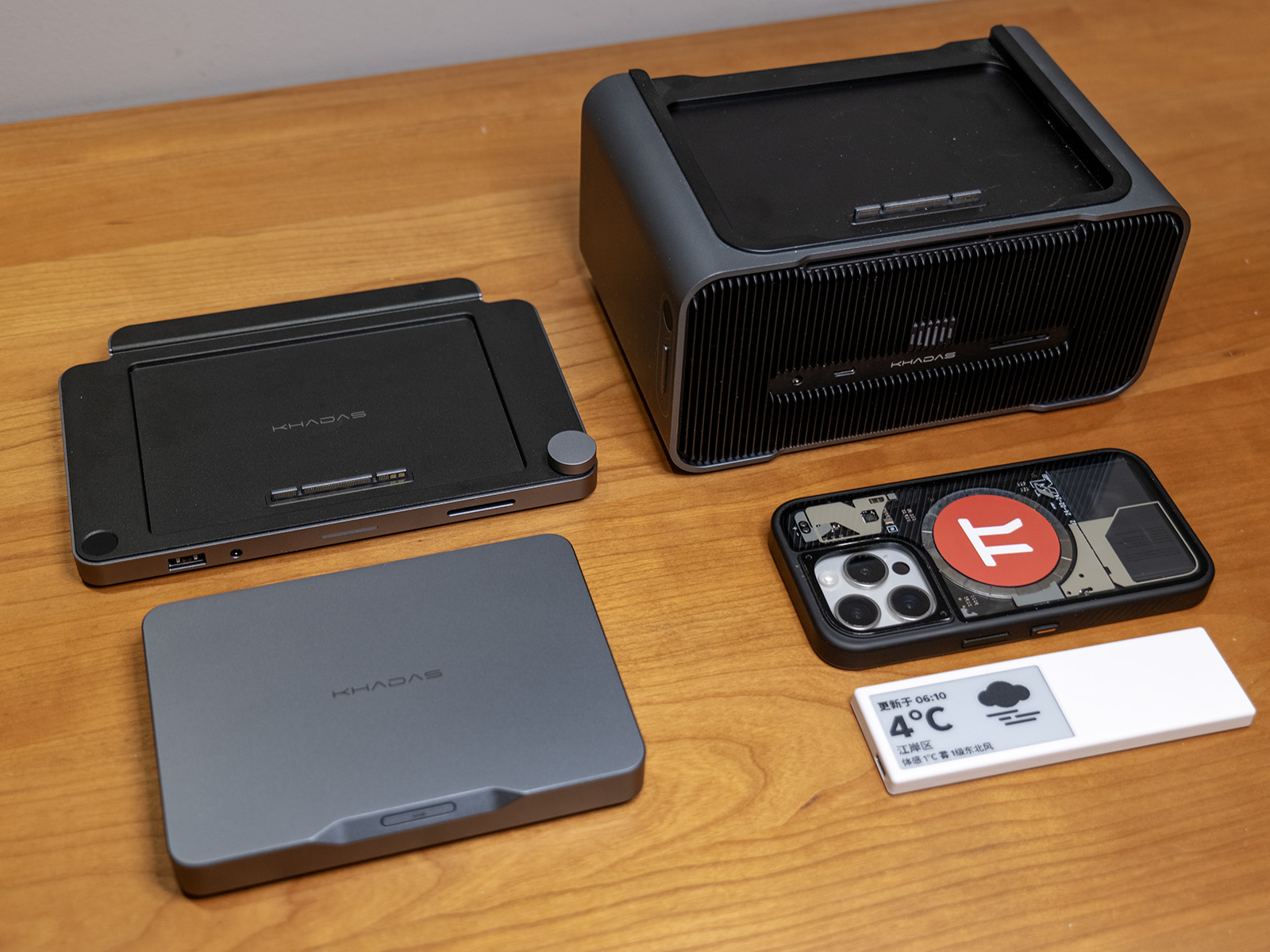
Additionally, the Mind Dock measures 187mm × 126mm × 17mm and weighs 490g, while the Mind Graphics module measures 197mm × 133mm × 100mm and weighs 2650g. Both share the same design language, materials, and build quality as the Mind 2, and are among the most satisfying electronic products I’ve used in recent years in terms of appearance and craftsmanship. Here’s an image comparing the full Mind Family setup with the more familiar BANGCASE for reference.
Mind Family Size Comparison (both phone cases shown are 15 Pro BANGCASE)
Performance Experience
Performance Specifications
The Khadas Mind 2 is available with two CPU configurations: Intel Ultra 5-125H and Intel Ultra 7-155H. There is also a Mind 2s variant featuring the Intel Ultra 7-255H. In terms of memory and storage, it offers options of 16GB / 32GB / 64GB LPDDR5X RAM and 512GB / 1TB / 2TB PCIe 4.0 SSDs.
There is already plenty of quantitative data on these core hardware specifications available online. What I would like to share instead is my own experience using it as a primary device: its performance is on par with a mainstream desktop PC equipped with an RTX 4060 Ti, and slightly below that of a gaming laptop powered by an RTX 5060.
When paired with the Mind Graphics module, Black Myth: Wukong (2K resolution / cinematic settings / ray tracing off / frame generation off) achieved an average frame rate of 31 FPS, while Cyberpunk 2077 (2K resolution / maximum settings / ray tracing off / frame generation off) reached an average of 65.4 FPS.
With 64GB of system memory and 16GB of VRAM, the Mind 2 also performs better than both my RTX 4060 Ti desktop and RTX 5060 gaming laptop in running local large language models. In my own tests, I observed the following inference speeds: gpt-oss:120b — 9.29 tokens/s; deepseek-r1:32b — 2.37 tokens/s; deepseek-r1:14b — 4.73 tokens/s; deepseek-r1:8b — 12.94 tokens/s, for reference.
Considering that this is a device released over a year ago, its performance aligns with my expectations. When factoring in the level of performance delivered within such a compact and quiet form factor, the overall experience actually exceeds expectations.
Game Performance Benchmark Results
Local LLM Performance Benchmark Results
Additionally, there is a 2230 M.2 SSD slot on the bottom of the device for future storage expansion. It is protected by a magnetic cover that can be removed by hand, making SSD installation quick and convenient. In the future, replacing the mounting screws with a quick-release latch would further improve the experience.
Port Configuration
In terms of standard I/O configuration, when paired with the Mind Graphics dock, the Mind 2 offers a number and specification of ports that far exceed Mini PCs of similar size and even rival larger ITX desktop systems—approaching the interface configurations of high-end desktop PCs on the market. It is fully capable of handling a wide range of application scenarios. I have compiled a table below to help compare the number and specifications of ports available across different components and combinations.
Product / Combination
Multi-Display
Thunderbolt 4
USB4
USB-A
HDMI
DP
Ethernet
Audio
Card Reader
Fingerprint Reader
Power Interface
Mind 2
2
1×40Gbps
1×40Gbps
2×10Gbps
1× HDMI 2.1 TMDS
–
–
–
–
–
1× PD
Mind Dock
–
–
–
3×5Gbps
2× HDMI 2.0
–
1×2.5Gbps
1×3.5mm
1×200MB/s
1
1× PD
Mind Graphics
–
1×40Gbps
–
3×10Gbps
2× HDMI 2.1a
1×DP1.4a
1×2.5Gbps
1×3.5mm
1×200MB/s
1
1× AC
Mind 2 + Mind Dock
4
1×40Gbps
1×40Gbps
2×10Gbps3×5Gbps
1× HDMI 2.1 TMDS2× HDMI 2.0
–
1×2.5Gbps
1×3.5mm
1×200MB/s
1
1× PD
Mind 2 + Mind Graphics
6
1×40Gbps
1×40Gbps
5×10Gbps
1× HDMI 2.1 TMDS2× HDMI 2.1a
1×DP1.4a
1×2.5Gbps
1×3.5mm
1×200MB/s
1
1× AC
Beyond the standard interfaces, the Mind 2 series is equipped with the future-ready Mind Link interface. This connector is designed with a PCIe 5.0 ×8 bandwidth, offering a theoretical maximum throughput of 256GT/s. In the current Mind 2 + Mind Graphics setup, it can achieve a transfer rate of up to 128GT/s—far exceeding the capabilities of the commonly used Thunderbolt 4 interface, and even surpassing the not-yet-widespread Thunderbolt 5 standard. This interface is, in my view, one of the most promising aspects of the Mind ecosystem. With an upper limit of 256GT/s, it provides ample headroom not only for expanding to current RTX 50-series or future 60-series GPUs, but also for connecting additional device types down the line—or even deploying multiple Mind units in parallel for local large language model workloads.
Cross-Scenario Practical Experience
As of late January 2026—at a time when Intel’s third-generation Ultra CPUs have just been released and new machines are widely beginning to adopt RTX 50-series GPUs—the Mind 2 may not deliver top-tier performance. However, the “cross-scenario” experience it provides is no less impressive than many of this year’s newly launched products. This experience fully aligns with my expectations of what a true “cross-scenario” personal terminal should be. Below, I’ll share my impressions based on my own real-world usage scenarios.
Due to the nature of my industry and role, my workplace is not fixed. My typical computing needs include handling large datasets in Excel, performing basic image editing in Photoshop, and editing videos in CapCut. Outside of work, my primary forms of entertainment include competitive online games, AAA single-player titles, high-definition media consumption, and 3D modeling. To achieve a seamless cross-scenario experience across all these use cases, I’ve experimented with numerous solutions over time—but all of them were eventually abandoned due to unresolved pain points. Before diving into my experience with the Mind 2, I’d like to share some of these pitfalls.
Solution
Pain Points
Running WTG on a portable SSD
Severe heat issues, unstable performance, risk of drive disconnection during long sessions;Poor hardware compatibility, frequent issues with both newer and older systems;Official support discontinued, making Windows 11 unusable through conventional means
Cloud PC
High long-term subscription costs;Insufficient real-world performance, heavy compression and frame drops;Extreme network dependence, complex operations nearly unusable on 4G/5G;Data and information security concerns;Low-performance hardware endpoints leading to poor user experience
Remote Desktop (RDP / Moonlight & Sunshine)
Extreme network dependence, complex operations nearly unusable on 4G/5G;Unstable home broadband upload speeds
Ultrabook + eGPU Dock
Compatibility issues, some laptops unable to recognize Thunderbolt 4 eGPU docks;Unstable operation of the dock itself;Poor product design—external power supply, bulky size, messy cabling, loud noise, and high heat output;Performance overhead from Thunderbolt 4 interface and eGPU controller
NAS User Folder Synchronization
Sync speeds limited by home/office bandwidth and NAS read/write performance;Highly network-dependent, with sync failures often leading to file inconsistencies
In the past, mitigating these issues required investing a significant amount of time and effort. But once I started using the Mind 2—a device compact enough to fit into a pocket, yet powerful and spacious enough to meet most scenario requirements while allowing flexible expansion on demand—all of these pain points were effectively resolved.
Use Case 1 – Fixed Office Setup
In this scenario, my setup consists of the Mind 2 standalone unit paired with a PD-powered docking station. Peripherals needed for daily work—such as the mouse, keyboard, and printer—are all connected to the dock. With just a single cable plugged into the Mind 2, I can immediately enter my working state. Thanks to the strong performance of the Ultra 7 155H processor combined with 64GB of RAM, it easily handles everything from the Office suite to everyday image editing and video cutting tasks.
If the monitor used in this setup supports single-cable connectivity with reverse power delivery, the configuration can be simplified even further by eliminating the dock altogether. The Mind 2 can then be powered directly by the monitor, making it easy to adapt to peripherals regardless of whether they are older or newer devices.
Mind 2 Host with Expansion Dock
Additionally, for users who require multi-display support in their workflow, the Mind 2 standalone unit supports dual USB-C video output. When paired with the Mind Dock, it can support up to four video outputs—sufficient for most multi-monitor setups even without using the Mind Graphics module.
Use Case 2 – Mobile Office
After the release of the Mind 2, Khadas announced plans for the Mind xPlay portable display. Although the product was only officially unveiled recently at CES 2026, I had already created a DIY setup using 3D printing to try out a similar experience in advance. I built a custom base that allows the Mind 2 to mount onto the Smartisan TNT GO portable display. Once installed, and combined with the display’s built-in camera, keyboard, and touchpad, it effectively transforms into a high-performance laptop.
The entire setup, including the keyboard, weighs around 1.6 kg. Compared to representative high-performance ultrabooks on the market that weigh around 1.48 kg, it is only about 100g heavier—and nearly identical to the ROG Flow Z13 2025 with keyboard at 1.59 kg—making it well within a practical range for portable work scenarios.
The TNT GO’s stylus supports the Microsoft MPP 2.0 protocol, allowing full compatibility with handwriting input in OneNote, the Office suite, and various design software. Personally, I often use it for simple 3D modeling, where the stylus and touchscreen interaction feel intuitive—very similar to the workflow of modeling on an iPad.
Mind 2 paired with a portable display for use as a laptop
With the detachable magnetic keyboard removed and using only the touchscreen, the combined weight of the Mind 2 and portable display drops to 1.2 kg—roughly the same as the standalone Flow Z13—allowing it to be handheld for short periods or supported against other surfaces. When held vertically, the Mind 2 sits near the palm, effectively serving as a grip for the tablet, making it even more comfortable to hold. In portrait mode, this setup significantly improves the experience of reading and annotating documents.
Mind 2 paired with a portable display for use as a tablet computer
There is currently one minor drawback to this usage method: the TNT GO itself is relatively thick, and when combined with the Mind 2, the overall thickness is noticeably greater than that of typical 2-in-1 tablets. Hopefully, the upcoming official Mind xPlay will better address this issue.
Use Case 3 – Home Entertainment
At home, I use a 4K@120Hz television, and my local network runs at 2.5Gbps. I’ve placed the Mind Dock on the TV cabinet and connected it to the network via Ethernet, paired with a wireless keyboard that includes a touchpad. Once I return home, I simply place the Mind 2 onto the Mind Dock and operate it from the sofa using the keyboard—instantly switching into relaxation mode without needing to repeatedly get up to interact with the computer.
Whether streaming online videos or playing high-quality media from a NAS, the Mind Dock’s 2.5Gbps Ethernet port ensures that buffering is virtually nonexistent. The only minor drawback during this process is that the Mind Dock’s built-in HDMI port does not support HDMI 2.1 output for 4K@120Hz HDR video. While it is sufficient for most content to fully showcase visual quality, manually switching to USB-C video output is still required for extremely high-quality playback scenarios. Hopefully, future versions of the dock will offer improved display output specifications.
Additionally, this setup includes a very convenient feature: the Mind Dock provides a 5Gbps USB-A port and a 200MB/s SD 4.0 card reader on the front panel. After returning from a shoot, I can directly insert the SD card into the dock for browsing. The USB-A port can be used to connect a card reader for accessing the Pocket 3’s TF card. Whether it’s 6K25p footage from a camera or 4K60p video from the Pocket 3, both interfaces offer sufficient bandwidth for smooth playback—saving me from having to fumble around with ports at the back each time.
Mind 2 pairs with Mind Dock to connect to your TV.
Use Case 4 – Gaming and Entertainment
As the most critical component of the Mind ecosystem—Mind Graphics—I chose to connect it to the monitor in my study. The output interfaces of Mind Graphics fully meet the display requirements of my monitor at 2K@240Hz. While the desktop RTX 4060 Ti GPU may now be considered an N-1 generation product, in actual use, the online games I regularly play (such as Teamfight Tactics and Hextech ARAM) can run at maximum settings with full frame rates. For the single-player AAA titles I frequently enjoy (such as Black Myth: Wukong and Elden Ring), slightly lowering the graphical settings and enabling DLSS still allows for smooth gameplay with good visual quality. Considering that, as of December 2025, the top-ranked GPU in the Steam Hardware Survey remains the RTX 3060 released four years ago, the RTX 4060 Ti integrated into Mind Graphics—released two and a half years ago—should continue to meet mainstream gaming performance requirements for the next few years.
In addition, Mind Graphics features a dual-speaker system composed of a full-range driver and a high-frequency unit. Its audio performance is significantly better than that of built-in monitor speakers, and subjectively, I find the sound quality superior to desktop speakers in the RMB 500 price range. This allows for a satisfying audio experience while keeping desktop cable management simple.
Mind 2 pairs with Mind Graphics to connect to a monitor for use.
Special Scenario 1 – Portable Entertainment
Beyond the more common usage scenarios mentioned above, I’ve also discovered a niche yet highly practical use case—pairing it with AR viewing glasses, which have gained considerable popularity over the past two years. Thanks to the compact size of the Mind 2 main unit, it can be placed steadily on a coffee table beside the sofa or on a bedside table. Powered by the Iris Xe integrated graphics, connecting AR glasses to the Mind 2 while lying on the sofa or in bed for large-screen viewing or playing strategy games offers a uniquely immersive experience. It effectively addresses both the limited onboard performance of AR glasses and the inconvenience of placing a full-sized PC in various casual environments.
Mind 2 Host Connects to AR Viewing Glasses for Use
Special Scenario 2 – Thunderbolt 4 eGPU Dock
Aside from being paired with the Mind 2, Mind Graphics has a hidden secondary use—as a Thunderbolt 4 eGPU dock and desktop speaker for laptops from other brands. When I first learned about this feature, I struggled to understand such a niche use case. However, after experiencing a situation during this year’s New Year holiday where the Mind 2 and Mind Graphics were split into two high-performance computers for emergency multiplayer gaming, I began to take this functionality more seriously.
While the price-performance ratio of Mind Graphics may not compare favorably to third-party Thunderbolt 4 eGPU enclosures paired with separately purchased GPUs, for users who already need the Mind 2, it effectively comes as an added-value bonus: a compact, quiet, and aesthetically pleasing desktop RTX 4060 Ti solution with a built-in 300W GaN power supply and integrated desktop speakers. Moreover, even as of 2026, products on the market that match Mind Graphics in terms of build quality, design, size, and functionality remain exceptionally rare. As such, this seemingly niche use case is worth highlighting separately for those who share similar needs.
Mind Graphics as a graphics card dock
The Future Is Approaching
After sharing so many of my personal experiences, as of the time of writing, CES 2026 has come to a close, and more detailed information about the products unveiled by various exhibitors is gradually becoming available. Among the many announcements from CES 2026, I was pleased to see long-awaited updates from Khadas.
At this year’s exhibition, Khadas introduced three new products: the Mind Pro, the world’s first modular mini PC powered by the Intel Panther Lake processor, with a volume of just 0.43L; the Mind Graphics 2, equipped with a desktop-grade RTX 5060 Ti and capable of delivering up to 180W of performance; and the Mind xPlay, which integrates a display, keyboard, touchpad, and a 48Wh battery. Building upon the existing Mind ecosystem, these new products upgrade the Mind host to Intel’s third-generation Ultra processors, further improving performance and energy efficiency; bring Mind Graphics up to the latest RTX 5060 Ti; and complete the final piece of the Mind ecosystem for mobile productivity. All three products are now available for overseas pre-order, and according to official information, will be launching in the domestic market soon.
Unlike cloud or streaming solutions—where data and computing units are separated from the user—or WTG-based approaches that separate the user and data from the computing unit, the Mind ecosystem presents what currently appears to be the most logical direction forward: integrating the user, data, and core computing unit into a seamlessly portable personal terminal, then leveraging a unified, high-bandwidth interface standard to adapt to different specialized scenarios. From Mind 1 to Mind 2, and now to the newly released Mind Pro, we can see that as the Mind ecosystem continues to expand, the Mind host itself—the core of the ecosystem—is evolving toward the ideal personal terminal. The Mind 2, born from this trajectory, is far more than just a Mini PC that is “a bit more powerful, a bit smaller, and a bit more refined in design.” It represents a significant step toward a truly “cross-scenario”—and even “all-scenario”—personal terminal.
Perhaps this is the ideal form of a “cross-scenario” personal terminal.
I believe many people have been repeatedly exposed over the past month to an AI tool called OpenClaw. According to social media posts and early community discussions, the tool went through several name changes before finally settling on OpenClaw. During the renaming period, there was even an incident where its social media accounts were maliciously squatted and used to launch a meme coin called $CLAWD to “harvest” users—adding a dramatic twist to the birth of OpenClaw.
For a typical mobile-internet-era user like me, my instinctive reaction when encountering a problem has always been to look for yet another app to solve it. After more than two weeks of using OpenClaw, however, I noticed that my habits had quietly changed. Step by step, as I rebuilt my workflow around OpenClaw, it gradually became my first choice for handling digital-life needs.
In this article, I’ll start by explaining what OpenClaw is and how to install it, then share some of my own usage scenarios and tips, hoping to offer some practical help to anyone interested in trying it out.
What Is OpenClaw?
OpenClaw is neither a simple large language model nor just a coding CLI. Instead, it is a locally running “digital life hub.” It can act as a personal AI assistant, and it can also take on parts of certain roles within a company. Its capabilities can be extended through Skills and tool integrations (including MCP scenarios), and by running a Gateway on a Mac mini or server, it enables cross-platform access and asynchronous scheduling. No matter where you are, you can interact with it in real time via various instant messaging tools.
At the same time, all memories, file indexes, and personal habits generated within OpenClaw are stored in your own local workspace (such as Memory.md files, index databases, and Skills scripts). In a local deployment scenario, this gives you much greater control over your data and makes permission management and backups easier.
How Do You Install OpenClaw?
There are many options for hosting OpenClaw. At the moment, the most popular choice is the Mac mini, mainly for three reasons. First, it supports 24/7 continuous operation with low power consumption. Second, within the Apple ecosystem it can easily integrate Skills tied to Apple Reminders, Apple Notes, Apple Calendar, and more. Third, the hardware itself offers strong value for money. The 16GB + 256GB configuration often fluctuates in price on e-commerce platforms, but at the time of writing, many channels are approaching the 3,000 RMB range. Combined with the M4 chip and a minimum of 16GB unified memory, performance is more than sufficient.
Beyond the Mac mini, OpenClaw can also be installed on devices running Windows, Linux, and other operating systems. If you don’t want to deploy OpenClaw locally, major cloud providers—such as Tencent Cloud, Alibaba Cloud, Cloudflare, and DigitalOcean—offer dedicated server images that support quick OpenClaw deployment as well.
Overall, OpenClaw provides four installation methods: One-liner, npm, Hackable, and a macOS client. The One-liner supports macOS, Linux, and Windows; npm can be used via either npm or pnpm; Hackable comes in installer and pnpm variants. Each distribution method corresponds to different terminal commands, and you can choose whichever best suits your needs.
After installation, OpenClaw automatically runs the openclaw onboard --install-daemon command for initial setup. In most cases, the default options are sufficient. The main configuration steps you’ll need to pay attention to are four key areas:
The first is selecting an AI service provider and the specific model you want to use. Most providers offer both OAuth authorization and direct API key input, corresponding to different billing methods.
Taking Google Gemini as an example: if you choose OAuth authentication, you can use services like Google Gemini 3 Pro, Google Gemini 3 Flash, Claude Opus 4.5, and Claude Sonnet 4.5 via Antigravity, with quotas refreshed every five hours. If you choose the Google API instead, you’ll need to create an API key in Google AI Studio or Vertex, and billing will be based on token and prompt usage. Once provider verification is complete, you can select your preferred model from the available list.
The second step is configuring the communication Channels used to interact with OpenClaw. If you choose certain overseas messaging tools, issues may arise during setup, potentially causing the Gateway to fail to start. In that case, you have three options: let it fail and complete the setup first, then ask the AI to help fix it later; skip Channel configuration and move on; or choose a domestic messaging tool such as Feishu.
The third step is selecting and installing Skills. Use the arrow keys to navigate, the spacebar to select or deselect, and press Enter to install. If you don’t want to spend too much time here, you can skip this step and install Skills later.
The final step is launching the Gateway and choosing a control interface, such as TUI or Web UI. At this point, the initial OpenClaw configuration is complete. If you’re a macOS user, you can also install the official Companion App. This menu-bar utility makes it easy to adjust OpenClaw settings, monitor Gateway status, and even chat directly with OpenClaw.
How Should You Choose an OpenClaw Model?
As of the time of writing, OpenAI has just released ChatGPT 5.3-Codex, while Anthropic has launched Claude Opus 4.6—widely regarded as the two models at the very top tier right now.
If budget isn’t a concern and you have reliable access to official subscriptions, then ChatGPT Pro and Claude Max are naturally the best choices. If you lack a suitable payment method or worry about account bans, you can also use aggregation services such as OpenRouter to access these top models on a token-based pricing scheme—though the value for money is significantly lower.
I believe many people have recently taken advantage of Google’s promotions to subscribe to Google AI Pro or Ultra family plans. In that case, you have two options. One is to use Google Antigravity for OAuth authorization; once authenticated, you can access Gemini and Claude models with quotas refreshed periodically. From my own experience, however, this approach is prone to rate limits—especially with Claude—resulting in a subpar experience. The second option is to apply for an API key directly through Google AI Studio and pay per token via the API. Recently, Google has also given Pro and Ultra subscribers a one-time USD 300 credit plus USD 10 in monthly credits, which should last you quite a while.
If you don’t want to spend heavily on ChatGPT or Claude models and can’t manage Google’s paid subscriptions either, it’s worth trying domestic models. To test OpenClaw, I specifically subscribed to MiniMax and Kimi’s Coding Plans. After using them for a while, I was pleasantly surprised. Their latest models—MiniMax 2.1 and Kimi K2.5—have both been recommended by OpenClaw’s developer Peter himself.
Based on my personal experience and feedback from users on X, Kimi K2.5 has slightly stronger engineering capabilities than MiniMax M2.1, with most projects running smoothly. MiniMax M2.1, however, has its own advantages: it’s cheaper, with a top-tier plan priced at just RMB 119, compared to RMB 199 for Kimi. In terms of responsiveness, I find MiniMax M2.1 a bit faster than Kimi K2.5, making it more suitable for lighter tasks. In my own usage, Kimi Code’s RMB 99 Moderato plan was exhausted in under five days, so if you plan to use it as a main driver, you’ll likely need the Allegretto plan.
Overall, I think the best value paid option right now is the ChatGPT Plus subscription. For USD 20 per month, you get access to GPT-5.3 Codex, a true T0-level model. OpenAI is also currently running a promotion that doubles your Codex App quota for two months.
After comparing multiple primary models, I find GPT-5.3 Codex delivers the best overall experience, with a more balanced combination of speed and quality. It’s particularly well-suited for code audits and refactoring of legacy projects. Many other models can technically complete projects and run them successfully, but they often hide subtle issues that only surface later on.
If you want to use another T0-level model—Claude Opus 4.6—but can’t manage a Claude subscription or are worried about account bans, you can access it via Google Antigravity (currently requires the AI Ultra plan; the Pro plan does not yet include Claude Opus 4.6). While Claude quotas are relatively limited, it’s still viable for light exploration or as one of several sub-agents handling critical but low-token tasks. If you can’t sort out subscriptions or credit purchases for overseas model services at all, then using domestic models like Kimi, MiniMax, or Qwen is also a solid option—at the very least, they’re more than sufficient for getting OpenClaw up and running and trying it out.
If you place a high priority on personal privacy or have powerful hardware, running local models is another good choice. Through services like Ollama, you can install local large language models such as DeepSeek V3.2, qwen3-coder-next, or gemma3, then configure OpenClaw to call these local models—saving a substantial amount of money.
Finally, if you simply want to try OpenClaw without spending extra money on AI subscriptions or credits, there are plenty of free models available. For example, NVIDIA has launched a trial program for Kimi K2.5, allowing you to apply for an API key and use it directly in OpenClaw. OpenRouter has also recently introduced a model called Pony Alpha, which can be used for free in OpenClaw—but as a trade-off, all requests and outputs are uploaded for model training purposes.
What Can OpenClaw Do?
With enough groundwork laid, it’s time to show some real-world use cases of OpenClaw to answer the question most people have in mind: what is OpenClaw actually good for? I’ll divide these scenarios into basic and advanced categories, so you can quickly scan according to your needs.
Note: Most of the capabilities below are based on my own configuration and custom scripts. Results may vary depending on models, Skills, permissions, and network conditions. In addition, due to personal usage scenarios and privacy considerations, the final two advanced use cases are drawn from online sharing—please refer to them at your discretion.
Basic
Chatbot
Yes—interacting with OpenClaw looks no different from chatting with a familiar chatbot. Just like what you do in the Gemini or ChatGPT web or desktop apps, you can ask questions or issue commands in OpenClaw and have a large language model respond or generate results.
After connecting Feishu, you can chat with OpenClaw across platforms including iPhone, iPad, Android phones, Mac, and Windows. All chat records are synchronized and stored in real time. Based on your configuration, OpenClaw can also distill conversations into memories and recall them in future interactions.
I’ve now grown accustomed to using OpenClaw as my primary way to gather information or conduct research. On one hand, it can aggregate multiple AI model services and switch between them at will; on the other, IM tools like Feishu offer a more comfortable conversational interface than most AI apps. For example, I discuss investment thoughts with the bot, look up ZIP codes, summarize documents, scrape posts from X, and more—there never seems to be a shortage of things to talk about.
A Coding Sidekick
The evolution of large language models by 2025 has fully proven that even people with zero programming background can easily accomplish tasks that once seemed out of reach—this is the once-viral concept of Vibe Coding. With tools like Claude Code, Codex, and Antigravity, and with Xcode now supporting ChatGPT and Claude for AI-assisted coding, ordinary users like me have gained the ability to build products firsthand.
Imagine yourself as the product manager, with these top-tier AI models acting as full-stack engineers. All you need to do is continuously describe your ideas, and they’ll handle the coding and deliver the results.
However, tools like Claude Code, Codex, and Antigravity still require working on a computer. Unless you remote into your machine via tools like Tailscale or Sunlogin to operate terminal-based workflows, the experience isn’t great. OpenClaw changes this completely. Wherever I am in the world, I can issue instructions in natural language through Feishu. The Feishu channel connects to the Gateway on my computer, passes the command to OpenClaw, executes various programming tasks in the terminal, and then sends the results back to Feishu.
For example, I recently switched my primary input method on iPhone to “Cang Input Method,” but wasn’t satisfied with the default skin. I simply dropped an existing .hskin skin file to the bot and asked it to precisely adjust the skin code according to my aesthetic preferences. Once done, I imported the generated skin file directly on my phone—never touching my computer keyboard throughout the entire process.
A Personalized News Editor
Today, our information intake is largely controlled by big platforms and algorithms, stripping us of source control. That’s why the revival of RSS has become a hot topic. With OpenClaw, you can bypass expensive RSS subscription services and build a reading system that truly fits you.
Step one: customize your own RSS list. You can send your frequently used RSS feeds directly to OpenClaw, ask it to discover feeds based on keywords, or—like me—simply drop an existing OPML file.
Step two: build an RSS fetching mechanism. I had OpenClaw create a script that fetches RSS content, keeps only the text, stores it in Markdown format, retains articles from the past two days, and automatically clears older files.
Step three: create an article filtering mechanism. If you have too many feeds or articles coming in too frequently, OpenClaw can automatically filter them based on criteria like topic, author, or online popularity—forming a screening system tailored just for you.
Step four: set up article delivery. After filtering, I had OpenClaw create a cron task that pushes the day’s selected articles to me at a fixed time every evening, following a consistent template. OpenClaw can even summarize each article in the push, letting me quickly scan and decide which ones to read in depth.
If you don’t like reading text, you can go a step further and have OpenClaw automatically turn the day’s content into a podcast episode or video and send it to you. It’s like running your own TV channel or media company—where you decide exactly what gets broadcast.
A Writing Assistant
The arrival of OpenClaw has effectively reassembled my entire writing workflow. While I’d already been using AI since last year for research, fact-checking, proofreading, and polishing, constant platform switching, model changes, and feature updates made the process fragmented.
In OpenClaw, I created a dedicated writing group to handle all AI collaboration in my writing workflow. When writing, I place the Feishu “Writing Master” group on the left side of the screen and the iA Writer editor on the right.
During the preparation phase, I ask Claw to gather information related to my topic, repeatedly verify its reliability, then organize it into an outline with sources attached to each point for manual verification.
While writing, if I need to look something up, I simply ask Claw and get an immediate response—without switching tools or windows, and without breaking my writing flow.
After finishing a draft, I let Claw handle proofreading and polishing. I created a Skill that allows me to say something like “Help me proofread/polish the article: XXX,” prompting it to read my local iA Writer library, locate the matching article, and begin reviewing it. OpenClaw checks for typos and grammatical issues, flags imprecise expressions, and provides concrete revision suggestions.
Advanced
Notion as an External Brain
I originally subscribed to Notion’s Business Plan, which allowed me to operate content across my entire Notion workspace using the built-in Notion AI. The biggest advantage of Notion AI is that, at least in theory, it offers unlimited access to top-tier models such as Gemini 3 Pro, Claude Opus 4.6, Claude Sonnet 4.5, and GPT-5.2. Users who upgraded before January this year could even keep the subscription at USD 10 per month. The downside, however, is that these AI capabilities are confined strictly within Notion, which significantly limits usage scenarios.
Later on, I discovered that OpenClaw natively supports Notion Skills. Even the free version of Notion can be controlled by an external AI agent via Connections. As a result, I canceled my Notion subscription and switched to using OpenClaw to operate my Notion content. I created a cron task in OpenClaw that, every day, selects five words from my Notion vocabulary database based on a memory algorithm and pushes them to me using a fixed template. After reviewing them, I rate my familiarity with each word, and OpenClaw records both the score and review count back into the Notion database before moving on to the next round. If I come across new words in daily life, I can simply send them to OpenClaw, which will add them to the Notion vocabulary database and automatically fill in fields such as phonetics, part of speech, definitions, mnemonic roots, and memory aids—ensuring a continuous supply of words to study.
Controlling the Browser
OpenClaw can act as an AI agent to control the browser on your computer, helping automate UI-level interactions.
Before getting started, you need to install the Chrome browser extension using the terminal command openclaw browser extension install. Once installed, click the extension icon in the top-right corner of the browser and make sure it’s enabled on the current page (the icon will display “ON”). From there, you can start directing OpenClaw to work inside the browser.
For example, I once discovered a great content creator on Xiaohongshu and wanted to scrape all of their posts for study. As a domestic social platform, Xiaohongshu obviously doesn’t provide APIs for this kind of access, nor can it be queried, posted to, or searched via Skills like X. So I had OpenClaw directly control the browser to “manually” scrape those posts. It’s slower, but at least I don’t have to constantly click the mouse myself. That said, Xiaohongshu’s anti-scraping mechanisms can be quite annoying—once you scrape too many posts, it forcibly redirects you back to the homepage.
Of course, if you’re comfortable with it, you could also let OpenClaw help you clean up your inbox, reply to emails, or even book a flight to Paris. If you’re not comfortable with that level of access, then simply don’t install the browser extension.
AI Phone
Some time ago, the Doubao phone sparked a lot of discussion. Users could control the Doubao model via voice to directly operate apps on their phones—ordering a milk tea, scrolling short videos, claiming red packets, and so on. Since OpenClaw also has agent capabilities, it naturally caught the attention of curious users.
I saw a post on X where a foreign user hacked together a USD 25 Android phone. They installed OpenClaw via Termux and were then able to use it to control the flashlight, recognize objects through the camera, read sensor data, and more.
How the Developer Uses It
OpenClaw’s creator, Peter Steinberger, also shared some of his personal use cases in an interview. These include adjusting mattress temperature, playing music, controlling lights, viewing camera feeds, and checking package delivery status. For specific examples, you can refer to the interview video shared in Fu Sheng’s post on X.
OpenClaw Usage Tips
OpenClaw is a relatively young open-source project and still maintains a high update cadence. Beyond adding new features, updates frequently focus on bug fixes—which is my roundabout way of saying that OpenClaw is not yet a mature product. You’ll inevitably run into various issues during use. Whether or not you’re an experienced developer with strong programming skills, I recommend handing all debugging tasks over to AI agents. If you don’t have to do it yourself, why would you?
To make OpenClaw more usable and stable, I’ll share some general usage strategies here. For the actual implementation, just let an AI agent handle it. You can even copy and paste this entire section directly to an AI agent and ask it to propose solutions following these ideas, then execute them after your approval.
Creating Groups
Once OpenClaw is set up, you’ll initially be chatting with your bot in a private conversation. All interactions happen in this private chat, and everything is stored in memory. Over time, the bot will continuously pull related information from its memory files to respond. Eventually, those memory files become long and messy.
To avoid this—and to keep cleaner, more focused timelines for different scenarios—I recommend creating multiple groups, channels, or topics. Add your Claw bot to each one, give it a different name and avatar, and use each group for a dedicated purpose when interacting with OpenClaw.
By default, when chatting with Claw in a group, you need to prefix messages with @Claw (for example, if my bot is named adawinterbot, I must include @adawinterbot for OpenClaw to receive the message). Once OpenClaw receives it, it adds a 👀 emoji reaction to your message.
If you’re tired of typing @Claw every time, have your local AI agent—or OpenClaw itself—modify the group configuration to support both @Claw mentions and direct messages.
Also, remember to propagate configurations you’ve completed in private chats—such as model selection or Skill usage—into your group chats with the help of an AI agent.
Reducing Token Costs and Improving Efficiency
If you’re using paid AI subscriptions or API-based billing, you’ll inevitably feel the pain of rate limits or rapidly growing bills. This is where optimizing OpenClaw’s token usage becomes important—both to slow down token consumption and to improve output efficiency by trimming context length.
The first method is to frequently use the /new and /compact commands. /new starts a completely fresh session with a cleared context—essentially “starting over”—which is useful when switching topics or avoiding interference from old context. /compact compresses the current session’s context, preserving key information while reducing token usage, allowing the conversation to continue more efficiently. If you want a fresh session but still retain some continuity, you can send /new followed by something like “Continue the previous task: XXX.” I’ve had OpenClaw set up a script that automatically runs /new every day at 4 a.m., which significantly reduces context buildup.
The second method is enabling OpenClaw’s built-in QMD. This acts as a memory-retrieval middleware layer. Before each conversation turn, it selects the most relevant fragments from historical memory and injects them into the model, allowing OpenClaw to retain long-term context while controlling token costs. You can ask OpenClaw to enable QMD and tune parameters such as the maximum number of memory entries per turn, truncation length, and retrieval timeout—choosing between balanced, cost-saving, or performance-oriented presets.
Subagents
You may have noticed a new feature released alongside Claude Opus 4.6 called Agents Team. It enables a “main agent + multiple parallel sub-agents” architecture, where the main agent decomposes, assigns, and aggregates tasks, while sub-agents operate with relatively independent contexts to handle frontend, backend, testing, auditing, and more in parallel.
OpenClaw also natively supports sub-agent collaboration through session orchestration, though its implementation differs from Claude’s official feature. You can ask Claw to build an advanced Subagents system based on the models you’ve configured, similar in spirit to Agents Team.
Unlike Claude’s kernel-level sub-agent coordination, OpenClaw’s Subagents rely on custom scripts orchestrated by an overarching controller. As for how to design this orchestration, simply explain your idea to OpenClaw and let it build the system. If you have no clear plan, just ask OpenClaw to implement its own recommended approach.
Voice Input and Output
On mobile devices, voice has become an indispensable input and output method for interacting with AI.
On the input side, you can have OpenClaw install the “Whisper without API” Skill and create a script that automatically transcribes incoming voice messages using this Skill. This allows you to send voice messages directly in Feishu, with OpenClaw handling transcription and executing tasks accordingly. While many IM tools already offer voice transcription, OpenAI’s Whisper supports more languages and mixed-language input, generally delivering better results.
On the output side, you can install the edge-tts Skill, which automatically converts text responses into audio and sends them to you. Currently, edge-tts offers both male and female voices. You can configure OpenClaw to generate audio for all text responses, or only in specific scenarios.
Backup and Recovery
It’s easy to run into issues when modifying OpenClaw’s configuration. Once something breaks, OpenClaw may freeze or the Gateway may disconnect. If this happens while you’re traveling or away from home, recovering via IM command menus alone can be extremely difficult and stressful.
There are currently two main approaches to address this.
The first is self-healing via automated scripts. Start by having OpenClaw create a daily automatic backup script. Then create a heartbeat monitoring script that pings the Gateway every five minutes; if three consecutive checks fail, it automatically restarts the Gateway. Finally, add a configuration rollback script so that if repeated restarts still result in errors, OpenClaw automatically restores the last known good backup.
The second approach is repairing via remote SSH access to your local machine. OpenClaw officially supports connecting to the Gateway via Tailscale, but I personally don’t like this option. First, Tailscale can conflict with other networking tools; second, my own programming skills are limited, so even with remote access I’d still struggle to fix bugs.
Instead, I prefer the “AI fixes AI” approach. There are many ways to remotely control a computer—the most brute-force being desktop control software like Sunlogin or ToDesk—but that feels like overkill. Remote SSH is lighter and easier to manage.
Beyond Tailscale, you can use Cloudflare Tunnel or VPS reverse proxies to connect to your home machine. My setup uses a VPS reverse proxy: I create a VM on GCP, connect my Mac mini to it, and then use Termius on my iPhone to SSH into the Mac mini. For a smoother experience, I recommend installing tmux on the Mac mini, so SSH sessions remain persistent instead of restarting every time.
So when OpenClaw crashes while I’m away, I open Termius, SSH into the Mac mini, and use the Codex CLI to diagnose the issue, propose a solution, and execute the fix in one continuous flow. For specific configurations and steps, consult your own AI agent.
Conclusion
As mentioned at the beginning, OpenClaw’s core innovation lies more in engineering integration and usability than in breakthroughs of individual model capabilities. Still, it successfully extends the concept of AI agents—once confined to desktops—across platforms, allowing us to access AI agent capabilities on virtually any device. As an open-source project, OpenClaw has also encouraged collective creativity, giving rise to a wide range of playful experiments and productivity tools, creating strong word-of-mouth momentum.
That said, from a cautious perspective, OpenClaw does pose certain privacy and security risks. Avoid exposing API keys online, never upload sensitive information such as financial data or home addresses, and closely monitor browser automation features—complacency is not an option.
Of course, every technological shift and real-world deployment comes with a period of growing pains. There’s no denying that personal AI assistants are entering our lives at an accelerating pace. If you’re uneasy about a personal developer’s project like OpenClaw, waiting for companies like Apple or Google to enter the field may offer stronger privacy guarantees—providing reassurance through trust in established giants.
This article is TDS Studio’s eighteenth piece on SSPAI, and, as always, it is a full-platform first release.
In our earlier review of the LinkBuds Open, we mentioned that in some regions it was marketed as “Sony’s ideal form of open wireless earbuds.” From my personal experience at the time, I didn’t really feel any particular inconvenience. However, it is ultimately a device that sits inside the concha. Even though its horizontal length was reduced compared to the first generation, users with smaller outer ears could still struggle to achieve a completely stable fit. Perhaps the LinkBuds Clip was created to address this need? With that in mind, we went ahead and picked up the purple version at launch. The initial out-of-the-box impression was surprisingly striking, but it was only after a period of rigorous comparison that we are now ready to share a detailed hands-on experience.
Packaging & Accessories | Package & Accessories
The LinkBuds Clip uses the same eco-friendly packaging as the second-generation LinkBuds products, sealed with a one-time adhesive strip. The design language is extremely restrained and minimal. There is no charging cable included; the only accessory is a pair of “Flex Cushions.” This is the main form-factor difference between the LinkBuds Clip and other mainstream clip-on earbuds. Essentially, they are soft silicone pads that slip over the C-bridge, designed to accommodate different thicknesses of the ear’s outer edge. We’ll focus on this more when discussing fit and wearing comfort.
Design, Fit & Acoustic Structure | Design, Fit & Acoustic Structure
The LinkBuds Clip comes in four default color options: Midnight Black, Bellflower Purple, Oxygen Green, and Oat White. Since we’ve already seen plenty of the black, white, and green combinations across previous LinkBuds models, we naturally chose the purple version—previously sold internationally as a co-branded colorway and now introduced as a standard option. Compared with the purple we’ve seen on the LinkBuds S and Fit, this one appears noticeably lighter.
The charging case shares the same overall form as the second-generation LinkBuds products, resembling a square macaron fresh out of the oven. Its overall volume is slightly larger than those two models, which also means silicone protective cases are not interchangeable.
The lid features a glossy finish and, this time, comes in a solid color without any marble-like decorative patterns. One-handed opening is fairly easy, with a comfortable hinge feel, though the magnetic hold securing the earbuds inside the case isn’t particularly strong.
The earbuds themselves adopt the familiar clip-on form factor. The C-bridge is flattened, with flexibility that sits between the AeroClip and the Bose Ultra Open. It feels more pre-shaped than the OpenDots One, and the clamping force is lighter than ambie’s product line. In terms of vertical resistance to twisting, performance is quite good. We compared several clip-on earbuds in the same price range, and the closest match in C-bridge elasticity would be the FreeClip series. The rear module is capsule-shaped, while the front acoustic chamber is relatively compact. Compared with the OpenDots One, the front chamber is similar in size, and smaller than the flatter chamber design of the AeroClip, though the sound port opening itself is relatively large.
In actual use, even without installing the “Flex Cushions,” the fit felt quite stable for me. The sense of enclosure from the C-bridge isn’t as strong as on the Bose Ultra Open or OpenDots One, but there was no noticeable up-and-down movement during running or jumping, and normal walking didn’t require frequent readjustment. We also asked a friend with thinner ear cartilage to try them; his feedback was that the pre-shaped C-bridge created more psychological instability compared to the stronger wrap provided by more flexible C-bridges.
That’s where the “Flex Cushions” come into play. They essentially add a buffer layer between the C-bridge and the edge of the ear. For me personally, they increased the sense of the earbuds’ presence, but for users with thinner ear cartilage, stability improved noticeably. While this accessory can technically be fitted to other clip-on earbuds, Sony does not currently sell it separately. Much like the ear supports on the LinkBuds Open, it would be better if more sets were included in the box.
Each earbud weighs 6.4 grams, with most of the weight concentrated in the rear module. The earbuds are rated IPX4 for splash resistance, which is adequate for an OWS product—fine for light rain or mild exercise.
Control & App | Control & APP
Without wide-area touch controls, the LinkBuds Clip uses a more “traditional” interaction method. As shown in the diagram, the tap zones are fairly specific. During initial use, it can take some getting used to—hence the need for a visual guide. That said, recognition response is quite fast, and you can adjust sensitivity in the app. The default control logic is as follows: double-tap on the left to switch modes; double-tap on the right for playback control; triple-tap on the right to skip tracks; four taps or more on either side are mapped to volume adjustment. All of these can be customized.
There is no automatic left/right ear detection or wear detection, which really should be included at this price point. Controls are accompanied by voice prompts. The default prompt volume is acceptable, though it can feel a bit quiet in very noisy environments. Fortunately, you can adjust prompt volume in the app and choose from eight different prompt languages.
Through the Sound Connect app, you can still access familiar features such as the equalizer, 360 Reality Audio measurement, control customization, and firmware updates.
There is no head-motion recognition, but Auto Play is retained. This feature automatically starts music playback based on different activity scenarios. Enabling it prompts you to pair an additional LE Bluetooth device. When you start running, it will automatically play a preset playlist. The first time you wear the earbuds each day, they announce the date, and you can also enable hourly time announcements. On the China mainland version, Quick Access continues to support services such as NetEase Cloud Music, Kugou, QQ Music, and Tencent Xiaowei. Available integrations vary by market.
Call | Call
Call performance is, in my personal experience over this period of use, where the LinkBuds Clip’s advantages are most clearly felt. Each side is equipped with two microphones and a bone-conduction pickup unit—making it one of the few clip-on earbuds that genuinely invests in call audio hardware.
We conducted call tests over carrier networks, and real-world stability proved to be very solid, placing it in the top tier among clip-on earbuds. Voice pickup is only slightly muffled, volume is sufficient, and voice isolation in high-noise environments is quite accurate (bone conduction is clearly doing its job). During calls, wind noise from the front and sides has relatively little impact, while wind coming from behind can reduce clarity. Overall, the LinkBuds Clip shows a clear advantage in default call loudness, clarity, and call noise reduction within the clip-on category.
Connection & Battery | Connection & Battery
It does not support high-bitrate codecs, so as usual we tested performance under AAC. In our familiar signal test environment, with AAC connected to the standard test device Xperia 5 III, near-field stuttering and packet loss were minimal, regardless of whether WLAN was turned on or off. At a distance of 7 meters with a load-bearing wall in between, there was no noticeable increase in stutter. Beyond 7 meters, occasional packet loss began to appear, and at around 9 meters the connection interruptions became clearly disruptive to the experience.
In terms of latency, there is no dedicated low-latency mode. Under default conditions, using AAC as the preferred codec when connected to the Xperia 5 III for streaming and local video playback, latency is roughly equivalent to slightly more than half a syllable at normal speaking speed, which is not particularly impressive.
It does support dual-device connections as well as features such as Windows Swift Pair.
For battery life, the official rating is 9 hours of continuous playback on the earbuds alone, and up to 37 hours in total with the charging case, which is relatively good among clip-on earbuds. Based on our standard testing procedure, using AAC with the Xperia 5 III, Auto Play disabled, default sound mode, DSEE set to Auto, and continuous playback at 50% volume (Apple Music Lossless streams and podcast content from Xiaoyuzhou), we recorded an earbud-only runtime of 7 hours and 49 minutes, measured from a full charge.
Charging performance was also tested. The earbuds charge fairly steadily at around 0.9W, which is on the lower end for TWS earbuds, though PD compatibility is not an issue. They also support quick charging, providing approximately 1 hour of playback from a 3-minute charge.
Driver, Sound Modes, Leak Control & Codec | Driver, Sound Modes, Leak Control & Codec
The LinkBuds Clip is equipped with a 10mm dynamic driver, with no further detailed specifications disclosed by Sony. Supported codecs are SBC and AAC, and it continues to support DSEE as well as Sony’s standard 360 Reality Audio spatial audio.
Here we’ll spend a bit more time on sound-related settings. The LinkBuds Clip is described as supporting the previously seen background sound effect modes, but these appear to require a future OTA update, as they are not present in the early firmware we tested. For clip-on earbuds, default loudness and sound leakage control are especially important, and Sony’s tuning this time clearly focuses on these aspects.
The two additional listening modes are “Voice Enhancement” and “Leakage Suppression.” The former can be understood as adding extra gain to the mid- and high-frequency range, making vocal information more prominent in noisy environments. The latter attenuates mid- and high-frequencies, resulting in lower overall perceived sound pressure, making it more suitable for environments like elevators or tightly packed study rooms. In our view, both modes are better suited for specific scenarios rather than everyday music listening—fine for podcasts or short videos, but not ideal for regular music. It’s worth noting that these two modes cannot be used simultaneously with the equalizer or DSEE.
For comparison, we fixed system volume at 50% and wore the earbuds normally. Personally, in Standard mode at this volume, most tracks mastered to current remastering standards are clear in a quiet indoor environment, though some listeners with hearing similar to mine may find the fullness slightly lacking. At around 60%, volume becomes more than sufficient. Since different systems, devices, and hearing conditions can affect judgment, we consistently used the Xperia 5 III—an often-featured device in our reviews—for comparison.
In Standard mode at 50% volume, leakage is only faintly perceptible beyond 15 cm, and almost imperceptible beyond 25 cm. In Voice Enhancement mode, mid- and high-frequency leakage is more noticeable, with slight perception still present around 25 cm, and only becoming reasonably controlled at around 30 cm. In Leakage Suppression mode, leakage is almost imperceptible beyond 10 cm, and even at very close distances it’s difficult to clearly make out content.
In a horizontal comparison with similarly positioned products, based on a not-particularly-rigorous unified measurement approach and subjective volume perception, leakage control from best to worst roughly ranks as follows: LinkBuds Clip (Leakage Suppression mode) >> OpenDots One ≈ FreeClip > LinkBuds Clip (Standard mode) ≈ AeroClip > Bose Ultra Open Earbuds > LinkBuds Clip (Voice Enhancement mode) > ambie TW-01.
The equalizer offers ±6 dB adjustment across ten frequency bands. Preset EQ modes remain the familiar options, and the “Find Your Equalizer” feature is also supported. We’ll provide a recommended EQ setting to help reduce its sense of sharpness.
Sound Description | Sound Description
Based on default tuning, AAC codec, Standard mode, DSEE set to Auto.
The low end is moderate in quantity, perhaps even slightly restrained, with limited thickness and fullness. Elasticity is moderate, and sub-bass extension is relatively good among clip-on earbuds. Decay is a touch on the faster side, retaining a light sense of resonance. There isn’t much atmospheric bloom or density. Bass presence on the LinkBuds Clip is clearly not emphasized; in Standard mode it can feel similar to some semi-in-ear bass presentations, yet it remains quite a distance from the compensated low-end energy of something like the AirPods 4. Bass solidity also trails slightly behind the FreeClip series and OpenDots One, though within the clip-on category there are only a handful of models that deliver noticeably fuller bass anyway. Instruments with fundamentals in the lower-mid range do not exhibit obvious forwardness issues.
In the midrange, vocals are not positioned too close, with mouth shape well controlled and a noticeable emphasis on refinement. The tuning slightly favors line definition over texture, with no strong bias toward either male or female vocals, making it suitable for listeners who don’t seek especially thick vocal bodies. A mild sense of grain is retained, while overall smoothness is fairly average. Timbre rendering includes light embellishment—primarily to enhance pleasantness rather than introduce obvious coloration or distortion. Throat tones sit slightly higher, with a greater proportion of breathiness. Sibilance is clearly perceptible—arguably the most pronounced among Sony headphones in recent years. Overall vocal transparency is high, with a slight brightening.
For instruments, most are rendered with an emphasis on contour. Among string instruments, violins, violas, and guitars lack notable thickness, but plucked and bowed details are relatively abundant and stand out within the clip-on category. Cellos are not especially full-bodied, though clarity is quite good, with a smaller spatial footprint. In tracks that make heavier use of distortion effects, electric guitars exhibit an energy presence that many clip-on earbuds previously lacked. Brass instruments deliver a moderate sense of power; instruments like trumpets have sufficient brightness. Woodwinds offer ample airiness with a certain degree of energy. Harmonic overtones are comparatively rich and prominent for this category. Among percussion, kick drums lack strong presence, snares are clean and quick, cymbals are bright with a mild edge, and metallic timbre is kept under control.
Overall treble brightness is relatively high, with two noticeable peaks. This makes some tracks sound more stimulating in the high frequencies than most Sony Bluetooth headphones in the past, though not to an extent that would be intolerable for most listeners. Perception also varies depending on fit. We’ll provide EQ suggestions later. Ultra-high-frequency extension is quite good for clip-on earbuds; although AAC imposes a high-frequency roll-off, it is neither too early nor too steep. Combined with the OWS form factor, this reduces the sense of truncation.
Soundstage performance is quite good, with a sense of scale and edge diffusion. It’s hard to say the horizontal and vertical dimensions are perfectly equal; paired with a not particularly pronounced sense of height, the LinkBuds Clip presents a slightly oblate, spheroidal space. Separation between vocals and instruments is acceptable, and overall cohesion is decent. Resolution is respectable among higher-priced clip-on earbuds—clearly an improvement over the ambie series—but the richness of information (especially in the low end) still lags slightly behind the FreeClip 2 and OpenDots One. That said, the sense of “resolution” itself stands out. Dynamics are moderate, with fairly good transient response.
Overall Impression | Overall Impression
When I first tried the LinkBuds Clip, as a long-time EX1000 user, I immediately sensed that wide, bright character in the new tuning. The brilliance in the upper mids and highs made it quite attention-grabbing, and after years of listening to Sony’s warmer, thicker low-mid–focused tunings, it was genuinely exciting. However, after a more comprehensive evaluation, we feel there are still areas that could be better. As a product in the thousand-yuan range, the lack of left/right ear detection and wear detection is disappointing. Some may also find the sound a bit aggressive, and there’s no high-bitrate codec support—criticisms you may have already seen echoed in recent reviews across various media outlets. That said, it also addresses several real pain points in my view: unexpectedly strong call quality for a clip-on design, leakage control in Leakage Suppression mode that surpasses many semi-in-ear models, and a new structural approach accommodating different ear cartilage thicknesses. Ultimately, we’ve decided to give the LinkBuds Clip a KT MARK rating of IV. It’s not fully mature yet, and we hope to see the background sound features restored as spring arrives. We’re also looking forward to what new breakthroughs the upcoming WF-1000XM6 may bring.
KT MARK for the model discussed, under the market context at the time:
SONY LinkBuds Clip: IV (Recommend)
For details on the KT MARK rating system and the “non-interference principle” regarding interests, please search for “TDS Studio Rating Standards & Content Notes V202502” via major search engines.
KingTsui, TDS Studio.
Feb 2026
It’s a TDS production.
Some screenshots are provided by Sony; all other content is entirely original. Unauthorized reproduction, imitation of structure, or plagiarism is prohibited. All rights reserved.
This is TDS Studio’s seventeenth article on SSPAI, once again released as an all-platform exclusive.
Faced with such a complex model name, it’s only right that we begin an Audio-Technica review by explaining the naming. CKS indicates the Solid Bass series, which emphasizes low frequencies; 50 places it in the mid-range tier; and TW2 means it’s a true wireless model and the second-generation mainline entry in this series. That explanation sounds straightforward enough—but in reality, the CKS50TW2 is actually the third-generation product in the lineup. The progression goes roughly like this: CKS5TW → CKS50TW → CKS50TW2. One defining trait that runs through this series is its notably strong single-charge battery life, rather than an all-out focus on sound performance like the TWX7 or CKR7TW lines. This time, we borrowed the Star Wars Edition CKS50TW2 purchased from Version V; we previously mentioned this release in RKTALLK Episode 059, while the standard retail version had appeared earlier. Many thanks to Version V for the loan.
Package & Accessories
The retail packaging of the CKS50TW2 follows Audio-Technica’s familiar white-based design language, while the Star Wars Edition comes with a bespoke design and is priced USD 30 / JPY 3,520 higher than the standard version. Inside the box, you’ll find a short USB-C to USB-A charging cable and four sizes of ear tips.
Design, Fit & Acoustic Structure
Including both the standard retail colors and the Star Wars special editions, the CKS50TW2 is currently available in seven colorways: the retail off-white, black, and dark green, plus the Star Wars editions—R2-D2 white/blue, Darth Vader black/red, Grogu light green, and Mandalorian silver-gray. Notably, the Mandalorian version appears to have been sold via a limited-time lottery on the official store and is currently unavailable.
All seven variants feature a semi-transparent charging case lid. The R2-D2 white/blue version we have uses a frosted white semi-transparent lid, paired with a pure white base that has no warm or cool tint, accented only by blue detailing around the magnetic latch. The case can be opened and closed with one hand, though it feels a bit lightweight. The earbuds rest flat inside the case, with the LED indicators also located within.
The earbuds themselves use a “buds”-style in-ear design. In fact, within Audio-Technica’s TWS lineup, only the TWX series adopts a stem-style “pods” design—everything else uses this buds form factor. The CKS50TW2 housings are fairly large. Compared with the familiar CK3TW, they’re noticeably bigger by about two sizes, and larger than models like the recently reviewed LinkBuds Fit, WF-1000XM5, and AZ100—roughly on par with the TE-ZX1. That said, the inner side of the housing features some contouring, so the portion that actually contacts the concha and cymba isn’t extensive. Much of the visible faceplate sits above the surface of the ear. As a result, unless you have particularly small ears, the CKS50TW2 is reasonably comfortable to wear. Side-lying use, however, is essentially out of the question.
The two earbuds can magnetically attach to each other via a set of contact points and also integrate a Hall sensor. This design is quite rare in the TWS space but is common—almost standard—in neckband-style Bluetooth earphones. The reason Audio-Technica chose this structure ties directly into the model’s excellent battery life, which we’ll discuss later. In any case, thanks to the reliable magnetic connection, you’re unlikely to lose a single earbud when carrying them outside the case; the two snapping together feels reassuringly secure.
The CKS50TW2 is rated IP55 for dust resistance and splash protection, meaning light rain and regular workout sweat should pose no real problem.
Control & App
The circular ornament on the faceplate is not a touch surface. Control is handled via a physical button located toward the front edge on the rear side of the housing. It supports single, double, and triple presses, as well as two long-press durations, all of which can be customized in the app. You can also adjust the button response speed. At the default setting, there’s about a one-second delay when pausing playback, while other actions feel relatively snappy.
Notification sounds are naturally a major highlight for a co-branded product. On the R2-D2 version, system events such as power on/off, connection, disconnection, low battery, noise-canceling toggles, and mode changes are all accompanied by R2-D2 voice samples. Both clarity and volume are more than adequate.
Like the TWX7 and others, the CKS50TW2 uses Audio-Technica’s Connect app for control and fine-tuning. The default interface is laid out clearly, though the settings section packs in many options without further sub-categorization. Fortunately, the UI is intuitive. Below is an overview of the main screens and a closer look at what each function does.
On the main page, the features are arranged as follows: ambient sound control, equalizer, low latency, timer, soundscape, and playback controls. The custom settings page is divided into Audio Settings and System Settings. All told, the range of controls available via the Connect app is extensive—more detailed than most TWS control apps I’ve used.
The Private Timer is a standalone countdown tool independent of the system timer. It offers three alert tones and supports countdowns longer than one minute, making it handy for reminders during long listening sessions or as a simple alarm when wearing the earbuds for a nap.
Sound Scape
As with the TWX7, the CKS50TW2 supports the Sound Scape feature. To recap, many manufacturers—and even iOS itself—offer similar functions. For example, iOS “Background Sounds” includes three types of white noise plus ocean, rain, and stream sounds. Audio-Technica’s implementation, however, is a bit different. Apple’s background sounds are already among the better-sounding options in this category, with file sizes exceeding 60 MB and a fairly natural listening experience. Audio-Technica’s Sound Scape samples, on the other hand, are recorded using the company’s own professional microphone lineup.
Sound Scape can be used in conjunction with the timer mentioned above. By default, it offers thirteen sounds: three white noises, four “healing” sounds, and six natural soundscapes.
In the white noise category, beyond standard white noise and pink noise, there’s also “Quiet Office,” which sounds like a calm office with air conditioning running. The sense of space isn’t cramped, and the proportion of AC noise can be freely adjusted. Combined with active noise canceling, it creates a surprisingly convincing environmental simulation. It can be useful for those who work better with ambient sound—assuming you don’t mind AC noise.
The natural sound category includes six options, all rendered with convincing realism and a strong sense of space. In the ocean soundscape, the stereo imaging of waves rolling in is particularly impressive. Wind in a forest is notoriously difficult to record, yet the sound of wind moving through leaves is recreated here with notable fidelity. I won’t go into each one in detail—you can try them yourself in person.
More distinctive are the four sounds categorized as “healing.”
“Rejuvenation” blends synthesized choral vocals with forest ambience, flowing water, and birdsong. “Tranquility” is built on pad-style synthesizer tones, lightly accented with natural sounds. “Journey” also uses pad tones, but with slower, subtler pitch changes, resulting in a deeper, more subdued feel. “Serenity” sounds fuller and richer, combined with subtle effects—very much the kind of audio you might listen to at night. In short, these are well suited for meditation, breathing exercises, and similar scenarios, carrying a clear sense of zen-like calm.
Beyond the features shared with the TWX7, the Star Wars edition of the CKS50TW2 adds three exclusive custom sound effects: random R2-D2 sounds, white noise from inside the Millennium Falcon, and cockpit signal tones from an X-wing fighter. All are fun and surprisingly authentic. As a fan of another niche sci-fi IP myself, I can’t help but say—if there’s ever a Doctor Who collaboration with a TARDIS interior soundscape, I’d buy it without hesitation.
ANC, Transparency & Call
Thanks to its relatively large housings, the CKS50TW2 already offers decent passive isolation. Compared with the TWX7, however, the overall improvement in noise cancelation isn’t just down to passive isolation—it also reflects tangible progress in active noise cancelation. This may be the first time an Audio-Technica mainstream product has made me think its ANC is genuinely “quite good.” With ANC enabled, the CKS50TW2 noticeably suppresses steady low-frequency noise, and it also does a respectable job of reducing the lower body of human voices. While in very noisy environments you can still sense a gap in effective bandwidth coverage compared with most Skyline Level models, it’s already very usable in practice. On top of that, ear pressure is reasonably well controlled, with no obvious discomfort.
As for wind noise, the CKS50TW2 doesn’t include a dedicated wind-noise reduction mode. In real-world testing, however, wind interference was only mildly noticeable when facing away from strong wind. Wind coming from the front or sides is largely cleaned up once ANC is enabled, barely affecting normal listening—an area where it performs quite satisfactorily.
In transparency mode, the naturalness of ambient sound is good, with no deliberate boosting of specific frequency bands. Although there is still some roll-off in the high frequencies and it’s not a fully high-fidelity passthrough, among Japanese brands aside from Sony, this places it firmly in the top tier. The wearer’s own voice does sound slightly muffled, something to keep in mind during conversations. Wind noise in transparency mode isn’t particularly severe either, becoming noticeable mainly when the wind comes from the side or behind.
The talk-through feature also carries over. Audio-Technica defines this as automatically switching to transparency mode and lowering music volume when enabled. You can adjust it in three levels within the app.
For calls, pickup volume is moderate, and clarity is usable though not outstanding. In carrier-network call tests, voices remain somewhat emphasized even in noisy environments. The tonal character sounds a bit muffled, but stability is good. Wind noise during calls depends heavily on direction: frontal wind has minimal impact, while side or rear wind introduces more noticeable interference.
Overall, the CKS50TW2’s noise cancelation is practical and well-rounded. It doesn’t excel dramatically in any single area, but its combined ANC performance, wind-noise handling, and transparency naturalness all place it toward the upper end of the Fine Level tier. That said, the depth of active noise cancelation doesn’t offer a strong advantage over similarly priced competitors and still trails the Skyline Level group. For everyday use, however—especially when combined with its passive isolation—it’s more than sufficient. Taking everything into account, we believe the CKS50TW2’s overall noise-cancelation performance earns it a place in the TDS Noise Cancelation Pyramid at the In-Ear Fine Level, with an above-average ranking within that tier.
Connection & Battery
It doesn’t support high-bitrate codecs, so we tested it under AAC as usual. In our standard signal test environment, paired with the Xperia 5 III using AAC, packet loss and stuttering were minimal whether WLAN was on or off. At a distance of 7 meters with a load-bearing wall in between, there was no noticeable increase in stuttering, while packet loss began to meaningfully affect the experience at around 9 meters.
In terms of latency, it supports a dedicated low-latency mode. Following our test procedure—AAC codec, Xperia 5 III as the source, and streaming video playback—subjective latency with low-latency mode enabled stayed under half a syllable at normal speech speed. This is perfectly usable for most video viewing and gaming scenarios that don’t demand ultra-tight synchronization. Without low-latency mode enabled, latency exceeded half a syllable and became more noticeable.
Battery life is where things get truly impressive. Official figures list 15h/25h of continuous playback from the earbuds alone (ANC on/off), and up to 40h/60h total with the charging case (ANC on/off)—frankly, staggering numbers. During our loan period, it wasn’t feasible to run a single uninterrupted test of that length, but several simplified half-cycle tests largely confirmed the claims. Whether it’s Audio-Technica or AVIOT, non-flagship sound-focused models still seem wildly “overpowered” when it comes to single-charge endurance.
In charging tests, the CKS50TW2 was able to charge steadily at a power level of around 1.2 W, with no issues regarding PD support. It also supports wireless charging. Below are the results of the wireless charging test.
Charging Type
Charger
Audio-Technica ATH-CKS50TW2
Qi Wireless
TESTV “KuaiLeNengLiang” Teardown Test Pad
Front charging position: 2 W; rear charging position: no charging
Qi Wireless
Lǜli Qi2 2-in-1 W702
Primary charging position: 1 W; secondary charging position: no charging
Wired
Anker Nano II 100 W
All three ports supported; input power stable at around 1.2 W
Third-Party Charging Compatibility Test Results
Driver, Sound Modes & Codec
The CKS50TW2 is equipped with a 9 mm dynamic driver. Supported codecs include SBC, AAC, and LC3.
In our previous article on the TWX7, we mentioned that when enabling the equalizer, Audio-Technica displays a specific prompt indicating that the sampling rate will be limited to 48 kHz. The impact of EQ on sound is well known, and limiting the sampling rate to enable EQ is a reasonable trade-off. With the CKS50TW2, however, the highest supported codec is AAC, so this prompt no longer appears. The five default presets are Original, Bass Boost, Clear Vocal, V-shaped, and Treble Enhance, and their sonic effects largely align with what their names suggest.
The custom equalizer allows adjustment across five frequency bands with a ±12 dB range. You can also independently set left/right channel balance in the app, as well as fine-tune volume in 16-step, 32-step, or 64-step increments—particularly useful for users who find one volume step too loud and the next too quiet.
Sound Description
Based on ANC off, AAC codec, and default sound mode.
The low end has slightly elevated quantity, with generous thickness and fullness. Elasticity is good, and sub-bass extension is acceptable. Decay is not especially fast, leaving some residual reverberation. There is a noticeable sense of ambience and bloom, but it never feels excessive. The bass presentation is very much in line with what you’d expect from a bass-focused series, yet in most everyday tracks it doesn’t come across as overpowering. It recalls the tuning approach of earlier Audio-Technica CKS wired earphones—rather than simply piling on energy, it presents bass with a thick, relaxed texture. Bass imaging is on the larger side, and instruments with fundamentals in the lower mids exhibit a slight forward tilt.
In the midrange, vocals are positioned relatively close, with slightly larger mouth shapes and limited emphasis on fine articulation. Texture takes priority over line definition, with moderate thickness. Grain is smoothed out, resulting in generally good overall smoothness. There is a mild warm coloration; the tonality isn’t strictly neutral, but it also avoids any sense of energy buildup. Throat tones are well behaved, breathiness is sufficient, and details like saliva sounds are polished and kept from protruding. Sibilance is present but softened—audible without being sharp or piercing. Overall, vocals are not dark, with a subtle lift in brightness that seems designed to balance the bass-forward character.
For instruments, texture again takes precedence over sharp outlines. Among strings, violins, violas, and guitars lean slightly warm, with plucked and bowed details that aren’t particularly forward or attention-grabbing. Cellos feel a bit loose in body definition and occupy a larger portion of the soundstage. Brass instruments convey a good sense of power; trumpets and other brightness-dependent instruments have adequate sparkle but roll off relatively early. Woodwinds show a slight enhancement in airiness, with a natural presentation. Harmonic content is relatively rich. In percussion, kick drums have a clear presence, snares decay a bit slowly, and cymbals are bright enough without sounding harsh or overly metallic.
Treble overall has moderate brightness, though the upper-mid transition region is somewhat thickened. The response is generally smooth, without pronounced sharp peaks. Ultra-high-frequency extension is not particularly strong, with an earlier and steeper roll-off compared with the TWX7.
Soundstage width is average. The forward-leaning imaging of the low and lower-mid frequencies makes the space feel less expansive, with a noticeable sense of boundaries. Both horizontal and vertical dimensions feel just sufficient rather than spacious. Combined with a decent sense of height, the overall spatial shape resembles a spindle. Separation between vocals and instruments isn’t especially strong, though coherence is good. Resolution doesn’t stand out at the sub–¥1,000 RMB price point, falling into a second-tier level of detail for its class. It sounds less clear than the TWX7, but this restrained sense of “resolution” contributes to a more fatigue-free, listenable presentation. Dynamics are adequate, while transient response is unremarkable.
Overall Impression
Compared with the TWX7 we discussed earlier, the CKS50TW2 doesn’t devote all its effort to sound tuning. Instead, it positions itself as a product with a wide range of interesting and practical features. The ANC performance is a pleasant surprise, and the sound tuning suits mainstream listening preferences, though it doesn’t stand out in terms of versatility or technical prowess. Its real strengths lie in its exceptionally long battery life, stable connectivity, and thoughtful functional details.
The standard retail version has remained stably priced below ¥18,000 JPY for an extended period. The Star Wars collaboration edition carries only a modest premium, and at the time of writing, some retailers are even offering discounts that bring it close to the standard version’s price when converted to RMB. For readers who can accept a small premium, this makes it a genuinely interesting option.
KT MARK at the time of evaluation:
Audio-Technica ATH-CKS50TW2: IV (Recommend)
TDS ANC Pyramid
Audio-Technica ATH-CKS50TW2: In-Ear Fine Level
For details on the KT MARK rating system and our “non-interference in evaluation” policy regarding commercial interests, please search for TDS Studio Rating Standards & Content Notes V202502 on major search engines.
KingTsui, TDS Studio Feb 2026
It’s a TDS production.
Some images are sourced from Audio-Technica. All other content is original. Unauthorized reproduction or imitation of content or structure is prohibited. All rights reserved.
Editor’s note: The following text version is a polished, written rearrangement based on the video’s verbatim transcript. AI tools were used in the process, and the images are screenshots from the original video. The goal is to help you quickly browse the key information. It is recommended to watch the original video alongside this article for a more complete picture.
This is Vbot’s first product, “Big Head.”
I’ve been especially excited about this episode, because it’s going to be different from what we’ve done before. I’ll start with the physical design of Big Head itself, and move earlier into its mobility performance; then I’ll cover the hardware specifications that many people care about, explain why it doesn’t need a remote control, and what kind of perception capabilities it has. Later on, I’ll also talk about quite a few standout features that rarely appear in past robot reviews, many of which are highly practical. Big Head performed far beyond my expectations, and I didn’t anticipate this episode becoming so long—there are simply too many details worth talking about. I hope you enjoy it. This might well be the beginning of the next generation of home robots.
Appearance
Let’s start with the design. As a To-C (consumer-oriented) product, Big Head stands out from other small robot dogs that lack a head: with its head design, it is noticeably taller when standing and looks much more like a real puppy. Its standing dimensions are 61 cm × 34 cm × 57 cm, and it weighs about 14 kg.
The body makes extensive use of curved lines, giving it a cuter and more approachable feel. The aluminum alloy on the outer sides of the thighs is treated with a powder-coating process, so scratches and bumps are not very noticeable, and there’s no need to be overly protective during long-term use.
In terms of details, Vbot’s Big Head features larger knee joint limiters. The underside of the body is slightly raised, so when it lies down, your hand won’t get caught between the thigh and the lower leg, nor will it be pressed under the body (either would be very painful). The mass-production version adds soft material wrapping between the joints and the body, with no exposed joints on the outside, so there are no safety hazards.
After a few days of use, I found that not only do humans like Big Head—it also attracts some small animals, mainly dogs, which become very curious about it. Alpacas and deer tend to keep a bit of distance. Whether pigeons come over doesn’t seem to have much to do with Big Head; as long as there’s food, they’ll fly in. When Big Head is still, everything feels peaceful and calm; once it starts moving, the pigeons take off.
I think its “human-friendly” and “animal-friendly” qualities come partly from its design, and partly from the fact that it runs very quietly—there’s almost no audible noise.
As a home robot dog, Big Head supports silent foot pads and is suitable for indoor use. But if it could only be used indoors or only on flat terrain, then there wouldn’t be much point in it being a quadruped robot at all. So next, let’s talk about its mobility performance.
Mobility Performance and Navigation
As you can see, this is a wild IROS obstacle course site. Any robot dog that can decisively traverse terrain like this is no simple machine. The following is a video segment of “Big Head” moving through complex terrain, showcasing several of its capabilities: first, its motion control does not require mode switching; when encountering relatively high steps, it can adjust its leg-lifting height within just a few frames to ensure passability. This detail is only noticeable in slow motion—at normal speed, you’d hardly catch it, only feeling that it walks well and that its leg adjustments are extremely fast. Everyday steps and curbs are all handled smoothly as well.
Its cruising speed can reach 14 km/h, with a top speed of 18 km/h. Overall, its mobility performance is excellent. Its disturbance rejection strategy is not overly aggressive: instead of using extremely high step frequency, it keeps its adjustments restrained and stabilizes its posture as much as possible while prioritizing user safety. In this kind of usage scenario, “Big Head” also has to account for the possibility of being messed with at close range by “rowdy kids (me).” From a safety standpoint, this design choice is very reasonable.
Next, let’s take a look at the overall hardware configuration of “Big Head.”
First, battery life—something I care a lot about, because carrying a dead robot home is both awkward and troublesome. “Big Head” offers 3 to 6 hours of runtime with a 594 Wh battery. The battery is not swappable, but that isn’t really a problem: the large capacity means you can head out without worrying about changing batteries, and there’s essentially no range anxiety. For charging, it supports both a Type-C port and a wireless “dock-and-charge” station, with a maximum charging power of up to 240 W, taking about 2.5 hours for a full charge.
In terms of perception, “Big Head” is equipped with a 16-beam LiDAR and a stereo depth camera system, supporting 1080p video transmission. It uses the DiGuA Robotics S100P chip, providing up to 128 TOPS of AI computing power. Many of the features I’ll talk about next are closely tied to these perception capabilities and hardware specs.
Lead, follow, navigate, tow—some of these functions are fun, some are special, and some are almost unheard of, yet they are all simple to use. The four-microphone array can detect the direction of sound and provide head-movement feedback—“Big Head” really is listening to me.
I give the command: “Big Head, Big Head, start leading.”
The leading function is a lot like walking a dog: “Big Head” walks in front, autonomously perceiving obstacles, finding its way, and planning routes. When it reaches an intersection, it chooses a path on its own; if I want to take a different one, I just tug the leash slightly from the side to guide it, and it will switch to the route I choose.
These visuals show the world as “Big Head” sees it: perception results, route planning, depth information, its understanding of the road, and a top-down view. You might already recognize shades of autonomous driving here. “Big Head” knows where the road is and where it can go—but it doesn’t yet know when to stop. If I want it to halt, for example to tie my shoes or greet someone, I just pull the leash from behind.
To resume leading, I don’t even need to give another voice command—just give “Big Head” a gentle nudge on the backside. The overall interaction feels very natural, a real-world version of “cyber dog-walking.”
It’s worth noting that the leading function does not require positioning systems or high-precision point clouds. It relies solely on its onboard LiDAR and vision to perceive the environment. This means “Big Head” can explore and unlock new maps with me even in unfamiliar places.
Now let’s look at following. I think this may currently be the most fully realized follow mode in the robotics industry, truly turning “Big Head” into a “little sidekick.” This uses an included accessory: a UWB beacon.
I give the command: “Big Head, Big Head, follow me.”
With obstacle avoidance enabled, “Big Head” locks onto the beacon, tracks its target precisely, and doesn’t drift or lose the subject the way vision-only solutions sometimes do. But even that alone would only count as “pretty good.”
Vbot also offers an expansion board accessory, which can be mounted on “Big Head’s” back with hand-tightened screws. A basket can be installed on top for carrying items. “Big Head” supports a payload of 10 kg, with a maximum of 12 kg. The structure is solid and also supports quick release, making it easy to carry things or remove the module—already impressive.
The expansion board also includes a standard 1/4-inch screw mount commonly used in the imaging industry, allowing you to attach action cameras, 360-degree cameras, camera gimbals, or even smartphone gimbals for follow-shot filming. I personally love this feature.
There’s another great design detail: the UWB beacon has a built-in microphone. You can press its button and speak directly to “Big Head,” avoiding wind noise or other ambient sounds interfering with command recognition.
Navigation is a feature I’ve rarely experienced on consumer robot dogs—it’s more common in industrial-grade products, mainly for scheduled inspection tasks. With “Big Head,” you first map the navigation area; usually walking it twice is enough. After mapping, you can tap a location on the map in the mobile app to name it, then give the command: “Big Head, Big Head, take me to the restaurant.”
Each navigation run may involve different people and changing street scenes, yet “Big Head” still performs very well, showing a certain level of generalization ability. Night navigation is no problem either. And it doesn’t get boring along the way—every so often, “Big Head” draws attention to itself and reports the navigation progress. For me, the most convenient part is that there’s no need to set the robot’s position or orientation on the map beforehand; you can start navigating right away. It’s very user-friendly for ordinary users.
Towing mode is for situations where you need to move faster or when the environment and obstacles are more complex: you simply pull “Big Head” along. I also made a point of confirming that its head structure has been reinforced, so using it as a leash attachment is reliable. The two degrees of freedom in the head (rotation and pitch) showed no issues at all during several days of use.
After seeing all these features, I think you can understand why “Big Head” doesn’t need a remote control. Still, a remote option exists as a safety backup, tucked away in the secondary menu of the mobile app. It supports one-handed operation and offers plenty of movements to try, so I won’t go into detail here.
But remote control doesn’t stop at remote control—there’s also a particularly interesting mode: the Avatar proxy. I can join this world in the form of “Big Head,” remotely control the robot itself, and experience extremely low network latency. With a new perspective and a different identity, I can run outdoors, greet passersby, and approach small animals. You have to realize: a person in their twenties or thirties chasing pigeons on a lawn looks pretty strange to others—that’s the kind of self-restraint adults impose on themselves.
Remotely controlling a robot dog, however, is different. If I want, I can lie on the couch and chase pigeons until “Big Head” is almost out of battery. I can greet puppies and, within safe limits, interact with children. In truth, every adult was once a child—only a few still remember it. At this moment, I am one of those few.
While playing, I once asked, “Can we turn on ‘Big Head’s’ microphone for live voice chat?” The answer I got was: “Absolutely not!” On second thought, that makes perfect sense. If you came across such an adorable robot dog and it suddenly spoke in the deep voice of a grown man, the sense of mismatch would be overwhelming—like when Disney’s LinaBell character head falls off and the staff inside greets you in a thick Beijing accent. The fairy tale would shatter in the most terrifying way.
Of course, you can now type what you want to say (or use speech-to-text) and have “Big Head” speak it in its own voice. You really should try this—it gets some hilarious reactions.
I believe many people can find a kind of pure, genuine, age-independent joy in “Big Head,” or in things that seem childish on the surface. I haven’t felt this way in a long time.
There’s also a feature called “Dance to the Beat”: “Big Head” can recognize audio waveforms picked up by its microphone and generate movements according to the rhythm of the music, focusing on hitting the beat. In the past, whether robot dogs danced on beat largely depended on how accurately you pressed the play button for the music. Now, letting “Big Head” listen and generate beat-matched movements on its own solves that problem.
A Sense of Life
If the features mentioned earlier already show “Big Head’s” playfulness and technical autonomy, then what comes next is what fascinates me the most about it: its sense of life.
Where does this sense of life come from? I see unpredictable autonomous decision-making, and movements that align with biological intuition.
Here is an example of “Big Head’s” chain of thought. The command was: “Let Big Head look for something it finds interesting.” No one knows what it will choose, so every time I’m eager to see what kind of response it gives.
The most surprising instance was when “Big Head” noticed an advertisement display. It wanted to get a closer look: first walking over, then lifting its head to look up. That head-raising motion matched biological instinct perfectly, but I had no expectation of it at all—seeing it for the first time was genuinely stunning. “Big Head” knows what it is interested in, knows that tall things need to be looked at by raising its head, and can even recognize that the image in the ad is a robot dog, judging it to be one of its “own kind.”
Another time, many people stood in front of “Big Head” and asked it to find someone it found interesting. No one knew who it would pick, but being chosen by a robot dog is truly a delightful experience. “Big Head” would actively walk up and interact with the person it was interested in.
Its spatial-agent capabilities allow “Big Head” to complete complex, multi-step tasks in the real world, such as going to find someone to get a bottle of water and then bringing it back. You might think that’s not particularly hard—but this is only the beginning.
In past reviews, we were used to using a product to gaze into the future. This time, I hope you can look at the present instead: using today’s existing technologies, Vbot has already delivered a large number of innovative experiences for everyday users, listening to user needs and polishing the details thoroughly. Many things that usually require DIY modifications already have official solutions among the original accessories. For me, “Big Head” has almost no barrier to entry.
Even though I understand what hardware and technologies are behind these features, I still find myself immersed in the “magic” they create. Sometimes “Big Head” leads the way ahead of me; sometimes I have a little sidekick at my side. A huge number of its movements and expressions are designed by animators, to the point that it can even give you the illusion of a cartoon character—and you never once need to think about “where the remote control is.”
Epilogue
The past few days with “Big Head” have felt more like the future—yet they’re happening right now.
This robot dog is already far beyond the level of a mere “early taste” product. I genuinely want to have “Big Head” with me for the New Year, and I’d be happy to keep it by my side for a long time to come.
Alright, thank you for reading all the way to the end. I hope you enjoyed this episode, and that you liked seeing all the different sides of “Big Head” in the review. Thanks to Vbot for creating such an amazing product—this was a truly satisfying review to make. Thanks as well to the Vlight Club at Beijing Forestry University for their support, which made it possible for us to complete this episode smoothly. There’s more robot review content currently in production, so stay tuned. See you in the next video.
For a long time, Garmin has firmly occupied the top spot in the high-end cycling computer market—an undisputed king. But as the saying goes, power shifts over time, and it’s hard for any single brand to dominate forever.
In recent years, emerging brands like Wahoo and Hammerhead have entered the scene and successfully taken a slice of the pie from Garmin. So today, in the high-end cycling computer market, how should you choose among these three?
First, it’s important to be clear about one thing: cycling has a learning curve. If you’re a complete beginner and happen to have experienced friends—or are part of a cycling group with helpful riders who can answer questions—then simply buy whatever they’re using. That way, when you run into issues, someone will be able to help you.
Another practical rule is to buy what most people around you are using, especially when it comes to Garmin. Garmin offers many group-riding and social features, and the more people using it, the more fun and useful those features become.
If neither of these conditions applies, then just go with Garmin without overthinking it. It has the largest user base, and almost any problem you encounter will already have an answer somewhere.
In this comparison review, Garmin is represented by the Edge 1040 and 1050 (with the 850 making occasional appearances), Hammerhead by the Karoo 3, and Wahoo by the Roam 2. Some features have been updated on the Roam 3—Roam 3 users are welcome to add notes and corrections in the comments.
Basic Feature Comparison
Boot Time
In terms of pure boot time, the three aren’t actually that far apart. From fully powered off to powered on, both Garmin and Wahoo take just over 40 seconds, while Hammerhead takes around 50 seconds. However, in real-world outdoor use, the difference from powering on to acquiring a GPS signal is much more noticeable.
On open roads, Garmin can sometimes lock onto GPS almost immediately after booting—you can start riding right away. Usually it only takes a few seconds, though occasionally it may take up to a minute.
Wahoo is a bit slower. From booting up to acquiring GPS, it typically takes between 30 seconds and one minute, but it’s relatively consistent and stable.
Hammerhead is where things get rough. Although it takes about 50 seconds to boot, it’s not actually usable at that point. Like an Android phone, it still needs time to load background frameworks after booting. Getting the ride screen fully ready takes another 10–20 seconds, and GPS acquisition pushes the total time to ride-ready to at least a minute and a half. The upside is that the boot animation looks pretty nice.
Some of you may have noticed that I specifically mentioned “pure boot time” earlier. That’s because Garmin supports sleep mode—just press the power button once and it wakes instantly. There’s no need to shut it down, and it barely consumes power. Press again and you can start riding immediately.
So in real-world usability, Garmin wins by a mile. It’s always ready, and the difference compared to other bike computers is like using a Mac versus Windows.
Subjective Score:
Garmin 5/5
Wahoo 4/5
Hammerhead 3/5
GPS Speed and Tracking
Before using high-end cycling computers, I never imagined this feature could differ so much. But the first time I used a Wahoo, it hit me hard—the speed readings were noticeably slow. Sometimes even when the bike had already stopped, the computer would still show a speed in the teens.
At first I thought Wahoo was just bad. But after using Hammerhead, I realized it was the same there. Garmin is simply on another level.
After stopping pedaling, only Garmin shows zero speed immediately
Even though all three support dual-frequency, multi-constellation GPS, there are still clear differences in responsiveness. In areas with heavy obstruction and interference—like the complex overpasses around Yuting Bridge on Beijing’s South Second Ring Road—both Wahoo and Hammerhead occasionally lose signal. Garmin, on the other hand, has never dropped signal for me. In short tunnels, Garmin is also the only one that may still retain a signal.
In addition, the latest Garmin 50-series introduces 5 Hz GPS sampling, recording position data five times per second—five times the standard rate. If you have high demands for GPS accuracy, Garmin is your only choice.
Subjective Score:
Garmin 5/5
Wahoo 3/5
Hammerhead 3/5
Bike Computer Screens
This is a tough one to answer, because each has its own strengths—it really comes down to personal preference.
Purely in terms of display quality, Hammerhead is the best. Whether it’s color reproduction or resolution, it’s almost on par with smartphones from a few years ago. The screen reaches a DPI of 292, and paired with Android, you could practically watch Bilibili on it. Its UI design is also the best among all bike computers.
The map view clearly shows the differences between brands
For everyday viewing, Hammerhead offers the best experience. Garmin 1050 and 850, which also use LCD panels, come next—mainly falling short in UI and map data. Older Garmin models like the 1040, which use a transflective display, show a noticeable drop in visual quality. Wahoo, with its transflective + matte screen, performs the worst in terms of display clarity.
After all, this is a bike computer that can run Bilibili—the screen quality really is impressive
However, the situation flips around at noon under strong summer sunlight and at night.
Under direct midday sun, active-emissive displays like those on Hammerhead and the Garmin 1050 simply can’t compete with sunlight—physics wins. Using a front-mounted out-front mount helps a bit, but if the unit is mounted on the handlebar, reflections become severe and the screen is almost unreadable.
The Garmin 1040’s transflective display also reflects sunlight, but the content remains readable, thanks to the nature of the panel. Wahoo’s matte screen goes a step further by diffusing sunlight, making it the most readable at noon. That said, other bike computers can use third-party matte screen protectors, so Wahoo doesn’t hold a unique advantage here.
Nighttime—or low-light—use is where things get awkward. LCD screens can be too glaring, especially when entering tunnels. Brightness adjustment often lags by half a beat, so when you enter a tunnel, a blast of white light hits your eyes—like checking your phone after the lights go out. Even at 0% brightness, the screen can still feel too bright during night rides.
Beyond display quality, screen tuning also differs, mainly in responsiveness. Even though Garmin and Hammerhead both use LCD panels, Hammerhead’s page-switching is noticeably slower than Garmin’s, and Wahoo is even slower. That said, since you don’t flip pages that often while riding, this doesn’t have a major impact.
Subjective Score:
Garmin 4/5
Wahoo 3/5
Hammerhead 4/5
Real-World Battery Life
This round is actually closely tied to the previous one, because screen quality and battery life are almost inversely related. Hammerhead and Garmin’s 50-series both use LCD screens that require constant active backlighting, which significantly increases power consumption.
Hammerhead is rated for 15 hours of battery life, but in real use, an 8-hour session with 6 hours and 46 minutes of actual riding consumed 76% of the battery. That works out to roughly 10 hours in theory—but given the nature of Android, it’s safer to think of it as 8–9 hours in practice.
Remaining battery after 8 hours and 163 km of riding on a full charge
On Garmin’s side, the 1050’s battery life was cut in half from 45 hours down to 20 hours—still barely acceptable. The 850, however, drops straight to 12 hours. The upside is that Garmin doesn’t exaggerate its numbers: after 6 hours of riding, the 850 used 51% battery, which lines up well with a true 12-hour total.
850 after 6 hours of riding, 51% battery consumed
Wahoo sits comfortably in the middle with 17 hours of battery life. The Roam 3 has been upgraded to 25 hours, though according to some overseas reviews, Wahoo may be playing a bit of a trick with the battery percentage—it doesn’t drop linearly over time.
All in all, battery life is something you should choose based on your own needs. For me, 16 hours is the key threshold. Anything above that is great: four weekday rides at 2 hours each, plus another 8 hours left for a long weekend ride, then one charge.
The two models hovering around 10 hours are theoretically usable as well. Looking back at over a decade of my ride records, I’ve only exceeded 10 hours once—and that was a 200+ km ride. Most people simply don’t ride more than 10 hours in a single session. Still, with a 10-hour battery, there’s always a bit of anxiety for unplanned rides—like early electric cars. If you suddenly feel inspired to go farther or change your route, you’re never quite sure whether it’ll make it.
In short: choose based on your needs.
Subjective Score:
Garmin 3/5
Wahoo 4/5
Hammerhead 3/5
Cycling Computer Controls and Interaction Logic
When it comes to controls, each brand has its own strengths, and all three follow very different philosophies.
In my view, Garmin is basically a condensed history of mobile phones.
Back in the feature-phone era, Garmin’s control logic was exactly like classic phones: a directional pad to move through options, confirm and back buttons to operate, plus dedicated start and lap buttons for quick actions.
Then, with the smartphone era, Garmin adopted full touch interaction—tap where you want, swipe to navigate. On the 10×0 series, the directional keys were removed entirely because they were no longer needed. You get swipe gestures, pull-down menus, and pull-up menus. Overall, there’s nothing particularly impressive about it, but no glaring flaws either.
Wahoo, whether to deliberately differentiate itself from competitors or simply out of a “pure athlete mindset,” has almost nothing you can directly operate. The whole philosophy is automation. The three buttons at the bottom change functions dynamically and correspond to what’s shown on the screen.
The downside is that some interactions become very awkward. For example, before touchscreens were introduced in the latest generation, once you flipped to the next page, you couldn’t directly go back—you had to cycle all the way around. It’s essentially a one-way revolving door. Another example: on segment and climb pages, you can’t press the lap button to manually mark laps or timing. There are plenty of similar annoyances.
Hammerhead, as the youngest of the three, benefits from having no historical baggage. Since it’s built around Android from the start, its interaction logic is almost identical to a smartphone’s. For beginners, there’s basically zero learning cost.
The surrounding physical buttons also feel very intuitive once you get used to them: top left and top right flip pages, bottom left and bottom right move backward and forward. These buttons can also be combined with long presses or dual-button presses to trigger additional actions. Among all the cycling computers I’ve used, Hammerhead has the best button design.
Overall, I think Hammerhead is the best in terms of control and interaction. Garmin is a bit more cumbersome—new users who never lived through the feature-phone era will face some learning curve. Wahoo, on the other hand, actually has functional limitations. You’re forced to adapt to its logic, but that logic isn’t particularly user-friendly.
For users who like to teach themselves, Garmin also has the most comprehensive official tutorials and documentation, with extensive text and video guides. The downside is that they’re a bit dry and you have to dig around on the official website. Hammerhead comes next, offering clear, practical, and lively animated tutorials on its website—but there’s no Chinese version, which raises the barrier a bit. Wahoo’s documentation, frankly, offers very little help.
Subjective Score:
Garmin 4/5
Wahoo 3/5
Hammerhead 5/5
Comparison of Core Cycling Functions
Data Pages
The most important function of a cycling computer is data display and data recording. Yet even in this area—which should be an open-book exam—some players still manage to mess it up badly. At that point, it’s not that Brand A is too strong; it’s simply that Brand B didn’t try hard enough.
The first difference lies in visualization. Wahoo pioneered the use of color to represent different zones, which is extremely helpful for quickly grasping information during intense riding. Hammerhead takes visualization a step further, adding not only color but also refined animations. Garmin, by comparison, sticks to relatively simple graphics, which makes it fall behind in terms of aesthetics.
Next comes data integration, where Garmin clearly does the best job. Garmin can display three or even more data points within a single field, while Hammerhead and Wahoo have to stick to one data item per field, plain and simple.
Finally, there’s data richness—and here it’s honestly a case of disappointment. Garmin has accumulated years’ worth of metrics; competitors could almost just copy them and still fail. Both Wahoo and Hammerhead are missing data you’d reasonably expect to find: real-time ambient temperature, lap-average power-to-weight ratio, climb segment statistics, secondary target information during workouts, and more.
You could say Hammerhead has lots of data—it natively supports advanced metrics like body temperature and aerodynamic drag—but you need third-party accessories for those. And yet, despite all that, Hammerhead doesn’t even offer a full-ride elevation profile.
Wahoo is slightly better, but it has some fatal flaws. There’s no location-based auto-lap, and no page that aggregates data across repeated laps. This seriously affects both repeat climb training and circuit training. That alone is enough for me to give Wahoo a death sentence, not to mention the brain-dead translations—like showing a huge, blunt “Climb” prompt before a climb.
Garmin not only offers the richest data set, but also has the killer weapon that is Connect IQ. Not pretty enough? There are tons of dashboards in IQ. Jealous of Wahoo’s color-coded zones? Just download a plugin from IQ. Slope updates too slow? Install a gradient plugin—it can even show current elevation. There are also dedicated plugins for third-party devices like radars and anemometers. It’s practically all-powerful.
Hammerhead technically supports third-party apps too, but their usability is simply too low.
Subjective Score:
Garmin 5/5
Wahoo 4/5
Hammerhead 4/5
Cycling Computer Navigation
Navigation is another area many people care about. Quite a few riders hope that by buying a high-end cycling computer, they’ll get a navigation experience close to that of a smartphone. But once they actually start using one, disappointment often follows. You can’t really say they’re similar—it’s more accurate to say they’re not related at all.
The maps used by each brand are also quite different.
The core reason is that the logic behind cycling computer navigation is fundamentally different. Smartphone navigation is about finding a place, while cycling computer navigation is about following a route.
On a phone, the logic is: where do I want to go, and how do I get there? Third Ring Road or Fourth Ring Road—it doesn’t matter, as long as you arrive.
On a cycling computer, the logic is: which route am I riding, which climbs am I doing, and I follow this predefined route. Even if the goal is a specific destination, the route still needs to be planned in advance, with climbs and road choices factored in. There’s no getting around that.
Routes suggested by apps like Gaode or Baidu aren’t necessarily suitable for cycling. So once a route is planned, there’s really no such thing as “changing the destination on the fly.” If a section becomes unridable, you switch the entire route—either reselect a new route or push a new one from your phone.
Common map apps (left) simply can’t do what cycling routes (right) do, with multiple waypoints defining a rideable path.
Many beginners don’t understand this distinction, and cycling computer manufacturers try to accommodate them by adding on-device search and rerouting. But honestly, these features aren’t very good. Even the flagship models from all three brands can give you some truly dumb navigation suggestions. I’d rather pull out my phone, take a quick look, and manually find my way back to the original route.
When you could clearly just go straight to rejoin the route, all three brands insist on making you detour.
If you strictly follow route navigation, the three brands also present guidance differently.
Garmin pops up a full-screen alert with both a map and text instructions telling you where to go. In a familiar city, this can feel a bit cumbersome. Switching to text-only works better, and the latest 1050 and 850 models also add voice prompts—similar to a phone—which is more convenient.
Hammerhead switches to a dedicated navigation page, then jumps back to the original page after you pass the turn. Like Garmin, this feels a bit overkill in familiar cities; a simple text prompt at the bottom would be enough.
Wahoo, on the other hand, uses text-only instructions with simple icons. In familiar areas, this works well, and the way it squeezes the prompt into a single data bar is quite elegant. However, at complex intersections or in unfamiliar cities, the lack of a pop-up map makes it easy to miss turns.
At the same intersection, relying only on Wahoo makes it easy to miss a quick left turn right after a right turn.Even with text prompts, Garmin and Hammerhead include icons to show which exit to take in a roundabout. Wahoo doesn’t.
Additionally, Garmin allows you to manually dismiss navigation pop-ups. Hammerhead requires you to switch back manually, which is a bit more cumbersome. Wahoo’s text prompts can’t be manually dismissed at all.
Subjective Score:
Garmin 4/5
Wahoo 3/5
Hammerhead 4/5
Cycling Maps
Garmin comes with nationwide curated cycling routes preloaded out of the box. You can directly search for a route you want to ride on the cycling computer itself and navigate to it.
There are also Trailforks and FORKSIGHT modes, which I personally don’t use very often. The former integrates global MTB trail data from Trailforks, while the latter lets you see upcoming trail names, remaining distance, elevation gain, and other information. Any mountain bikers in the comments want to chime in?
Hammerhead offers a similar feature—Suunto Heatmaps—but due to network restrictions, it’s not usable in mainland China.
However, Hammerhead has a real trump card: third-party apps such as Gaode (Amap) or Baidu Maps, which can provide a navigation experience similar to that on a smartphone. That said, this requires an active internet connection. For example, you can search for a destination at home, start navigation, and then head out. Or you can connect to your phone’s hotspot while on the road, search within the map app, and then start navigation.
As for Wahoo, this is a missing feature altogether—there are no additional map options available.
Subjective Score:
Garmin 5/5
Wahoo 0/5
Hammerhead 4/5
Companion Software
The biggest difference between modern smart cycling computers and traditional ones lies in their companion software, and this is where the three brands really diverge.
Starting with Garmin, the oldest player in the game: it has evolved from the desktop internet era all the way into the mobile internet era, so you get both web and mobile clients. However, the heavy historical baggage means a lot of legacy “spaghetti code” that no one dares to touch, resulting in a pretty messy software experience.
The web interface is acceptable, but the mobile app is by far the worst among the three. First of all, sync speed is pure Schrödinger’s cat—this is the most commonly complained-about issue. Based on my own experience, Garmin watches sync the fastest, followed by the 50 series, then the 30 series, with the 40 series being the slowest. Among them, the 840 and 540 are tolerable, while the 1040 is the slowest of all, often requiring a full reboot before ride data will sync successfully.
That said, the Garmin app has improved a lot compared to earlier versions. You can now complete most device settings directly from the cycling computer, input text via your phone’s keyboard, and perform deeper training analysis and planning—topics I’ll cover in more detail later.
Wahoo, on the other hand, managed to steal market share from Garmin largely thanks to one key differentiator: full device setup directly on the phone, with near-instant synchronization. While Wahoo doesn’t have a web interface—making detailed data comparisons and analysis a bit inconvenient—when it comes to the mobile app experience, Wahoo is miles ahead.
You can control and configure the entire device from the app, and data syncs instantly. Whether it’s ride data, training plans, or routes, the moment you tap “confirm,” it appears on the computer. The user experience is excellent. That said, I’ve heard that the new app introduced with the ACE and Roam 3 is pretty rough—Roam 3 users, feel free to share your experiences in the comments.
Hammerhead is another outlier altogether. Since the cycling computer itself is essentially an Android phone, you can’t really use one phone to control another phone. As a result, all device settings must be done directly on the unit. Fortunately, the workflows and interaction logic are fairly well designed, and the data visualizations are clear and intuitive, so it’s still quite usable.
That said, network restrictions further limit an already minimal companion app. Without a “scientific” internet connection, you can’t even load ride data or routes in the mobile app. To view your data, you’ll need to open the website on a computer. Thankfully, the website itself is well done, and the app can at least function as a basic communication and data transfer bridge—which doesn’t require special network access.
Subjective Score:
Garmin 2/5
Wahoo 5/5
Hammerhead 3/5
Third-Party Platform Support
Once you’ve accumulated some riding experience, you’ll usually reach this stage. Whether it’s cycling social platforms like Strava, data analysis platforms like Intervals.icu (ICU), route planning tools like Komoot, or even race-oriented power guidance platforms like BestBikeSplit, all of them require proper support from your cycling computer’s ecosystem.
There are two main aspects here. The first is the number of supported platforms. At present, Garmin clearly leads in third-party support—whether in sheer platform coverage or depth of integration. Thanks to its massive and high-quality user base, not supporting Garmin is almost equivalent to not wanting to scale at all. Strava even made a fuss about this some time ago and eventually had to back down and play along.
On Intervals.icu, Garmin-supported data types are still the most comprehensive.
Wahoo is generally fine as well. All the platforms I know support Wahoo, although some data fields may be less comprehensive than Garmin’s. Hammerhead fares worse: quite a few platforms don’t support it. If you’re a heavy user of a specific platform, this is something you really need to check beforehand.
Some niche training platforms, like Xert, don’t support Hammerhead at all.
The second aspect is synchronization speed. Here, Garmin once again ranks last. On the one hand, it’s limited by the slow ride data sync mentioned earlier—you first have to sync to Garmin’s servers before the data can be pushed to third-party platforms like Strava, which is inevitably a few beats slower than Wahoo’s near-instant syncing.
On the other hand, Garmin forces an all-or-nothing approach: either everything syncs automatically, or you have to manually download the data file and upload it to a website for syncing, which is cumbersome. By contrast, both Wahoo and Hammerhead allow you to selectively sync individual rides to specific platforms. Personally, I really dislike cluttering my Strava with low-value rides, so when using Garmin, I simply choose not to sync to Strava at all.
Both Wahoo and Hammerhead allow you to selectively sync a single ride to a specific platform.
Subjective Score:
Garmin 4/5
Wahoo 4/5
Hammerhead 3/5
Third-Party Hardware Support
Beyond third-party platform support, third-party hardware support is just as important.
For most people, the primary requirement is support for electronic shifting systems. Here, Garmin is once again the clear winner. Support is native and feature-rich: not only can you configure the shifting system directly on the head unit, but the latest 50 series can also track how long each gear is used and the proportion of time spent in each gear.
After pairing electronic shifting, you can do much more than basic controls like page switching or start/pause via the shifters. You can also use the shifter buttons to control music playback on the phone connected to the head unit—play/pause, next track, volume—as well as control bike lights (on/off or flashing), trigger a camera to take photos or record video, and more.
Wahoo is weaker in this regard. Shifter buttons can only be mapped to basic head-unit button functions, with no real configurability and no control over additional devices. Whether newer models like the Ace or Roam 3 have improved here, Roam 3 users are welcome to clarify in the comments.
Hammerhead is a rather special case. Because it was acquired by SRAM, Shimano officially cut off native support for Hammerhead. As a result, control now relies on a third-party app called Ki2. In my experience, Ki2 is feature-complete and rich, and in practice it’s not worse than Garmin’s implementation. However, there is always the risk that a future Shimano firmware update could break it entirely.
SRAM users don’t need to worry as much, since support is truly native. That said, the feature set is not as extensive—but that’s largely on SRAM, as there simply aren’t many buttons to work with.
Beyond electronic shifting, power meters are another commonly used accessory. Generally speaking, devices using the ANT+ protocol work fine across the board, though some head units offer more data or features than others. Cycling dynamics data in particular is an area where Garmin excels—especially with Garmin pedal power meters and the latest Favero models. If you’re using either of these, a Garmin head unit is strongly recommended.
Then there are more niche devices like wind sensors or real-time lactate measurement tools. I haven’t personally used these, so I can’t speak in detail about support. For now, it’s clear that Garmin supports almost all of them, for the same reasons as its dominance in third-party platforms. Hammerhead, thanks to its Android-based system, can integrate more deeply at the system level: it natively supports devices like the GiBLI aerodynamic sensor and hDrop sweat monitoring sensors. In theory, this gives it an edge here.
Subjective Score:
Garmin 5/5
Wahoo 2/5
Hammerhead 4/5
Advanced Cycling Features Comparison
Segment Features
Segment support is almost a must-have for any bike computer that wants to compete in the high-end market. Once you enter a segment, a dedicated segment page pops up automatically, showing real-time progress, elapsed time, and whether you’re ahead of or behind your PR or competitors. It’s highly engaging and fun. This feature even gave rise to a near-IPO company—Strava—and 99.9% of bike computers’ segment functionality is essentially powered by Strava. Without Strava, devices like Wahoo are almost unusable in this regard.
The only real exception is Garmin. As an industry giant, Garmin obviously doesn’t want such a critical feature entirely in someone else’s hands, so it maintains its own segment system. That said, it’s currently in a semi-abandoned state: you can’t add new segments, and the total number of segments is much smaller. Still, it works—and it’s free. You can’t complain too much about something that costs nothing. With all the recent drama around Strava, who knows—maybe Garmin will pick it back up again.
Garmin’s segment library is clearly much smaller than Strava’s, and new segments are often missing.
Thanks to its roots in the desktop-internet era, Garmin still carries some traces of the old open-source days. If you connect the device to a computer and use a few technical workarounds, you can actually import Strava segments into a Garmin head unit for free. You won’t get real-time leaderboard updates, but as a personal segment-chasing tool it’s more than sufficient—and you save 383 yuan a year.
Setting aside the “free segments” angle, Wahoo offers the best segment experience overall. As Strava’s best partner, it shows distance to segment end, time gained or lost, and is the only one that still lets you view your completion time for that attempt after finishing the segment.
Garmin comes next. Compared to Wahoo’s elevation profile display on the segment screen, Garmin instead shows a small map. Personally, I don’t like this—it’s hard to read and takes up screen space. When riding segments, I rarely need navigation anyway.
Garmin also has a notable limitation compared to Wahoo and Hammerhead: only one segment can appear on the same stretch of road. You can’t switch between multiple overlapping segments like on the other two. It’s not hugely useful, but still—I might not need it, but you can’t not have it, right?
On Wahoo and Garmin, the segment pages are still primarily about riding data, whereas Hammerhead focuses almost entirely on segment information.
Previously, some users claimed that segment features couldn’t be used while navigation was active. I specifically tested this to clear things up: segments do work with navigation enabled.
Hammerhead’s segment feature is more of an entertainment feature. It uses cartoon-style icons to show whether you’re catching someone or being caught. For example, different crown icons represent KOM and QOM, and if you’re in contention for the fastest time, you can directly challenge the crown.
When you achieve a good result, you even get celebratory animations—very gamified. The trade-off is fewer data fields. Combined with Hammerhead’s card-based screen layout, it’s just about sufficient.
Subjective Score:
Garmin 4/5
Wahoo 5/5
Hammerhead 3/5
Climb Planning
Climb planning is, in my view, one of the best inventions in bike computers in recent years. It was pioneered by Garmin on the 530 and 830 under the name Climb Pro. By analyzing route data, the device can determine how many climbs a route contains and, upon reaching the base of a climb, automatically pop up a dedicated page similar to the segment feature. This page shows your current position on the climb in real time, as well as how much distance and elevation remain to be conquered. Compared with the more competition-oriented segment feature, climb planning is much better suited to the general riding public, especially when tackling unfamiliar routes.
Once introduced, it quickly became very popular, and both Wahoo and Hammerhead followed suit with their own versions, called Summit and Climber respectively. Hammerhead went even further by evolving the feature to work without loading a route in advance: the head unit uses your current location to match map data and predict whether there is a climb ahead. Garmin and Wahoo soon updated their systems to offer similar functionality.
However, in China, Garmin—despite having an official local presence and mainland versions—actually struggles with this feature. Because it uses compliant, officially licensed maps, the contour line data can be offset compared to reality, making automatic Climb Pro almost unusable. It may even trigger while you’re descending. The traditional route-based Climb Pro also had this issue when the 1040 was first released, though that China-specific bug has since been fixed. At present, the solutions are either to replace the entire device map with OSM open-source maps, or to use Climb Pro only when navigating a preloaded route.
Wahoo and Hammerhead, which use globally unified maps, don’t have this issue, though they can still misjudge occasionally—for example, triggering on overpass ramps. It’s recommended to set the climb threshold to level 3 in the settings.
That said, both Wahoo and Hammerhead lack the ability to preview how many climbs a route contains before starting navigation; you can only see climbs after you begin riding. Wahoo also doesn’t offer a detailed elevation profile, only a rough gradient indication.
Before starting a ride, only Garmin shows climb information in advance.
On the climb page itself, Wahoo provides the richest set of information, with up to seven data fields available. Garmin’s 40-series offers only two, with most of the screen taken up by the elevation profile; the 50-series improves this to six fields, though you still need Connect IQ add-ons to get enough information.
Hammerhead sticks to its signature card-style layout, showing only four data fields. The real-time gradient under the elevation chart is also quite inaccurate and doesn’t match the actual slope, and the color grading is a mess—red doesn’t appear until 12.6%. For normal riders, most climbs are shown as green. Are these thresholds set by Froome or what?
Subjective Score:
Garmin 2/5
Wahoo 4/5
Hammerhead 3/5
Training Control
Another money-saving feature of high-end bike computers is training control: using the head unit to control a smart trainer. Training workouts from training software can be synced directly to the bike computer, which then automatically controls the trainer—just pedal and go. This alone can save you several hundred yuan a year on Zwift subscriptions.
Garmin still does this best. Beyond its broad platform support mentioned earlier—covering virtually all mainstream and niche training platforms and trainers—Garmin’s interface is also the most intuitive and user-friendly.
For scheduled workouts, both Garmin and Wahoo display the day’s training on the home screen, allowing you to start with a single tap. Hammerhead, by contrast, requires diving two levels deeper into menus, which feels a bit cumbersome.
Garmin also supports dual training targets—for example, holding a certain power while maintaining a specific cadence—enabling more precise muscle-group training.
In addition, Garmin presents training targets most clearly: a gauge-style display shows whether you’re above or below target, and a pull-down menu reveals both the current target and the full workout profile. Wahoo shows only numbers without graphics, while Hammerhead relies solely on tabbed views.
Finally, Garmin’s power control is relatively precise, allowing adjustments in 5-watt increments on top of the planned workout power, which is more intuitive than percentage-based adjustments used by others.
Subjective Score:
Garmin 5/5
Wahoo 4/5
Hammerhead 3/5
Training Programs
Earlier we mentioned that bike computers can directly control smart trainers for workouts—but where do those training programs come from? There are generally a few options: pay a coach to design a personalized plan, buy structured plans from professional platforms like TrainingPeaks, or, if you have some experience, find free programs online. On this front, all three brands are similar: once the workouts are synced, you just follow along and train.
The difference is that Garmin comes with built-in free training programs. The most basic is the “Daily Suggested Workout,” which consists of simple aerobic, interval, or sprint sessions. These workouts automatically adjust based on your current condition. The overall difficulty is on the easier side, but it’s more than enough to get beginners out of the “starter zone.”
For more advanced users, there’s the “Garmin Coach” program. It’s very similar to what I used to pay over ¥1,000 per year for on TrainerRoad. You choose your training goal and frequency, input your personal conditions, and Garmin generates a targeted training plan that’s fairly scientific. For riders under 4 W/kg, following this plan is absolutely sufficient.
If you’re even more seasoned, you can create your own training workouts. This can be done easily on both the web and in the app. Personally, most of my training now relies on self-built workouts—after all, as an amateur, there’s no need to push things too hard.
Wahoo has something similar called 4DP, which seems to have been launched alongside its new app. The heavy push for the new app is likely tied to this feature, since it costs about $18 per month. The system can also generate personalized training plans and analyses, but I haven’t used it long enough to fairly judge how good it is.
As for Hammerhead, it doesn’t really offer any of these fancy features—it sticks to a minimalist approach.
Subjective Score:
Garmin 5/5
Wahoo 3/5
Hammerhead 0/5
Training Analysis
Post-ride data analysis is just as important. For advanced riders with strong analytical skills, the cycling computer is merely a recording tool, while the real analysis happens on professional platforms like Intervals.icu (ICU) or WKO. But not everyone understands metrics like CTL, ATL, or TSB. For most riders, a high-level training analysis is more than enough.
In this area, Garmin is still far ahead. After each ride, it tells you the training focus of that session, and based on long-term data, it can analyze what type of rider you are—an all-round GC rider or a climber, for example. Garmin breaks this down into three metrics: “Anaerobic Capacity,” “Aerobic Capacity,” and “Aerobic Endurance.” It’s like a game character panel showing three core attributes. Knowing your strengths and weaknesses makes it much easier to train with purpose, and tapping into the analysis also gives you Garmin’s training suggestions as references.
Garmin can also estimate your FTP based on each ride and provide recommendations on rest and training focus. When selecting a route, Garmin can even show the ability requirements of that route, helping you judge whether you can complete it.
Wahoo and Hammerhead lag far behind here. They don’t even offer basic FTP estimation—you have to input it manually. Wahoo does a bit better if you pay extra for the previously mentioned 4DP system, which provides some analysis and suggestions. But honestly, after spending thousands on a high-end cycling computer, paying extra on top of that feels a bit hard to swallow.
Subjective Score:
Garmin 5/5
Wahoo 3/5
Hammerhead 1/5
At this point, all the horizontal comparisons are complete, and you can choose based on your own needs. In practice, it really comes down to two things: whether a must-have feature exists only on one brand (such as Garmin’s Connect IQ), and whether a brand is missing a critical feature (like Wahoo’s lack of location-based lap marking). Once you line these up, the choice becomes quite straightforward.
Overall Subjective Score:
Garmin 67/80
Wahoo 54/80
Hammerhead 50/80
The Final Easter Egg
Previously, a reader replied and roughly explained how they use a Garmin cycling computer. When riding a completely unfamiliar Gran Fondo, they import the route file provided by the event organizer, and the computer then generates navigation data from it.
Based on this navigation data, you can not only see the required riding abilities for the route, but also set up power guidance that tells you how to ride each section. At intersections, you get turn-by-turn prompts; when approaching sharp corners, you also receive gradient warnings to avoid being caught off guard on unfamiliar roads and braking too late. When encountering climbs, the climb planning feature kicks in, showing how many kilometers and how much elevation remain on that climb, making it easier to manage your effort distribution, and so on.
This is a very typical example of fully leveraging the advanced features of a cycling computer—every extra dollar spent on a high-end device is put to good use. The difficulty of Gran Fondos is well known: even experienced riders with a 4 W/kg power-to-weight ratio wouldn’t dare say they can ride one easily. Having more technological assistance is certainly a good thing.
At the same time, we should recognize that many cyclists aren’t that strong. For some, even a 100 km flat ride can be a major challenge. More guidance is naturally beneficial, and this has also been a key focus of Garmin’s feature updates in recent years.
Beyond this point, the remaining content is essentially Garmin-exclusive. Other high-end options like Wahoo and Hammerhead don’t offer corresponding features. If these are must-have capabilities for you, then Garmin is basically the locked-in choice.
Connect IQ
At present, Connect IQ is Garmin’s biggest ace for keeping me onboard. Without Power Plus, I honestly wouldn’t know how to ride anymore. A single data field can simultaneously show real-time power, power zone, zone distribution, AP, and NP—who else can do that?
There are also plugins that show real-time gradient, real-time wind speed and direction, real-time power curves, and even pedaling force analysis—implemented via IQ plugins before Garmin officially released its latest power pedal hardware. I could easily write a separate article just about commonly used plugins.
Among competitors, only Hammerhead, thanks to its Android system, can install some third-party apps and plugins. Some of them are quite interesting, such as converting wind speed into an equivalent “perceived gradient.” However, many plugins suffer from severe latency issues. For example, speed and power plugins similar to Power Plus can lag by around ten seconds, making them completely unusable. Others have incomplete data displays or lack proper optimization, essentially feeling like half-finished products.
In my personal view, if competitors truly want to go head-to-head with Garmin, building a robust third-party app ecosystem is unavoidable—especially for domestic brands. Why not develop similar capabilities? After all, programming resources in China are second to none.
Group Ride
Also known as Group Ride, this feature is especially well suited for bike shops, clubs, or small riding groups. You can see each other’s location and speed directly on the cycling computer. One person can plan the route and share it with everyone, and during the ride you can even send short text messages to chat with each other.
After the ride, there are ranking statistics, and the latest systems have added leaderboards for speed, heart rate, and power. It’s highly gamified and very fun to play with. If everyone you ride with uses Garmin, this becomes a genuinely enjoyable feature.
Corresponding to this is LiveTrack sharing. It’s similar to Group Ride, but instead uses a web link to let others track your real-time location and speed. During long rides, you can send this link to family members to ease their worries. This is a feature that Wahoo and Hammerhead also offer in similar forms.
Real-Time Stamina
Real-Time Stamina is a stamina metric calculated by Garmin based on your data, similar to a health bar in a game. It estimates how much farther or longer you can continue riding. During the ride, you can see this “health bar” change: green indicates recovery, red indicates consumption. On descents or during low-power riding, the bar will recover accordingly, letting you know at any moment how much you still have left in the tank.
Power Guidance
In professional racing, coaches design power output strategies based on each rider’s abilities and the characteristics of the course, especially in individual time trials. Power Guidance is essentially a simulation of this concept. The cycling computer can generate a power output plan based on the route and the intensity level you choose.
While it can’t help advanced riders chase PRs the way a professional coach or platforms like BestBikeSplit can, it’s more than sufficient to help beginners complete challenging routes.
Various Alerts
Although Garmin mainly targets the mid-to-high-end market, it has clearly put a lot of thought into beginners. Many features are designed specifically for them. While the actual user share of these features may not be high, some genuinely useful ones include the following:
Nutrition and Hydration Reminders Older models would periodically remind you to drink water and eat, with post-ride statistics afterward. Starting with the newer 50-series, Garmin introduced more sophisticated algorithms that assess your physical condition, route difficulty, temperature, and humidity to intelligently estimate when to remind you to refuel.
Corner Warnings Garmin compares map data with your real-time position to determine whether a turn is coming up ahead. This is quite useful on unfamiliar routes. If you’ve watched enough crash compilation videos on Bilibili, you’ll notice that many crashes might have been avoided if riders had just heeded a simple warning before a corner.
Hazard Alerts By leveraging user-reported road conditions, Garmin can pop up advance warnings for obstacles, potholes, stray dogs, slippery roads, and more. I initially thought this was useless, but during one ride in heavy fog near dusk, on a familiar route I hadn’t ridden in a long time due to an injury, a newly added speed bump caught me by surprise. Without the warning from the cycling computer, hitting it at high speed could have been genuinely dangerous.
Incident Detection
Even with road and hazard alerts, accidents can still happen. If you’re riding alone and crash without immediate help, the situation can be risky. Garmin cycling computers can detect a crash and automatically send a message with your current location to preselected contacts. If Group Ride mode is enabled, your riding partners will also be notified, allowing for immediate rescue.
Theft Alarm
This can be enabled when you briefly leave your bike unattended. If the bike is moved, the computer will emit an alarm sound and send a notification to your phone. In China, this feature is basically useless.
Mountain Bike Training Features
Garmin may be the only cycling computer manufacturer that is still actively developing features specifically for mountain biking. I haven’t ridden MTB in a long time myself, so I’ll briefly summarize this section based on the official descriptions—MTB veterans are welcome to add more details in the comments.
MTB Endurance and Downhill Modes MTB Endurance mode records each lap as well as total elevation gain and descent, while Downhill mode automatically laps each completed descent.
MTB Ride Dynamics Mountain bike metrics track key indicators such as the number of jumps, jump distance, and airtime during each ride.
GRIT and FLOW Grit evaluates ride difficulty based on GPS, elevation, and other data. Flow measures how smoothly you descend, helping you continuously push your limits.
Timing Gates You can set timing points along a route to record split times, allowing you to track performance in real time.
This may well be the only written comparison in the Chinese internet ecosystem that puts these three brands side by side as high-end cycling computers. After reading through it all, do you think they live up to their several-thousand-yuan price tags? Feel free to share your thoughts in the comments.