Author: kiwi

  • Heart Rate Monitoring, Noise Cancellation, Spatial Audio: AirPods Pro 3 All-Round Experience from Daily Use to Workouts

    Heart Rate Monitoring, Noise Cancellation, Spatial Audio: AirPods Pro 3 All-Round Experience from Daily Use to Workouts

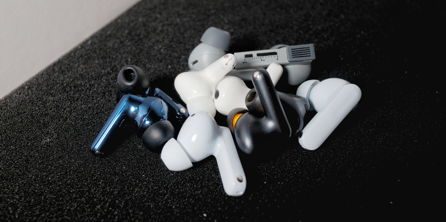
    I suppose I can count as something of a headphone enthusiast. I started with the MX500 and CX300, and over the years I’ve played with everything from a few hundred to several thousand—or even tens of thousands—of yuan. I still regularly use six pairs today, but the one I use the most is still the AirPods. Simply because they’re just too convenient.

    But AirPods aren’t perfect yet. They can’t fully replace all my other headphones. When I need great sound quality, I’ll still reach for my Sennheiser over-ears plugged into an amp. When I need something for sports, I’ll choose a pair with longer single-session battery life, a more secure fit, and proper water resistance. When I need to completely isolate external noise, I’ll go for my custom-molded in-ears that physically block out sound.

    Yet the new AirPods Pro 3 have genuinely captured my attention. It really looks like it might be that “all-in-one,” well-rounded, hexagon-warrior, chosen-one device.

    The convenience AirPods are known for goes without saying. The new acoustic design reportedly improves sound quality and even brings spatial audio. IP57 dust and water resistance, an innovative heart-rate sensor, and 8 hours of single-charge battery life check all the boxes for sports headphones. And with twice the noise-cancelling power, it also meets the needs of isolating external sounds.

    Can the AirPods Pro 3 be used with three generations?

    Unexpectedly Strong Sports Capabilities

    The biggest innovation of the AirPods Pro 3 is undoubtedly the built-in heart rate sensor. This isn’t Apple’s first attempt at integrating a heart rate sensor into earbuds—its adopted child Beats used one more than half a year earlier, but according to professional foreign media tests, it was almost unusable. Will the AirPods Pro 3 be any better? Let’s take a look at what might be the only fully Chinese-language review of the AirPods Pro 3’s heart-rate-monitoring feature.

    What is a heart rate monitor

    Let’s start with a simple explanation of what a heart rate monitor is and what it’s used for.

    Heart rate has always been the most important metric for quantifying exercise intensity. Heart rate data reflects intensity, efficiency, metabolism, oxygen consumption, lactate accumulation, and fatigue/recovery status. It helps guide your training and ensures you don’t overwork—or underwork—yourself.

    But heart rate is not the best metric. Temperature, humidity, dryness, and even your mood can greatly affect heart rate, making it far less precise than power output as a real-time indicator of exercise intensity.

    However, that doesn’t mean heart rate is useless. For winter base training, recovery from injury, or beginners just starting out, using heart rate zones for low-intensity aerobic training is an extremely friendly and effective method.

    In addition, for those trying to lose weight, staying within Zone 2 guided by heart rate can make training more efficient—and more enjoyable.

    Today’s common heart rate monitors come in two forms: bio-electrical (ECG) chest straps and optical heart rate sensors.

    Bio-electrical or ECG chest straps are the most common type of heart rate monitor. They typically come as a strap worn across the chest—one of the infamous “two great embarrassments of sports gear,” along with compression tights.

    These straps measure the tiny electrical currents across your skin to determine heart rate, using the same underlying principle as medical ECG machines. This is a mature and highly accurate monitoring technology. Chest straps range from basic models costing a bit over a hundred yuan to high-end models costing over a thousand, with more advanced metrics. The downside: they’re not very comfortable to wear.

    For this test, the baseline device used is the Garmin HRM-Tri triathlon heart rate strap: formerly Garmin’s flagship product and a benchmark for heart rate straps. A versatile all-rounder, it not only provides basic heart rate monitoring but also tracks advanced running dynamics such as stride length, cadence, and vertical oscillation. It also has excellent waterproofing, can be worn for swimming, records heart rate during the swim and syncs afterward, and supports HRV measurements.

    Photoplethysmography (PPG) heart-rate monitoring works by using photodiodes to project light through the skin. Because changes in blood flow cause variations in hemoglobin density, a PPG sensor calculates heart-rate data by detecting differences in light reflection. This technology can experience slight inaccuracies due to sweat, motion, temperature, or ambient light interference, which manufacturers compensate for through their own algorithms.

    The strengths and weaknesses of these two heart-rate measurement methods are almost opposite. In real-world use, even high-end optical sensors may show occasional anomalies in the data and cannot match the 100% stability and accuracy of electrical-current-based sensors.

    But optical sensors are far superior in wearing comfort. They can be built into armbands, wristbands, and watches, and can even support 24/7 continuous monitoring. Apple has taken this even further by integrating optical heart-rate sensors into the already highly compact Beats earbuds and AirPods Pro 3—an impressive engineering feat.

    Comparing the AirPods Pro 3 and Watch Heart-Rate Sensors

    For comparison, I used the Garmin Fenix 7X sports watch, my primary optical heart-rate device. Heart-rate monitoring is just one of the built-in functions of a sports watch, yet the range of metrics it gathers is the most comprehensive: basic heart rate and HRV, blood-oxygen saturation, VO₂ max, respiratory rate, and more. After OTA updates, it even supports advanced running dynamics—like cadence and vertical oscillation—previously exclusive to high-end chest straps, though its accuracy still can’t fully match a dedicated heart-rate strap.

    A smartwatch can display heart rate and trends in real time

    Comfort of Wearing

    AirPods Pro 3 > Garmin Fenix 7X >> Garmin HRM-Tri chest strap.

    AirPods Pro 3 is undoubtedly the most comfortable, because you simply don’t feel it at all. There are no bumps or special materials on the earbuds themselves, and Apple made the whole sensor module so compact that unless you’re really familiar with product design, you wouldn’t even guess there’s a heart-rate sensor hidden inside.

    You’d never guess there’s a heart-rate sensor in there without looking at Apple’s official images

    Next is the watch. For people used to wearing watches, it’s completely natural and doesn’t require any extra step before a workout. Ever since I started using a sports watch, I almost stopped touching my chest strap. But the watch’s sensor does protrude noticeably, and after long wear it leaves clear marks on the skin. Some people even experience mild allergic reactions or slight burns from the optical sensor.

    The chest strap is, unsurprisingly, the most uncomfortable. If it weren’t for testing the accuracy of the AirPods Pro 3, I honestly wouldn’t bother wearing it.

    If you don’t know what it feels like to wear a chest strap, here’s a reference

    Test Data and Analysis

    First is the indoor bike trainer test, which provides the most controlled environment. The test covers Zones 1 through 7, from aerobic to anaerobic intensity. In all charts, green represents the baseline Garmin chest strap, blue is the Garmin Fenix 7X optical heart-rate sensor, and red is AirPods Pro 3.

    AirPods Pro 3 performed unexpectedly well.

    As you can see, the three lines almost completely overlap, with no major heart-rate drops or data anomalies. In the summary data below, all three devices show nearly identical average heart rates, and the AirPods Pro 3’s peak heart rate is only 1 bpm lower—well within acceptable error margins.

    Surprisingly, the AirPods Pro 3 actually performed better than the theoretically more professional Garmin device. If you look closely, you’ll notice that whenever power output fluctuates, heart rate also shows small variations. The Garmin chest strap (green line) reacts the fastest, and in some cases it’s the only one that responds at all. That’s why chest straps remain the most precise and detailed heart-rate measurement devices.

    But the AirPods Pro 3 performed better than the Garmin watch. During a large 500-watt power change, the AirPods Pro 3 responded faster than the watch.

    Next, let’s zoom in. During a sudden anaerobic burst, the chest strap is still the fastest, but the AirPods Pro 3 follow up very quickly—while the Garmin watch hesitates for a moment before catching up.

    In two sets of 300-watt high-power outputs, the trend remains the same.

    And during a longer period of medium-to-high power output, all three devices were able to measure heart-rate changes accurately enough within acceptable range. But when it comes to detecting subtle heart-rate fluctuations, only the chest strap can truly capture the details—this is determined by the measurement principle itself. For the vast majority of people, though, all three devices are entirely sufficient.

    What about outdoor conditions, where things get more complicated?

    As it happened, Beijing’s weather in October was unpredictable, so I tested them during a race.

    In this round of testing, the AirPods Pro 3 didn’t perform as well as they did indoors—the delay was slightly longer (see the last three red boxes). But overall performance was still very impressive. In fact, at the beginning of the activity, the AirPods Pro 3 entered the correct state even faster than the Garmin watch (first red box).

    Even when pushing to peak heart rate, the AirPods Pro 3 showed no issues, and their accuracy was not affected by sweat or other factors.

    AirPods Pro 3’s heart-rate measurement accuracy far exceeded my expectations. It’s remarkably good — completely usable. Keep in mind that AirPods Pro 3 measure from the auricle, which has only sparse capillaries, making the challenge much greater than that of a smartwatch. Apple’s technical capability is truly terrifying.

    If I have to nitpick, it’s that the overall curve is too smooth. This was already somewhat noticeable in the indoor tests, but indoor heart rate fluctuations are smaller, so it wasn’t obvious. Outdoors, where heart rate changes more dramatically, the curve lacks the small micro-variations that a normal heart-rate curve should show.

    But whether for elite athletes or beginners, heart-rate data is mostly for logging, not ultra-precise measurement. So aside from someone like me who zooms in on curves, almost no one would notice this.

    Data Collection and Expandability

    It’s a pity that AirPods Pro 3’s excellent heart-rate measurement capability is not fully utilized. Currently, only iPhone can extract heart-rate data, and even then, only a few native workout apps on iOS 26 support it — and you need to have music playing for it to work. You can’t use them as a standalone heart-rate device.

    Third-party app support is currently poor. Mainstream platforms like Strava and Zwift can’t use it. The only third-party app I found that supports it is Keep, but you need a subscription to enable it, which makes it hard to evaluate.

    It can’t be detected as a Bluetooth heart-rate monitor

    At the moment, AirPods Pro 3 cannot be recognized by more professional sports devices as a Bluetooth heart-rate sensor. The only thing that sort of works is the Apple Watch. According to Apple, when AirPods Pro 3 are used together with Apple Watch, the system uses algorithmic fusion to make the heart-rate data more accurate.

    Can AirPods Pro 3 Be Used as Sports Earbuds?

    AirPods Pro 3 improve fit. The new foam tips primarily enhance passive noise isolation but also incidentally improve stability. Paired with the new design, even without ear hooks, they stay secure during running and cycling.

    With an IP57 rating, they’re safe from sweat and can even theoretically be rinsed under water.

    Anyone who exercises often knows you rarely have free hands to answer calls. AirPods Pro 3 add gesture-based controls: shaking your head to decline and nodding to accept. Too bad it never once worked for me—maybe my movements weren’t big enough?

    Battery life is rated at 8 hours, or 6.5 hours with heart-rate monitoring. This easily covers a weekend 100-km cycling session. In my test, I listened continuously for 6 hours and consumed 72% battery—consistent with the 8-hour claim. For heart-rate monitoring, my multiple tests averaged 18% consumption per hour, suggesting about 5.5 hours of battery life. My highest was 20% in one hour.

    I suspect this is due to differing noise-cancellation loads, because one earbud consumed significantly more—and it happened to be the one facing constant wind. This leads to AirPods Pro 3’s fatal flaw as a sports earbud—wind noise is very loud.

    Because of the protruding stem, AirPods Pro 3 naturally catch wind. Whether ANC is on, transparency is on, or ANC is off entirely, the wind noise is always obvious. When cycling, it’s present 100% of the time—even at slow speeds. For running, it appears at around a pace of 4:00/km.

    You won’t be unable to hear audio, but it’s definitely loud. And when wind varies from side to side, the imbalance becomes uncomfortable—a common scenario in both running and cycling.

    Overall, AirPods Pro 3 are not a perfect sports earbud—and they weren’t designed to be. But their heart-rate monitoring is genuinely phenomenal. For indoor light exercise users without professional sports gear, they can absolutely serve as auxiliary training equipment, helping guide workout intensity and safety. Paired with ANC in a gym, they should be great.

    Given such impressive heart-rate performance, I’m very excited to see where Apple takes health monitoring technology next.

    Convenient and Comfortable Daily Earphones

    I believe many people, like me, always wear earphones when going out alone—both to isolate themselves from the world and to make the journey less boring. In this scenario, AirPods are undoubtedly the best choice.

    When the first-generation AirPods were released, Apple was heavily mocked—cutting off the EarPods’ wires just to make a quick profit? Yet once AirPods hit the market, both the media and consumers ended up eating their words: they were surprisingly good. No wonder—AirPods are simply excellent.

    Unlike traditional Bluetooth earphones, AirPods don’t require complicated pairing. They seamlessly switch between iPhone, Mac, and iPad. There’s no power switch—they’re ready to use right out of the case. Controls are simple; a tap plays, pauses, or skips tracks. Wearing them is effortless; the EarPods design is actually very well-engineered for long-term comfort. Most importantly, AirPods feature a semi-open design, so they don’t completely block out external sound, allowing conversations without removing the earphones.

    AirPods Pro 3 continues these advantages. The Apple ecosystem still achieves seamless switching most of the time, though I’ve encountered a few cases where incoming iPhone calls couldn’t be answered while connected to a Mac.

    In terms of wearing comfort, the AirPods Pro 3 is slightly inferior to the regular AirPods due to its physical structure. The semi-open design makes it easy to hear ambient sounds. Transparency mode can be a bit noisy—fine in quiet environments, but in an office or on the street, external sounds come through clearly. Turning off transparency mode gives a more in-ear isolation effect, though the new foam tips may feel slightly pressurized after extended wear. Overall, it’s still excellent, akin to a 99 versus 90 comparison with standard AirPods.

    Control-wise, it’s similar. The tap controls on the first and second-generation AirPods were the most convenient. The AirPods Pro series now consolidates all functions on the earphone stem, using different pressure levels and tap counts to skip tracks, answer calls, switch noise cancellation modes, and adjust volume. You just need to get used to the small stem; it’s not as instantly intuitive as tapping the original AirPods.

    Another feature I really like on the AirPods Pro 3 is the sleep mode—music automatically pauses when you fall asleep. I suspect this leverages the heart rate monitoring, similar to how a smartwatch tracks sleep. Once it detects you’re asleep, it automatically stops playback. Anyone who has ever slept with headphones knows the frustration of being abruptly woken by an unexpected track—after all, timers are rarely precise.

    Another significant downgrade: reduced battery in the case one notable compromise is the reduced battery in the charging case. Officially, the total playback time dropped from 30 hours to 24 hours, but in practice it feels even less. Previously, AirPods cases could go ten days or more without needing a charge, whereas with the AirPods Pro 3, after just a few uses, the battery seems noticeably lower.

    Here’s a quick record of battery top-ups: on average, a charge gives about 13 hours, the minimum is 8 hours, and the maximum is 17 hours. It’s not very stable. Interestingly, after heavy usage (like a 6-hour session), topping up doesn’t seem to restore much battery, while after lighter usage, the same top-up might feel like it drains faster.

    Sound Quality—Hardly Worth Discussing

    While all manufacturers love to tout their headphones’ sound quality, for Bluetooth earbuds, sound quality is largely a moot point. On one hand, Bluetooth transmission protocols inherently limit bitrate. Even high-end headphones supporting LDAC or APT-X Lossless peak around 1 Mbps. Four years ago, AirPods 3 claimed “lossless” support, and yet the AirPods Pro 3 still only supports the modest AAC codec.

    On the other hand, Bluetooth earbuds—especially in-ear ones—prioritize battery life over powerful DAC chips or large drivers, so HiFi-grade sound is impossible from both hardware and software perspectives.

    Does sound quality matter? Yes, but not as much as you might think. The human ear and brain are fascinating: I’ve listened to in-ear monitors costing tens of thousands, and large over-ear setups costing hundreds of thousands. Initially, the sound impresses—the soundstage feels expansive, the details smooth—but over time, it’s just “good-sounding music.” Different gear shows its strengths mostly in direct comparisons, but after prolonged listening, you acclimate and it all feels normal.

    Sennheiser Orpheus—Sold for 200,000 in the ’90s

    There’s a difference between active and passive listening. Active listening is like visiting an art museum to appreciate a master painting—every subtle brushstroke brings pleasure. Passive listening is like hanging a reproduction at home; you rarely scrutinize it, but glimpsing it in passing still lifts your mood.

    Manufacturers understand this. Meticulous HiFi music, like museum-grade art, appeals to a niche audience. It’s often more fun to offer something playful and engaging, like spatial audio.

    Spatial audio is a next-generation audio technology based on Dolby Atmos, designed around the listener in a point-to-point audio format. It can separate individual instruments and vocals across 360-degree positions, making sounds appear from above, in front, or behind you, creating the sensation of being in the center of the stage.

    Take my favorite spatial audio track, the musical number Satisfied from Hamilton, as an example. Angelica Schuyler, Hamilton’s sister-in-law, performs a toast song at Hamilton’s wedding.

    At the beginning, when Angelica delivers her lines, you can hear her calling out the bridesmaids and groomsmen in front, while harmonies come from behind your ears. It feels as if you are standing at the wedding, right between Angelica and the bridal party.

    Then the song moves into Angelica’s stream of thoughts and flashback memories, with notes swirling from all directions like a vortex, pulling you into the flow of time. You can hear snippets of the earlier track A Winter’s Ball coming from various directions, following Angelica’s recollection of first meeting Hamilton.

    Lin-Manuel Miranda uses parallel narrative in this song—two stories unfolding across a single time dimension. With traditional stereo music, all sound comes from one angle, making it hard to perceive depth. Spatial audio lets you “stand on the stage” as Angelica, experiencing her frustration and uncertainty firsthand. Coupled with video, it allows a deeper understanding of this groundbreaking musical.

    Currently, the best spatial audio experience is still a home theater setup. AirPods render spatial audio through headphones, which cannot fully replicate the sensation of being in the center of the stage. You can hear harmonies around you, but precise front/back positioning is limited. This is not a limitation of AirPods specifically—headphones in general face this challenge.

    So far, I’ve only experienced true home-theater-level spatial audio on Sonos’ Bluetooth headphones, Ace. This requires decoding full Dolby Atmos through Sonos speakers, then transmitting it via WiFi to the headphones. This points to another technical frontier for wireless headphones—WiFi audio. If Apple wants to push AirPods’ sound quality further, this is a potential path. Xiaomi has already demonstrated it, and Apple has related technology: Apple TV and HomePod can transmit Dolby Atmos audio via WiFi.

    Overall, in terms of sound quality, the AirPods Pro 3 is similar to its predecessors—above average, capable of providing enjoyable sound, but not exceptional.

    Top-Tier Noise Cancellation

    I’m very sensitive to the ear pressure changes caused by noise cancellation. I once tried the first-generation AirPods Pro, but I couldn’t stand the dizzying feeling of ear pressure shifting when ANC was on—it gave me a headache immediately, like a tightening curse. For a long time, on long trips or in noisy environments, I relied on a FiiO Bluetooth ear-hook paired with custom in-ear monitors for pure physical noise isolation.

    Active Noise Cancellation vs. Passive Noise Cancellation

    But as I mentioned at the start, AirPods are a must-have. Carrying an extra set of headphones is a hassle, so I’ve tried different noise-canceling headphones, including the AirPods 4 ANC version. Semi-open designs greatly reduce sudden ear pressure changes, but they compromise noise cancellation, making them unsuitable for long trips.

    The AirPods Pro 3, however, deliver outstanding noise cancellation. The new foam ear tips fully isolate external noise, and the new multi-hole design keeps ear pressure changes minimal—acceptable for me. Among all the noise-canceling headphones I’ve tried, only the Sonos Ace can achieve zero ear pressure change, but that’s a bulky over-ear design, not practical for travel.

    AirPods Pro 3 can fully replace my custom in-ear monitors while adding convenient features like automatically switching to transparency mode and lowering music volume during conversation—a true showcase of technological convenience.

    Summary

    The AirPods Pro 3 is a top-tier noise-canceling headphone, an excellent everyday headphone, a headphone with adequate sound quality, and, within limits, a top-notch in-ear sports headphone. It’s not a perfect “hexagonal warrior,” but it does cover all six sides and works hard to expand its boundaries.

    If you’re hesitating between different headphones, AirPods Pro 3 is the one you can choose blindly. For features that competitors have, like noise cancellation and sound quality, it excels. For features competitors lack, like the seamless ecosystem experience, it also excels. Its limitations stem either from form factor constraints, like spatial audio, or from overreaching beyond its abilities, like in the sports headphone category. But for users doing indoor workouts, yoga, or dance, AirPods Pro 3 is fully capable of supporting exercise.

    AirPods Pro 3 can rightfully claim to be the most versatile TWS Bluetooth headphone today, with enormous potential for future development. Imagine the possibilities when heart-rate monitoring is paired with health algorithms—the user base is far larger than that of the Apple Watch. With the newly launched real-time translation across Mainland China, the AirPods line truly deserves to be called Apple’s greatest product after the iPhone.

  • Low-Cost, Scalable CyberBrick Replica: Build Your Own 3D-Printed RC Car

    Low-Cost, Scalable CyberBrick Replica: Build Your Own 3D-Printed RC Car

    Introduction to Bambu Lab CyberBrick & Why This Project Exists

    First of all, Bambu Lab is a consumer-grade 3D-printer manufacturer whose printers—especially the A1 series—have received widespread praise. The A1 series even sells for around just ¥1,000.

    Meanwhile, Bambu Lab operates MakerWorld, a large-scale model-sharing platform where beginners (those with zero modeling experience) can download community-made 3D designs and print them directly.

    However, most 3D-printed objects are static—meant only for display or simple hand-manipulation. If you want your 3D-printed car to actually move, you need experience in electronics and circuitry. To address this, Bambu Lab released the CyberBrick kit, enabling beginners to create a remote-controlled 3D-printed car using simple, LEGO-like building blocks—adding a whole new layer of fun.

    Here’s the official CyberBrick introduction from Bambu Lab:

    CyberBrick is a modular smart-toy ecosystem that integrates programmable hardware, 3D-printed structures, and a dual-layer coding environment. It combines 3D printing with electronics and programming through LEGO-like simplicity. CyberBrick allows anyone to build and enjoy a wide range of 3D-printed creations—from RC toys to productivity tools.

    However, the CyberBrick kit is not cheap. A starter set costs ¥199, and each set can only drive one toy car. That’s why I started this project: replicating “Bambu Lab CyberBrick” using inexpensive components—not only reducing cost but also unlocking more possibilities.

    I call this project OpenCyberBrick. Let’s begin.

    Disassembly & Replication Strategy

    The Core Logic of CyberBrick

    Back during the CyberBrick crowdfunding phase, I already had a rough understanding of its structure and logic through introductions and demo videos. On the day the CyberBrick kit officially launched, I bought the starter set and printed the official truck model to test it.

    Although CyberBrick divides its system into a controller and a receiver, both sides use the same ESP32-C3 mini as the main control board—and they’re interchangeable. The controller side gathers input from joysticks, buttons, switches, etc., through a “remote-control baseboard” and sends that data to the receiver. The receiver side takes the incoming signals and, using its own “remote-control baseboard,” drives motors, servos, LEDs, and other output devices. Communication between the controller and the receiver appears to use ESP-NOW, a proprietary ESP protocol.

    Replication Approach

    Once we understand the core logic of CyberBrick, the replication strategy becomes clear.

    • Main Control Board Communication Protocol: For the main control board, we also use Espressif’s ESP-series chips. The ESP8266, ESP32, and ESP32-C3 are all inexpensive and come with built-in Wi-Fi modules. Communication between modules can be handled through ESP-NOW, which conveniently solves the issue of transmitting control signals.
    • Controlled Unit: The controlled unit uses an ESP8266 connected to an L298N motor-driver module (for driving the motors), a 9g servo (for steering), and a WS2812 LED strip (for headlights, turn signals, and lighting effects).
    • Remote Control Unit: The remote unit uses an ESP32-C3 connected to two PS2 joystick modules (each with two built-in buttons), plus two additional button modules, forming a 12-channel controller capable of supporting a large number of actions.
    • During later optimization, I realized that using a smartphone as the controller is actually more suitable. It supports more actions while eliminating the hardware and software cost of building a separate remote controller. Therefore, in the following sections, the remote-control replication will only be introduced briefly.

    Detailed Look at the Controlled Side

    3D-Printed Jeep Body

    First, just like with CyberBrick, we need to 3D-print the Jeep parts and assemble them. But one thing to note: since we’re using loose components with much lower integration than CyberBrick’s custom modules, they take up significantly more space. Therefore, choose a larger model—small bodies won’t have enough room for the electronics.

    I chose Willy’s CyberBrick RC Jeep for this project. The front trunk of this Jeep provides enough space to house the electronic components, and its structure is quite typical: a motor is used to drive forward and backward, a servo handles steering, and there are reserved slots for LED lights.

    Jeep Electronics Layout

    Above is the wiring diagram for the Jeep’s electronics. Here are the pitfalls I ran into:

    • Different modules require different operating voltages. For example, the ESP8266 needs a stable 3.7V supply, the servo and LEDs require 5V, and the motor-driver module works within a voltage range (the higher the voltage, the stronger the torque). If you want the entire system to run from a single battery, you must add buck/voltage-regulation modules before each device.
    • 7.4V batteries are relatively expensive and require dedicated chargers. But 3.7V 18650 and 14500 cells can be found in many discarded toys and electronics. I made a series-connection wire to combine two 3.7V cells into a 7.4V pack—just make sure the cells have matching internal resistance when you use them in series.
    • The ESP8266’s GPIO pins connect to the signal interfaces of the motor driver, servo, and LED modules, and output PWM signals for control. However, the ESP also needs to share a common ground with all these devices.

    Software Program

    ESP devices support Micropython and Arduino. Since I have some Python experience, I chose Micropython for development.

    The software portion of the project is already uploaded to GitHub: OpenCyberBrick GitHub / OpenCyberBrick Gitee.

    Here is what each file does:

    • jeep_motor.py — Motor driver program. Controls motor direction and speed to achieve forward/reverse movement.
    • jeep_servo.py — Servo driver program. Controls servo angles for steering.
    • jeep_led.py — LED driver program. Controls two WS2812 LEDs, enabling headlights, reverse lights, turn signals, and light-show effects.
    • wifi.py — Connects the controller to Wi-Fi for LAN-based control.
    • wificonfig.json — Stores network information and can be edited through the remote webpage.
    • jeep_action.py — The action dispatcher for the Jeep. It converts received remote-control signals into motor, servo, and LED commands. GPIO pin assignments are also configured here.
    • jeep_espnow_rec.py — ESP-NOW listener. Continuously receives ESP-NOW packets and forwards them to jeep_action.
    • jeep_websocket_rec.py — Runs a WebSocket server, receives commands from a LAN webpage, and forwards them to jeep_action.
    • main.py — Main program entry, used to select which control-signal source to listen to.
    • jeep_remote_index.html — The H5 remote-control page, supporting both button and gyroscope-based motion control. This file is not uploaded to the ESP—save it on the phone used as the controller.

    Remote Control Module Overview

    Unlike CyberBrick, this project ultimately works best with a smartphone controller, even though I also implemented a standalone hardware remote. When using the phone, you can switch between button control and motion-sensor control.

    ESP-NOW Remote Control

    ESP-NOW control can actually be treated as an independent project—it can control not only CyberBrick replicas but any ESP-based device. It consists of both hardware and software components:

    The hardware portion consists of an ESP32 connected to two PS2 joysticks, two regular buttons, a power supply, and a switch. The software portion, also written in Micropython, retrieves data from the PS2 joysticks and buttons, formats it, and forwards it to the controlled device. This remote can even switch between different controlled devices via buttons, allowing a single controller to operate multiple units.

    This remote-control project may be introduced in a separate article later.

    Mobile Webpage Button Control

    Using a dedicated remote and a separate controlled device is still fairly costly. So why not use something everyone already owns—a smartphone—as the controller? The answer is of course yes. ESP devices have Wi-Fi capabilities, meaning they can connect to your home network via a router or create their own hotspot to form a local network.

    On the controlled device’s ESP controller, a server runs in the background to receive command requests from other devices on the network and translate those commands into actions for the Jeep.

    On the controller side, you can open an HTML page on your phone; button presses and releases on that page are sent to the server, enabling remote operation. There are a few special considerations:

    • Since ESP devices have extremely limited memory, the server cannot return HTML content. Therefore, the control-page HTML file must be saved on the phone beforehand. On iPhone, you can open local HTML files using HTML Viewer. On Android, you can tap the HTML file and open it in a browser.
    • Because real-time responsiveness is critical for a remote controller, ordinary HTTP GET/POST requests would put heavy load on the server. Instead, the system uses WebSocket long-connections, which maintain real-time performance while greatly reducing server load.

    Mobile Gyroscope Control

    Button-based control is simple and intuitive, but it’s not quite “cool” enough. Gyroscope control, on the other hand, is cool. On the HTML page, the phone’s gyroscope data is captured, and changes in the phone’s orientation are translated into actions for the Jeep. For example:

    • X-axis:
      Tilt less than –20° → move forward
      Tilt greater than 20° → move backward
      Between –20° and 20° → stay still
    • Y-axis:
      Tilt less than –20° → turn left
      Tilt greater than 20° → turn right
      Between –20° and 20° → stay still
    • Z-axis: not used.
    • The X and Y axes can be read simultaneously, allowing combined movements such as forward-left, forward-right, backward-left, and backward-right.

    Cost Calculation

    If the smartphone is used as the remote control, the entire system only includes the Jeep’s on-board electronics. Here’s a rough breakdown of the cost:

    • ESP8266 or ESP32 controller: 11.7 RMB
    • One L298N motor driver: 7.42 RMB (you can definitely find cheaper alternatives; I just used what I had)
    • Two N20 motors: 6.16 RMB (30.8 RMB for 10 pieces)
    • One 9g plastic servo: 4.7 RMB
    • Two WS2812 LEDs: 0.37 RMB (11 RMB for 60 pieces)
    • Two DC-DC voltage regulators: 3.6 RMB (1.8 RMB each). If you’re knowledgeable about capacitors, a cheap capacitor may suffice.
    • Two 3.7V 14500 batteries: 0 RMB — you can salvage them from old toys or electronics.
    • Wires, terminals, and a switch: about 2 RMB.

    Total: 35.95 RMB.
    This does not include some mechanical components required by the Jeep model, such as screws and bearings.

    More Possibilities

    Most of the functionality above is designed to match CyberBrick’s capabilities, though implemented differently on the remote side. But in fact, we have far more room to expand: adding a screen to the ESP-NOW controller, adding a screen to the Jeep, adding sound effects, adding an obstacle-avoidance sensor, and so on. This is where the OpenCyberBrick project can offer greater flexibility and fun.

    Conclusion

    This article only introduces the general logic of the project. There are many more hardware and software details not covered here due to space constraints. If you’re interested in this project, feel free to leave me a message — I’d be happy to discuss it.

    If you know how to design PCBs on JLCPCB and you’re interested in my projects, I very much welcome you to contact me. Let’s build something fun together.

  • My Autumn–Winter Styling Approach: Building From Core Pieces With Warmth and Personality in Mind

    My Autumn–Winter Styling Approach: Building From Core Pieces With Warmth and Personality in Mind

    The colder it gets, the more room there is to play with outfits. In autumn and winter, whether it’s inner layers or outerwear, there are countless categories to choose from — naturally opening up endless styling possibilities. Beyond the usual “base layer + jacket” formula, the colder seasons also allow for layering, which helps emphasize depth and create different dressing moods. Now that autumn and winter have arrived again, the final installment of this series is here as promised.

    When it comes to style, I believe everyone has their own unique taste and aesthetic. The outfits I share might not suit your body shape or vibe; you might even feel completely indifferent to them — and that’s perfectly normal. But what I genuinely hope is that my sharing doesn’t become a “standard answer,” but rather a spark that inspires you. If I can offer you some ideas about color, coordination, or key pieces that help you better understand and shape your own style, that would be the most meaningful thing to me.

    Principles of Fall/Winter Outfits

    The most obvious difference between late-autumn/winter clothing and other seasons is thickness. Generally, people choose shirts, knitwear, and hoodies as inner layers, while outerwear includes heavy jackets, coats, padded jackets, and down jackets. The most common—and also the most basic—way to dress is “inner layer + outerwear + pants.” A slightly more challenging approach is layering multiple inner layers or multiple outer layers paired with one pair of pants, which is the layered-wearing method.

    Basic Styling Methods

    When it comes to the basic “inner layer + jacket + pants” outfit, there’s a popular saying on Xiaohongshu: “If the top is simple, the bottom shouldn’t be simple,” and sometimes the saying is reversed. The idea is that only one part of the outfit should be “not simple.” Personally, I’m skeptical about this rule. It’s not wrong—actually, it’s a perfectly safe styling consideration. But in reality, the opposite combinations—whether both top and bottom are simple or both are not—can also look great, as long as they’re well-coordinated. It’s just that having one simple piece makes things easier. Next, I’ll break down the everyday basic styling principles by level of difficulty.

    Easiest: One Simple, Two Not-Simple

    Fashion is subjective, so defining “simple” is tricky. Let’s assume solid-colored, pattern-free items are simple pieces, and everything else is not-simple.

    • The easiest method:
      A solid-color simple inner layer + solid-color pants, paired with a not-simple jacket.
    • One level up:
      A not-simple inner layer + solid-color pants, paired with a simple jacket.
    • Two levels up:
      Not-simple pants paired with a simple inner layer and simple jacket.

    In short, under this styling logic: if you don’t want to go wrong, choose a simple inner layer; if you want the best result within the “rules,” choose not-simple pants.

    Moderately Difficult: All Simple

    Learning outfits from Uniqlo’s lookbooks is a good idea, since the outfits are mostly solid-colored basics and look very easy to coordinate. But I think this varies from person to person. A fully simple outfit may seem effortless to style, but it also means the clothes offer almost no additional shaping or visual support to your body. It places higher demands on your body shape, looks, and even skin tone. Take me for example—I’ve encouraged myself countless times to buy a “minimalist” outfit from Uniqlo or MUJI, but I’m always discouraged before leaving the fitting room.

    So my suggestion is: light-colored “all simple” outfits are often easier to pull off than dark-colored ones. If you want to try a full minimalist look, start with an all-light set and add one dark jacket.

    Very Difficult: All Not-Simple

    No doubt, an outfit where every single item is not-simple is the hardest combination of all. Unusual colors, bold patterns, and standout materials—all are challenging to pair. So here are two suggestions:

    When you want to go in this direction, follow the style of an idol you like and try to recreate their outfits.

    A more practical suggestion: prioritize bold patterns or cuts instead of bold colors.

    Highly unconventional colors are demanding on both face shape and skin tone, while bold patterns or silhouettes are relatively easier to manage. In the worst case, you’ll just look like a stylish street kid—and honestly, that’s not necessarily a bad thing.

    Layering
    Layering is challenging because it really tests your ability to control a sense of depth in an outfit. Even something as simple as a shirt layered under a crewneck sweatshirt can create very different vibes depending on how much of the collar is exposed. The countries best at layering are probably the UK and Japan, so if you’re really into this style, you can check out magazines from those two places.

    Japanese outfits often love layering pieces, and autumn and winter are exactly the seasons where layering shines the most. For everyday wear, it’s especially important to pay attention to how you manage the sense of depth. I recommend a basic layering rule: treat the collar area as the core element that highlights layering, combining wide collars, collarless pieces, and lapelled jackets. Once you’re comfortable with this style, you can experiment with more advanced techniques, including layering with differences in length or with contrasting colors.

    But remember, don’t fully cover the layer underneath, or it’ll look abrupt and stiff. Whether it’s the color, material, or something else from the next layer, as long as something is visible, it works. Ultimately, no matter how you layer, the goal is to see different levels on your body—and material and color are the easiest ways to showcase that. In daily life, it’s all about trying things out. The more you experiment, the easier it becomes to discover your own layering style.

    Materials Suitable for Autumn and Winter Clothing

    Autumn and winter garments tend to be thicker, which makes the differences in material texture much more noticeable. In this part, I’ll focus on materials and recommend different types of clothing so you have more options when shopping.

    Cashmere/Wool
    Cashmere and wool are very familiar to most people and are among the most popular materials in autumn and winter, especially for sweaters and pants. Cashmere sweaters are lightweight, warm, elastic, and resistant to wrinkles. Other than being a bit troublesome to wash, they basically have no downsides. Unlike previous years, many fashion and casual brands are now offering more wool items, including shirts, sweaters, and trousers, which meet the needs of everyday casual dressing.

    Wool casual trousers and dress pants are particularly worth mentioning. They’re durable, stretchy, and usually have very straight silhouettes that nicely flatter the legs. When properly cared for, they don’t deform easily, making them great winter staples. Many fashion influencers recommend pairing wool dress trousers with an overcoat, showing just how popular this category has become in recent years.

    Additionally, cashmere and wool are extremely versatile in autumn and winter and pair well with almost anything. Using wool sweaters or cashmere trousers as part of your outfit helps elevate the overall texture and sense of style.

    Uniqlo Cashmere Blend Sweater / NANS Wool-Blend Trousers

    Corduroy
    Corduroy is actually a composite fabric, usually woven from materials such as cotton, polyester, or wool. Its surface features dense, soft ridges with a certain thickness, making it particularly suitable for fall and winter. Compared to regular cotton fabrics, corduroy adds more visual texture, which works especially well for minimalist outfits.

    Common corduroy pieces include shirts and pants. Shirts typically have a structured silhouette, making them suitable for wearing alone or layered over a knit sweater. Pants on the market seem to come most frequently in khaki tones and work well for a preppy style. Overall, corduroy—with its unique texture and aesthetic appeal—is both practical and stylish for fall and winter looks. Whether you prefer a casual vibe or a retro mood, corduroy performs exceptionally well and can easily create warm yet distinctive seasonal outfits when styled thoughtfully.

    niko and Corduroy Shirt / NORYBRAND Corduroy Pants

    Leather
    Leather garments are a key part of fall and winter wardrobes thanks to their warmth, durability, and unmistakable texture. The leather used in jackets and pants that most people purchase tends to fall into three categories: cowhide, sheepskin, and synthetic leather. Each type differs in characteristics and price. From the perspective of individual pieces, the easiest to style is the leather jacket (including blousons and outerwear), followed by leather boots, and lastly leather pants, which are usually the hardest to pull off.

    Leather jackets commonly use cowhide or sheepskin. Both are highly durable and elastic, making them great for outerwear. Cowhide tends to be thicker and tougher, offering excellent longevity and the ability to “break in” over time. It has great wind resistance and a structured appearance, and while its price is high, the cost performance is also excellent. Sheepskin, on the other hand, is typically softer and more delicate, making it suitable for jackets with a more body-hugging silhouette. It has become increasingly popular in fashion design in recent years—especially among many Japanese streetwear brands, where sheepskin is being used noticeably more frequently than before.

    Synthetic leather differs from the two natural types. It’s usually made from plastics such as PVC (polyvinyl chloride) or PU (polyurethane), sometimes combined with other materials. It offers better waterproof performance and allows much easier color and texture control, enabling a wide range of styles and visual effects. Unlike natural leather, which tends to come in a limited color palette, synthetic leather can be produced in a rich variety of hues and patterns to meet different styling needs.

    Kevinqi Cowhide Jacket

    Duck Down / Goose Down
    Duck down and goose down are common insulating materials for fall and winter. Both offer excellent warmth, but they differ in several details—the most obvious one being price. Goose down is warmer than duck down, so it’s naturally more expensive. For example, goose-down jackets from Li-Ning often cost upward of 3,000 RMB per piece; even during discount seasons, they usually remain around 2,000 RMB. The second major difference is loftiness. Goose down clusters are typically larger and fluffier, giving goose down better insulation at the same weight. For instance, in a Beijing winter, a duck-down jacket usually needs more than 300g of filling to feel very warm, whereas goose down can achieve similar warmth with around 250g.

    If you’ve ever shopped for down jackets on Taobao or in livestreams, you’ve probably heard sellers emphasize the “New National Standard.” In short, the new standard requires that at least 80% of the filling in down products must be actual down (excluding feathers). High-quality down jackets can reach 90%. Just pay attention to this percentage when you shop.

    Li-Ning Duck Down Jacket / Li-Ning Goose Down Jacket

    Fleece
    Fleece is actually a synthetic fiber fabric—essentially polyester. The polyester fibers are woven into a dense, fuzzy structure and then brushed to create a soft, wool-like surface, which gives fleece its name and characteristic texture. The brushed fibers trap air effectively, providing excellent insulation. Its warmth is close to wool, yet it’s much lighter than many natural fibers.

    In the past couple of years, many outdoor brands have shown a strong preference for fleece items. They’re easy to maintain, durable, and look good. Other than not being windproof, fleece doesn’t have many drawbacks. Choosing a fleece jacket in fall and winter can significantly enhance the visual warmth and cozy outdoor feel of your outfits. If you want to create a warm, relaxed, and slightly lazy vibe, fleece is a must.

    When the economy is booming, people tend to pursue trendy, eye-catching designs. When the economy declines, they quickly shift toward durability and practicality. In reality, material and style complement each other—certain designs simply require specific materials to convey their intended texture and visual effect. Instead of treating them as mutually exclusive, it’s better to consider both. Fall and winter garments are generally thicker, so when choosing materials, it’s important to factor in how the design affects comfort and visual coherence. Only then can you achieve outfits that feel both effortless and stylish.

    Patagonia Fleece Jacket

    Outfit Combinations: Start with One Item You Already Own

    When writing the Double 11 menswear guide, a reader mentioned that they hoped I could recommend outfits based on specific scenarios, considering styles, fabrics, and more. I thought it was a great idea. But after thinking it over again, I realized that scenarios are too complicated — and if you add aesthetic styles on top of them, things become even harder to explain. So although I genuinely appreciate the suggestion, I decided to use a simpler and more direct approach: starting with any item you already have on hand.

    In the summer edition, I mentioned that when putting together an outfit, we can begin with the category in which we own the fewest items and build the rest of the outfit around it. In the fall and winter, the items we usually own the least of are heavy jackets, overcoats, padded jackets, and down jackets. However, compared with other categories, these pieces are much easier to match — starting with them is almost the same as not needing to match anything at all. Given that, it makes more sense to start with shirts and pants. I’ll consider both material and style to give you a more practical reference.

    To improve the clarity of the imagery, the outfit combinations in this section use Gemini-generated background replacements applied to real clothing items. However, because I may not have suitable photos for every single piece, some examples may be demonstrated without real images — thank you for understanding.

    Shirts

    Shirts are extremely common all-season items. As inner layers — whether worn alone or for layering — they pair well with a wide variety of outerwear and fit many different styles. I categorized several types of shirts you might have in your wardrobe and will offer some pairing suggestions you can use as reference.

    Basic styles: solid / striped / plaid shirts

    The most basic and commonly owned shirts are solid-colored, striped, or plaid. Their materials are usually cotton blended with polyester or other synthetic fibers.

    Solid Color Shirts

    For solid shirts, I recommend choosing earthy or warm neutrals, such as off-white, cream, or light khaki. These colors are generally less picky about skin tone. For me personally, pure black or deep-colored shirts tend to make my skin tone look duller, so I don’t prefer them. With solid shirts, the cut becomes even more important — I recommend shirts with a more structured, oversized silhouette for better shape and presence.

    For light-colored solid shirts, I especially recommend pairing them with dress pants or jeans. Dress pants in a matching color family work especially well; if you want to enhance the sophistication of the outfit, consider upgrading to wool trousers — they not only elevate the texture but also provide warmth. When pairing with jeans, try to avoid shades that are too light. Washed blue, classic denim blue, and vintage dark blue-black washes are all good choices. In terms of fit, avoid skinny or slim cuts; go for wide-leg or curved-cut (“弯刀”) silhouettes. Also try to avoid designs with too many pockets — anything with strong streetwear motifs — as they tend to clash with the clean style of a shirt.

    The outerwear that pairs most naturally with shirts are sturdy work jackets or overcoats. Work jackets are extremely effortless to style; dark colors are the most versatile, and you can choose designs with contrasting leather collars to create texture contrast. For overcoats, camel and black are usually the easiest to match with shirts.

    Striped Shirts

    Striped shirts are a bit of an unfamiliar territory for me. Personally, my ability to pull off stripes is quite low, and I don’t have many good-looking striped pieces in my wardrobe. So for striped shirts, I only have one suggestion: preppy style. A simple vintage striped shirt paired with a cardigan and a classic pair of jeans or dress pants is already enough.

    Plaid Shirts

    Wearing plaid shirts as outerwear can sometimes make you look a bit older, but as an inner layer for autumn and winter, they’re definitely versatile and reliable. First, I recommend choosing warm-toned large-check patterns, which highlight a relaxed vibe more effectively. Second, it’s best not to pair them directly with only an outer jacket—instead, layer a cardigan of a similar warm tone over them. This enhances warmth and also works great as a standalone outfit for going out. Finally, if you want to achieve a softer, cozier look, pair them with a short coat and light-colored dress pants. If you prefer something slightly more street-casual, pair them with a long coat and jeans. Holding a coffee cup in hand will instantly boost the overall vibe.

    Advanced Option A: Knit Shirts

    Compared with spring and summer, autumn–winter outfits place greater emphasis on texture because clothing tends to be thicker, and choosing the right material significantly enhances the quality of each piece. Naturally, items with better texture require more thoughtful styling too.

    A few years ago, I bought a cotton knit shirt and found it incredibly useful as a fall–winter item. This type of shirt feels and looks very similar to a sweater, fitting perfectly with the texture-driven vibe of the cold seasons. Yet since it’s cotton, it can be machine-washed and ironed, making maintenance much easier. It can absolutely serve as an advanced shirt option for autumn and winter.

    I think knit shirts are also great for layering. If worn as an outer layer, you can add a turtleneck underneath. If worn as an inner layer, add a fuzzy cardigan on top. For bottoms, simply choose suitable dress pants or jeans depending on the occasion. For outerwear, both coats and down jackets will work fine, as long as they’re not overly sporty.

    Advanced Option B: Denim Shirts

    Wearing a denim shirt on its own is easy, but making it look stylish is a bit tricky. Based on my experience, if you want a tougher, more rugged vibe, it’s best to pair denim shirts—regardless of their color—with dark denim jeans to avoid a top-heavy look. If you prefer a softer style, pair them with warm-toned casual pants. As for outerwear, whether you’re going for rugged or gentle, leather jackets are always a great match. On top of that, you can finish the outfit with a pair of versatile German-trainer sneakers or classic yellow boots.

    Sweaters

    In autumn and winter, sweaters are naturally essential wardrobe staples. When it’s not too cold, you can wear a warm inner layer and use the sweater as an outer piece. When temperatures drop, pairing a sweater with a coat or down jacket gives you both warmth and style. So, sweaters are basically pieces that work well both dressed up and dressed down.

    Basic Style: Solid-Color Sweaters

    The easiest and most universally flattering option is the solid-color sweater (even small patterns are fine—if the overall look is one uniform color, you can treat it as solid for styling purposes). Solid-color sweaters pair well with virtually any type of pants, whether exaggerated or simple, and they also work with either coats or down jackets.

    With that in mind, I’ll recommend two combinations I’ve been loving this year. One is a solid-color sweater + warm-toned casual pants + coat. The other is a solid-color sweater + dark denim jeans + down jacket. The first is great for sunny days out, and you can add a scarf when it gets chilly. The second works perfectly for commuting, school, or casual outings—it’s a look you can comfortably wear from Monday through Saturday.

    Advanced Option A: Turtlenecks

    I’m sure everyone has bought a turtleneck before, but why is it considered an “advanced option”?
    Because it’s picky—picky about the wearer and picky about what you pair it with. If you’re not careful, it can make your neck look shorter and your skin less bright. I personally can’t always pull off a turtleneck well either, and I’ve found that a good solution is to layer a loose-fitting knit over it—whether it’s a pullover or a cardigan. Adding an outer layer to a turtleneck creates more visual depth, and when you’re indoors without a jacket, you won’t look awkward or too bare. On top of that, pair it with casual dress pants and a coat, and you’ve got yourself a solid outfit for both commuting and going out.

    Advanced Option B: Cardigans

    I’ve already mentioned cardigans in both the knit-over-turtleneck combo and the shirt-plus-knit combo, so you probably already know how to wear them. In my opinion, cardigans are one of the most atmospheric pieces for fall and winter. Pair them with sweaters or shirts to create a warm, cozy, or collegiate vibe. One more reminder: it’s best to choose light-colored, loose-fitting cardigans. Dark ones can easily make you look older if not styled well, and fitted ones lean too heavily toward businesswear.

    Sweatshirts

    For many guys, sweatshirts are probably something they wear for three out of four seasons. They come in tons of styles, they’re easy to pair, and having a few in the closet covers most situations. However, there’s one issue people often overlook: sweatshirts can make you look messy if worn poorly. When using sweatshirts in your outfits, keep these two points in mind:

    • Dark, plain crewneck sweatshirts can make you look 20 years older—I personally avoid them in everyday outfits
    • Crewnecks are easy to buy and come in many styles, but in terms of fit, “wide rather than long” is key. If it’s a longer cut, consider pairing it with a short jacket.

    Basic Option: Solid-color Sweatshirts

    Once you have a basic solid-color sweatshirt, pairing becomes effortless.
    If it’s a colored sweatshirt, I recommend styling it with an outerwear piece in the same color family but in a different shade, plus pants with some contrast.
    If it’s white or beige, almost any outerwear and pants will work.
    For hoodies, you can pair them with a coat in a matching color. And some of the sporty, yoga-style solid sweatshirts also work great with outdoor jackets.

    Advanced Option A: Bright Hoodies

    In spring and fall, sweatshirts are often worn on their own, so most people have at least one or two bright or boldly patterned hoodies. For these more eye-catching hoodies, I recommend pairing them with a varsity jacket. Casual varsity jackets usually feature ribbed cuffs and contrasting color details—they’re already visually striking, and pairing them with an equally lively hoodie screams youthful energy. Personally, I think it’s totally fine to choose a boldly designed varsity jacket as your signature piece—when you want to look energetic and vibrant, it’ll make you stand out instantly.

    Advanced Option B: Textured/Waffle-knit Sweatshirts

    Ever since waffle-knit fabrics suddenly became popular, the market has been flooded with waffle sweatshirts and similar textured pieces. These usually come in warm tones—white, beige, and earthy shades. Compared with the plain crewneck sweatshirts most people wear, waffle sweatshirts naturally have a “lazy, relaxed” vibe. The only thing to watch out for is avoiding overly patterned pants or jackets—keep the whole outfit clean and simple. In late fall, you can wear a waffle sweatshirt with light-colored denim and a denim jacket. In winter, just swap the denim jacket for a long coat or a puffer jacket, and you’re good to go.

    Pants

    I’m someone who absolutely loves buying pants—I always feel like I have nothing to wear and need to restock, to the point where my wardrobe is nearly full. Because pants take up half of the visual space in an outfit, they’re also a perfectly legitimate place to start when putting together a look. If you ever feel stuck choosing a top, you can simply begin with a pair of pants instead.

    Basic Style A: Regular Jeans

    Straight-leg, solid-color denim—regular jeans—can pair well with almost anything. When you’re rushing to work, throw on a light-colored sweater or sweatshirt and add a jacket that contrasts with the pants. On weekends, when you want to look more put-together, try pairing them with a long shirt or cardigan to create differences in color and layering, then add any outerwear on top. Regular jeans rarely go wrong. The only thing you should avoid is dressing head-to-toe in a single denim color (unless you have idol-level looks). Some degree of contrast is always better.

    Basic Style B: Regular Casual Pants

    A lot of people don’t like wearing jeans and find them uncomfortable, so casual pants often become their go-to. Most casual pants have a straight, slightly loose silhouette and are easy to style. In autumn and winter, I highly recommend choosing corduroy or wide-wale trousers. On that foundation, pair them with a sporty sweatshirt and finish with a shell jacket. Another practical option is to match athletic-style sweatshirts with low-saturation outerwear or down jackets—this combination also works really well.

    Advanced Style A: Wool Trousers

    I’ve mentioned wool trousers several times already, so I won’t repeat too much here. Simply choose a knit sweater or knit shirt, pair it with wool trousers and a coat, and you’re set.

    Advanced Style B: Leather Pants

    When people think of leather pants, they tend to picture rock musicians or motorcyclists—tight leather pants are common in those circles. But for everyday wear, looser fits work much better. Leather pants usually come in black or dark tones, so a loose, light-colored sweater works perfectly on top. From there, I recommend adding a shiny black down jacket as the finishing touch. With that, you’ll have a winter “cool guy” outfit ready to debut.

    Chart Summary

    Starting Point for OutfitMain ItemRecommended Pairings
    ShirtSolid ShirtLight-colored solid shirt + dress pants + coat Light-colored solid shirt + low-saturation jeans + utility jacket
    Striped ShirtVintage striped shirt + cardigan + jeans
    Vintage striped shirt + cardigan + dress pants
    Checked ShirtChecked shirt + cardigan + dress pants + coat
    Checked shirt + (cardigan) + jeans + utility jacket
    Knit ShirtKnit shirt + turtleneck + jeans
    Knit shirt + (cardigan) + dress pants + coat
    Denim ShirtDenim shirt + dark denim jeans
    Denim shirt + warm-toned casual pants
    SweaterSolid SweaterSolid sweater + warm-toned casual pants + coat
    Solid sweater + dark denim jeans + puffer jacket
    TurtleneckTurtleneck + knit shirt + dress pants + coat
    SweatshirtSolid SweatshirtSolid sweatshirt + contrasting-color pants + jacket / puffer jacket
    Bright HoodieBright hoodie + baseball jacket + jeans
    Textured / Waffle Sweatshirt
    PantsRegular JeansSolid jeans + light-colored sweater + jacket / puffer jacket
    Solid jeans + light-colored sweatshirt + jacket / puffer jacket
    Regular Casual PantsCorduroy casual pants + sporty sweatshirt + shell jacket
    Corduroy casual pants + loose sweater + jacket / puffer jacket
    Wool TrousersWool trousers + knit shirt + coat
    Leather PantsLeather pants + light-colored loose sweater + same-color glossy puffer jacket

    Epilogue: Dressing Warm Can Still Look Great

    I often hear people say that in autumn and winter, you end up throwing on a big black puffer jacket anyway, so every outfit looks the same. But I don’t think dressing warm necessarily means looking bad. Not to mention that many puffer jackets and coats nowadays manage to be both lightweight and warm, and high-quality inner layers can also help keep you warm, so you don’t have to rely on overly bulky outerwear.

    Autumn and winter come with plenty of wardrobe options, making them the perfect seasons for experimenting with outfits. It might feel troublesome at first, but once you grasp some basic techniques and start trying more combinations, I believe you’ll quickly find the styles and pairings that work for you. Dressing well is all about trying—once you try enough, it becomes second nature.

    I hope that this winter, your outfits bring you a bit more joy, help you shake off the boredom of the cold season, and give you the good mood you need to face what is rumored to be a very chilly winter ahead.

  • SSPAI Morning Brief: Google Releases Gemini 3, Cloudflare Triggers Network Outages, and More

    SSPAI Morning Brief: Google Releases Gemini 3, Cloudflare Triggers Network Outages, and More

    Morning Brief Highlights

    1. Google Releases Gemini 3
    2. Cloudflare Outage Causes Partial Network Service Failures
    3. Zigbee 4.0 Standard Announced
    4. Microsoft, NVIDIA, and Anthropic Form Strategic Partnership
    5. Apple Shares Crafting Details of Apple Watch Titanium Case
    6. Rumors You Can Just Glance At

    Google Releases Gemini 3

    On November 18, Google announced the launch of Gemini 3 via an official blog post. Gemini 3 is said to feature top-tier reasoning capabilities, with a stronger grasp of creative concepts and contextual details in user requests, enabling it to better understand user needs. The Gemini 3 Pro model is described as having “PhD-level” reasoning abilities, delivering significantly improved performance over the 2.5 Pro version across all AI benchmarks. It shows outstanding mathematical abilities and highly reliable multimodal reasoning, capable of solving complex problems across broad fields such as science and mathematics. In conversational interactions, Google says Gemini 3 Pro is smarter, more concise, and more direct, “free of clichés and flattery.” The Gemini 3 Deep Think mode goes even further, offering superior performance in reasoning and multimodal understanding.

    In terms of programming capabilities, Gemini 3 is also described as Google’s “most powerful” Vibe Coding and agent-coding model to date. It excels in zero-shot generation, handling complex prompts and instructions with ease while providing richer, more interactive visual renderings. It can execute reliable long-term planning and maintain consistent tool usage and decision-making throughout simulations spanning up to an entire year. To support this, Google also introduced the new Google Antigravity agent development platform, which provides an AI IDE experience and an agent capable of directly accessing the editor, terminal, and browser. The platform integrates three models—Gemini 3 Pro, 2.5 Computer Use, and Nano Banana (Gemini 2.5 Image)—to autonomously plan and execute complex end-to-end software development tasks, including self-verification of code.

    Starting today, Gemini 3 will first roll out as a preview of Gemini 3 Pro across Google Search’s AI mode, the Gemini mobile app, AI Studio, the Vertex AI platform, and the Google Antigravity agent development platform. The enhanced-reasoning Gemini 3 Deep Think mode is now available to safety testers and will later roll out to Google AI Ultra subscribers.Source

    Cloudflare Outage Causes Partial Network Service Failures

    On November 18, several online services—including X, OpenAI, Spotify, and Downdetector—experienced outages due to a Cloudflare service failure. After the issue occurred, Cloudflare confirmed widespread service abnormalities, including problems with its dashboard and API. Full service was restored roughly six hours later. The Cloudflare CTO apologized on social media, and in a subsequent official blog post, Cloudflare confirmed the outage was not caused by a cyberattack. Instead, it was triggered by a permissions change in the database system. This change caused Cloudflare’s bot management system to receive duplicated signature entries. The resulting file—double in size—was then distributed across all machines in the Cloudflare network, exceeding the file-size limits of the software responsible for routing traffic. Source

    Zigbee 4.0 Standard Announced

    The Connectivity Standards Alliance (CSA) has officially released the Zigbee 4.0 standard. In addition to a simplified certification process, improved security, better battery life, and enhanced batch configuration capabilities, the 4.0 standard introduces a new feature called Suzi. Suzi stands for Sub-GHz and Zigbee. Unlike traditional Zigbee devices, which mainly operate in the 2.4GHz band, devices supporting Suzi can operate in the 800MHz and 900MHz frequency bands. This provides greater signal stability and enables long-range operation without additional hardware, making it especially suitable for commercial and industrial applications. Source

    Microsoft, NVIDIA, and Anthropic Form Strategic Partnership

    On November 18, Microsoft announced that it has entered a strategic partnership with NVIDIA and Anthropic. Under the agreement, Microsoft will invest USD 5 billion in Anthropic, while NVIDIA will invest USD 10 billion. In return, Anthropic will purchase approximately USD 30 billion worth of Azure compute from Microsoft, and sign a contract with NVIDIA to acquire up to 1,000 MW of additional compute capacity. The partnership will also bring more of Anthropic’s Claude AI models into Microsoft’s Foundry business. Source

    Microsoft also announced the rollout of the new Copilot Actions feature to Windows Insider testers on the same day, requiring an update to Copilot for Windows (version 1.25112.74 or later). Users can simply describe the desired task in natural language, and Copilot will attempt to automate it—such as processing travel photos, organizing the Downloads folder, converting file formats, or extracting information from PDFs. All operations run in an auditable, isolated environment controlled by the Agent Workspace policy, independent from the user’s interactive Windows desktop. Microsoft positions Copilot Actions as an experimental Copilot Labs feature, cautioning that it may still encounter errors or difficulties when handling complex interfaces. The company recommends that users stay attentive during use to intervene or take over when necessary. The feature will initially support a limited range of tasks, with Microsoft planning to expand its capabilities as feedback is collected and models are refined. Source

    Apple Shares Crafting Details of Apple Watch Titanium Case

    On November 18, Apple published a blog post detailing the case-manufacturing process behind the Apple Watch Ultra 3 and the titanium Apple Watch Series 11. According to the post, both models feature cases produced through 3D printing using 100% aerospace-grade recycled titanium powder—a technique previously considered impossible to mass-produce. Apple states that compared with traditional subtractive machining of forged components, the additive 3D printing process used for the Ultra 3 and Series 11 reduces raw material consumption by half, saving an estimated total of more than 400 tons of titanium annually. Source

    Rumors You Can Just Glance At

    Google Play has announced its Best Apps and Games of 2025. The selections vary by region: in the U.S. store, the Best App is Focus Friend, while in Taiwan, the Best App is Adobe Firefly.

    To commemorate the 30th anniversary of the Toy Story franchise, the Steve Jobs Archive released a previously unpublished interview recorded on November 22, 1996, one year after the film’s debut. In the interview, Steve Jobs discusses how Pixar’s business model was designed to ensure that artists and engineers could benefit from copyright revenue, and how leadership and team culture played a critical role in enabling that vision. Source

    According to a report from 9to5Mac citing leaker yeux1122, the battery capacity of Apple’s foldable iPhone has been “confirmed” to exceed that of the iPhone 17 Pro Max. The unit currently in testing reportedly has a battery capacity between 5400–5800 mAh. The same source also claims that the original design for the iPhone Air included only a 3000 mAh battery—rather than the final 3149 mAh—suggesting that the foldable iPhone’s final battery capacity may end up even higher than current prototype data. Source

  • Mid-Range True Wireless Earbuds Roundup and Recommendations (2025 Year-End Edition) – TDS Unfiltered Thoughts

    Mid-Range True Wireless Earbuds Roundup and Recommendations (2025 Year-End Edition) – TDS Unfiltered Thoughts

    True Wireless Earbuds

    This article is TDS Studio’s fifteenth piece on SSPAI, and as always, it debuts across all platforms simultaneously.

    We previously hinted that we planned to publish a mid-range TWS comparison during the Double 11 period. However, right in the middle of testing, vivo and iQOO released their updated TWS models, so we added the new contenders to the lineup. That pushed our schedule back a bit — thanks for your patience.

    Our selection criteria for the five contenders this time were as follows: First, their original retail prices fall within the 300–500 RMB range — shopping-festival discounts or government subsidies are not considered. Second, the models must be popular choices within this price segment. Third, we need to have covered their experience before (though not necessarily on SSPAI; coverage of their previous generations also counts). Following the usual logic of TDS REVIEW’s wireless comparisons, we focused on six major categories: fit and comfort, controls and app experience, signal performance, battery life, overall ANC performance, and sound quality. All evaluations are based on the newest firmware available at the time of writing. We removed redundant sections related to design, packaging, and spatial audio performance — the latter being something most products in this price bracket don’t do particularly well anyway.

    Our lineup this round includes: vivo TWS 5 / iQOO TWS 5 — the latest models, with the vivo TWS 5 represented by the Hi-Fi edition. For context, iQOO’s TWS lineup used to correspond with vivo’s numbering: TWS 1 aligned with vivo’s third generation, TWS 2 aligned with vivo’s fourth. This year, both brands jumped directly to the fifth generation in sync. We have previously reviewed the iQOO TWS 2, which we introduced as a strong example of low-frequency noise reduction and wide codec support. For this round, we focus on the subtle differences between the two TWS 5 models, and where they have progressed or regressed compared with their predecessors. OPPO Enco Free4 is included because — prior to the release of the TWS 5 series — it was the unavoidable ANC benchmark in this price range. Moondrop’s Dreamback 2, meanwhile, is the essential pick when discussing sound quality in this segment. With these five models, we cover old vs. new, different strengths, and a diverse lineup.

    We also maintain long-term evaluation notes for many other models consistently sold within this price tier — including TEZO Que, vivo TWS 4, Edifier Lolli Pro 5, Beats Solo Buds, CMF Buds 2 Plus, TOZO NC20, Redmi Buds 6 Pro, Sony WF-C510, BGVP Q3, among others. These may be referenced in the comparison summary, and you’re welcome to discuss any specific questions in the comments.

    Fit

    All five earphones in this comparison use a stem-style pods design. The shells of the Enco Free4 and Dreamback 2 are noticeably fuller vertically than the AirPods Pro 2, which means they occupy more space in the concha and feel more present when worn. The three vivo/iQOO models are nearly identical in shell structure and are flatter by comparison, closer to the AirPods Pro 2. Their horizontal length isn’t significantly different from one another, so for users with larger auricles or conchas, the Enco Free4 and Dreamback 2 may feel more substantial and secure — while users with smaller ears may find the AirPods Pro 2 and vivo-series models much easier to adapt to.

    Overall, all five models use relatively conventional shell shapes and should fit most people well. If you have small ears, the vivo models are the safest choice. If your pods-style TWS earphones tend to slip out during daily wear, remember to choose the glossy version — matte finishes actually feel more slippery.

    Controls

    The TWS 2 uses a control area located toward the front of the stem, supporting pinch gestures and vertical sliding. In real-world use, it’s very difficult to trigger correctly — sliding is often misread as a playback command before your finger even moves. In the current firmware, the required pinch force is higher than that of similar implementations from Apple, Xiaomi, Baseus, and others. Another issue is the delayed feedback tone, which makes the interaction feel less responsive.

    Both TWS 5 models use a touch-sensitive area on the upper outside of the stem — a more traditional design. Feedback responsiveness has improved significantly compared with the previous generation, though there’s still a slight perceptible delay. The default volume of voice prompts isn’t very loud, though it is clear enough — just remember to increase it in the app.

    The Free4 also uses a touch area on the upper outside of the stem, with a clear groove design. The stem itself is flat, so touching or pressing it never feels awkward. Feedback is quick, and the default prompt volume is moderate yet clear — you can even change the prompt sound or adjust its loudness. Wear detection is also reasonably responsive, and even frequent on-off actions rarely lead to misdetection.

    The Dreamback 2 uses a touch area on the upper part of the stem. Out of the box, both sensitivity and recognition accuracy are excellent, and the controls feel very responsive. Thanks to a newly added physical bump in the structure, blind operation accuracy is also improved. Voice prompt clarity is good, and you won’t have trouble hearing notifications in most environments. Unfortunately, the Dreamback 2 does not include a wear-detection sensor.

    App Features

    All five products come with their own apps, and we tested them on third-party Android systems.

    The vivo earphones app and OPPO/OnePlus’s “Huanlü” app share a similar UI style with their respective system interfaces. One issue with vivo’s app is that when multiple earphones are connected, sometimes only one device’s settings can be adjusted, and even after the audio output has switched to another earphone in the background, the app may still fail to recognize the correct device. Occasionally, after a device successfully connects and its status is shown, the settings may remain unadjustable for a long time due to a bug.

    The main features worth introducing are two sound-related options. The first is DeepX Stereo Sound—though called “stereo,” it’s essentially a frequency-band adjustment based on the original audio, similar to an EQ. The different modes generally match their names in terms of perceived sound, and they’re worth trying.

    The second is Personalized Hearing Compensation, which seems to tailor audio output based on the user’s hearing condition. There are three default presets, designed according to age groups—presumably because hearing degradation patterns vary across ages. But to be honest, judging from the quality of the sample audio, the perceived compensation is minimal. As for the custom compensation option, it determines whether certain frequency bands need boosting by testing your ability to recognize subtle tones. Still, with the sample tones provided, it feels like the compensation does almost nothing—since I can clearly hear all the test tones anyway.

    The Huanlü app allows seamless switching between sound effects when the device is connected to two sources simultaneously, which is very convenient for users who frequently switch between a phone and a computer. My only complaint about Huanlü is that the reboot and reconnection time during firmware updates can be somewhat inconsistent. As for the equalizer, the Enco Free4 supports ±6 dB adjustments across six frequency points, though it does not offer any Q-factor controls.

    As for the so-called “AI features,” the vivo Earbuds app and OPPO’s Huanlü app do not have these capabilities built in, so they still rely on OriginOS / ColorOS for support. Third-party systems cannot access these features.

    The Moondrop app interface is comparatively more minimalistic. Introduced alongside the Dreamback 2 during the launch event were Moondrop’s AI Tuning Assistant and the interactive DSP that first appeared on the Space Travel 2. You can now adjust three gain levels, three presets, and access a graphical EQ interface that supports tuning five frequency bands from +3 dB to –12 dB, along with Q-value adjustments. However, it’s important to note that DSP tuning is currently unavailable under LDAC / LHDC. Fortunately, after switching back to LDAC, all previously configured DSP settings are preserved.

    A new addition is AI Lab, also known as the Moondrop Yuki AI Tuning Assistant. It allows natural-language conversations and uses an online large model to interpret your intentions. You can tell it the subjective direction you want to adjust toward, or even ask it to emulate the sound signature of another headphone model. It will offer EQ suggestions based on its database and can even explain the subjective listening changes corresponding to those EQ settings. In our tests, asking it for simulations returned surprisingly complete and thoughtful recommendations.

    In summary, among all the companion apps, OPPO’s Huanlü is currently the most stable in day-to-day use, while Moondrop’s app offers the richest set of sound-related features.

    Noise Cancellation, Transparency, and Call Quality Overview

    Setting aside existing noise-cancellation reviews, this section focuses purely on comparison. Following the usual TDS REVIEW workflow, we tested the earbuds subjectively across several environments, including:

    1. Subway commute scenarios with loud, stable low-frequency noise and some human voices, used to judge differences between modes and low-frequency noise-reduction depth
    2. Busy café environments dominated by human voices and complex noise, used to judge noise-cancellation bandwidth
    3. Quiet library scenarios without obvious stable noise, used to evaluate noise floor and ear pressure
    4. Street-corner scenarios with complex but generally low-pressure noise and occasional sudden peaks, used to evaluate the naturalness of transparency mode
    5. Wind-noise simulation, speech scenarios, and call-simulation tests

    Noise-Cancellation Depth

    In terms of overall perceived noise reduction, all five earbuds are very usable in common daily environments such as public buses, subways, subway stations, and shopping malls. With deep ANC enabled and without choosing specific scenario-based modes, the strongest low-frequency performance comes from the sibling duo: iQOO TWS 5 and vivo TWS 5 Hi-Fi Edition. They most noticeably suppress stable low-frequency noise, approaching the level of AirPods Pro 2.

    Next is the iQOO TWS 2. Its perceived low-frequency depth is close to the first two, but its mid-low-frequency attenuation is slightly weaker. When we previously recommended it, its peak low-frequency ANC performance was a major reason. Following that is the OPPO Enco Free4. Its overall low-frequency ANC depth is not as aggressive as the three vivo-system models.
    Lastly, the Moondrop Space Travel 2 shows a more balanced ANC depth overall, though its low-frequency and mid-low-frequency transitions are not as pronounced as the others.

    Noise-Cancellation Bandwidth & Mid-Frequency Performance

    All five earbuds demonstrate clear improvement in ANC bandwidth, and all can cover the main vocal frequency range to a significant extent—though generally still slightly behind the AirPods Pro 2.

    After direct comparisons, we believe the best bandwidth coverage and mid-frequency attenuation still come from the vivo/iQOO TWS 5 models. Next are the Moondrop Space Travel 2 and OPPO Enco Free4. The iQOO TWS 2 ranks last.

    The two TWS 5 models perform well in both bandwidth extension and mid-frequency attenuation. The Enco Free4 has bandwidth coverage similar to the Space Travel 2, but its mid-frequency noise-reduction perception is stronger, reducing more vocal energy. The iQOO TWS 2, being a previous-generation product, already lagged behind the Free4 in mid-frequency depth during earlier evaluations, and within these five models it remains the weakest performer in this category.

    Ear Pressure Control

    In terms of actual ear pressure experience, the lightest is the Shuiyueyu Dreamback 2, which uses feedforward noise cancellation and has a moderate depth of noise cancellation, resulting in almost no noticeable ear pressure and allowing for longer, more comfortable listening. The next in line is the iQOO TWS 2, which, in its initial firmware, already had minimal ear pressure, and the current firmware has improved this further. The OPPO Enco Free4 and iQOO TWS 5 have a moderate ear pressure feel, which is more noticeable compared to the first two. For first-time noise-cancelling headphone users, this might be more perceptible. The worst ear pressure control is on the vivo TWS 5 Hi-Fi version, which may be due to it being a new product, and there is still significant room for improvement in its ear pressure management.

    Wind Noise Suppression

    In terms of wind noise suppression, all models were tested under their default noise cancellation settings without any dedicated wind noise suppression mode. The Enco Free4 performed excellently, automatically adjusting to a lower depth of noise cancellation when wind noise was detected. The effect on wind noise suppression is quite noticeable, and it quickly returns to the original noise cancellation depth once the wind disappears. The vivo TWS 5 and iQOO TWS 5 also have adaptive capabilities, but their response times are a bit slower than the Free4, and some wind noise still remains after the adjustment.

    The Dreamback 2 and iQOO TWS 2 are relatively average in wind noise suppression in their default modes, but the Dreamback 2 has a dedicated manual wind noise suppression option. When enabled, it provides the strongest wind noise reduction among these five models, although this comes at the cost of further reducing noise cancellation depth. Therefore, considering the overall noise cancellation experience and wind noise suppression, the Enco Free4 is sufficient for most scenarios, while those who want to avoid wind noise affecting their listening experience can opt for the Dreamback 2 with the wind noise suppression feature activated.

    Transparency Mode / Ambient Sound

    In terms of ambient sound reproduction, the iQOO TWS 2 gives a noticeably “screened” feel, while the others are similar in terms of naturalness. Among them, the iQOO TWS 5 and Enco Free4 have a slight emphasis on high frequencies, creating a peak-like effect, while the Dreamback 2 has more emphasis on human voices. The adaptive logic of both TWS 5 models can trigger frequent adjustments, especially when the environment’s noise falls into a completely different frequency range, creating a lagging adjustment effect.

    In terms of voice clarity, the Free4 and both TWS 5 models are better, with almost no muffled feel to the speaker’s voice, while the Dreamback 2 and TWS 2 have a more noticeable muffling effect.

    Call Performance

    For calls, we tested in a mobile operator’s VoLTE environment. The best call clarity is from the Shuiyueyu Dreamback 2, followed by the OPPO Enco Free4, with the Free4’s voice slightly thinner in tone. The iQOO TWS 5’s call noise cancellation is not as effective at suppressing surrounding noise as the vivo TWS 5 Hi-Fi version, but both are comparable in performance, though the sound is more muffled. The iQOO TWS 2 has less muffling but overemphasizes low frequencies, making sibilant sounds and breath noises more pronounced.

    Overall Noise Cancellation Assessment

    Overall, all five products meet the basic standard required for daily commuting, representing a significant improvement compared with sub-¥500 models from just a few years ago. From the perspective of noise cancellation perception alone, we recommend prioritizing the two TWS 5 models and the Enco Free4. If you care more about comfortable noise cancellation, minimal ear pressure, and the least impact on sound quality, the Dreamback 2 is the better choice.

    Compared with the iQOO TWS 2, the new TWS 5 models show clear improvements: deeper mid-to-low-frequency noise reduction, better adaptive behavior, improved wind-noise handling, and largely resolved background noise issues. The Free4 provides a balanced approach, paying equal attention to wind-noise control and cancellation depth. Dreamback 2 does not achieve the same cancellation depth as the new models from major smartphone brands, but its lower ear pressure and feedforward ANC—designed to minimize distortion of the sound—make it ideal for users who prioritize comfort and audio integrity. Ultimately, your choice should depend on your own needs and usage scenarios.

    In this same price segment, the Edifier Lolli Pro 5 and TOZO NC20 also offer strong noise-cancellation depth, while the BGVP Q3 and Beats Solo Buds prioritize passive isolation—great options for users who do not need active noise cancellation but prefer the buds-style fit.

    Connectivity & Battery Life

    Signal Stability

    iQOO TWS 2:

    Equipped with Qualcomm’s second-generation S3 audio platform, the TWS 2 already has a strong foundation for reliable wireless performance, which is reflected in real-world usage. Under Snapdragon Sound + aptX Adaptive at 96 kHz, as well as LDAC in “Best Effort” mode, its connection to an Xperia 5 III remains very stable, with no disconnections and only rare stutters. However, with WLAN enabled and LDAC pushed to 990 kbps, stuttering and packet loss become quite common.

    vivo TWS 5 Hi-Fi Edition / iQOO TWS 5

    When connected to the standard test device Xperia 5 III using LDAC in “Signal Priority” or “Best Effort” mode, both models exhibit very few stutters or packet loss regardless of whether WLAN is enabled or disabled. Even at a distance of 5 meters with a load-bearing wall in between, performance remains largely stable without noticeable degradation. Only when the distance exceeds around 6.5 meters through a wall do stutters and dropouts begin to appear.

    On the same device, switching to “Sound Quality Priority” mode changes the situation slightly. In RF-dense environments, enabling LDAC Sound Quality Priority may cause occasional stutters, which become a bit more frequent when WLAN is active. When both conditions—wall obstruction and WLAN enabled—occur together, packet loss increases further. In extremely congested environments such as train stations, noticeable stuttering is expected.

    For LHDC testing, we used the LHDC One standalone transmitter—the standard testing device that supports the full LHDC-V 1 Mbps specification. With a wall and roughly 9 meters of separation, dropouts occur. Without obstruction at around 10 meters, stability is generally not an issue. For users of the Hi-Fi edition, we recommend switching to LHDC in complex wireless environments.

    OPPO Enco Free4

    As a TWS earphone that supports the LHDC-V 1 Mbps specification, the Enco Free4 was tested using the LHDC One standalone transmitter. However, just as some users previously experienced with the Enco X2, when connected to the universal LHDC transmitter, the Free4 only engages the older LHDC mode at a 48 kHz sample rate.

    Under LHDC 48 kHz and AAC, the Free4’s basic signal stability is acceptable. When connected to the Xperia 5 III, dropouts occur at around 5 meters with a wall in between. Without obstructions, stability is generally fine within a 10-meter range. As for “Fluid Bluetooth,” it is only available when paired with an OPPO smartphone.

    ShuiYueYu DreamBack 2

    When connected to the standard test device Xperia 5 III using LDAC in “Signal Priority” or “Best Effort” mode, both WLAN on and off, there is minimal stutter or packet loss. Even at a distance of 5 meters with a load-bearing wall between, the performance remains stable with no noticeable increase in stuttering. It is only after 7 meters of separation with a wall that stuttering and packet loss become apparent.

    With the same device, switching to “Sound Quality Priority” mode causes occasional stuttering in signal-dense areas when LDAC Sound Quality Priority is activated. This effect is slightly increased when WLAN is on. When both wall obstructions and WLAN are active, packet loss and stuttering increase further. In highly signal-dense environments, such as train stations, there is noticeable stuttering.

    Under LHDC 48kHz, packet loss and stuttering occur at around 8.5 meters with a wall in between. Compared to the first generation, DreamBack 2 shows a significant improvement in signal stability. In daily usage, you can reliably use LDAC or LHDC, but in signal-dense areas where your phone isn’t kept close, switching to AAC is more reliable.

    For all five of the tested earphones, after switching to AAC, the test results with both Xperia 5 III and iPhone 14 were stable, even when WLAN was on or off, ensuring smooth signal performance over considerable distances.

    Latency

    Following our latency testing process, in a traditional Bluetooth (non-LE Audio) environment, when low-latency mode is enabled, the connection to the standard test devices Xperia 5 III (LDAC, aptX series, AAC), LHDC One (LHDC), and iPhone 14 (AAC) was tested with streaming video playback. The subjective experience is as follows.

    Battery Life & Charging

    For battery life support, our standard testing procedure is as follows:
    Connect to the Xperia 5 III using LDAC in “Best Effort / Signal Priority” or AAC codec, enable ANC, disable spatial audio and low-latency mode, keep all other settings at default, set volume to 50%, and continuously play streaming music (Apple Music Lossless) and podcast programs (Xiaoyuzhou). Playback continues until one side of the earbuds fully depletes its battery.
    Each earbud undergoes at least three full test cycles to avoid anomalies caused by single-sample outliers.

    Sound Performance

    Specifications

    Subjective Evaluation – iQOO TWS 2

    Based on ANC off, LDAC codec, all sound effects disabled.

    The low frequencies have a moderate amount, with slightly emphasized thickness and fullness. You can sense a mild mid-bass hump. Sub-bass extension is decent, with good elasticity. Attack and decay speed are moderate, with very minimal lingering resonance. Atmosphere is not overly colored, and smearing is minimal—just enough to set the tone. Instruments with fundamentals in the lower midrange do not lean forward excessively.

    The midrange places vocals at a slight distance, with a slightly smaller mouth shape than usual. In most tracks, you will not encounter an exaggerated “big mouth” effect, and the imaging is refined. TWS 2 presents vocals with a slightly textured, weightier quality. It handles male and female voices similarly well, though it suits thicker vocal timbres slightly better, while maintaining only a moderate amount of grain. The throat region is slightly elevated in presence, with more breathiness and some retained sibilance. Vocal transparency is good—there is no muffled coloration.

    Regarding instruments, their texture and definition do not lean strongly in any particular direction. For string instruments such as violins, violas, and guitars, body resonance is not heavily emphasized, while bowing and plucking details are a bit pronounced but not protruding unnaturally. Cellos have a solid sense of body, but still slightly thinner than standard. Electronic instruments—synths, electric guitars—can sound relatively stimulating. Brass instruments have adequate grandeur; trumpets and other bright brass exhibit slightly elevated brilliance. Woodwinds perform reasonably and without surprises. Harmonics are not the most natural, but the quantity is quite sufficient for this price range. Percussion presence is appropriate, though upper-frequency impact—especially from cymbals—can feel somewhat sharp.

    The treble region has moderate brightness overall, with detectable peaks in certain bands that add刺激感 to cymbals and similar transients, occasionally affecting long-term listening comfort. Fortunately, it stops just short of turning into “shattered glass.” Upper-treble extension is impressive for this price class, with roll-off not arriving too early, though still a bit faster than ideal.

    Soundstage size is not large but remains well-structured, with relatively equal width and depth. Vocal–instrument separation is decent, and overall coherence is maintained. Resolution is above average for its class, with a slightly emphasized “sense of detail.” Dynamics are good, and transients are responsive.

    Additional Note: Differences Between iQOO TWS 2 and vivo TWS 4 Hi-Fi Edition

    Subjective Evaluation – vivo TWS 5 / iQOO TWS 5

    Based on ANC off, LDAC codec, Hi-Fi edition, all sound effects disabled.

    The low frequencies have a moderate amount, with some added thickness and fullness. Elasticity is decent, and sub-bass extension is good. Attack and decay speeds are moderate, retaining a light touch of resonance. The overall ambience has mild bloom and a slightly richer character. In default tuning, the TWS 5 Hi-Fi edition delivers a rather solid low end—less in quantity than the Enco Free4 and TWS 4 Hi-Fi edition, but with healthier energy distribution, while still clearly leaning toward a pop-oriented tuning. Instruments with fundamentals in the lower midrange lean forward slightly.

    In the midrange, vocals sit relatively close but not “in your face,” with a moderate mouth size and good refinement. The tuning emphasizes vocal texture more than contour definition. There isn’t a strong preference toward male or female vocals, but the earbuds tend to suit more robust, firm, and energetic vocal timbres; lighter voices may sound slightly thickened. Grain is noticeably polished, delivering decent smoothness. Timbre coloration is perceptible, leaning a bit warm. The throat region is slightly elevated, with a touch more breathiness. Details like saliva sounds are highlighted, and sibilance is mildly present. Overall vocal transparency is moderate, without artificial brightness.

    For instruments, most are also rendered with texture taking priority over definition. String instruments—violins, guitars, violas—have some thickness, sounding fuller rather than sharp or attention-grabbing. Bowing and plucking details are improved from the previous generation, but not heavily emphasized. Cellos have a moderate sense of body, slightly oversized in spatial proportion. Brass instruments offer decent grandeur, though trumpets and other bright brass lean a bit conservative. Woodwinds have acceptable air and a touch of added thickness. Harmonic content is relatively abundant. In percussion, the kick drum is prominent, snares decay at a moderate speed, and cymbal brightness is moderate without harshness.

    The treble region overall is not very bright, though there are mildly emphasized peaks. Upper-treble extension is average, with a slightly quick—but not prematurely early—roll-off. Compared to the TWS 2, upper-band energy is more conservative across the board.

    Soundstage is moderate in size with clear boundaries, maintaining some width and depth. Combined with a reasonable sense of “height,” it forms a fairly full, flattened-sphere-like space. Separation between vocals and instruments is acceptable, and overall cohesion is good. Resolution is aligned with expectations for this price tier, slightly improved from the previous generation, with only a mild emphasis on “perceived detail.” Dynamics are good, and transients are average.

    Additional Note: Differences Between iQOO TWS 5 and vivo TWS 5 Hi-Fi Edition

    Compared with the previous generation’s noticeable differences, the TWS 5 lineup is much closer this time. The iQOO TWS 5 adds a bit of thickness in the upper midrange and lower treble, giving some instruments a more pronounced attack and adding a touch more “sweetness” to vocals. Low-frequency solidity and prominence are slightly reduced compared to the vivo model. Broadly speaking, both share a similar tuning style; the vivo Hi-Fi edition sounds a bit warmer, while the iQOO variant leans slightly more colored in the upper mids/treble—nothing drastic. In contrast to standard mode, the Hi-Fi edition’s “Master Pro” profile sounds even more neutral and balanced.

    Subjective Evaluation – OPPO Enco Free4

    Based on ANC off, AAC codec, Dynaudio edition “Ultimate Sound,” Golden Sound disabled.

    The low frequencies have slightly elevated quantity, with notable thickness and fullness. Elasticity is decent, and sub-bass extension is average. Attack and decay speed are moderate, but there is a noticeable amount of lingering resonance. The ambience has little smearing yet still sounds rather rich. The default tuning of the Enco Free4 makes the low end feel a bit overwhelming in the head. The quality itself isn’t bad—there’s no mushiness—but for a lot of recent Western pop, the bass is simply too showy. Low-frequency instruments are pushed prominently forward. Instruments with fundamentals in the lower midrange lean heavily toward the front.

    In the midrange, vocals sit slightly close, with moderate mouth size and a somewhat emphasized refinement. Vocal texture is not prioritized as much as contour definition; thickness is limited, and lines are clearly drawn. There’s no strong leaning toward male or female vocals, but in general the tuning favors lighter, more delicate vocal timbres—rough, grainy, thick voices tend to lose their character here. Timbre coloration is minimal, especially in the upper midrange of the vocal fundamental, where accuracy is decent. Grain is noticeably polished, making the sound quite smooth. The throat area sits at a normal height, but breathiness is slightly more abundant. Sibilance is mildly present, and some mouth-noise details (saliva, lip sounds) can stand out. Overall vocal transparency is relatively high without artificial brightness.

    For instruments, the Enco Free4 generally balances texture and contour—except for instruments with lower fundamentals, which can sound distinctly off. In the string family, violins, violas, and guitars have an appropriate thickness, with bowing/plucking details mildly emphasized. Cellos feel physically solid, though disproportionately enlarged in the soundstage. Brass has decent power (especially under the Dynaudio tuning), and trumpets or other bright brass have sufficient sparkle. Woodwinds maintain decent timbre accuracy, but the sense of air feels unnatural—too tense and overly highlighted rather than rich. Harmonic content is insufficient and less natural. In percussion, the kick drum is over-present, snares are tightened aggressively, and cymbals skew bright with some metallic tinge.

    Treble brightness is moderate-to-slightly-bright, with both overall sparkle and discernible localized peaks—not the smoothest treble. Upper-treble extension is acceptable; even with AAC there is some retained top-end detail. Under LHDC the roll-off is less abrupt.

    The Enco Free4 creates a space that isn’t congested, offering reasonable width and depth with fairly sharp edges and low diffusion. Combined with mildly compressed height, the soundstage forms a slightly flattened, moderately sized sphere. Separation between vocals and instruments is decent—vocals don’t drown despite the strong bass. Cohesion is average. Resolution ranks upper-mid within the sub-¥500 TWS category, with some emphasis on “perceived detail.” Dynamics and transients are respectable.

    Overall, the Enco Free4 is a classic “fun tuning” with excessive bass and elevated ends on both sides of the spectrum—immediately impressive, but difficult to listen to for long. I strongly recommend reducing low-frequency gain or switching to the “Pure Vocal” preset.

    Additional Note: Differences Among Free4 Preset Tunings

    Among the three defaults in the regular (non-Dynaudio) version, “Pure Vocal” is the one I recommend—its bass quantity is the most restrained of the three. However, it also introduces problems: cymbals become more aggressive, brass instruments gain sharper metallic overtones, and vocal breathiness is more pronounced. In terms of frequency balance, though, it’s the healthiest. Compared with the regular version, the Dynaudio edition adds the “Dynaudio Signature” profile, which still retains heavy bass and adds some looseness to the texture. There’s also added room-like reverberation. Honestly, it still isn’t a particularly healthy tuning.

    Subjective Evaluation – Moondrop Dreamback 2

    Based on ANC off, LDAC codec, default “Pop” sound profile, medium gain.

    The low frequencies have moderate quantity, with neither notable thickness nor fullness. Elasticity is good, and sub-bass extension is excellent. Attack and decay lean slightly fast, with very little lingering resonance. Of the three sound modes, this one offers the strongest ambience, though smearing and richness are still relatively low. Dreamback 2’s bass has commendable layering and contributes supportive weight without drawing excessive attention. Even in the “Pop” profile—its highest bass-gain option—the energy distribution remains fairly healthy. Instruments with fundamentals in the lower midrange do not tilt forward.

    In the midrange, vocals sit relatively close with a slightly large mouth size and high refinement. Dreamback 2 balances texture and contour well; thickness is moderate, and lines are outlined with some emphasis but not excessively. There’s no strong male/female vocal bias, and it generally suits voices that aren’t too thick or grainy. Grain is lightly polished, giving overall smooth presentation. Timbre coloration is minimal, with only subtle adjustments in the upper mids—neither warm nor cold. The throat region sounds natural, breathiness is mildly highlighted, and mouth-noise details come forward a bit without harming listenability. Sibilance is only noticeable in extreme cases. Vocal transparency is quite high with a slight lift in brightness, yet the tonality remains natural.

    For instruments, most maintain a balance between texture and contour, with slight brightening in some cases. In strings—violins, guitars, violas—thickness is moderate, and bowing/plucking details are clear and sufficiently present. Cellos have realistic body and proportional size within the space. Brass has respectable power, and trumpets or other bright brass gain adequate brightness (sometimes slightly too much in certain modes). Woodwinds have good air and decent naturalness. Harmonic content is plentiful for a true wireless earphone. In percussion, the kick drum has moderate presence, snare decay is quick, and cymbals are generally bright without sharpness—metallic overtones stay controlled.

    Treble is fairly bright with notable overall energy. Smoothness is respectable, with peaks somewhat polished down. Upper-treble extension is very good for a TWS, with roll-off neither early nor abrupt.

    The soundstage is moderate in scale, with slightly sharp boundaries and respectable width and depth. Combined with a reasonable sense of height, Dreamback 2 in its Pop tuning produces a slightly flattened spherical sound field. Separation between vocals and instruments is strong for a TWS, and overall coherence is intact. Resolution is very good thanks to the excellent driver, with a mild emphasis on “perceived detail.” Dynamics and transients are solid.

    Additional Note: Differences Among Dreamback 2 Preset Tunings

    All three profiles mainly adjust bass levels. My preferred option is the default “Pop” tuning mentioned above. The “Standard” and “Monitor” profiles progressively flatten the low end. Compared with the first-generation Dreamback’s default tuning, Dreamback 2’s default brings a bit more upper-mid gain, resulting in slight added brightness.

    Sound Trends of Other Models in a Similar Price Range

    TEZO Que: A pleasing balance with good vocal texture. This tuning suits podcast listeners well and also delivers a natural impression for most pop and electronic genres, without particularly strong coloration or emphasis.

    Edifier Lolli Pro 5: A fuller, rounder sound with solid mid-bass quality and firm instrumental body. It follows a mildly V-shaped tuning.

    beats Solo Buds: Bass elasticity is good with added fullness, vocals are refined, and treble brightness is moderate. Overall energy is a bit concentrated, still fitting into a lightly V-shaped profile.

    CMF Buds 2 Plus: Prominent, highly elastic low frequencies—this is a clearly bass-focused tuning.

    TOZO NC20: Treble extension is better than CMF’s, and bass quantity is slightly more restrained. It represents a mild V-shaped, pop-oriented tuning.

    Redmi Buds 6 Pro: The stock tuning has noticeably elevated bass. It is a classic “V-shape,” though with lower technical performance than CMF.

    Sony WF-C510: A traditional Sony-style tuning for their lower-midrange dynamic models—thicker mids and bass, less treble presence, a warm tone, and overall average technicalities.

    BGVP Q3: Among all listed models, its technical performance ranks second only to Dreamback 2. As the only dual-mode wired/wireless TWS, its bass is tight and focused, vocals maintain both good listenability and some transparency, and treble smoothness is acceptable.

    Summary and Recommendations

    Overall, the five main units we selected this round all exceed the average standard. The lineup is based partly on survey data we gathered earlier on Weibo and partly on our own judgment, while doing our best to avoid exaggeration or unfair comparisons.

    The noise cancellation performance of the vivo TWS 5 and iQOO TWS 5 is excellent. The sound performance of both versions is generally fine, but it’s recommended to choose your preferred sound profile, as the default mode tends to emphasize both ends of the frequency spectrum. There are no major issues with cross-platform compatibility or signal performance. The Hi-Fi version has good support for LHDC and LDAC, making it a top choice for Android users prioritizing noise cancellation in this price range.

    The OPPO Enco Free4 also delivers solid noise cancellation performance, making it one of the most comprehensive noise-cancelling options in this price range, just below the TWS 5. However, the default sound profile emphasizes the bass quite a bit. There are some compatibility issues with LHDC on different devices, so it’s recommended for users of Oppo and OnePlus devices, or those within the OPPO ecosystem.

    The iQOO TWS 2 is technically a previous-generation product, but it’s still quite easy to find. It’s a representative of the mid-to-low-range phone brands that started to emphasize deep bass noise cancellation. Compared to the same generation vivo TWS 4 series, it has well-calibrated sound. With good support for LDAC and aptX Adaptive, it remains a solid noise cancellation option for users with Qualcomm-based SoC phones, but it’s not as highly recommended as the first two.

    Shuiyueyu Menghui 2 is the only one among these models that prioritizes sound quality. Its overall noise cancellation perception is slightly weaker compared to the others, but its noise cancellation has minimal impact on the sound quality. The sound performance is very high, and it also offers a highly flexible tuning function. It’s the only model in the sub-500 RMB price range that supports spatial audio rendering (see our TDS REVIEW of Menghui 2) and wireless charging. This model is recommended for users who prioritize sound quality, with noise cancellation as a secondary feature.

    This is our mid-range TWS comparison for the end of 2025. Compared to the previous two mid-range comparisons, the general level of the models has improved. It’s clear that after hitting a bottleneck in active noise cancellation depth, competition has shifted back to the relatively low-to-mid price market. This comparison covers fewer points than a standard TDS REVIEW, which is something we’ve been thinking about. We’d love to hear your feedback on the aspects you’d like to see in future comparisons in the comments section.

    KT MARK and Noise Cancellation Pyramid:

    Past products are included, and those that should be downrated in the current market context are marked with an asterisk. The table shows the updated ratings.

    For information about the KT MARK scoring system and our “no interference with evaluations” principle, please search for “TDS Studio Scoring Criteria and Content Explanation V202502” on mainstream search engines.

    KingTsui, TDS Studio
    Nov 2025
    It’s a TDS production.

    All content is independently created; please do not plagiarize or copy the structure. All rights reserved.

  • Use AI to Create Interactive Games and Bring Textbook Stories to Life

    Use AI to Create Interactive Games and Bring Textbook Stories to Life

    A teacher used AI to create an interactive game based on “Lin Daiyu’s First Visit to the Jia Mansion.”

    Seeing something like this, were you about to scroll past it? Another flashy AI showcase, right?But after I saw the full piece, I paused for a long time. Not because of any particularly complex technology, but because I suddenly realized: after talking about AI Coding for an entire year, maybe we’ve been looking in the wrong direction.

    The game itself is simple: students take on the perspective of Daiyu, guiding the direction of the story, with each scene accompanied by one illustration.

    But when I put myself back into the mindset of my student days, I instantly understood the charm.
    Instead of passively listening to the story, students experience its progression, and can even explore “what if I made a different choice” possibilities.

    However, after seeing the forty-plus rounds of prompts pulled back and forth behind this project, I noticed a problem:

    To build this game, the creator had to constantly switch between coding platforms and AI image-generation tools, going back and forth in dialogue. So is there a way to make the process simpler?

    In other words: what if making an interactive game like this could be as simple as writing a single sentence? What would happen then? With that question in mind, I tried another method.
    The result was this — an interactive courseware format that fits classroom teaching remarkably well.

    It can also look more like an immersive story-driven game:

    Yes — from inputting the idea to getting the complete game, there’s no manual image generation, no switching between multiple tools, and no adjusting code or matching assets.

    All of it comes from one single prompt.
    And in this article, I’ll share the entire method with you, along with two style templates.

    📍 Starting Here

    The core design of this method is simple: choose the right scenario, give the AI more room to operate, and let it reach its upper limits of intelligence.

    For implementation, I used two main tools:

    • Claude Code + Skill: Claude Code is an agent framework that provides the plan-and-execute action space; Skill can be thought of as a capability pack that, for this task, guides the AI through image generation.
    • Doubao Seed-Code Model: ByteDance’s latest model and the first domestic multimodal coding model. It drives the agent, completes the game development, and provides multimodal understanding so the AI can “interpret” the generated images and adapt UI design.

    Using them, the entire process of “creating an interactive game with one sentence” is automated:

    • Provide the plot text: You can simply give a title and let the AI recall world knowledge, or provide the original story directly.
    • Identify key scenes: The AI recognizes narrative turning points and splits the story into 5–10 key moments.
    • Design scene illustrations: AI-generated images are ideal. Traditionally, users had to craft consistent image-generation prompts, download images from a separate platform, then upload them into the coding tool — a time-consuming workflow.
    • Game development: Includes designing scene options and feedback, implementing interactions, performing multimodal analysis of the illustrations, extracting stylistic elements, and unifying all UI components.

    If any of this looks confusing, don’t worry — and don’t let the black-window command line scare you. Just follow the guide below and, even with zero AI background, you can use top-tier agent workflows to create these games with a single sentence.

    1️⃣ Install Claude Code

    Although Claude Code is very easy to use — and I’ve covered installation many times — new readers might need a refresher. If you already installed it, feel free to skip ahead. Open the Terminal/Command Line tool on your computer:

    Follow the official installation guide https://code.claude.com/docs/en/quickstart#native-install-recommended to complete the Claude Code installation.

    Not sure how? No worries—send the following prompt to any AI and it will walk you through the entire process step by step.

    Using the information below as a reference, guide me step-by-step to install this program in the terminal on [Mac / Windows / Linux]: [paste the installation instructions from the link above here] If I run into questions or errors, I will send you the terminal logs — please help me troubleshoot and resolve them.


    Reference the following information and guide me step by step to install this program in my Mac/Windows/Linux terminal: [Paste the installation instructions from the link above here]
    If I run into confusion or errors, I’ll send you the terminal logs—please help me fix them.

    If there’s an error, just send it a screenshot—most issues can be resolved easily. You can also ask the AI, “I’m on Mac / Windows—how do I open my terminal?”

    After installation, type claude --version in the terminal. If you see a version number, the installation was successful.

    2️⃣ Configure the Doubao Seed-Code Model

    This time, we’re choosing the Doubao Seed-Code model to power Claude Code mainly because:

    On one hand, after testing it over the past two days, the compatibility between Doubao, Claude Code, and Skills is excellent. I haven’t yet encountered any failed Agent actions.

    On the other hand, as the first domestic multimodal coding model, we can finally use a local model to analyze game visual assets and automatically design a matching UI.

    1. Before starting, it’s recommended to create an empty project folder—say, test—and navigate to it in your terminal:

    This keeps Claude Code’s AI actions restricted to that directory, reducing the risk of affecting other files on your machine.

    1. Replace the model with Doubao-Seed-Code by entering the following in your terminal:

    export ANTHROPIC_BASE_URL=https://ark.cn-beijing.volces.com/api/compatible
    export ANTHROPIC_AUTH_TOKEN=【Replace with your Volcano Ark API Key】
    export ANTHROPIC_MODEL=doubao-seed-code-preview-latest
    claude

    This operation temporarily switches the model to the target model within the current terminal window. (After closing this window, you must resend this command to re-specify the model API and Key.) The Volcano Ark API Key can be obtained by applying at https://console.volcengine.com/ark/region:ark+cn-beijing/apiKey.
    To use the model, you need to top up your balance within it.

    3. After sending the above commands, if you see the screen below, then it’s working:

    3️⃣ Configure the Image-Generation Skill

    This is the final step of the preparation process. Once completed, your Agent will gain the ability to generate its own visual assets for the game. To achieve this, we’ll use a Skill package—you can think of it as a “capability plugin” installed for the AI.

    I created a Skill called “seedream-image-generator”, which teaches the AI how to call ByteDance’s Seedream 4.0 image-generation API to create and download AI-generated images. The Skill is open-sourced on GitHub:
    https://github.com/eze-is/seedream-image-generator

    To let Claude Code use our Skill, you need to place the seedream-image-generator Skill archive inside the /.claude/skills/ directory of your current project folder.

    You can download the Skill archive manually and place it into the folder yourself (the image below shows what the correct Skills directory configuration looks like):

    Or you can let Claude Code do the work by sending the following instruction:

    Download the contents of https://github.com/eze-is/seedream-image-generator, excluding README.md and .DS_Store, and place them under the path /seedream-image-generator/ inside the current directory’s /.claude/skills/

    The AI will request execution permissions from you along the way—most of the time, you can simply confirm with “Yes.”

    When you see:

    At this point, all the preparations are complete. You can now start using the prompt templates in the following section to create an interactive game with a single sentence.

    💡 Let’s Begin: Your Interactive Game Creation Guide

    Now that everything is set up, we can begin creating our own interactive game.

    The core command structure works like this: you can send instructions to the Agent step by step (that’s how I created the example below—doing it this way also helps you better understand the Agent’s logic).

    You can also scroll further down to the “Treasure Prompt Templates” section. There, you’ll find the optimized prompt templates I prepared for you—perfect for generating similar games in one go (more effortless, ideal for everyday use, with more detailed operational guidance):

    1)Multi-round prompting approach (you may skip to the next section to grab the template)

    The first priority is to specify the main generation goal of the game: to create an HTML-based game in which the player enters the scenario and experiences the process of [a certain character] [doing something], designed to evoke [certain emotions / social atmosphere / other essential experiential elements].

    The game content refers to [describe the plot here: you may paste the original text directly; if it’s a well-known literary work, you may simply describe the story title and let the AI recall it on its own]. The game requires a total of X images, to be generated using the seedream-image-generator skill and embedded into the game page. All images should follow a unified visual style prompt

    By the way, when generating AI images, the Agent will ask you again for the Volcengine Ark API_KEY—the same one we provided at the beginning. Just follow the console instructions when prompted. Note that image generation is billed by usage, so make sure your Volcengine Ark account has sufficient balance.

    When it comes to detailed prompting, you can control the number of choices: each scene should have 3 different options that simulate how the character might act in that situation. Only 1 option aligns with the original text (i.e., the correct choice), while the other 2 are incorrect. After the player makes a selection, provide game feedback, indicating whether the choice is correct and explaining the reasoning. This gameplay structure helps enhance immersion and deepens the player’s understanding of what the character is experiencing.

    Using multimodal capabilities to analyze the image style and automatically optimize the UI: ask the model to analyze the style of [the specified image file name, or an image you drag/drop into the Claude Code input box], then optimize and unify UI elements according to that style.

    Thanks to the Doubao-Seed-Code model’s strong multimodal understanding, the Agent can interpret the style of images it has already generated and redesign the game interface to match. The Agent automatically transformed the game UI above into this—more unified and visually harmonious.

    The interactive game format is very intuitive and easy to follow, making it suitable for teachers to demonstrate in class. If you want a more gamified interface or additional adjustments, you can simply tell the AI your ideas directly:

    “I want the game interface to use the scene illustration as the full background, with all option UI elements displayed on top of the image.”

    “I need to add a character status panel to show changes in the character’s emotional values.”

    “The illustration for Scene 3 doesn’t look good—please replace it with XX.”

    “I’ve placed an image I found in the /pic folder. Please replace the illustration for Scene 3 with the picture I provided.”

    2)Treasure Prompt Templates (use these if you prefer the lazy option—still works great)

    I’ve prepared two different prompt templates: one for an “interactive courseware style,” and one for an “immersive story-driven game.” After entering Claude Code, simply paste and send them. You can also take a closer look at the operation flow I demonstrated:

    A. Interactive courseware style
    This layout leans toward an interactive courseware UI, and the effect looks like this:

    It could also be arranged horizontally like this (Zhu Ziqing’s “The Back View”):

    The one-time prompt template is as follows:

    【Task Objective】
    Based on the provided original text / specific plot / literary content, automatically generate a complete interactive narrative web game / teaching module, and create a folder in the project root directory to store all game code and assets.

    【Core Requirements】

    1. Automatic Scene Segmentation:
    • Automatically split the story into 3–10 key narrative scenes (default around 7, adjusted according to the original text’s length) based on plot turning points
    • Each scene must extract the core plot, environmental description, and character state
    1. Image Design Prompts:
    • Generate detailed prompts for AI image creation, one for each scene
    • Image style: automatically match the theme of the original text, ensuring all images share a unified style as if from one coherent game (e.g., classical literature → ink painting, sci-fi → cyberpunk, history → realistic)
    • Content requirements: include the core elements of the scene (characters, setting, actions, atmosphere) and stay faithful to textual details
    1. Image Generation:
      Use the seedream-image-generator skill to generate corresponding images.
    2. HTML Game Development:
      Choice Design:
    • Each scene must include 3 options: 1 that aligns with the original plot (correct), and 2 that appear reasonable but deviate from the text or character logic (incorrect)
    • Choices must align with the character’s identity/personality (e.g., Daiyu → cautious and delicate; Sun Wukong → rebellious and bold)
    • The correct option must strictly follow the original plot; incorrect ones should fit the context but diverge from the source Feedback System:
    • Correct feedback: explain which specific textual evidence supports the correct choice
    • Incorrect feedback: explain why the choice contradicts the plot/character logic, guiding the player toward accurate understanding Game Interaction & Styling:
    • UI layout must follow typical text-based interactive games
    • UI elements must be optimized and unified using multimodal analysis of the generated images’ visual style

    【Game Content】
    <Insert/replace with the literary text or historical material you want turned into a game>

    【Output Format】
    A complete, runnable HTML game

    【Example Reference (to illustrate generation logic)】
    If the original text is the “Daiyu Enters the Jia Mansion” chapter from Dream of the Red Chamber, the AI should:

    • Split scenes: disembark from the boat → enter the city and view the streets → in front of Ningguo Mansion → in front of Rongguo Mansion → before the hanging-flower gate → through the corridors into the courtyard → before meeting Grandmother Jia
    • Image style: Chinese classical gongbi painting with soft pink/brown/teal tones
    • Option design: reflect Daiyu’s personality—careful, observant, mindful at every step
    • Feedback: explain correctness or mistakes using details from the original text

    You only need to paste/replace the content in the Game Content section with the literary or historical text you want to turn into a game, then send it to Claude Code:

    The agent will automatically break the text into scenes and plan illustrations with corresponding prompts:

    You can see that the selected scene transitions largely match expectations, and the agent’s execution process is smooth and error-free.

    The agent will then begin automatically generating batches of illustrations under /project-directory/pic/. Using Doubao-Seed-Code’s multimodal analysis capabilities, it recognizes image content and designs the UI style.

    It plans options and feedback and develops the main body of the game:

    Finally, the agent will automatically inform you that the game has been successfully generated, and you can follow the instructions to experience it:

    If you want a horizontal layout, you can ask the AI after generation:

    Change to a horizontal layout with the image on the left and the options on the right. Make sure everything fits on one page on desktop without scrolling.

    For example, here is what Zhu Ziqing’s “Back View” looks like in effect:

    B. Immersive Narrative Game

    A more game-like style looks like this — for example, using the historical episode The Feast at Hongmen as a scenario:

    Players can choose the game’s direction based on their own understanding:

    At the end, there is also a results screen, helping players review and better understand how the story unfolded.

    You can send the following instructions to Claude Code all at once to enjoy AI-driven productivity and automatically generate the corresponding game:

    [Task Objective]
    Your core mission is to act as an all-round interactive narrative game designer. Receive any literary text I (the teacher) provide (classical prose, fairy tales, essays, etc.) and automatically convert it into a complete web-based interactive game/lesson for teaching.

    [Core Workflow]
    I will provide the original text. You must strictly follow the four steps below, and after completing each step, confirm with me before proceeding to the next step. Before starting specific work, create a folder named after the story in the current project root directory.

    Step One: Story Analysis & Instructional Design

    1. Text analysis: Deeply understand the original text I provide; analyze its genre, emotional tone, core plot, character personalities, and key choices; select the most suitable immersive avatar/player perspective.
    2. Gamified structure planning:
    • Start screen: Include a compelling title, a short background introduction (clearly state the role the player will take and the learning objectives), and a “Start Experience” button.
    • Scene segmentation: Automatically split the original text into 5–10 coherent core scenes (default ~7, adjust according to original text length).
    • Ending design: Based on player choices, decide whether to use a single linear ending or multiple endings, grounded in the original text.
    1. Interactive option design:
      In each core scene, provide the player with 3 different action choices (1 choice that best fits the original text’s logic, and 2 distractors). Options must tightly adhere to character personalities and the situation; avoid revealing the correct choice within the scene description.
    2. Instructional feedback:
    • Extract teaching points: Clearly state 1–2 core learning objectives students should gain from the experience (e.g., character traits, central theme).
    • Design debrief content: Draft the post-game debrief. This section will include “Choice Path Review,” “Key Point Explanations,” and “Class Discussion Questions.”

    Step Two: Art Style Definition & Visual Generation

    1. Define art style: Recommend a unified, non-photoreal illustrative style based on the original’s tone (e.g., classical prose → “Chinese ink wash with light color” or “traditional gongbi illustration”; fairy tale → “fantasy watercolor storybook” or “cute cartoon”; modern essay → “soft healing” or “minimalist imagery”).
    2. Generate image prompts: For the cover, each scene, and ending images, produce detailed AI image-generation prompts that include the chosen style keywords.
    • Image style: Auto-match the subject matter; all images must share a unified style and use a horizontal widescreen aspect ratio (e.g., 16:9) to avoid scaling distortion during scene transitions.
    • Content requirements: Include core scene elements (characters, environment, actions, atmosphere), stay faithful to the original text details, and do not invent facts.
    1. Generate images: Locate the seedream-image-generator tool and generate images for all scenes. If APIs or other resources are required or missing, proactively ask me — this step cannot be skipped. You must generate images before moving on to UI design.

    Step Three: Interaction and UI Design

    1. Overall layout:
    • Scene display area: Center-upper part of the screen to show the current scene’s generated image.
    • Interaction area: Fixed at the bottom of the screen to hold the main dialog box.
    1. Core dialog box:
    • Appearance: Use a clear, easy-to-operate bordered style.
    • Motion: When a new dialog appears, use an appropriate animation.
    • Content flow: Show the scene description with a “typewriter” effect (characters appear one by one). After the text finishes, display three option buttons below.
    1. Button system:
    • Option buttons: Three equally wide option buttons with interactive feedback — slight glow or scale on hover and a pressed visual on click.
    • Utility buttons: “Previous” and “Retry” buttons as small icons or text links fixed in a corner (e.g., top right) so they don’t distract from the main visual.
    1. Responsive UI design:
      Analyze the overall color tone and style of the generated images and design matching UI elements to craft an immersive experience. Ensure all visual elements (dialog boxes, buttons, fonts, animations) seamlessly integrate with the illustration style to form a harmonious aesthetic.

    Step Four: Final Delivery

    1. Implementation:
    • Integrate the planned game paths, generated background images, and UI design into a working codebase.
    • After the game ends, present a simple, well-designed debrief screen — a centered, softly backed translucent card that clearly lists the “Choice Path Review,” “Key Point Explanations,” and “Class Discussion Questions” conceived in Step One.
    1. File delivery:
    • Inside the project folder you created, produce the game code file (【StoryName】.html) and all image assets.
    • The final 【StoryName】.html must be a single, standalone file with all CSS and JavaScript inlined so it runs in a browser without additional setup.
    • Verify all interactive operations and package the project folder with every resource included for final delivery.

    Additionally, I also had Agent generate Wang Zengqi’s “Duck Eggs for the Dragon Boat Festival.” The results produced in one go are as follows, and they all turned out quite well:

    🎐 Final Thoughts

    At this point, you’ve mastered the complete method for “creating an interactive game with a single prompt.” Let’s take a moment to review what we’ve achieved:

    • We successfully compressed the teacher’s original 40+ rounds of prompt iteration into a single instruction.
      No manual image generation required—the entire process is automated (something previously only possible with vertical Agent products).
      And with that, we can transform literary works and historical narratives into satisfying interactive games in one go.
    • With AI, teachers no longer need to worry about where to find visual assets, how to write code, how to craft copy, or how to maintain stylistic consistency across game elements.
      Educators can finally focus on what truly matters: the story, the learning experience, and the students’ emotional engagement.

    The purpose of technology is not to replace anyone, but to align with the original goals—and achieve them better, much better.
    When you see students passionately debating a choice, or searching for information on their own because of a story ending, you’ll understand: this is the gift AI brings to education in this era.

    And finally, one more thing ⬇️
    If you create an interesting game using this method, feel free to tag me—I’d love to experience your creativity.

    Let technology return to its original purpose. Let AI elevate the experience. This is the positive change the AI era brings to us.

  • SSPAI Morning Brief: Alibaba’s Qianwen App Enters Public Beta, UNISOC Launches T9300 5G SoC, and More

    SSPAI Morning Brief: Alibaba’s Qianwen App Enters Public Beta, UNISOC Launches T9300 5G SoC, and More

    Morning Brief Highlights

    1. Alibaba’s Qianwen App Enters Public Beta
    2. UNISOC Launches the T9300 High-Performance 5G SoC
    3. Ministry of Public Security Flags 40 Mobile Apps for Illegal or Irregular Personal Data Collection
    4. OPPO Unveils the Reno15 Series Smartphones
    5. TGA 2025 Game Awards Nominees Announced
    6. Google DeepMind Releases the WeatherNext 2 Model
    7. Google Play Adds “Where to Watch” Feature
    8. Cities: Skylines II Switches Development Teams
    9. Just a heads-up on the small rumor mill—nothing to take too seriously.

    Alibaba’s Qianwen App Enters Public Beta

    On November 17, Alibaba announced that its AI assistant app, Qianwen, has entered public beta. Built on Alibaba’s Qwen model, the app aims to become an AI assistant that “can chat and get things done.” Looking ahead, Alibaba plans to integrate a wide range of everyday scenarios into the Qianwen app — including maps, food delivery, ticket booking, office tools, learning, shopping, and health services — turning it into an all-in-one entry point. The app will also be updated with the latest and most powerful Qwen models as soon as they become available. The public beta version of the Qianwen app is now available in major app stores. An international version for global users will also be launched soon. Sources.

    UNISOC Launches the T9300 High-Performance 5G SoC

    On November 16, UNISOC officially listed its T9300 high-performance 5G SoC on its website. The chip is built on a 6nm process and features an octa-core CPU architecture with A78 performance cores clocked at up to 2.4GHz. It comes with a dual-core Mali G57 GPU, high-speed UFS 2.2 storage, and LPDDR4X memory. The T9300 supports dual-SIM 5G standby and the latest Android 16, and integrates the 7th-gen Vivimagic imaging engine with support for 200-megapixel sensors and 144Hz high-refresh displays, along with Hi-Fi-grade audio. It also includes the UNISOC Miracle Gaming engine for mobile gaming. For displays, it supports FHD+ 144Hz and 1.5K 90Hz modes, HDR10+, VideoPQ dynamic contrast adjustment, VRR adaptive refresh rate, blue-light reduction, sunlight and night-mode eye protection, and intelligent resolution switching. It has also passed Netflix certification. In imaging, the chip uses the 7th-gen Vivimagic engine with a new 7th-gen quad-core ISP, supporting 200MP sensors, 32MP@25fps ZSL, and 20+20MP dual-camera setups. It offers strong noise-reduction capabilities, supporting hardware MFNR multi-frame noise reduction, hardware TNR temporal noise reduction, and a new 3A 5.0 algorithm. For connectivity, it supports 2G through 5G multi-mode networks, 3GPP R17, integrated NR NTN satellite communications, 5G MBS broadcast, 5G NR with both SA and NSA modes, dual-SIM dual-VoNR, and VoWiFi. Additional features include enhanced full-scenario coverage technologies and AI-driven intelligent network switching. Sources.

    Ministry of Public Security Flags 40 Mobile Apps for Illegal or Irregular Personal Data Collection

    On November 17, the National Cybersecurity Notification Center reported that between September 28 and October 16, 2025, the Ministry of Public Security’s Quality Supervision and Testing Center for Computer Information System Security Products detected 40 mobile applications involved in illegal or improper collection and use of personal information. The identified issues include: failure to list the purposes, methods, and scope of personal information collection and use one by one (16 apps); failure to inform users of the purpose when requesting permissions that allow access to personal information (1 app); collecting personal information before obtaining user consent (2 apps); collecting personal information beyond the scope authorized by users (16 apps); personal information protection policies describing data collection beyond what is necessary for related functions (1 app); declared permissions in configuration files exceeding the necessary scope for related functions (2 apps); actual collection of personal information beyond what is necessary for related functions (10 apps); failure to provide users with channels or features to file personal information–related complaints (5 apps); failure to provide specific ways for users to correct or supplement their personal information (3 apps); failure to provide specific ways for users to delete their personal information (3 apps); failure to provide channels or methods for users to delete their accounts (1 app); including unreasonable conditions or extra requirements in the account deletion process (1 app); failure to provide options to exit or disable personalized content display (1 app); and advertisements that mislead or deceive users (2 apps). Additionally, out of 34 apps listed in the previous notice, 9 failed to correct the identified issues upon reinspection and have been removed from app stores. Sources.

    OPPO Unveils the Reno15 Series Smartphones

    On November 17, OPPO launched the Reno15 series, including the Reno15 and Reno15 Pro, with a focus on Live Photos and livestreaming features.

    The OPPO Reno15 is powered by the Dimensity 8450 chipset and features a 6.32-inch 1.5K 120Hz display. It comes with a 6200mAh battery supporting 80W SuperVOOC fast charging and 80W UFCS unified fast charging. The device is rated IP69 for water and dust resistance. The rear triple-camera system includes a 200MP equivalent 24mm f/1.8 OIS wide camera, a 50MP equivalent 16mm f/2.0 ultra-wide camera, and a 50MP equivalent 80mm f/2.8 OIS telephoto camera, supporting up to 3.5× optical zoom. The Reno15 is available in three colors: Luli Brown, Aurora Blue, and Starlight Bow, priced from 2,999 RMB (12GB+256GB) to 3,999 RMB (16GB+1TB).

    The OPPO Reno15 Pro also uses the Dimensity 8450 chipset and features a larger 6.78-inch 1.5K 120Hz display. It has a 6500mAh battery with 80W SuperVOOC fast charging and 80W UFCS unified fast charging. It also carries IP69 protection and shares the same camera setup as the Reno15. The Reno15 Pro comes in Luli Brown, Honey Gold, and Starlight Bow, priced from 3,699 RMB (12GB+256GB) to 4,799 RMB (16GB+1TB). Alongside the phones, OPPO also released accessories such as a magnetic stand selfie stick and a magnetic ring-fill light. Sources.

    TGA 2025 Game Awards Nominees Announced

    On November 18, The Game Awards 2025 (TGA) announced its list of nominees. Six titles have been nominated for Game of the Year: Light & Shadow: Expedition 33, Death Stranding 2: On the Beach of the Dead, Donkey Kong: Banana Boost, Hades II, Hollow Knight: Silksong, and Kingdom Come: Deliverance II. Among them, Light & Shadow: Expedition 33 leads with 12 nominations, making it the most nominated game in TGA history. The awards ceremony will take place on December 11 in Los Angeles. Sources.

    Google DeepMind Releases the WeatherNext 2 Model

    On November 17, Google DeepMind and Google Research released the WeatherNext 2 weather prediction model. WeatherNext 2 delivers forecasts eight times faster, with resolution reaching up to one hour. The model is now available on Earth Engine and BigQuery, and weather forecasts in Google Search, Gemini, Pixel Weather, as well as the Google Maps Platform Weather API, have all been upgraded to WeatherNext 2. Sources.

    Google Play Adds “Where to Watch” Feature

    According to Android Authority, Google Play has begun adding a new “Where to Watch” feature on store pages. Users can directly search for streaming shows, and Google Play will display information about the program along with buttons that link straight to the platforms where it is available, allowing playback with a single tap. This feature significantly reduces the time users spend searching for specific shows. Sources.

    Cities: Skylines II Switches Development Teams

    On November 17, the development team behind Cities: Skylines II announced that publisher Paradox Interactive and developer Colossal Order have ended their partnership of more than ten years. The statement noted that the decision was made jointly by both teams to ensure the strongest possible future for the Cities: Skylines franchise. Starting in early 2026, development of Cities: Skylines II will be handed over to Finland-based Iceflake Studios, a Paradox Interactive–managed studio. Before the transition, Colossal Order will complete the bicycle patch and the beta version of the editor asset manager. Sources.

    Just Some Rumors to Glance At

    At the “JD Wine Tasting Event” on November 17, Richard Liu announced the launch of the standalone JD Food Delivery app and the “never-to-be-commercialized” JD Reviews. He also introduced “Qixian Coffee,” which will exclusively use fresh milk, with 3–5 new stores opening each week. The goal is to achieve basic coverage across major districts in Beijing by the end of this year. Sources 1 2

    At the 2025 Honor Carnival event, Honor showcased a prototype of the HONOR ROBOT phone. Its core design involves retracting a gimbal-style camera beneath the glass back panel of the device. Sources.

    In an 8-K filing submitted to the U.S. Securities and Exchange Commission on November 14, Logitech confirmed that data had been stolen in July by the Cl0p ransomware group through an Oracle E-Business Suite vulnerability. The specific information stolen has not been disclosed. Sources.

    Weibo user Yiyi Tech posted close-up photos of two versions of the Huawei Mate80 Pro packaging box. The images indicate that different versions of the Mate80 Pro will feature either the Kirin 9030 or Kirin 9030 Pro chipset. Sources.

    The X platform has begun rolling out its new end-to-end encrypted “Chat” feature to replace traditional direct messages. However, X emphasized that the system lacks protection against man-in-the-middle attacks and does not encrypt metadata. Sources.

  • SSPAI Review | Apps Worth Checking Out Recently

    SSPAI Review | Apps Worth Checking Out Recently

    Welcome to this week’s Pi Review. You can use the table of contents to jump directly to the sections you’re interested in. And if you discover other apps or topics worth discussing, feel free to join the conversation in the comments.

    Must-See App Updates

    Beyond the “new and shiny,” many long-standing App Store favorites continue to iterate, release updates, and add more useful or delightful features. At Sspai, we want to help you filter through these changes and quickly catch up on the latest app developments worth your attention.

    Moment Pro Camera II: A Classic Third-Party Camera App Reborn — Practicality Above All

    • Platform: iOS
    • Keywords: mobile photography, LUT

    @Vanilla: Most third-party camera apps these days fall into one of three categories:

    1. Filter-driven, featuring LUTs, film simulations, and similar effects;
    2. Design-driven, using custom skins or UI interactions to evoke a mood or aesthetic;
    3. Feature-driven, offering advanced controls to unlock more powerful shooting capabilities on the iPhone.

    The newly released second-generation Moment Pro Camera belongs squarely to the third category. While it doesn’t bring bold innovations in visual design or interaction, it strikes an excellent balance in terms of feature implementation—and crucially, it supports both photo and video workflows. It’s fair to call it a “comprehensive, all-in-one” camera app.

    Opening Moment Pro Camera reveals a familiar interface, with the main area naturally dominated by the viewfinder. On the right side of the viewfinder are two indicators showing the status of the flash and orientation lock. To change either of these settings, simply swipe down on the viewfinder to open the shooting settings panel. This panel is divided into two major sections: shooting functions and viewfinder tools. The former includes options like flash and timer settings, while the latter offers tools such as grids, a level, device orientation, highlight/shadow zebra intensity, focus peaking, and monitor settings.

    At the top center of the viewfinder, you can quickly adjust parameters related to the captured file, with different options available depending on whether you are in photo or video mode. In photo mode, you can modify settings such as processing method, manual exposure, Fusion, encoding format, pixel count, and aspect ratio. In video mode, you can adjust the encoding format, maximum bitrate, chroma subsampling, resolution, color space, and frame rate.

    At the top left and right sides of the viewfinder, you’ll find the software and hardware settings, respectively. In the software settings panel, you can enable options such as mirroring the front-facing camera, locking auto white balance during recording, choosing the Fusion saving format, and toggling geolocation data. In the hardware settings panel, you can configure the audio input source, output source, as well as settings for both the viewfinder and the monitor.

    On the left side of the shutter button, you’ll find buttons for LUTs, white balance, the photo library, and mode switching. On the right side of the shutter button are the controls for adjusting shooting parameters (shutter speed, exposure compensation, ISO), switching parameter modes, and enabling the minimalist mode.

    At the top of the viewfinder, just above the shutter button, you’ll find an indicator displaying the device’s acceleration. Above that is the lens-switching area. The button on the left lets you perform seamless, continuous zoom, while the button on the right enables manual focus.

    Moment Pro Camera II essentially integrates all functions and settings into the main interface, putting everything within easy reach while shooting. The downside, of course, is that the entire interface can look a bit cluttered.

    Moment Pro Camera II is available on the App Store for 68 RMB. It’s a one-time purchase with no subscription required — truly a breath of fresh air among third-party photography apps.

    WaterMinder 7: Let AI Track Your Water Intake for You

    • Platform: iOS / iPadOS / macOS / watchOS / visionOS
    • Keywords: Water intake reminder

    @Snow: In this era where everything seems to be infused with AI, WaterMinder’s major 7.x update this month also puts AI at the center. Its core feature, Gulp AI (AI Swallow Enhancement), is designed to automatically estimate how much water you drink, simplifying the logging process.

    Using Gulp AI is incredibly simple. When adding a record, choose Gulp AI and WaterMinder will automatically activate the front-facing camera. You just need to make sure your mouth, neck, and cup or bottle are within the frame. Tap the record button and start drinking. When you’re done, stop the recording. Gulp AI will analyze the drink type and the amount consumed based on the appearance of the beverage and your swallowing actions. Tap Add to complete the entry.

    In the 7.1 update, WaterMinder also enhanced its voice logging capabilities. When adding data, you can now use either voice or text input with natural language, and the app will automatically analyze the drink type and the amount consumed.

    However, WaterMinder’s AI features are still not performing as well as expected. First, Gulp AI requires your mouth, neck, and a mostly unobstructed view of your cup to be visible at the same time. This basically means you need to face the camera from the side when drinking. And since the front-facing camera’s field of view is limited on all devices except the iPhone 17 series, if you normally use a large cup, your other hand will almost need to stretch out to selfie length just to complete a recording — every sip becomes an arm workout.

    Second, Gulp AI’s ability to recognize bottled beverages is also very limited. I tried Coca-Cola, Oriental Leaf tea, 7UP, and Suntory. Only the slim canned Coca-Cola was correctly identified; everything else was labeled as water. The main issue with voice logging also lies in drink-type recognition. Aside from text containing explicit keywords like “cola” or “milk,” which have higher accuracy, any drink not in the database will still be classified as water — meaning you’ll often have to adjust it manually.

    Some minor tweaks to the icons do offer small usability improvements, such as more milk-related indicators and the ability to quickly find the icon you need through text search.

    You can download WaterMinder in the App Store.

    Noteworthy New Apps

    Although we at SSPAI have always been committed to discovering and introducing high-quality apps across various platforms, there are still many apps with excellent design, functionality, interaction, and overall experience that we haven’t yet covered. They might be long-standing apps, or newly launched ones — and we’ll introduce them to you here.

    Riveo: A Video Creation App Packed with Special-Effects Templates

    • Platform: iOS, iPadOS, macOS
    • Keywords: video creation, special-effects templates

    @ElijahLee: Riveo is a creative app developed by Forge and Form GmbH, focused on video effects and animation editing. It was even shortlisted as a finalist for the Apple Design Awards.

    Riveo’s standout feature is its emphasis on visual effects and creative editing, offering results far beyond typical video-editing apps. First, it provides a rich selection of special-effects templates, including retro styles, beat-synced cuts, action effects, text art, and many other high-quality options. These templates are also very easy to use. In some of them, you simply import photos or videos into Riveo, and the app automatically blends filters and motion effects with your media to create visually stunning videos.

    Riveo lets you dive into advanced creative adjustments for any video you make — including those built from templates. The app offers more than 100 effects, ranging from particle effects (smoke, gas, bubbles, cartoon flames, etc.) to decorative lens effects (shattered glass, pencil sketch, fog), and for subjects within a video, you can even overlay motion-based effects. In terms of filters, Riveo supports a wide variety of color styles such as VHS, retro, glitch, ’90s TV, pixelation, and more. The editor also includes keyframe control, allowing you to customize how each effect moves or changes from start to finish. The masking feature is AI-assisted, letting you use a contour or a person for background replacement or layered effects. Other standard tools — adding text, shapes, subtitles, music, and more — are all present as you’d expect from a full-featured video editor.

    Text-based templates are also one of Riveo’s highlight features. It supports 3D text effects, including materials like metal, glass, and reflective surfaces. In terms of motion effects, it offers a variety of dynamic styles such as entrance, pop-out, floating, and distortion. Paired with beat-synced music or rhythmic tracks, it can easily create the fast-paced, catchy, and eye-grabbing effects often seen in short videos.

    Riveo also provides AI-assisted creative tools. First, there’s AI-powered image transformation: by entering keywords such as “forest,” “universe,” or “anime,” Riveo can transform real portraits or landscape photos into scenes based on the chosen keywords. With the AI generation feature, you simply input a text description of the desired image and Riveo will begin creating. I tried using: “In a magical world, inside a castle, a wand and a wizard hat placed on a thick, vintage patterned tablecloth, with the castle’s stained-glass windows in the distant background.” The generated image had an impressively refined texture, and I was very satisfied with the result. The output can be directly applied to the editor for secondary creation.

    Overall, Riveo allows creators to quickly produce impactful, visually distinctive videos thanks to its rich library of templates and effects. Compared with ordinary editing apps that mainly offer cutting and filters, Riveo feels more like a compact visual-effects compositing tool, and it also supports a seamless workflow that integrates shooting and editing—making it suitable for various creative scenarios. In terms of exporting, it supports multiple aspect ratios and up to 4K @ 60fps, meeting the needs of high-quality rendering as well as fast publishing on social media.

    You can download Riveo for free on the App Store. Setapp users can access it directly at no additional cost.

    Meow: HarmonyOS App Update Tracker

    • Platform: HarmonyOS
    • Keywords: App updates

    @侧脸君: After upgrading to HarmonyOS NEXT, many people find themselves frequently checking the App Store to see whether their commonly used apps have been released or updated. MeoW, a notification subscription tool, taps perfectly into this need. You can subscribe to the app channels you care about, and whenever an app releases an invitation test, public beta, or official update, you’ll receive a notification right away.

    Because the test versions published in App Early Access have limited invitation slots, MeoW has also become a must-have tool for digital content creators, helping them track updates for major apps like WeChat, QQ, Douyin, Taobao, and more. In just one year, it has gained 370,000 installs—a remarkable achievement for a new system whose device base has just passed 23 million.

    In addition, MeoW also supports the creation and subscription of personal channels, which I think is a particularly clever move.

    After subscribing to a channel, any content update will trigger a push notification, with support for jumping directly to the content source — whether it’s a personal website, Xiaohongshu, WeChat Official Accounts, and so on. To some extent, it has become a content distribution platform and a messaging channel within the Huawei HarmonyOS ecosystem, attracting many content creators and independent media bloggers to join. This also opens up more possibilities for future commercialization.

    You can download MeoW from the HarmonyOS App Market.

    Related reading: A HarmonyOS App Developed in Less Than a Month Accidentally Became a Hit

    InkRoot: An Enhanced Note-Taking App Based on Memos
    Platform: Android
    Keywords: Notes

    @化学心情下2: I’ve been using Memos, an open-source and self-hosted note-taking service. By deploying Memos on my NAS, I can use the Memos mobile client to quickly capture fragmented information. And because Memos is open source, there are now many third-party Memos mobile clients available for us to choose from—such as InkRoot, which is developed by a Chinese developer.

    InkRoot builds on Memos and offers users several ways to use the service: if you simply want to store your note data locally without considering sync, you can directly use InkRoot’s local service. Otherwise, you can consider using InkRoot’s official server. Or, if you’re like me and have already deployed a Memos instance on your NAS, you can use InkRoot as the mobile client for your self-hosted Memos service. The only caveat is that InkRoot has version requirements for connecting to Memos—currently, it only supports version v0.21.0.

    Besides the features already supported by Memos, InkRoot also introduces a number of improvements. For example, its recording feature can quickly convert voice into text, and the AI feature can continue and refine the current content.

    InkRoot also offers AI Insight features for organizing notes. By setting keywords, time ranges, and included tags, it helps you quickly extract and summarize the fragmented notes you’ve recorded recently. It also comes with multiple note-view modes, including All Tags, Random Review, and a Knowledge Graph, making it easier to organize your notes in a structured way.

    You can download InkRoot for free from the official website. The app supports both Android and iOS (manual sideloading via AltStore is required).

    Glow HDR: Convert Any Photo into Ultra HDR Format

    • Platform: Android
    • Keywords: Imaging, HDR

    @大大大K: Ultra HDR is a new feature introduced by Google in Android 14. Compared with traditional HDR images, Ultra HDR overlays an additional gain map within the image, allowing for precise preservation of highlights and shadows, while maintaining backward compatibility—displaying as standard SDR on devices that don’t support HDR. Glow HDR takes advantage of this feature, enabling the conversion of regular SDR photos or the editing of images already in Ultra HDR format.

    You need to confirm whether your device is compatible to truly experience the effects brought by Ultra HDR. Glow HDR includes a built-in quick testing tool. From the home screen, enter the Ultra HDR Test feature, where the two logo images at the top correspond to standard SDR output and Ultra HDR output. If your device supports Ultra HDR, the brightness difference between the two images will be very noticeable, and the parameters listed below will also display compatibility reminders. However, keep in mind that the final HDR/SDR ratio may be affected by your current screen brightness and does not represent the final result.

    Glow HDR is compatible with JPEG, PNG, HEIC, and other formats, and it supports adjustments to parameters such as brightness and contrast. By swiping right on the function menu, you can edit image quality and HDR ratio, and you can also save your frequently used parameter settings as presets. The histogram is displayed by default in the upper-right corner of the editing page, allowing you to observe color and brightness information separately within both the SDR and HDR ranges during the editing process.

    Since Ultra HDR’s gain information is essentially an additional gain layer embedded within the original image, the gain editing status shown in the upper-left corner is usually labeled as “Embedded.” To inspect the gain information of an image, you can tap the button at the bottom of the screen—this will display the gain data in grayscale in the preview window. The button on the right allows you to compare the before-and-after effects of your edits. If you notice no significant difference between the two, make sure to check the test tool to confirm whether your device is compatible with Ultra HDR.

    You can verify whether the edited image has successfully applied the Ultra HDR effect by opening it in your system gallery and checking whether the screen brightness is boosted by HDR. Alternatively, you can view the image details in Google Photos to see if the Ultra HDR label is present.

    Besides that, Glow HDR also supports batch image processing and metadata adjustments, though some of these features require a donation to unlock. Additionally, if you need to edit HEIC-format images, you may encounter occasional compatibility issues, but they won’t affect basic usage. If you mind this, you can wait for the developer to release a fix. For now, you can download it for free on Google Play.

    Tack: Putting a Beautiful Metronome on Your Phone

    • Platform: Android
    • Keywords: Metronome

    @Peggy_: My understanding of music has mostly come from what I’ve seen in movies and TV shows. One thing that always intrigued me was the peculiar little device often placed on top of a piano—its pointer swinging rhythmically back and forth, accompanied by an off-screen “tick-tock” sound. Eventually, I learned that this device is a metronome, which helps learners grasp rhythm and improve the effectiveness of their instrument practice.

    Tack is a beautifully designed metronome app, from its icon to its interface. In terms of visual refinement alone, Tack is one of the rare apps this year that truly blends functionality with aesthetics. Its icon is an abstract representation of a metronome, and upon opening the app, you’re greeted with a brief splash animation showing a metronome’s pendulum swinging in steady rhythm.

    Entering the main interface, the most prominent element is the tempo displayed at the center, with arrow buttons on both sides that help users quickly adjust the speed. From top to bottom, there are buttons for increasing or decreasing by 1, 5, and 10 BPM, making tempo adjustments extremely convenient and highly practical. Beyond the basic features, Tack thoughtfully includes visualized beat animations and supports beat cues through both sound and vibration. Additionally, Tack lets you add songs within the app to create your own personal practice playlist. This allows you to save each track’s tempo configuration, eliminating the hassle of reconfiguring your settings every time you practice.

    Before using the metronome, you can further set the duration of your practice. Tack allows timing by measures, seconds, or minutes, letting you personalize your practice sessions. Interestingly, once practice begins, the app’s main interface shows a small metronome animation in the upper-left corner that runs according to your current settings—a thoughtful touch from the developer. If you enjoy this little animation or prefer a more prominent visual beat indicator, you can enable the “Show Large Logo Animation” option in the settings to let the beautifully designed metronome take center stage. Of course, if you care more about battery life, you can toggle on “Reduce Animations,” allowing you to focus purely on the app’s functionality and avoid excessive animation that might drain your phone’s battery.

    Since I’m not a professional, I can’t go into detail about the more advanced features, but if you happen to need a tool like this, you might as well download and try Tack through the Play Store or F-Droid. The app is completely free.

  • Searching for the Ideal Laptop: My Painful Testimony

    Searching for the Ideal Laptop: My Painful Testimony

    Preface

    My journey of choosing laptops began in 2014, when I bought my first computer as a new university student—a ThinkPad L14 (2014 model). In 2017, I switched to the Intel-based 16-inch MacBook Pro, and in 2021 I upgraded to the 14-inch M1 MacBook Pro, witnessing firsthand the dramatic shift brought by Apple’s transition to its own silicon.

    In October 2024, during a government subsidy program, I purchased the ThinkPad T14p Gen 2 with the Ultra 9 integrated GPU. In May 2025, I added the MacBook Air 15-inch M4 to my lineup; and by October of the same year, I bought the Surface Pro 11 X Plus, officially beginning my exploration of the Windows-on-ARM experience. Over the past decade, my laptop choices have shifted with the changes in my studies, work, and lifestyle—they reflect not only my evolving professional needs, but also the broader transitions of computing platforms and industry trends.

    The Strengths and Limitations of the Windows Ecosystem

    The advantages of using Windows are obvious. First, the Office suite on Windows offers an unparalleled experience—its performance and compatibility are both impeccable. Second, expandability is virtually unlimited. Over the years, I’ve always kept a desktop alongside my laptops—from an early Intel Hades Canyon NUC, to a self-built i7-11700 mATX desktop, and later an HP workstation with an i7-12700. The persistent fan noise of the Hades Canyon under sustained load eventually drove me toward better-cooled self-built systems and workstations, whose thermal performance once gave me the illusion of “limitless performance.”

    My main operating system has long been Windows 10, which has been stable for the past few years—I probably went one or two years without reinstalling it. Occasionally, I’d complain about Windows forcing updates and rebooting automatically, closing my browser and all work files. Other than that, the experience was generally good.

    By comparison, the MacBook Pro has always been more of a “light-duty companion” in my usage—mostly for writing simple code, checking email, and reading PDFs. Heavy tasks like data analysis or running large professional software all took place on my x86 Windows desktop.

    But recently, my lifestyle has changed. I’ve been traveling frequently, often living in different places for months at a time, without a stable workspace, and unwilling to stay indoors all day. I want to be able to work in different environments—cafés, on the road, anywhere. This created a new need: a high-performance Windows laptop that could recreate desktop-level productivity in a portable form. I had used Windows laptops back in university, but my strongest memory was wandering around the library looking for seats with available power outlets. Naively, I assumed that after ten years and leaps in chip manufacturing, we’d already have far better battery life and thermals. Reality proved otherwise.

    When the government subsidy went live in October 2024, I barely hesitated before locking onto the ThinkPad T14p Gen 2. I didn’t look at lighter options like the X1 Carbon, nor did I consider high-TDP gaming laptops. I hardly play games anyway—what I truly needed was a machine that could complete code runs as quickly as possible. So I went straight for the Ultra 9 iGPU model. Another thing that drew me to the T14p was its near-perfect expandability: dual-channel RAM, dual M.2 slots. As for battery life, at the time I was doing a lot of writing, and saw many users casually saying, “It lasts the whole day.”

    And I believed them. Back then, terms like power consumption, thermals, and performance limits didn’t mean much to me. I assumed that improvements in chip fabrication naturally translated to better user experience. I thought that the gap between Windows laptops and MacBooks might no longer be that wide. But reality soon hit me—hard. I eventually realized that Apple’s M-series laptops are a dimensionality-reducing strike against Windows+x86. It isn’t just a generational difference—it’s a fundamental one: power efficiency, battery life, standby behavior—every aspect feels like it’s separated by several eras.

    Thinkapd T14p 2024

    Battery Life, Standby, and the Real-World Experience

    Standby

    When it comes to standby, the MacBook is almost perfect. Close the lid, and it can sleep quietly for days—sometimes even weeks. Open it again, and the battery is nearly untouched, the screen lights up instantly, and every app sits exactly where you left it.

    And Windows laptops? When you pull one out of your backpack, it’s often warm. If you shut it down and reboot to the desktop, you’ll spend 15 to 20 seconds waiting for all the background processes to finish loading. Put it in your bag at 100%, take it out later to find only 30% left—and at best, you’ll squeeze out another half hour of use. I’ve experienced this scenario so many times that each recurrence feels like reliving the same nightmare.

    The root cause lies in Microsoft’s attempt to introduce “Modern Standby” (S1 mode), hoping to give Windows laptops a smartphone-like “always on” experience. But the vision was rosy; the reality, painfully brittle. To remain compatible with the vast and messy x86 hardware ecosystem, this mechanism ended up being almost despairingly bad. And Windows 11’s automatic maintenance tasks—checking for updates, downloading patches, installing system updates you never asked for—routinely wake the system during standby. Sometimes a single update can break sleep entirely, especially when virtualization-related features like WSL2 are enabled.

    Laptop manufacturers haven’t optimized S1 standby properly, nor have they invested resources to support the older S3 mode. Modern ThinkPads no longer support traditional S3 sleep. Which means the only reliable way to prevent your battery from being drained is… shutting down, or using hibernation, which is barely better than a reboot. But for me, “shutting down” feels downright inhumane. I keep dozens of Chrome tabs open, along with multiple editors and terminal windows. Being forced to close everything feels like being forced to shut down my entire train of thought.

    I’ve been spoiled by the MacBook’s M-series. It trained me to expect near-perfect fluidity: close the lid and go; open the lid and continue. On that machine, work is continuous. On Windows, it is constantly interrupted.

    Different Sleep Modes for Windows Laptops

    The Opacity of Battery Life

    The internet is filled with marketing-driven ads and vague, uninformative “battery life tests.” In review videos, the host might tell you with a straight face: “This laptop scored 8 hours of office battery life in PCMark10,” yet no one explains: How long does it actually last in day-to-day use? Will power-saving mode cause lag or frame drops? What’s the actual experience? Does dark mode really save power? The real details of battery life have never been seriously discussed.

    Many reviewers test under unrealistic conditions—like playing a Bilibili video at minimum brightness. But processors are optimized specifically for video playback, so this tells you nothing about real office workloads. Others open a Word document and claim it lasts 10 hours. Those who boast “all-day battery life” on Xiaohongshu are usually light-duty users whose needs could be met by an iPad, a Chromebook, or even Samsung’s Dex mode. They are not users like me—nor am I the audience their tests speak to. I can’t help but think that HarmonyOS PCs, which emphasize light productivity, might actually represent the true mainstream of today’s laptop market.

    To understand battery life better, I learned to track my own power usage constantly and analyze how my behavior affects consumption. I bought the T14p Ultra 9 version specifically for its 80W peak performance and stable 50W sustained performance.

    But for battery life, I was forced to enable Best Power Efficiency mode—which caps power draw at around 20W. And then… everything slowed down. Text input lagged, window switching stuttered, even typing felt “sticky.” Whenever I worked outside, I constantly had to babysit Task Manager, manually killing background processes—Dropbox, OneDrive, Tailscale, LocalShare, PowerToys… clearing them one by one.

    It’s an extremely anti-human experience. I finally understood why almost no one online recommends “Windows utility apps,” while Mac users love sharing menu-bar tools and background enhancers. On Windows, background apps are a burden; on macOS, they are effortless conveniences.

    My daily workflow isn’t complicated, but it’s enough to stress battery life: dozens of Chrome tabs, music playing in the background; Word, Adobe Acrobat, Zotero, Notion, Outlook, VSCode/Cursor all open at once; Bluetooth earbuds and mouse connected; screen brightness at maximum (T14p peaks at 430 nits) because I often work in cafés or outdoors. In power-saving mode, the CPU is locked at around 2.0GHz, and this whole workflow averages 23.6W of power draw. That means: with a 75Wh battery, the T14p lasts only about 3 hours.

    Switch to Balanced or Performance mode, and battery life drops below 2 hours—though performance becomes slightly smoother, at the cost of heat and fan noise. In performance mode, you also feel the heat, especially brutal in summer—the keyboard gets uncomfortably hot.

    I rebuilt the exact same workflow on the MacBook Air M4 (15-inch). Power consumption fluctuates only between 3–6W, with more background apps and a smoother experience. I can summon any app instantly with Raycast; the system has virtually no latency. No fans, no noise—even under long hours, the palm rests remain cool. The M4’s performance is more than enough for my needs, and whether plugged in or on battery, the experience is almost identical. With its 66.5Wh Li-poly battery, the MacBook Air M4 delivers a real, fully usable 10-hour workday. Since I bought it, I’ve almost never managed to drain the battery completely.

    MacBook Air M4 15-inch Daily Power Consumption

    For macOS, my workflow of webpages and documents is merely a light load—close the lid, let it sleep, open it again, and everything continues in one seamless flow. But in the Windows world, so-called “light office battery life” usually refers only to opening Word, Excel, PowerPoint, plus a handful of webpages—and only after shutting down many background processes. Once you enter a real multitasking environment, the system becomes sluggish and heavy.

    When frequently switching between “open → lid-close sleep → open again,” the MacBook remains consistently smooth; meanwhile, a Windows laptop behaves as if it’s rebooting—often needing more than ten seconds to return to a usable state. Ever since I bought the T14p, I’ve had to quit apps, close webpages, and shut down entirely before closing the lid. This forced “adaptation” created a profound sense of fragmentation—what feels fluid and continuous on a Mac is chopped into pieces on Windows.

    Portability, Input Experience, and Peripheral Dependence

    As someone who goes to the gym year-round, I’m not sensitive to laptop weight—500 grams is just another bottle of water. But the real weight penalty of using a Windows laptop?

    The 100W “brick” power supply. I have to carry it nearly every day. Yes, I could switch to a smaller 65W GaN charger—but the wattage isn’t enough. On loose café outlets, it often disconnects and falls to the floor. And even when plugged into a 65W charger, I still can’t use the T14p in “Best Performance Mode.”

    A mouse—always. ThinkPad’s trackpad can’t compare to the MacBook’s precision. The cursor constantly drifts off target, the logic of single vs. double-click feels vague, and the buttons require too much force. Only the Surface Pro Flex keyboard cover has a trackpad that can somewhat match the MacBook’s. I still remember having this level of smooth trackpad experience as early as my 2017 MacBook Pro. I genuinely don’t understand why something that dramatically improves usability—like a high-quality, large-surface trackpad—is still not standard on Windows laptops approaching four-figure prices, leaving users stuck with outdated, cumbersome touchpad technology.

    Another point that must be mentioned is heat in the keyboard area. As someone who spends more than 8 hours a day at a computer, with my hands on the keyboard for 5 to 6 hours, I’m extremely sensitive to typing feel. This should be an advantage of Windows laptops—especially ThinkPads, whose firm, confident key feedback used to be reassuring. But the T14p’s thermal issues completely ruined it. When I first bought it during autumn and winter, the heat didn’t bother me; but in summer, you can feel waves of heat rising from the keyboard. That burning sensation is stressful—and that’s not even mentioning the fan noise.

    Conclusion

    Through these months of use, I gradually realized that “wanting everything at once” is nearly impossible in a laptop. Even a seemingly perfect, highly expandable all-round machine like the T14p cannot escape terrible standby and battery life. Windows and Intel don’t seem capable of solving these long-standing issues anytime soon.

    Even upgrading to workstation-class devices like the P16 Gen2 won’t avoid the same bottlenecks: power management, thermals, and noise. The MacBook lineup has its own flaws—its RAM and storage are priced like gold—but unlike Windows laptops, these flaws can be solved with money. Windows laptops have shortcomings that money simply cannot fix.

    In the end, the compromise I found was a combination of “ITX desktop + thin-and-light laptop.” The ITX machine became the most realistic balance among performance, noise, and portability—a return from idealism to practicality.

    So in August 2025, I purchased the ThinkStation P3 Ultra Gen2. This compact but powerful device fulfills nearly all my needs for portable, high-performance computing. I can fit it into a 20L suitcase, plug it in at a hotel, use it without an external monitor as if it were a server, and with Moonlight for remote streaming, I can finally enjoy a near-desktop-level work experience anywhere.

    3.9 L ThinkStation P3 Ultra Gen 2: A Compromise Between Portability and Performance

    The Overlooked World of Windows on Arm (WOA) Laptops

    The scorching keyboards of traditional laptops finally pushed me away for good. The irritation and discomfort of long typing sessions drove me to explore a different category of devices—2-in-1s. Among them, the Surface Pro series stood out immediately: no heat, detachable keyboard—two decisive advantages for someone like me. And as luck would have it, Amazon Prime Day rolled around, allowing me to pick up the much-criticized Qualcomm Snapdragon version of the Surface Pro 11 at an almost “impossible to refuse” price.

    Some might ask: if I care so much about user experience, why not choose the more powerful Surface Pro Lunar Lake version? The answer is simple and pragmatic.

    While I’m willing to pay extra for better usability, the Lunar Lake model starts at a staggering $1,500—whereas the entry-level Qualcomm version costs just over $400. With a price gap this large, compatibility issues suddenly don’t seem all that insurmountable.

    Most of my work revolves around writing in Office apps, browsing the web, and reading PDF files—all of which are native ARM applications with virtually zero compatibility concerns. And with Qualcomm’s CPU built on a 4nm process, the efficiency advantages at low-power workloads are unmistakable. Compared with raw performance, what I really wanted to experience was Qualcomm’s long-established expertise in power management as a mobile chip veteran.

    To be frank, I’ve already lost confidence in the Intel platform. The way x86 processors transition between high-load and low-load states—especially instantaneous frequency adjustments—feels clumsy and sluggish, nowhere near the fine-grained power control of mobile processor makers. On top of that, Intel’s various power modes seem like crude frequency locks, and Windows 11 still hasn’t mastered the scheduling of Intel’s big cores, small cores, and “smaller” small cores. Even on Reddit, users who bought both the Lunar Lake and Snapdragon X Plus versions of the Surface Pro mentioned: “Windows 11 isn’t actually faster on Intel than on ARM; it just feels less smooth. Especially when opening or closing apps or pulling up the Start menu, the animations seem slightly choppy, like minor frame drops.”

    Surface Pro 11 X Plus Real-Time Power Consumption and Standby Performance Demonstration

    I received the Surface Pro in early October, and I can finally rely on S0 Modern Standby without worrying that the device will heat up mysteriously in my bag or wake itself up for no reason. What surprised me most was its standby power draw—just 0.1 Wh.
    In my daily workflow—web browsing, document editing, PDF annotation, background syncing—the system’s total power consumption stays at 6–8 W. Switching to Battery Saver mode brings it below 5 W, even with all background tasks still active. And the system remains smooth, with no obvious stutter or dropped frames.

    Qualcomm’s Snapdragon X Plus platform is a flagship ARM processor built specifically for PCs, based on the Oryon CPU architecture and a 4nm process.

    I understand why Snapdragon CPUs have been widely criticized—weak performance, compatibility issues, inconsistent heat and power behavior, and the painfully long gap between announcement and actual availability. But to me, none of these are the real deal-breakers.

    What truly discourages users is the pricing. If these laptops fell into the ¥4000–¥5000 range, people might judge them far more kindly. After all, once the price stops towering over expectations, users can finally appreciate the ARM platform’s strengths: cooler, quieter, more efficient computing.

    Even if Lunar Lake manages to match Qualcomm in battery life, Intel’s x86 architecture still feels clumsy when it comes to fine-grained tuning. A genuinely great laptop experience has never been just about piling up performance numbers—it’s about balancing power consumption, noise, thermals, system responsiveness, and ecosystem maturity.

    It’s worth mentioning that I haven’t run into any major compatibility issues so far. I even played several Steam games on this tablet—Detroit: Become Human, Stardew Valley, Disco Elysium, Escape from Tarkov, and a few visual novels. Meanwhile, reports suggest that Valve is actively working on an ARM-compatible layer (Proton on ARM), which naturally leads one to imagine future ARM-powered handheld gaming devices. Personally, I’m looking forward to the second-generation Snapdragon X series.

    Let’s give it a little more time—Perhaps in the not-so-distant future, the ARM platform will truly shine on the stage of laptops and mobile computing.

    Summary & Outlook

    Ten years of buying and using laptops have taught me one thing: the perfect laptop simply doesn’t exist—not today. The key isn’t to hunt for a device that “does everything,” but to clearly understand what you truly need.

    Laptop experience has never been just a hardware issue. If Windows cannot achieve deeper synergy with its hardware, its shortcomings in standby and battery life will never be fully resolved. For me, the most practical and efficient mobile-work setup remains the combination of an ITX desktop + an ultraportable laptop—balancing performance with mobility while adapting flexibly to different work scenarios.

    At the same time, ARM laptops are showing undeniable long-term potential. With ultra-low standby power consumption and more refined frequency tuning, they promise an experience that is genuinely lightweight, quiet, and long-lasting. Compared with traditional x86 platforms, ARM seems to better understand the balance between power efficiency and user experience—and this may very well be the direction in which future laptops evolve.

    As an ordinary consumer, I sincerely hope future battery-life reviews will reflect real-world usage rather than idealized tests like “video playback at minimum brightness.” What we need are evaluations that reveal true power consumption and minimum usable battery life under everyday workloads—for example, by continuously recording power draw with open-source tools like Traffic Monitor, presenting a transparent and verifiable picture of actual experience.

    (This article was proofread with the help of ChatGPT, which also generated the cover image.)

    Cover image by Sandor Nagy

  • SSPAI Morning Brief: Apple Accelerates CEO Succession Planning

    SSPAI Morning Brief: Apple Accelerates CEO Succession Planning

    Morning Brief Highlights

    1. Apple accelerates CEO succession planning
    2. “Antitrust Compliance Guidelines for Internet Platforms” released for public comment
    3. OpenAI fixes ChatGPT’s em-dash overuse issue
    4. Europe to begin taxing low-value Chinese e-commerce parcels ahead of schedule
    5. iOS 26 flaw allows modification of system files to unlock disabled feature
    6. Huaqiangbei storage product prices surge
    7. Apple Beijing Huiju store opening soon
    8. Just Some Rumors to Glance At

    Apple Accelerates CEO Succession Planning

    According to the Financial Times, Apple is accelerating its CEO succession plan. Several people familiar with the discussions revealed that Tim Cook may step down as early as next year. John Ternus, the current Senior Vice President of Hardware Engineering, is widely seen as the most likely successor, though Apple has yet to make a final decision.

    Reports indicate that Apple’s board and senior executives have recently intensified preparations for Cook’s transition. Sources emphasized that this succession planning has been underway for years and is unrelated to Apple’s current performance. Cook, who just turned 65 this month, has led Apple for more than 14 years since taking over from Steve Jobs in 2011. During Cook’s tenure, Apple’s market capitalization has risen from around $350 billion in 2011 to today’s $4 trillion.

    Apple’s executive team has seen several major changes this year, including the departure of Chief Financial Officer Luca Maestri earlier in the year and the announced exit of Chief Operating Officer Jeff Williams. Cook has previously stated that he prefers an internal candidate to succeed him. Apple declined to comment on its succession plans.

    “Antitrust Compliance Guidelines for Internet Platforms” released for public comment

    On November 15, the State Administration for Market Regulation (SAMR) issued the Antitrust Compliance Guidelines for Internet Platforms (Draft for Public Comment) and opened it for public feedback. The deadline for submitting opinions is November 29, 2025.

    SAMR stated that in recent years, the platform economy has developed rapidly, with internet platforms exhibiting strong network effects. Enforcement practice shows that antitrust risks in the platform economy are frequent, and businesses have expressed a need for compliance guidance. In response, SAMR drafted the Guidelines. The document refines the Anti-Monopoly Law but is not legally binding, serving instead as general guidance.

    The Guidelines identify four major categories of antitrust risks. Concerning monopoly agreements, it prohibits horizontal agreements between platform operators (such as price fixing or market division) and vertical agreements with trading partners (such as fixing resale prices). It specifically highlights the risks of using algorithms to facilitate coordinated behavior.

    Regarding abuse of market dominance, the Guidelines outline the factors for determining whether a platform holds a dominant position (such as market share, control capability, user dependence, and entry barriers). They prohibit dominant platforms from engaging in unfair high or low pricing (e.g., charging excessively high commissions), below-cost sales (such as unjustified excessive subsidies), refusal to deal (e.g., delisting products, restricting traffic, blocking accounts), exclusive dealings (“choose one of two”), tying or imposing unreasonable conditions (such as forcing “lowest price on the entire internet” or mandatory collection of unnecessary user data), and discriminatory practices (such as “personalized price discrimination based on big data”).

    The Guidelines also note that concentrations meeting the declaration thresholds must be filed in advance, and platforms should avoid participating in monopoly behaviors encouraged or coordinated by administrative authorities.

    To manage these risks, the Guidelines require platforms to establish a full-chain risk prevention system covering pre-event, ongoing, and post-event compliance management. They emphasize reviewing platform rules and screening algorithms to ensure algorithm transparency and explainability, avoiding “black-box algorithms.” The document also outlines compliance assurance mechanisms, including establishing compliance management bodies and implementing reporting, training, and assessment systems.

    OpenAI fixes ChatGPT’s em-dash overuse issue

    On November 15, OpenAI announced through its official Threads account that it has fixed ChatGPT’s issue of excessively using em dashes. For a long time, overuse of the em dash has been widely regarded as an effective indicator of AI-generated text. CEO Sam Altman confirmed the update in a post on X, calling the fix “a small win, but a nice one.”

    Although em dashes are a perfectly legitimate punctuation mark and have been widely used in serious writing such as literature and academic work, many AI models have struggled to restrain their tendency to overuse them, making the symbol a recent target of widespread criticism. Over the past few months, numerous academic papers, emails, ad copy, and online comments have been criticized for their “ChatGPT-style em dashes.” Even when users explicitly requested “no em dashes” in prompts, ChatGPT would stubbornly use them anyway.

    This update does not mean that ChatGPT will stop using em dashes by default. According to Altman, users need to explicitly request this in their personalized settings under Custom Instructions.

    Europe to begin taxing low-value Chinese e-commerce parcels ahead of schedule

    According to the Financial Times, EU finance ministers reached an agreement on November 13 to accelerate a plan aimed at curbing cheap imports from China. Beginning in early 2026, the EU will impose tariffs on small parcels from e-commerce platforms such as Shein, Temu, and Alibaba, in an effort to protect domestic retailers from unfair competition. This timeline is more than two years earlier than originally planned.

    Under the agreement, the EU will formally abolish the current €150 duty-free threshold for imported goods by mid-2028. Before that, starting in early 2026, a temporary tariff will first be introduced. Two diplomats revealed that this temporary tariff will likely take the form of a fixed fee, as customs systems would otherwise be overwhelmed if required to process the correct tax rate for each individual item.

    The EU’s economics commissioner noted that in 2024, imports of such low-value parcels reached 4.6 billion items, 91% of which came from China. In a letter to national ministers, the EU trade commissioner called this move a crucial step toward ensuring Europe’s competitiveness and providing fair conditions for businesses. The Dutch finance minister similarly stated that the EU needs to regulate the influx of cheap Chinese parcels.

    Back in August of this year, Trump also issued an executive order suspending the U.S. de minimis trade rule entirely. Previously, the U.S. threshold had been raised from $200 to $800 during the Obama administration, making it one of the highest duty-free limits in the world.

    In response to the EU’s actions, China’s ambassador to the EU, Cai Run, warned against the rise of trade politicization and protectionism, calling for dialogue to resolve frictions. China’s Ministry of Foreign Affairs said it hopes the EU will provide Chinese companies with a fair, just, and non-discriminatory business environment.

    iOS 26 flaw allows modification of system files to unlock disabled feature

    Recently, researcher Hana Kim disclosed a vulnerability found in iOS 26.2 Beta 1 and earlier versions. By exploiting this flaw, attackers can modify files under the usually protected /private/var/ directory, thereby enabling various Apple-disabled or hidden features.

    According to Hana Kim, the vulnerability is made possible because the iBooks daemon bookassetd possesses elevated write permissions but does not strictly validate target write paths. Meanwhile, the iTunes Store daemon itunesstored can control bookassetd by writing files—yet itunesstored itself can be influenced by files writable by ordinary users.

    To exploit this vulnerability, an attacker can first use standard device management software to write a specially crafted SQLite file instructing itunesstored to pass another specially crafted SQLite file—disguised as an EPUB e-book—to bookassetd. bookassetd then follows the instructions and overwrites other specified system files, effectively achieving sandbox escape.

    Multiple tools such as Misaka and Nugget—used to unlock Apple’s disabled or hidden features—have announced plans to support iOS 26 based on this vulnerability. These tools work by modifying system files through the exploit. Previously, many of their features became unusable after a key exploit, TrollStore, was patched in iOS 18.2. Developer Duy Tran has even demonstrated enabling iPadOS-exclusive multitasking and windowed app features on an iPhone 17 Pro Max using the new vulnerability.

    However, Apple has already patched the flaw in iOS 26.2 Beta 2 and has stopped signing iOS 26.2 Beta 1. Therefore, the vulnerability is available only to existing users who remain on supported versions.

    Related Reading: How iOS Restricts Features by Region: A Brief Look at MobileGestalt and Eligibility

    Huaqiangbei storage product prices surge

    According to Securities Times, Shenzhen’s Huaqiangbei electronics market is experiencing a dramatic surge in storage product prices. Since April this year, prices for memory sticks and SSDs have generally doubled. Some 64GB RAM modules using domestic chips have jumped from just over 1,000 RMB to 4,200 RMB—a more than threefold increase. Vendors report that RAM prices now change several times a day—morning and afternoon prices differ—earning them the nickname “black gold bars.”

    The core driver of this price spike is a global supply-demand imbalance. On the demand side, explosive infrastructure growth in AI data centers has sharply increased the need for high-end memory chips. Industry data shows that a single AI server requires 3 to 8 times more DRAM and NAND than a regular server. On the supply side, to protect profit margins, global memory giants such as SK Hynix, Samsung, and Micron are prioritizing production capacity for high-margin AI-focused products like HBM (high-bandwidth memory) and DDR5. They have also announced the discontinuation of DDR4 and other long-standing consumer-focused product lines, prompting an overall supply contraction.

    In Huaqiangbei, although some merchants who stockpiled inventory early have seen their “paper wealth” soar, many others say that despite rising prices, sales are declining. This has created a dilemma of being afraid to buy inventory but also unable to sell it. PC assembly vendors have seen a clear drop in orders, and the cost of assembling a single computer has risen by at least 200 RMB. Smartphones are also affected: recent flagship launches from OPPO and vivo have all seen across-the-board price hikes. Xiaomi executives likewise stated publicly that rising storage costs have far exceeded expectations, significantly widening the price gap between storage tiers—such as the Redmi K90, where the 512GB model is 600 RMB more expensive than the 256GB version.

    Industry analysts widely believe that this “supercycle” in storage is unlikely to reverse in the short term. Some consulting firms predict that the demand and price momentum for DRAM may continue through 2026. Several A-share–listed storage companies have also said that the industry upcycle will positively impact their performance.

    In addition, Reuters, citing insiders, reported that Samsung Electronics raised the prices of some memory chips by as much as 60% compared to September. Research firms predict that Samsung may increase contract prices by 40% to 50% in the fourth quarter, exceeding the industry’s average expectation of 30%. Samsung declined to comment.

    Apple Beijing Huiju store opening soon

    On November 17, Apple updated its official website with the opening details of Apple Beijing Huiju, announcing that the store will open at 10 a.m. on December 6. Located on the first floor of Beijing Huiju at 15 Xinning Street, Daxing District, it will become Beijing’s sixth Apple Store. According to earlier media reports, the store began recruitment in February this year, and construction started in April.

    On Apple’s website, the new store’s slogan is “Gather in Beijing, at Beijing Huiju,” accompanied by a rainbow-colored Apple logo with pixel dots and stripes as background elements. As with previous Apple Store openings, Apple is also offering wallpapers for iPhone, iPad, Mac, and Apple Watch based on this new logo.

    Just Some Rumors to Look At

    • Opera claims that over the past two years, its daily active iOS users (DAU) in Europe have nearly doubled, and in key markets like France, the active user base has grown fivefold during the same period. The company attributes part of this growth to the EU’s Digital Markets Act (DMA), which requires “gatekeeper” platforms such as Apple to allow users to freely choose their default browser.
    • According to The Wall Street Journal, downloads of Flighty—an iOS flight-tracking app—have doubled due to the U.S. Federal Aviation Administration (FAA) reducing flights during the government shutdown. The app’s key strength lies in its timely, detailed flight data, and its delay and cancellation alerts often arrive faster than official airline notifications.
    • Under Apple’s newly updated App Store Review Guidelines, the annual percentage rate (APR) for loan apps must not exceed 36% (including all costs and fees), and such apps may not require borrowers to repay the loan in full within 60 days.
    • According to Mark Gurman
      • Apple is planning to abandon its iconic fall keynote model, shifting instead to a more distributed release schedule throughout the year. In 2026, Apple is expected to launch three high-end models in the fall (iPhone 18 Pro/Max and the foldable iPhone), followed by the iPhone 18 and iPhone 18e mid-range and entry models in the spring of 2027—roughly six months later. The goal is to distribute revenue more evenly across the year, reduce concentrated pressure on marketing, engineering, and the supply chain, and respond more flexibly to competitors like Samsung.
      • The second-generation iPhone Air was never planned for release next year, so recent rumors of a “delay” are inaccurate. Apple views the iPhone Air as a way to stockpile technology and supply-chain experience for its foldable devices. Its sales performance is roughly comparable to that of the Plus model it replaces.
      • Apple has canceled development of the M4 Ultra chip. The next high-end M5 Ultra will debut in the Mac Studio. The high-end Mac Pro desktop has been put on hold, and Mac Studio is expected to become Apple’s main professional desktop offering.