Category: MacOS

  • SSPAI App Picks: Must-Try Apps This Month

    SSPAI App Picks: Must-Try Apps This Month

    TabTab: A Feature-Enhanced Window Switcher

    • Platform: macOS
    • Keywords: window switching, tab switching

    @ElijahLee: TabTab is a window switcher designed specifically for macOS. It is similar to macOS’s native ⌘ Command + Tab feature, but more powerful. In addition to switching between application windows, TabTab can also switch browser tabs and tabs within certain apps, helping you quickly locate your target among multiple windows and tabs and improve multitasking efficiency.

    First is the window-switching feature. To distinguish itself from the system’s default shortcut, TabTab uses ⌥ Option + Tab to trigger window switching. Its switcher interface is displayed in a vertical layout, and the app offers three positioning options: docked to the left edge of the screen, the right edge, or centered, which users can choose freely. Holding down the shortcut cycles through app icons, and releasing it switches to the selected window, consistent with the native behavior. For users accustomed to the default shortcut, the app can also be configured to use ⌘ Command + Tab to replace the system’s built-in function.

    TabTab supports search. Using the shortcut Shift + Command + L brings up the switcher window and activates search. By typing keywords, you can search across app names, window contents, and more. It supports searching by app name, window title, tab title, and even URL.

    Based on this, TabTab also supports tab switching. For applications that support tabs—such as browsers (Safari, Google Chrome, Arc, etc.), development tools (VS Code, Xcode, Cursor, etc.), system apps (Finder, Terminal, etc.), as well as apps like Notion and Figma—it allows you to search directly for content, locate the corresponding tab, and switch to it. This is faster and more precise than macOS’s native switching. However, based on my brief testing, the search function is basically unusable on systems set to Chinese.

    TabTab emphasizes an experience close to native macOS usage. Its interface is clean, performance is lightweight, memory usage is extremely low, and everything runs locally. In the settings, the app also provides various customization options. The mouse-trigger feature is disabled by default; when enabled, moving the cursor to the edge of the screen will bring up the switcher. The tab-group feature is enabled by default; disabling it will list all tabs individually. You can also set a blacklist for specific apps to prevent them from being included in window or tab switching.

    You can download TabTab for free from its official website. The free version supports switching between only five windows and tabs, and search is also limited to five windows and tabs. The paid version unlocks all features, including unlimited windows and tabs and full search functionality. Pricing is based on the number of devices activated: USD 15.19 for one device, USD 19.99 for two devices, and USD 26.39 for three devices. It is a one-time purchase with lifetime access.


    KashCal: Syncing Your Calendar with iCloud on Android

    • Platform: Android
    • Keywords: calendar sync

    @Peggy_: For many users who use both iOS and Android devices, keeping data in sync has always been a headache. As a syncing solution deeply rooted in Apple’s ecosystem, iCloud can be said to be almost unbeatable within that ecosystem.

    However, for various reasons, I first used a Google account as my primary account, then later switched to Outlook because of syncing issues. After all that back and forth, calendar syncing—something that was never a problem before—has now become one. At present, I mainly use Apple products, and while iCloud’s syncing is far from perfect, it is indeed the most convenient option. So I started thinking about migrating my data again. Around that time, I came across a calendar app that can sync iCloud account data on Android: KashCal.

    As a calendar app, KashCal claims to prioritize privacy, so it can be used completely offline. However, doing so means giving up syncing, making the data visible on only a single device—something most of us probably don’t need from a fully offline local calendar app.

    When it comes to data syncing, KashCal says it has implemented multiple security measures. It does not analyze user data, and its codebase is open source, which means anyone can audit the code to help ensure security. As its killer feature, KashCal allows you to use your iCloud account as the syncing account.

    Open the app’s settings, and you can choose to sign in to iCloud. On this screen, you need to enter your Apple ID and generate an app-specific password online exclusively for this application. The app provides detailed instructions on how to generate this password on the login page. This way, you don’t have to worry about your main Apple ID password being exposed. Once logged in, you can use your iCloud account to sync calendar events across devices.

    Of course, KashCal also includes the basic features found in other calendar apps. For example, you can subscribe to calendars to bring in calendars from other accounts or even shared calendars created by other people. You can also import local calendar files in .ics format, or export the calendar data from within the app.

    If you want to use your iCloud account to sync schedules across both iOS and Android devices, there are currently not many options available. KashCal may be one of the more hassle-free solutions you can find right now. You can download and try KashCal via F-Droid. The app is open source and completely free to use.


    aShell You: An ADB Command Tool with Material You Design

    Platform: Android
    Keywords: command-line tool, ADB

    @大大大K: The fun of tinkering with Android is not just about installing countless apps. A deeper level of play lies in using ADB commands to query system outputs and parameters. In the past, using ADB usually meant connecting to a computer. Later, a number of apps emerged that made it possible to run ADB commands locally through various methods—one of which is the aShell You app introduced here.

    Unlike the “clunky and utilitarian” command-line tools people might be used to, aShell You adopts a Material You design. Its interface is not only modern and visually appealing, but also supports dynamic theme colors and linear motor haptic feedback. Even the gear icon on the settings page has an animation, giving the whole app a very polished feel.

    In terms of functionality, aShell You supports three ADB debugging modes. If you want to run higher-privilege commands directly on the local device, you must execute them via Root or Shizuku. Given that rooting phones has become increasingly impractical in recent years, Shizuku is probably the simplest and most straightforward option. Alternatively, you can connect to the current device via wireless ADB debugging, similar to how Shizuku is activated. aShell You also supports connecting to other Android devices via wireless debugging and OTG mode, making its usage highly flexible.

    In practice, however, aside from professional developers, even Android enthusiasts with some technical background are unlikely to remember so many ADB commands. To address this, aShell You has many of them built in. Tap the button to the right of the input box to view and search preset commands. For each command, the app thoughtfully adds attribute tags, such as whether it accesses a file or a directory, or whether it is a system command.

    For your own frequently used custom commands, in addition to adding them to the preset list, you can also bookmark them for easier access. If you use many custom commands, it’s recommended to save them as bookmarks to avoid mixing them up with the built-in presets.

    ADB command functionality is already included in many all-in-one system utility apps, but few do it with this level of refinement and attention to detail. If you’d like to try this convenient tool, aShell You is available for free on GitHub and F-Droid.


    Lexibird: An All-Around AI-Powered Translation Tool

    AI-based applications have been booming over the past year or two, and translation tools are one of the most important categories among them. However, few products truly integrate language translation with language learning. The tool introduced today, called Lexibird, is more like a comprehensive AI toolkit designed to help users learn languages more effectively.

    In addition to the text translation features commonly found in translation apps, Lexibird also bundles a series of tools useful for language learning, including a built-in dictionary, text-to-speech, writing tools, and transcription. Take text and image translation as examples: compared with web-based translators that we often use, I personally encounter far more situations where I need to translate local documents.

    When I want to check the meaning of a paragraph of English or another language in a document, I used to open Google Translate and copy and paste the text. Lexibird solves this pain point: I only need to copy the text into the app’s translation dialog box to get the result instantly. What’s more, I can choose different types of large language models to make the translation sound more “human.”

    Beyond text translation, Lexibird also supports image OCR translation and voice translation. For images, you simply upload the file, and Lexibird will first perform OCR recognition and then translate it into your target language. As for audio translation, you can upload an audio clip and have it converted and translated into the desired language, which is especially useful for work scenarios that involve speech transcription.

    Another highly practical feature of Lexibird is its writing tools, which are particularly useful for people working in publishing, journalism, or self-media. For example, if I need to adjust the style of a piece of English news text, I can open the “Rewrite” option, paste the text directly, and wait for the model to analyze and rewrite it. For more fragmented content such as meeting minutes or communication records, the “Summarize” function can be used to extract key points. And for content you’ve already written, you can use “Proofread” to check and correct it.

    The final feature, in my view, is even more helpful for language learning: the dictionary. If you encounter a word you don’t understand at all during your studies, you can look it up to see its meaning, example sentences, and translations, helping you quickly grasp how the word is used.

    Overall, Lexibird covers most of the scenarios involving language translation and learning that we encounter in both work and daily life. With AI, tasks that used to be time-consuming—such as transcription, organization, and proofreading—become much easier. In terms of pricing, the free basic version provides 100,000 AI credits per month along with full access to features like text translation and transcription. You can also purchase a Pro subscription to get more credits or use more advanced AI models. You can download the desktop client from the official website or use the web version directly, and you can also pair it with a browser extension for better translation while browsing the web.


    Halo: Can AI Really Help You Build Better Habits?

    • Platform: iOS
    • Keywords: habit building

    As one of the evergreen categories on the App Store, habit-tracking apps should be familiar to almost everyone. SSPAI has also published detailed reviews and comparisons of various popular habit apps in previous articles. With the arrival of the AI era, habit-building apps have naturally entered a phase of “upgrading and transformation.” Halo is one such app. It comes from the developer of the well-known read-it-later tool Matter and adds an AI assistant on top of traditional habit-tracking features, aiming to help users cultivate habits more effectively.

    When you open Halo for the first time, the app guides you to create a habit you want to build. Most habits can automatically pull data from system APIs such as HealthKit and Screen Time to complete check-ins automatically. This is nothing new—veteran habit apps like Streaks have been doing this for years. Tap the plus button in the top-right corner to add new habits. Halo provides many built-in templates you can use directly, and of course you can also create custom habits based on your needs. For each habit, you can freely adjust the check-in frequency, reminder method, and detailed goals.

    After completing a habit for three consecutive days via the app or home screen widgets, you unlock Halo’s Progress and Toolkit sections. As the names suggest, the Progress page shows each habit’s development score and duration, while the Toolkit page offers a collection of video tutorials about habit building. Halo categorizes and organizes these YouTube videos to help you acquire relevant knowledge and build habits more effectively.

    Naturally, the most eye-catching feature is Halo’s AI Coach. However, Halo’s AI functionality is not built directly into the app. Instead, it provides an entry point to the Messages app, where all interactions take place. Before starting a conversation with the Coach, you need to add Halo as a contact, verify your phone number, and then communicate with the Coach via SMS. The AI Coach provides personalized advice based on your habit-building progress.

    If you have a strong need for a habit-tracking app, Halo is worth trying. Its basic features are free to use, and its overall design and interaction are quite polished. As for the AI Coach, however, it feels more like a gimmick—the annual subscription price of RMB 398 is hard to justify.


    WidgetWall: A “Wall” of Desktop Widgets for macOS

    • Platform: macOS
    • Keywords: widgets

    @Snow: Since macOS Sonoma introduced support for desktop widgets, the macOS desktop—long overlooked—has returned to users’ attention. Unlike the “Swiss Army knife” widget apps on iOS, which let standalone widgets of different sizes blend into the native home screen layout and truly shine, similar apps on macOS—such as DeskWidgets or Widgetify—mostly adopt the approach of creating a new “desktop overlay.” It’s like a transparent glass wall attached to your desktop, on which you can freely arrange built-in widgets. WidgetWall, which we introduced previously, has recently added multiple style options and new widget choices in its latest update, so it’s worth revisiting.

    The current version of WidgetWall includes 29 functional widgets. Common tools such as clocks, timers, photos, calculators, and music controls are all there, along with some widgets designed to boost your work (or “slacking-off”) efficiency. The app provides a web browser widget that supports layouts up to 2×4 and 4×2, adapting well to both landscape and portrait screens. You can “pin” any webpage to your desktop for quick viewing. On top of that, it comes pre-optimized for TikTok and Pinterest—after logging in, you can start scrolling short videos and image feeds right away.

    WidgetWall is also one of the few apps that supports video widgets. You can play specified video files or videos from the system photo library, and it even supports playing Live Photos as videos on the desktop. The video widget offers basic playback controls such as a progress bar and play/pause, as well as adjustable size and volume, making it a very practical video preview tool.

    Pomodoro timers and white noise have both been proven to help improve focus. If you don’t yet have tools you’re satisfied with in these areas, you can make do with the built-in widgets here.

    Beyond productivity, WidgetWall also includes some widgets with a strong sense of ritual. One example is the nostalgia-filled iPod widget. Functionally it’s just a simple music player, but its four size options mimic several generations of classic products like the iPod shuffle and iPod nano. Long-buried memories start flooding back.

    If you’ve just finished writing a piece of code or completing a proposal, you can enable the built-in confetti widget and treat yourself to an explosion of colorful paper as a burst of positive energy. And if confetti alone isn’t enough to brighten your dull workday, you can also use the built-in sticker tool to further decorate your desktop and add a bit more fun.

    WidgetWall’s desktop overlay is adapted to the grid size of macOS native widgets, so you can either use it on its own with freely arranged widgets or combine its grid with native widgets. Unfortunately, WidgetWall does not currently support automatically changing colors based on desktop activity. Even though it supports light and dark modes and offers four levels of adjustable widget materials, there is still some visual mismatch when used alongside native widgets.

    The app includes an in-app “Pro” upgrade that unlocks all widgets and stickers. You can subscribe for RMB 15 per month or RMB 148 per year, or make a one-time purchase of RMB 298 for lifetime access. If you are a Setapp subscriber, you can use the Pro version for free.

    You can download WidgetWall for free from the App Store.


    App Brief

    • Dozens of iOS apps have been found by security agencies to contain serious vulnerabilities that could lead to the leakage of sensitive information such as chat records, user IDs, and contact details. Most of these apps are related to AI technologies or categories. Source
    • A cooperation agreement worth USD 800 million between Epic Games and Google has come under court review. The deal involves licensing of Unreal Engine technology and joint promotion efforts. The court’s focus is on whether the transaction could affect Epic’s stance on the Android app ecosystem and its antitrust claims. Source

  • New Stuff 228|What Have Minority Editors Been Buying Lately?

    New Stuff 228|What Have Minority Editors Been Buying Lately?

    Many readers are often curious about what the editors at SSPAI actually buy. Through the “Editors’ New Stuff” column, we hope to introduce the interesting gadgets and products that our team members have recently started using — and let them personally share what the experience of using these “new stuff” has really been like.

    Content Note: If any installment of the New Stuff column includes commercial content, it will be clearly marked as “Advertisement” within that entry.


    @Sideface: MacBook Air 13 (M4)

    • Reference price: ¥5599 (after government subsidy)

    My MacBook Pro (2017), after eight years of loyal service, has recently started showing its age—its fans spin up loudly and frequently, several butterfly-switch keys no longer pop back up when pressed, and even with a full battery, it lasts less than an hour once unplugged… All signs, loud and subtle, are telling me this old fellow is ready to retire.

    This year’s Double 11 wasn’t particularly exciting, but after browsing a few e-commerce platforms, I ended up buying an M4 MacBook Air base model on JD.com. After the subsidy, the actual price was ¥5599—roughly the same as an iPhone 17 standard model. The biggest reason I chose the base Air is that features that once required an extra ¥1500 upgrade—like 16 GB RAM—and the Retina display, which couldn’t even be added for extra money back then, are now standard across the entire lineup. Even the most entry-level configuration no longer has any significant compromises. The only downside is that the box contents are getting increasingly minimal: no Apple stickers this time, though thankfully the 30W charger is still included.

    As one device replaces another, eight years have passed, and the MagSafe charging port, long-travel keyboard, and physical function row that were once removed have gradually returned—along with the somewhat awkward notch. Meanwhile, the once-trendy butterfly keyboard and TouchBar have quietly faded out with the rise of the M-series chips. For a true productivity tool, practical, durable, and easy to use matters far more than quirky innovation.

    What I’m not entirely used to with this generation of Air is the shift from the wedge shape to a chunky rectangular slab. Whether visually or in hand, it just doesn’t feel that “Air.” Especially the top lid—so flat it lacks even a hint of curvature. Every time I glance at it, I mistake it for a 15-inch model. Holding it feels contradictory as well: it looks thick and heavy, yet feels surprisingly light. And while the black finish does attract fingerprints, it’s undeniably gorgeous.

    Since the chips are different and my old laptop had accumulated a messy amount of files, I skipped migrating data and set up this Air as a brand-new device. Right after activation, the first thing I did was disable auto-update to keep macOS on version 15.6—preserving the now-discontinued Launchpad layout. Then I went to Settings → Accessibility → Display, turned on Reduce Transparency, and enabled Dark Mode so the black status bar blends nicely with the notch.

    This is my first time using an M-series MacBook, and what surprised me most is that it can install iOS apps. I’ve been working on an article about the “HarmonyOS Star River Interconnection” iOS client, and on my Intel-based Pro, the App Store simply showed it as unsupported. The next day, I switched to the M-series Air, and suddenly the previously greyed-out button became a clickable Install—which felt pretty novel.

    As for battery life—a major factor in my decision to upgrade—I’ve heard that M-series MacBooks can last an entire day unplugged. I haven’t used mine long enough to confirm this yet, but I’ll need more time before reaching a verdict.

    @Microhoo: Osmo Action 6

    • Reference price: ¥2998

    The iPhone 17 series introduced a square front-facing sensor, enabling full-frame vertical capture without sacrificing image quality—a design that’s both practical and innovative, and quickly became a fan-favorite. Watching the keynote, the first thing that came to my mind was the 1/1.1-inch square sensor on the Osmo 360. If square sensors help simplify dual-lens stitching on 360° cameras, then for action cameras—devices that should never be constrained by orientation—a square sensor makes even more sense.

    Unsurprisingly, that very sensor has now made its way into the Osmo Action 6. You no longer have to rotate the camera just to shoot vertical video; you’ll always get full-quality footage regardless. For an action camera that relies heavily on mounting accessories, flipping the camera isn’t just inconvenient—it’s often physically impossible due to how accessories are designed.

    With aspect ratio locked, your footage remains consistent no matter how you orient the camera.

    But vertical video is only one “convenience” brought by a square sensor. The real advantage shows up in stabilization and flexible cropping. We all know image stabilization is the defining strength of action cameras and a key factor in any comparison. But stabilization isn’t “free”—digital stabilization works by cropping the edges of the frame, sacrificing some field of view. Even if you maintain the same viewing angle, digital stabilization still has a physical limit. A square sensor, with larger surface area for the same diagonal size, widens that limit and gives stabilization more room to breathe.

    And flexible cropping means you can choose horizontal, vertical, or any aspect ratio you need after shooting. Especially in extreme sports like cycling or diving—where it’s often difficult to predict your final output format—free-crop mode captures as much as possible so you can compose later without regrets.

    Alongside the square sensor, the other major upgrade on the Osmo Action 6 is the new F2.0–4.0 variable aperture. Action cameras have a unique trait: they’re fixed-focus. This requires smaller apertures for sharpness across the frame, but bright apertures are still crucial—especially for low-light imaging, the Achilles’ heel of action cams. The variable aperture solves this physically: a wide aperture for cleaner night shots, and a smaller one for daytime sharpness and controlled motion blur.

    To complement the larger aperture, DJI also introduced a new macro lens accessory. Once attached, it locks the aperture at F2.0 and shortens minimum focus distance to 11 cm, giving depth-of-field effects traditional action cameras simply can’t achieve. But where I think it shines most is in night shooting. I’ve never liked the “Super Night” computational mode—it brightens the scene and reduces noise, sure, but looks overly processed and imposes limits on resolution, stabilization, and Log compatibility.

    When shooting in normal mode—especially if you want to maintain proper ISO and shutter speeds—aperture becomes the single most important variable. Since the default manual mode tops out at F2.6, the macro lens becomes incredibly useful by allowing F2.0 throughout the shot. Here’s a quick demonstration of brightness differences between F2.0, F2.8, and F4.0 under fixed ISO and shutter:

    Square sensor and variable aperture are the two upgrades I find most meaningful on the Action 6, but realistically, their improvements are incremental on paper. So if your only question is: “Is the Action 6 a massive leap over the Action 5 Pro?” then the discounted previous generation might offer better value.

    But if you have specific shooting needs and care about image quality, the Action 6 is arguably a milestone product in the action-camera category—a device that establishes a new technical direction for action cams aiming at professional workflows, while retaining the classic form factor.

    Especially now, when smartphone video quality is soaring and thumb-sized “micro cameras” are quickly gaining traction, action cameras face an increasingly awkward position. In this context, the Action 6 feels like a bold self-reinvention. I’m genuinely curious to see how the Action series will build upon these optical foundations to hold its ground in future generations.

    @Lotta: Tidying Time

    • Reference price: ¥29.7

    A cozy simulation game that had been teased for a year or two finally launched on Steam last week. A friend thought I’d like it and grabbed it for me while it was on release discount. I was initially drawn in by its adorable art style, though I assumed the gameplay would be monotonous. But once I actually started playing, I got unexpectedly hooked—telling myself “just one more level” while blasting through twelve in a row.

    The core gameplay is all about sorting and placing: turning messy gray items into “lit-up” ones, categorizing them, and arranging them neatly in each scene. Following the little black cat, you progress through 20 levels—pet supply shop, a travel vlogger’s window nook, student dorm room, office desk, private kitchen, refrigerator, and more—no two scenes are repeated.

    Between levels, short dialogue-driven story bits reveal what’s going on with each scene’s owner. The environments are impressively detailed: a breakfast cart with a QR payment code, childproof outlet covers in a nursery, travel gear with long/short camera lenses, lens caps, lens pouches… Even every book and magazine has its own title. Every object comes with a brief description.

    This design has pros and cons. On the plus side, it makes immersion easy and the experience richer; on the downside, the gameplay can feel repetitive when you’re placing every single egg back into its carton or fitting every steamed bun into its basket. And each time you start a level and see that mountain of clutter, there’s a moment of panic—but finishing the arrangement brings real relief and satisfaction… before you voluntarily dive into the next level (panic all over again).

    So whether it counts as a “relaxing” game depends on the player. But as something to play casually during small breaks, it’s genuinely fun. Each level includes three hidden-object achievements triggered by placing special items correctly (e.g., placing a car key into the car). Beyond that, placements are not restricted—anywhere in the scene counts as long as everything is inside. You can breeze through by tossing things anywhere, or carefully design your own layout. A great pick for players who enjoy decorating in Animal Crossing.

    @Tp: “Moonlight Zoo” Concert Tickets

    • Reference price: ¥780 × 2

    After wrapping up the Twenty Years, One Moment tour earlier this year, Sodagreen’s pianist Gong Yuchi not only released his second solo album The Moonlight Zoo, but also began a concert tour of the same name in November. Both the album and the tour are rooted in his longing for his departed pets—imagining a “Moonlight Zoo” where all lost animals could find their way home again.

    During the album’s pre-release phase, several tracks were revealed in advance. Among them, “The Moonlight Zoo” and “Stairway To Light” left a particularly strong impression on me from the very first listen. So while preordering the album, I also made up my mind to attend the Guangzhou stop of the concert tour.

    Perhaps because concerts (as opposed to pop concerts) are more niche, the ticket-buying experience was unbelievably smooth—I got two ¥780 VIP tickets without any trouble. The seats were dead center, which made the overall experience fantastic. When the performance ended past 10:30 p.m., I still felt a lingering sense of wanting more.

    The thematic execution of this concert was truly impeccable. The stage was decorated with silhouettes and lighting inspired by various animals, creating the atmosphere of a “zoo.” Gong and the string ensemble performed as if surrounded by these shadowy creatures. Lighting effects shifted to express different moods and scenes, drawing the audience powerfully into the story. The opening track even featured a burst of light that radiated from the center of the stage outward—it felt as if we were stepping into a time tunnel and truly entering the “Moonlight Zoo.”

    Between pieces, a simple narrative unfolded through dialogues between Gong and a little dog, giving the entire concert the charm of an old-school Disney animation: a warm, straightforward storyline paired with beautiful classical arrangements, like a fairytale dedicated to pet lovers. Every audience member received a random wristband printed with an animal, symbolizing that we were all visitors to this magical zoo. During the song-request segment, requests were made based on the animal on your wristband—it was a delightful touch.

    I drew a deer and a penguin

    Since we bought VIP tickets, we received not only the program booklet but also an extra signed card—something genuinely meaningful as a keepsake.

    Before entering, I worried I might get sleepy during the show. But the moment the very first note sounded, I was instantly pulled into this “Moonlight Zoo.” By the time I checked my watch at the final bow, I couldn’t believe that two and a half hours had passed so quickly.

  • Searching for the Ideal Laptop: My Painful Testimony

    Searching for the Ideal Laptop: My Painful Testimony

    Preface

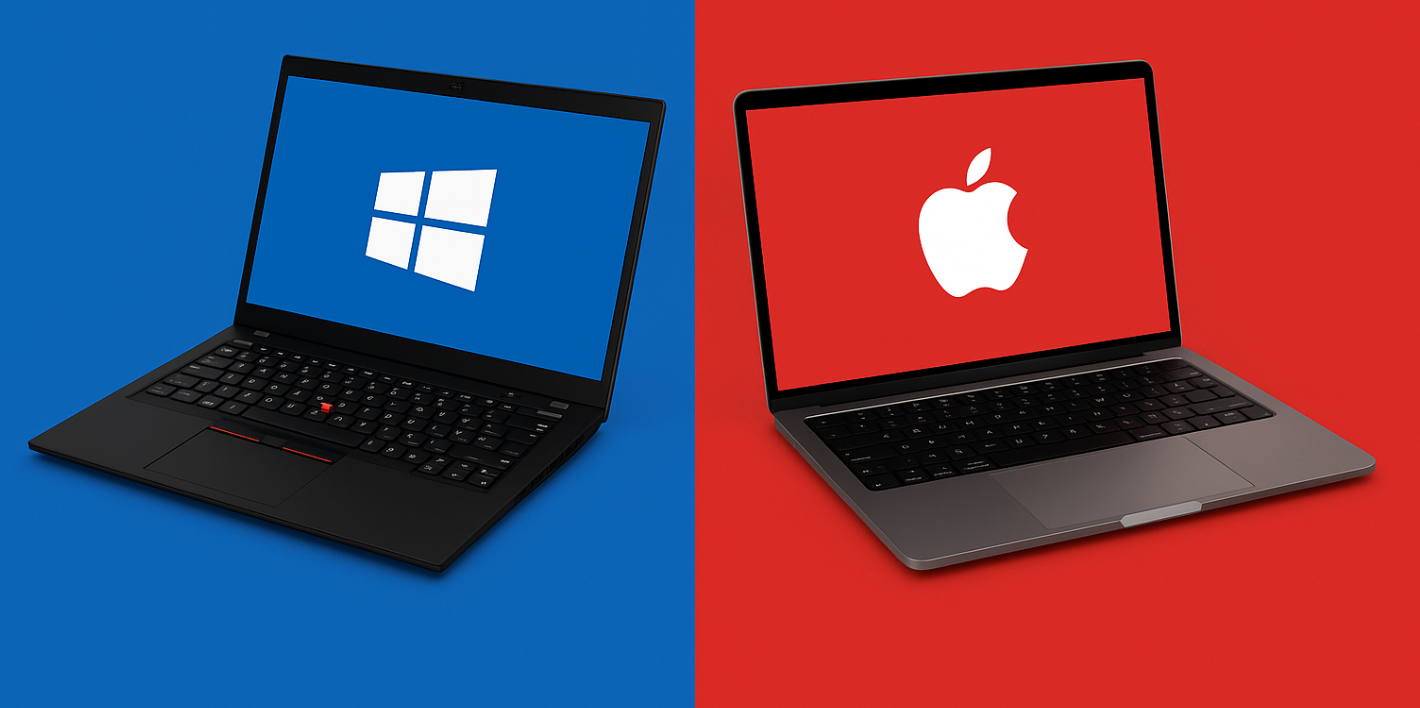
    My journey of choosing laptops began in 2014, when I bought my first computer as a new university student—a ThinkPad L14 (2014 model). In 2017, I switched to the Intel-based 16-inch MacBook Pro, and in 2021 I upgraded to the 14-inch M1 MacBook Pro, witnessing firsthand the dramatic shift brought by Apple’s transition to its own silicon.

    In October 2024, during a government subsidy program, I purchased the ThinkPad T14p Gen 2 with the Ultra 9 integrated GPU. In May 2025, I added the MacBook Air 15-inch M4 to my lineup; and by October of the same year, I bought the Surface Pro 11 X Plus, officially beginning my exploration of the Windows-on-ARM experience. Over the past decade, my laptop choices have shifted with the changes in my studies, work, and lifestyle—they reflect not only my evolving professional needs, but also the broader transitions of computing platforms and industry trends.

    The Strengths and Limitations of the Windows Ecosystem

    The advantages of using Windows are obvious. First, the Office suite on Windows offers an unparalleled experience—its performance and compatibility are both impeccable. Second, expandability is virtually unlimited. Over the years, I’ve always kept a desktop alongside my laptops—from an early Intel Hades Canyon NUC, to a self-built i7-11700 mATX desktop, and later an HP workstation with an i7-12700. The persistent fan noise of the Hades Canyon under sustained load eventually drove me toward better-cooled self-built systems and workstations, whose thermal performance once gave me the illusion of “limitless performance.”

    My main operating system has long been Windows 10, which has been stable for the past few years—I probably went one or two years without reinstalling it. Occasionally, I’d complain about Windows forcing updates and rebooting automatically, closing my browser and all work files. Other than that, the experience was generally good.

    By comparison, the MacBook Pro has always been more of a “light-duty companion” in my usage—mostly for writing simple code, checking email, and reading PDFs. Heavy tasks like data analysis or running large professional software all took place on my x86 Windows desktop.

    But recently, my lifestyle has changed. I’ve been traveling frequently, often living in different places for months at a time, without a stable workspace, and unwilling to stay indoors all day. I want to be able to work in different environments—cafés, on the road, anywhere. This created a new need: a high-performance Windows laptop that could recreate desktop-level productivity in a portable form. I had used Windows laptops back in university, but my strongest memory was wandering around the library looking for seats with available power outlets. Naively, I assumed that after ten years and leaps in chip manufacturing, we’d already have far better battery life and thermals. Reality proved otherwise.

    When the government subsidy went live in October 2024, I barely hesitated before locking onto the ThinkPad T14p Gen 2. I didn’t look at lighter options like the X1 Carbon, nor did I consider high-TDP gaming laptops. I hardly play games anyway—what I truly needed was a machine that could complete code runs as quickly as possible. So I went straight for the Ultra 9 iGPU model. Another thing that drew me to the T14p was its near-perfect expandability: dual-channel RAM, dual M.2 slots. As for battery life, at the time I was doing a lot of writing, and saw many users casually saying, “It lasts the whole day.”

    And I believed them. Back then, terms like power consumption, thermals, and performance limits didn’t mean much to me. I assumed that improvements in chip fabrication naturally translated to better user experience. I thought that the gap between Windows laptops and MacBooks might no longer be that wide. But reality soon hit me—hard. I eventually realized that Apple’s M-series laptops are a dimensionality-reducing strike against Windows+x86. It isn’t just a generational difference—it’s a fundamental one: power efficiency, battery life, standby behavior—every aspect feels like it’s separated by several eras.

    Thinkapd T14p 2024

    Battery Life, Standby, and the Real-World Experience

    Standby

    When it comes to standby, the MacBook is almost perfect. Close the lid, and it can sleep quietly for days—sometimes even weeks. Open it again, and the battery is nearly untouched, the screen lights up instantly, and every app sits exactly where you left it.

    And Windows laptops? When you pull one out of your backpack, it’s often warm. If you shut it down and reboot to the desktop, you’ll spend 15 to 20 seconds waiting for all the background processes to finish loading. Put it in your bag at 100%, take it out later to find only 30% left—and at best, you’ll squeeze out another half hour of use. I’ve experienced this scenario so many times that each recurrence feels like reliving the same nightmare.

    The root cause lies in Microsoft’s attempt to introduce “Modern Standby” (S1 mode), hoping to give Windows laptops a smartphone-like “always on” experience. But the vision was rosy; the reality, painfully brittle. To remain compatible with the vast and messy x86 hardware ecosystem, this mechanism ended up being almost despairingly bad. And Windows 11’s automatic maintenance tasks—checking for updates, downloading patches, installing system updates you never asked for—routinely wake the system during standby. Sometimes a single update can break sleep entirely, especially when virtualization-related features like WSL2 are enabled.

    Laptop manufacturers haven’t optimized S1 standby properly, nor have they invested resources to support the older S3 mode. Modern ThinkPads no longer support traditional S3 sleep. Which means the only reliable way to prevent your battery from being drained is… shutting down, or using hibernation, which is barely better than a reboot. But for me, “shutting down” feels downright inhumane. I keep dozens of Chrome tabs open, along with multiple editors and terminal windows. Being forced to close everything feels like being forced to shut down my entire train of thought.

    I’ve been spoiled by the MacBook’s M-series. It trained me to expect near-perfect fluidity: close the lid and go; open the lid and continue. On that machine, work is continuous. On Windows, it is constantly interrupted.

    Different Sleep Modes for Windows Laptops

    The Opacity of Battery Life

    The internet is filled with marketing-driven ads and vague, uninformative “battery life tests.” In review videos, the host might tell you with a straight face: “This laptop scored 8 hours of office battery life in PCMark10,” yet no one explains: How long does it actually last in day-to-day use? Will power-saving mode cause lag or frame drops? What’s the actual experience? Does dark mode really save power? The real details of battery life have never been seriously discussed.

    Many reviewers test under unrealistic conditions—like playing a Bilibili video at minimum brightness. But processors are optimized specifically for video playback, so this tells you nothing about real office workloads. Others open a Word document and claim it lasts 10 hours. Those who boast “all-day battery life” on Xiaohongshu are usually light-duty users whose needs could be met by an iPad, a Chromebook, or even Samsung’s Dex mode. They are not users like me—nor am I the audience their tests speak to. I can’t help but think that HarmonyOS PCs, which emphasize light productivity, might actually represent the true mainstream of today’s laptop market.

    To understand battery life better, I learned to track my own power usage constantly and analyze how my behavior affects consumption. I bought the T14p Ultra 9 version specifically for its 80W peak performance and stable 50W sustained performance.

    But for battery life, I was forced to enable Best Power Efficiency mode—which caps power draw at around 20W. And then… everything slowed down. Text input lagged, window switching stuttered, even typing felt “sticky.” Whenever I worked outside, I constantly had to babysit Task Manager, manually killing background processes—Dropbox, OneDrive, Tailscale, LocalShare, PowerToys… clearing them one by one.

    It’s an extremely anti-human experience. I finally understood why almost no one online recommends “Windows utility apps,” while Mac users love sharing menu-bar tools and background enhancers. On Windows, background apps are a burden; on macOS, they are effortless conveniences.

    My daily workflow isn’t complicated, but it’s enough to stress battery life: dozens of Chrome tabs, music playing in the background; Word, Adobe Acrobat, Zotero, Notion, Outlook, VSCode/Cursor all open at once; Bluetooth earbuds and mouse connected; screen brightness at maximum (T14p peaks at 430 nits) because I often work in cafés or outdoors. In power-saving mode, the CPU is locked at around 2.0GHz, and this whole workflow averages 23.6W of power draw. That means: with a 75Wh battery, the T14p lasts only about 3 hours.

    Switch to Balanced or Performance mode, and battery life drops below 2 hours—though performance becomes slightly smoother, at the cost of heat and fan noise. In performance mode, you also feel the heat, especially brutal in summer—the keyboard gets uncomfortably hot.

    I rebuilt the exact same workflow on the MacBook Air M4 (15-inch). Power consumption fluctuates only between 3–6W, with more background apps and a smoother experience. I can summon any app instantly with Raycast; the system has virtually no latency. No fans, no noise—even under long hours, the palm rests remain cool. The M4’s performance is more than enough for my needs, and whether plugged in or on battery, the experience is almost identical. With its 66.5Wh Li-poly battery, the MacBook Air M4 delivers a real, fully usable 10-hour workday. Since I bought it, I’ve almost never managed to drain the battery completely.

    MacBook Air M4 15-inch Daily Power Consumption

    For macOS, my workflow of webpages and documents is merely a light load—close the lid, let it sleep, open it again, and everything continues in one seamless flow. But in the Windows world, so-called “light office battery life” usually refers only to opening Word, Excel, PowerPoint, plus a handful of webpages—and only after shutting down many background processes. Once you enter a real multitasking environment, the system becomes sluggish and heavy.

    When frequently switching between “open → lid-close sleep → open again,” the MacBook remains consistently smooth; meanwhile, a Windows laptop behaves as if it’s rebooting—often needing more than ten seconds to return to a usable state. Ever since I bought the T14p, I’ve had to quit apps, close webpages, and shut down entirely before closing the lid. This forced “adaptation” created a profound sense of fragmentation—what feels fluid and continuous on a Mac is chopped into pieces on Windows.

    Portability, Input Experience, and Peripheral Dependence

    As someone who goes to the gym year-round, I’m not sensitive to laptop weight—500 grams is just another bottle of water. But the real weight penalty of using a Windows laptop?

    The 100W “brick” power supply. I have to carry it nearly every day. Yes, I could switch to a smaller 65W GaN charger—but the wattage isn’t enough. On loose café outlets, it often disconnects and falls to the floor. And even when plugged into a 65W charger, I still can’t use the T14p in “Best Performance Mode.”

    A mouse—always. ThinkPad’s trackpad can’t compare to the MacBook’s precision. The cursor constantly drifts off target, the logic of single vs. double-click feels vague, and the buttons require too much force. Only the Surface Pro Flex keyboard cover has a trackpad that can somewhat match the MacBook’s. I still remember having this level of smooth trackpad experience as early as my 2017 MacBook Pro. I genuinely don’t understand why something that dramatically improves usability—like a high-quality, large-surface trackpad—is still not standard on Windows laptops approaching four-figure prices, leaving users stuck with outdated, cumbersome touchpad technology.

    Another point that must be mentioned is heat in the keyboard area. As someone who spends more than 8 hours a day at a computer, with my hands on the keyboard for 5 to 6 hours, I’m extremely sensitive to typing feel. This should be an advantage of Windows laptops—especially ThinkPads, whose firm, confident key feedback used to be reassuring. But the T14p’s thermal issues completely ruined it. When I first bought it during autumn and winter, the heat didn’t bother me; but in summer, you can feel waves of heat rising from the keyboard. That burning sensation is stressful—and that’s not even mentioning the fan noise.

    Conclusion

    Through these months of use, I gradually realized that “wanting everything at once” is nearly impossible in a laptop. Even a seemingly perfect, highly expandable all-round machine like the T14p cannot escape terrible standby and battery life. Windows and Intel don’t seem capable of solving these long-standing issues anytime soon.

    Even upgrading to workstation-class devices like the P16 Gen2 won’t avoid the same bottlenecks: power management, thermals, and noise. The MacBook lineup has its own flaws—its RAM and storage are priced like gold—but unlike Windows laptops, these flaws can be solved with money. Windows laptops have shortcomings that money simply cannot fix.

    In the end, the compromise I found was a combination of “ITX desktop + thin-and-light laptop.” The ITX machine became the most realistic balance among performance, noise, and portability—a return from idealism to practicality.

    So in August 2025, I purchased the ThinkStation P3 Ultra Gen2. This compact but powerful device fulfills nearly all my needs for portable, high-performance computing. I can fit it into a 20L suitcase, plug it in at a hotel, use it without an external monitor as if it were a server, and with Moonlight for remote streaming, I can finally enjoy a near-desktop-level work experience anywhere.

    3.9 L ThinkStation P3 Ultra Gen 2: A Compromise Between Portability and Performance

    The Overlooked World of Windows on Arm (WOA) Laptops

    The scorching keyboards of traditional laptops finally pushed me away for good. The irritation and discomfort of long typing sessions drove me to explore a different category of devices—2-in-1s. Among them, the Surface Pro series stood out immediately: no heat, detachable keyboard—two decisive advantages for someone like me. And as luck would have it, Amazon Prime Day rolled around, allowing me to pick up the much-criticized Qualcomm Snapdragon version of the Surface Pro 11 at an almost “impossible to refuse” price.

    Some might ask: if I care so much about user experience, why not choose the more powerful Surface Pro Lunar Lake version? The answer is simple and pragmatic.

    While I’m willing to pay extra for better usability, the Lunar Lake model starts at a staggering $1,500—whereas the entry-level Qualcomm version costs just over $400. With a price gap this large, compatibility issues suddenly don’t seem all that insurmountable.

    Most of my work revolves around writing in Office apps, browsing the web, and reading PDF files—all of which are native ARM applications with virtually zero compatibility concerns. And with Qualcomm’s CPU built on a 4nm process, the efficiency advantages at low-power workloads are unmistakable. Compared with raw performance, what I really wanted to experience was Qualcomm’s long-established expertise in power management as a mobile chip veteran.

    To be frank, I’ve already lost confidence in the Intel platform. The way x86 processors transition between high-load and low-load states—especially instantaneous frequency adjustments—feels clumsy and sluggish, nowhere near the fine-grained power control of mobile processor makers. On top of that, Intel’s various power modes seem like crude frequency locks, and Windows 11 still hasn’t mastered the scheduling of Intel’s big cores, small cores, and “smaller” small cores. Even on Reddit, users who bought both the Lunar Lake and Snapdragon X Plus versions of the Surface Pro mentioned: “Windows 11 isn’t actually faster on Intel than on ARM; it just feels less smooth. Especially when opening or closing apps or pulling up the Start menu, the animations seem slightly choppy, like minor frame drops.”

    Surface Pro 11 X Plus Real-Time Power Consumption and Standby Performance Demonstration

    I received the Surface Pro in early October, and I can finally rely on S0 Modern Standby without worrying that the device will heat up mysteriously in my bag or wake itself up for no reason. What surprised me most was its standby power draw—just 0.1 Wh.
    In my daily workflow—web browsing, document editing, PDF annotation, background syncing—the system’s total power consumption stays at 6–8 W. Switching to Battery Saver mode brings it below 5 W, even with all background tasks still active. And the system remains smooth, with no obvious stutter or dropped frames.

    Qualcomm’s Snapdragon X Plus platform is a flagship ARM processor built specifically for PCs, based on the Oryon CPU architecture and a 4nm process.

    I understand why Snapdragon CPUs have been widely criticized—weak performance, compatibility issues, inconsistent heat and power behavior, and the painfully long gap between announcement and actual availability. But to me, none of these are the real deal-breakers.

    What truly discourages users is the pricing. If these laptops fell into the ¥4000–¥5000 range, people might judge them far more kindly. After all, once the price stops towering over expectations, users can finally appreciate the ARM platform’s strengths: cooler, quieter, more efficient computing.

    Even if Lunar Lake manages to match Qualcomm in battery life, Intel’s x86 architecture still feels clumsy when it comes to fine-grained tuning. A genuinely great laptop experience has never been just about piling up performance numbers—it’s about balancing power consumption, noise, thermals, system responsiveness, and ecosystem maturity.

    It’s worth mentioning that I haven’t run into any major compatibility issues so far. I even played several Steam games on this tablet—Detroit: Become Human, Stardew Valley, Disco Elysium, Escape from Tarkov, and a few visual novels. Meanwhile, reports suggest that Valve is actively working on an ARM-compatible layer (Proton on ARM), which naturally leads one to imagine future ARM-powered handheld gaming devices. Personally, I’m looking forward to the second-generation Snapdragon X series.

    Let’s give it a little more time—Perhaps in the not-so-distant future, the ARM platform will truly shine on the stage of laptops and mobile computing.

    Summary & Outlook

    Ten years of buying and using laptops have taught me one thing: the perfect laptop simply doesn’t exist—not today. The key isn’t to hunt for a device that “does everything,” but to clearly understand what you truly need.

    Laptop experience has never been just a hardware issue. If Windows cannot achieve deeper synergy with its hardware, its shortcomings in standby and battery life will never be fully resolved. For me, the most practical and efficient mobile-work setup remains the combination of an ITX desktop + an ultraportable laptop—balancing performance with mobility while adapting flexibly to different work scenarios.

    At the same time, ARM laptops are showing undeniable long-term potential. With ultra-low standby power consumption and more refined frequency tuning, they promise an experience that is genuinely lightweight, quiet, and long-lasting. Compared with traditional x86 platforms, ARM seems to better understand the balance between power efficiency and user experience—and this may very well be the direction in which future laptops evolve.

    As an ordinary consumer, I sincerely hope future battery-life reviews will reflect real-world usage rather than idealized tests like “video playback at minimum brightness.” What we need are evaluations that reveal true power consumption and minimum usable battery life under everyday workloads—for example, by continuously recording power draw with open-source tools like Traffic Monitor, presenting a transparent and verifiable picture of actual experience.

    (This article was proofread with the help of ChatGPT, which also generated the cover image.)

    Cover image by Sandor Nagy

  • App Picks | Noteworthy Apps of the Moment

    App Picks | Noteworthy Apps of the Moment

    Welcome to this issue of App Picks. You can use the article’s table of contents to quickly jump to the sections that interest you most. If you discover other apps or topics you’d like to discuss, feel free to share them with us in the comments section.

    New Apps Worth Your Attention

    While SSPAI has always been dedicated to discovering and introducing high-quality apps across different platforms, there are still many apps with outstanding design, functionality, interaction, and overall user experience that we haven’t yet featured. Some may be long-standing hidden gems, while others are brand-new releases. Here, we bring them to your attention.

    Hurricane Camera: Lowering the Barrier for Video Creation, Making iPhone Filmmaking Easier

    • Platform: iOS
    • Keywords: Mobile Imaging, LUT

    @Vanilla: This year, Apple has once again strengthened its dominance in mobile videography with the iPhone 17 Pro series. In addition to hardware upgrades, Apple introduced professional-grade features like OpenGate, Genlock, support for ProRes RAW video recording, and the new Apple Log 2 format.

    Shortly after the iPhone 17’s release, Hurricane Studio launched Hurricane Camera, a third-party video app for iPhone—something that sounds perfectly reasonable at first. But with Apple’s own Final Cut Camera, its “godson” Blackmagic Camera, and a lineup of other third-party apps already targeting advanced mobile videography, one might wonder—is there really room for another one? With that question in mind, I decided to give Hurricane Camera a try. After using it for a while, here’s what I found.

    When you open Hurricane Camera, it defaults to video shooting mode. You can switch to Dynamic Image (Log) mode via the top tab, though this feature requires a paid upgrade. In the video mode, the top-left corner of the viewfinder displays input levels for the left and right microphones, while the top-right corner houses the video format selector. Tap it to choose among different formats, resolutions, and frame rates.

    Inside the format menu, Hurricane Camera clearly labels and explains options like sRGB, HDR, Log, and Log 2—a friendly touch for users who aren’t professional cinematographers. At the bottom of the viewfinder, there’s a row of controls for front/rear camera switching, focus, white balance, ISO (sensitivity), shutter speed, exposure compensation, and settings. From focus to exposure compensation, each parameter can be fine-tuned with a slider or left on Auto. However, it’s worth noting that focus and exposure compensation use circular sliders, while the other three use horizontal ones—this small inconsistency in UI design can feel a bit confusing at first glance.

    The lens switch module and the storage information panel are hidden by default, but you can swipe up on the viewfinder to bring them out, or swipe down to hide them again. Hurricane Camera even adds an animation when switching lenses, though the transition isn’t entirely smooth—it’s unclear whether that’s an intentional design choice or a technical limitation. One thing to note: lens switching is disabled once recording starts, meaning you can’t change lenses mid-shot.

    To the left of the record button is the media library, where you can edit your footage—apply LUTs, make simple cuts, and render the final result for export. You can also export a clip as a dynamic image, though that feature is reserved for Pro members.

    To the right of the record button lies the LUT button. Hurricane Camera offers a selection of built-in LUTs you can apply instantly, with real-time previews displayed directly in the viewfinder.

    In the settings menu, Hurricane Camera provides a variety of practical options. For example, under performance settings, you can limit preview frame rates, enable system overload protection, and toggle LUT preview—all of which can noticeably improve the app’s smoothness. In the recording settings, you can choose to record either the raw footage only or include LUT-applied video simultaneously.

    To me, Hurricane Camera strikes an excellent balance between ease of use and professional-level functionality. It’s powerful enough to handle most shooting needs while remaining approachable for casual users. To reinforce that accessibility, the app even includes a “Simple Mode” toggle in the settings menu, which retains only the core shooting features—further lowering the barrier for everyday creators.

    Hurricane Camera is available for free on the App Store, with a ¥69 Pro membership unlocking features such as dynamic image recording and export. Relation article.

    Wins 3: Efficient Multi-Window Management

    • Platform: macOS
    • Keywords: window management

    @Snow: Earlier this year, I recommended two macOS window management apps—TabTab, known for its minimalism and efficiency, and DockDoor, praised for its gorgeous visual effects. The app I’m introducing today, Wins, feels like a perfect blend of the two while also incorporating some of Magnet’s strengths. With deep system-level integration, Wins helps you manage multiple windows more effectively.

    Like DockDoor, Wins provides multi-window previews for both the App Switcher and the Dock, designed with macOS’s translucent “liquid glass” aesthetic. Animations are fluid, and users can quickly close windows directly from their previews. Wins also enhances the App Switcher with its “Cmd-Tab Plus” feature—after pressing Command + Tab to activate the switcher, you can hold Command and use the arrow keys, or press W or Q, to swiftly switch, close, or quit apps.

    Wins also brings a Windows-like window toggling logic to the Dock: when enabled, clicking the same Dock icon twice automatically minimizes its corresponding window. Combined with the macOS option “Minimize windows into application icon” and multi-window previews, this feature keeps your Dock neat and uncluttered.

    In addition, Wins offers Magnet-level window snapping and split-screen options. You can drag a window to the screen’s edge to snap it to the left, right, or full screen. When dragging a window to the top of the screen, Wins presents four preset split layouts in a floating overlay—just drag the window onto your desired layout to instantly organize your workspace. The app also includes handy shortcuts like hiding all windows, hiding others, and centering windows, all of which can be customized in System Settings > Wins.

    Wins further supports features like shake-to-hide other windows, multi-monitor quick switching, and closing windows from the Mission Control view. However, during testing, I encountered a few issues affecting usability—for example, certain apps like One Markdown failed to display previews, and the integrated settings panel occasionally glitched when switching between light and dark modes.Wins offers a one-day free trial, and it’s best to test it before purchasing.

    A personal license (for one device) costs ¥139, but during the SSPAI App Store Double 11 promotion, you can get it at a 40% discount via the purchase link.

    Hungry: If You Feel Hungry, Go Cook

    • Platform: Android
    • Keywords: recipes

    @Peggy_: I have to start with a confession. During the height of the food delivery boom, I practically lived on hamburgers, barbecue, spicy hot pot, milk tea, beer, and iced Americanos—never leaving home, barely touching my kitchen. Unsurprisingly, I eventually earned myself a bout of gastritis. It’s not that eating delivery food will definitely make you sick, but compared to constantly consuming takeout with questionable hygiene, taking the time to visit a local market and cook something with your own hands is not only healthier, but also a great way to rediscover the joy of everyday life.

    Hungry is a beautifully designed recipe app that helps you organize the dishes you want to cook. As you use it over time and add more content, it gradually solves that eternal dilemma—“What should I eat today?” Let’s walk through the process of creating a recipe to get familiar with how it works.

    Tap the “Add” button in the lower-right corner of the app. You can take a photo of the finished dish or the prepared ingredients to make your recipe look more appealing, then enter the recipe name. In the description field, you can add personal notes or comments about how much you like the dish. If the recipe comes from a creator or YouTuber you follow, you can credit them as the author—or if it’s your own creation, even better; nothing beats the satisfaction of cooking your own recipe. You can also set an estimated cooking time (in minutes by default), though that might be a bit limiting for Chinese dishes that require longer steaming or simmering. Before finishing this setup, you can tag your dish with labels such as “Healthy Meal” or “Vegetarian.”

    Next comes the real work: adding ingredients one by one, including their names and quantities. To keep your prep organized and avoid chaos, Hungry allows you to group ingredients, add dividers between sections, or even use emojis to make ingredients easier to identify—and to add a bit of fun to recipe editing. The app even tries to automatically suggest emojis for each ingredient, but in Chinese, the results are often hilariously off. For example, it once matched “lamb” with “green tea,” which clearly required manual correction. If you’re copying an existing recipe from elsewhere, Hungry also includes a convenient “Paste” button so you can quickly drop in all the ingredient names at once.

    After that, you can begin adding cooking steps. Hungry lets you list each step in order, complete with descriptions, duration, and optional tips. You can even bulk paste instructions if your content matches the app’s formatting requirements. Overall, Hungry has done a good job minimizing the friction of recipe creation—after all, if maintaining your recipe collection is harder than cooking itself, who would bother?

    Hungry is available for free on the Play Store.

    MagicFX Wallpaper: Bringing Pixel’s Exclusive Wallpaper Magic to Everyone

    • Platform: Android
    • Keywords: wallpaper

    @大大大K: On Pixel devices running Android 16, users can create wallpapers with a “Magic Portrait” effect—where the subject of a photo appears to extend beyond its frame. Samsung has introduced a similar feature in newer versions of One UI, but for most other Android devices or older systems, this option simply doesn’t exist.

    To change that, an independent developer created MagicFX Wallpaper, an app that brings the same subject-pop-out effect to any Android phone. The app automatically separates the subject from the background of a photo and lets you export it as a wallpaper with that signature layered look.

    Using it is simple: just select a photo, and the app will automatically handle the background and subject separation. The extracted subject is positioned relative to its base, creating the illusion that it’s “standing inside the frame, with its head popping out.” However, depending on the photo’s composition—such as subject position, size, or angle—the pop-out effect may not always look perfect. In such cases, you can fine-tune the boundaries of the subject under the “Subject” option, cropping out unwanted areas to improve the final result.

    Once you’re done editing, MagicFX Wallpaper’s preview tool allows you to see how the wallpaper transitions from lock screen to home screen. By adjusting the home screen wallpaper’s position and scale, you can achieve a smooth, visually cohesive unlock animation.

    MagicFX Wallpaper supports separating people, pets, and distinct objects from photos as subjects. For more complex images, the developer has promised ongoing algorithm improvements. Some of the frame styles in the editing page require an in-app purchase to unlock, but more designs are already planned for future updates.If you’re curious to try it, MagicFX Wallpaper is available for free on Google Play.

    AutoSnore: Intelligent Snore Tracking

    • Platform: iOS
    • Keywords: Snore Monitoring

    @Snow: When iOS 26 introduced the new sleep score system, many users thought that sleep-tracking apps like AutoSleep were about to become obsolete. But the AutoSleep team clearly had no plans to retire. Last week, they launched AutoSnore, a new app designed to help users understand how snoring affects their health. Unlike other solutions, AutoSnore doesn’t require external devices such as the Apple Watch — simply place your iPhone by your bedside before sleeping, and the app will automatically track and analyze your snoring throughout the night, adding a new dimension to your sleep insights.

    Using AutoSnore is remarkably straightforward. Upon the first launch, you just need to enter your nickname, then before going to sleep, position your iPhone’s microphone toward yourself and tap the Start button. In the morning, tap Stop, and AutoSnore will automatically process your data. It presents your snoring patterns in a visual “Snore Cloud,” where white dots indicate snoring events, categorized by frequency and intensity. Beyond analyzing a single night, AutoSnore also compares your current session with past records, giving you a broader view of your sleep quality over time.

    Within the Snore Cloud view, you can replay recorded sound snippets from your sleep. Thanks to its built-in algorithms, AutoSnore isolates snoring segments and highlights the “Top 10 Snore Moments,” helping you identify periods of severe breathing irregularity so you can take corrective action. The app also tags other detected sounds — such as voices, musical instruments, ambient noise, or natural sounds — allowing you to revisit specific moments and even discover who (or what) you might have “talked to” in your dreams.

    Scrolling down to the main screen, AutoSnore also provides a manual tagging feature. You can log factors that might affect your snoring, such as whether you have a cold, are overly fatigued, switched pillows, or took medication — all of which help refine your personal sleep optimization strategy.

    However, as a newly released app, AutoSnore still suffers from several bugs that affect the overall user experience. The sound analysis algorithm, for example, occasionally misclassifies alarm tones as high-intensity snores. Since there’s currently no way to exclude alarms from detection or manually correct false positives, the analysis results can be significantly skewed. Additionally, due to its strict privacy policy, AutoSnore cannot yet distinguish between different voices. If you share a bed with someone or fall asleep with the TV or a podcast on, your only workaround is to reposition your iPhone or tweak the Sound Threshold setting under Options > Configure My AutoSnore to filter out external noise. Users have also reported playback issues such as overlapping soundtracks and UI glitches with mislabeled tags.

    AutoSnore is now available on the App Store for an introductory price of ¥38. Given the current technical issues affecting its daily usability, it might be wise to wait for a few updates before purchasing.

    Can’t-Miss App Updates

    Besides brand-new apps, many long-standing names on the App Store continue to evolve with fresh, useful features. Here at SSPAI, we aim to help you keep up with the latest updates worth your attention—so you can quickly discover what developers have been up to.

    XMind: AI-Powered Mind Mapping and Brainstorming

    • Platform: iOS / iPadOS / macOS / Android / Windows / Web
    • Keywords: Mind Mapping, Brainstorming

    @ElijahLee: Recently, the veteran mind mapping app XMind rolled out a major update, introducing a suite of AI-powered creative tools. With these new features, users can now leverage AI to automatically generate mind maps, break down projects into tasks, assist in brainstorming sessions, and even spark new ideas.

    In the updated XMind interface, you’ll find a new “One-Click Generate” button in the sidebar—this is the entry point to the AI creation tools. In the pop-up window, you can transform virtually any content—an article, document, website, or even a webpage video—into a structured mind map. This makes the process of mind map creation faster and significantly less tedious.

    In my own quick test, I found XMind’s AI assistance dramatically reduces the manual labor involved in organizing and formatting maps. For instance, I was reading Satantango and asked XMind to create a mind map summarizing each chapter and its main characters. The resulting map looked impressively polished: chapter titles, plot outlines, and character listings were all logically arranged and visually cohesive. The only issue? The AI had completely made up the story—none of the plot points or characters matched the book. Clearly, XMind’s AI had a “hallucination moment.”

    XMind’s AI toolset is surprisingly comprehensive. Within the “One-Click Generate” window, you can upload files like PDFs, Word documents, PowerPoint slides, plain text, or Markdown files. You can also select from multiple diagram types—mind maps, logic charts, organizational charts, timelines, and fishbone diagrams. The system supports multiple languages, including English, Japanese, Simplified Chinese, and Traditional Chinese.

    The AI Work Breakdown feature automatically decomposes projects into executable tasks, assigning timelines and priorities. You can use it when first generating a map or later, by right-clicking on any node and selecting “AI Work Breakdown.” It effectively transforms a conceptual mind map into a practical action plan.

    The web version of XMind currently offers even more AI-powered features, which will gradually roll out to desktop and mobile platforms. One standout is Brainstorming, which provides five AI-assisted creative modes: Direct, Associative, Analogical, Synthetic, and Exploratory. Essentially, this is an AI chatbot for idea generation—just describe your topic, select a brainstorming style, and the system will generate idea cards and automatically arrange them into an elegant mind map.

    Another feature, Grow Ideas, allows AI to expand on any topic or subtopic within an existing map. The tool icon sits at the far right of the toolbar. You can choose between on-demand or automatic generation, letting the AI analyze the current structure and create new branches of thought in real time.

    You can download XMind from the official website. The AI functions use “AI Points,” with each task consuming a different amount depending on complexity. Free users get 10 AI Points, while upgrading to the Premium plan ($99/year, with a 7-day free trial) grants 500 points per month, unlimited cloud mind maps, AI summaries, Gantt charts, and more.

    DEVONthink 4.1: Expanded AI Model Support and Natural Language Task Creation

    • Platform: macOS
    • Keywords: Knowledge Management

    @化学心情下2: As one of the most established file management tools on macOS, DEVONthink has maintained a steady pace of major version updates. The release of version 4.0 in July 2025 marked a major milestone, introducing support for AI-powered large language models. Now, just a few months later, the 4.x series receives its first minor update—version 4.1—bringing with it a series of meaningful improvements and expanded AI integration.

    Compared with version 4.0, where AI was first introduced, version 4.1’s biggest change is its enhanced openness and flexibility in connecting to AI services. Previously, users were limited to specific AI providers; now, you can connect to your preferred models through OpenRouter or OpenAI (Compatible) endpoints. This means you can integrate models from providers like xAI, Baidu, and Alibaba’s Qwen. On the native side, DEVONthink 4.1 adds support for Claude 4.1 Opus, Claude 4.5 Sonnet, Gemini 2.5 Flash Lite, OpenAI GPT-5, Google Imagen 4, Mistral, Google Nano Banana, and Ollama Cloud. All Perplexity Sonar models now include vision capabilities, giving users the option to work with visual input when needed.

    With these AI integrations, DEVONthink takes automation even further. Users can now use natural language in the Script Assistant to generate executable AppleScript or JavaScript for Automation code. This makes it much easier to automate workflows without manually writing lengthy scripts, reducing syntax errors and improving productivity.

    AI also extends to image generation and editing. You can now adjust or create images through prompt-based editing, using AI to refine visual details or produce entirely new images according to your description. The same principle applies to editing—simply tell the AI to remove unwanted objects or insert new subjects into your scene, and DEVONthink handles the rest.

    Beyond AI, version 4.1 also introduces a Quick Look extension that allows users to preview Spotlight search results directly in macOS. Large Markdown files have also been optimized for better performance and faster editing speeds. If you use DEVONthink for document or note management, this update is worth exploring—it makes organizing, automating, and editing your files more intuitive than ever.

    You can download and purchase DEVONthink from the official website.

    App News Briefs

    • The App Store has officially launched its full web version, expanding access beyond the visionOS-specific web interface previously available.
    • Meanwhile, rumors suggest that WeChat is testing a new feature that would allow users to log into the same account on multiple smartphones simultaneously.